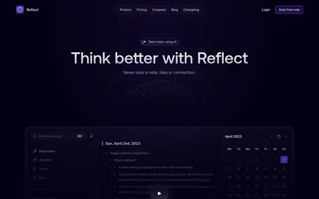
Preview image. Unlock full-res
Midnight Orbit in a Dark Universe. It feels like navigating a personal cosmos of interconnected thoughts, illuminated by subtle internal light.
Color palette
Primary brand accent for critical interactive elements like call-to-action buttons, indicating action or focus.
Hover states for links and interactive elements, a lighter, more vibrant shade of Reflect Violet for subtle feedback.
Decorative background gradient for hero sections and prominent visual elements, evoking a celestial atmosphere.
Used for card and feature backgrounds, implying internal glow and depth.
Feature background, indicating high energy or premium content with a broad color spectrum.
Primary background for the application, providing a deep, immersive canvas.
Secondary background, subtly darker than Deep Violet, creates slight hierarchical separation for larger sections.
Background for secondary interactive elements and less prominent sections, adding another layer of depth.
Primary text color for maximum contrast against dark backgrounds, used extensively for headings and primary content.
Secondary text color, slightly off-white, for body copy and less emphasized elements, providing a softer contrast.
Tertiary text color, borders, and subtle iconography, indicating lesser importance or inactive states.
Placeholder text, inactive navigation links, and subtle dividing lines, for content that should recede.
Very subtle borders and disabled text states, appearing almost transparent against the darker backgrounds.
Typography
- Weights
- 500
- Sizes
- 24px, 32px, 48px, 56px, 72px
- Line height
- 1.11, 1.14, 1.17, 1.25, 1.33
- Fallback
- Montserrat
Headlines and display text. Its geometric sans-serif shapes at these larger sizes provide a commanding yet approachable presence without being overly bold, balancing technical precision with user-friendliness for a note-taking app.
- Weights
- 400, 500
- Sizes
- 12px, 13px, 14px, 15px, 16px, 18px
- Line height
- 1.2, 1.33, 1.43, 1.5, 1.54, 1.56, 1.6, 1.85
- Letter spacing
- normal
- Fallback
- Inter
Body copy, UI labels, buttons, and all smaller text. Its high legibility, even at small sizes, is critical for note-taking and dense information display.
Spacing & shape
Components
Solid Reflect Violet background (#5046e4), Whisper White text, 6px border-radius, 0px vertical padding, 12px horizontal padding. Features a transparent border for subtle definition.
Transparent background, Muted Ash text, 6px border-radius, 0px vertical padding, 12px horizontal padding. Features a very faint, transparent border, indicating a less dominant action.
Transparent background, Shadowed Slate text, 8px border-radius with 8px vertical padding and 16px horizontal padding. Prominently uses Shadowed Slate for both text and a border to define its shape against the dark background.
Near-transparent background rgba(255, 255, 255, 0.01), 16px border-radius, 24px vertical padding, 28px horizontal padding. The transparent background allows the subtle main page gradient to show through, creating depth without heavy shadows. Features glow-like inset shadows for elevation.
Transparent background, Shadowed Slate text and border color, 0px border-radius. Padding is 8px vertical, 12px horizontal. The distinct border highlights its interactive nature.
Transparent background, Whisper White text, 32px border-radius, 6px vertical padding, 14-15px horizontal padding. The pill shape and white text make it stand out as metadata.
Guidelines
- Use Deep Violet (#030014) as the primary page background to maintain the consistent dark, immersive aesthetic.
- Apply Reflect Violet (#5046e4) exclusively to primary call-to-action buttons for powerful, unambiguous interaction.
- Maintain a clear visual hierarchy using AeonikPro (substitute: Montserrat) for all headings (sizes 24px-72px) and Inter V (substitute: Inter) for all body and UI text (sizes 12px-18px).
- Employ the 16px border-radius for all primary content cards to establish visual consistency and a subtle softness.
- Utilize rgba(255, 255, 255, 0.01) for card backgrounds to allow the underlying page gradients and dark tones to create depth.
- Implement the Halo Inset Gradient (linear-gradient(rgba(183, 164, 251, 0) 0px, rgb(183, 164, 251) 100%, rgb(133, 98, 255) 100%, rgba(133, 98, 255, 0) 0%)) for feature backgrounds to give an internal glow.
- Avoid using highly saturated colors other than Reflect Violet for interactive elements; stick to the muted violet palette.
- Do not introduce sharp corners; maintain the consistent 5px, 6px, 8px, 16px, or 32px border radii for elements.
- Do not use external drop shadows for elevation; rely on transparent backgrounds and subtle inset shadows like rgba(255, 255, 255, 0.04) 0px 0px 24px 0px inset.
- Do not deviate from the Inter V and AeonikPro font families; alternative fonts would compromise the precise, thoughtful tone.
- Avoid arbitrary custom padding values; adhere to the 4px base unit and specified spacing tokens (e.g., 8px, 12px, 16px, 20px, 24px, 28px).
- Do not replace the subtle gradient backgrounds with solid colors, as the gradients are central to the 'orbit' aesthetic.
About this system
ShowHide
Reflect Notes evokes a deep, intellectual calm, like a thoughtful, organized mind brought to digital life. The consistent dark violet canvas sets a contemplative mood, while subtle gradients and inset shadows carve out interactive elements and content zones with precision. A single powerful violet serves as the primary accent, drawing focus and providing clear affordances without overwhelming the subdued aesthetic. The interplay of soft, almost translucent cards with sharp typography gives the UI a distinctly thoughtful and elevated feel.
The page primarily utilizes a max-width contained layout for content sections, implicitly around 1200px, although the hero section extends full-bleed. The hero features a large, centered headline over a cosmic gradient background. Subsequent sections often employ a 2-column or 3-column grid for features and testimonials. Section rhythm is generally consistent vertical spacing, often with subtle background shifts (Deep Violet vs. Subtle Violet) or atmospheric gradients like Aurora. Content arrangement frequently alternates text-left/image-right or centered feature blocks. A 3-column card grid is common for presenting features and social proof. The overall density is comfortable, with ample breathing room between elements and sections. Navigation is a sticky top bar with logo, links, and right-aligned buttons.
The site uses a combination of abstract, subtle glowing graphics, product screenshots, and iconography. Abstract graphics, especially in the hero, are full-bleed radial gradients with slight white opacity highlights over the dark violet background, creating a sense of a distant nebula or cosmic energy without being distracting. Product screenshots are contained within cards, depicting a minimalist dark UI, often with subtle, almost holographic internal elements. Icons are predominantly outlined, mono-color (Whisper White or Shadowed Slate), and highly simplified, serving an explanatory role without adding visual clutter. Imagery is used decoratively to set mood and illustratively to explain features, and is never full-bleed photography. The density is moderate; images break up text but don't dominate the layout.
Reminiscent of Notion, Linear, Obsidian, Supabase.
# Reflect Notes — Style Reference
> Midnight Orbit in a Dark Universe. It feels like navigating a personal cosmos of interconnected thoughts, illuminated by subtle internal light.

**Theme:** dark

**Site:** https://reflect.app

Reflect Notes evokes a deep, intellectual calm, like a thoughtful, organized mind brought to digital life. The consistent dark violet canvas sets a contemplative mood, while subtle gradients and inset shadows carve out interactive elements and content zones with precision. A single powerful violet serves as the primary accent, drawing focus and providing clear affordances without overwhelming the subdued aesthetic. The interplay of soft, almost translucent cards with sharp typography gives the UI a distinctly thoughtful and elevated feel.

## Tokens — Colors

| Name | Value | Token | Role |
|------|------|------|------|
| Reflect Violet | `#5046e4` | `--color-reflect-violet` | Primary brand accent for critical interactive elements like call-to-action buttons, indicating action or focus. |
| Interactive Violet | `#9382ff` | `--color-interactive-violet` | Hover states for links and interactive elements, a lighter, more vibrant shade of Reflect Violet for subtle feedback. |
| Aurora Gradient | `#e59cff` | `--color-aurora-gradient` | Decorative background gradient for hero sections and prominent visual elements, evoking a celestial atmosphere. |
| Halo Inset Gradient | `#b7a4fb` | `--color-halo-inset-gradient` | Used for card and feature backgrounds, implying internal glow and depth. |
| Rainbow Burst Gradient | `#fc72ff` | `--color-rainbow-burst-gradient` | Feature background, indicating high energy or premium content with a broad color spectrum. |
| Deep Violet | `#030014` | `--color-deep-violet` | Primary background for the application, providing a deep, immersive canvas. |
| Subtle Violet | `#060317` | `--color-subtle-violet` | Secondary background, subtly darker than Deep Violet, creates slight hierarchical separation for larger sections. |
| Twilight Graphite | `#10093a` | `--color-twilight-graphite` | Background for secondary interactive elements and less prominent sections, adding another layer of depth. |
| Whisper White | `#ffffff` | `--color-whisper-white` | Primary text color for maximum contrast against dark backgrounds, used extensively for headings and primary content. |
| Shadowed Slate | `#f4f0ff` | `--color-shadowed-slate` | Secondary text color, slightly off-white, for body copy and less emphasized elements, providing a softer contrast. |
| Muted Ash | `#a8a6b7` | `--color-muted-ash` | Tertiary text color, borders, and subtle iconography, indicating lesser importance or inactive states. |
| Passive Gray | `#918ea0` | `--color-passive-gray` | Placeholder text, inactive navigation links, and subtle dividing lines, for content that should recede. |
| Inactive Steel | `#54525f` | `--color-inactive-steel` | Very subtle borders and disabled text states, appearing almost transparent against the darker backgrounds. |

## Tokens — Typography

### AeonikPro
- **Substitute:** Montserrat
- **Weights:** 500
- **Sizes:** 24px, 32px, 48px, 56px, 72px
- **Line height:** 1.11, 1.14, 1.17, 1.25, 1.33
- **Role:** Headlines and display text. Its geometric sans-serif shapes at these larger sizes provide a commanding yet approachable presence without being overly bold, balancing technical precision with user-friendliness for a note-taking app.

### Inter V
- **Substitute:** Inter
- **Weights:** 400, 500
- **Sizes:** 12px, 13px, 14px, 15px, 16px, 18px
- **Line height:** 1.2, 1.33, 1.43, 1.5, 1.54, 1.56, 1.6, 1.85
- **Letter spacing:** normal
- **Role:** Body copy, UI labels, buttons, and all smaller text. Its high legibility, even at small sizes, is critical for note-taking and dense information display.

## Tokens — Type Scale

Perfect Fourth (1.333) from 18px base.

| Role | Size | Line height | Letter spacing |
|------|------|------|------|
| heading | 18px | 1.33 | — |
| heading-lg | 24px | 1.33 | — |
| display-sm | 32px | 1.25 | — |
| display | 48px | 1.17 | — |
| display-lg | 56px | 1.14 | — |
| display-xl | 72px | 1.11 | — |

## Tokens — Spacing

- **Section gap:** 72-120px

## Tokens — Radius

- **Default:** 5px
- **Buttons:** 6px
- **Cards:** 16px
- **accentTags:** 32px

## Layout

The page primarily utilizes a max-width contained layout for content sections, implicitly around 1200px, although the hero section extends full-bleed. The hero features a large, centered headline over a cosmic gradient background. Subsequent sections often employ a 2-column or 3-column grid for features and testimonials. Section rhythm is generally consistent vertical spacing, often with subtle background shifts (Deep Violet vs. Subtle Violet) or atmospheric gradients like Aurora. Content arrangement frequently alternates text-left/image-right or centered feature blocks. A 3-column card grid is common for presenting features and social proof. The overall density is comfortable, with ample breathing room between elements and sections. Navigation is a sticky top bar with logo, links, and right-aligned buttons.

## Imagery

The site uses a combination of abstract, subtle glowing graphics, product screenshots, and iconography. Abstract graphics, especially in the hero, are full-bleed radial gradients with slight white opacity highlights over the dark violet background, creating a sense of a distant nebula or cosmic energy without being distracting. Product screenshots are contained within cards, depicting a minimalist dark UI, often with subtle, almost holographic internal elements. Icons are predominantly outlined, mono-color (Whisper White or Shadowed Slate), and highly simplified, serving an explanatory role without adding visual clutter. Imagery is used decoratively to set mood and illustratively to explain features, and is never full-bleed photography. The density is moderate; images break up text but don't dominate the layout.

## Components

### CTA Badge + Hero Buttons

### Feature Grid Cards

### Testimonial Cards

### Primary Call-to-Action Button
*Main user action.*

Solid Reflect Violet background (#5046e4), Whisper White text, 6px border-radius, 0px vertical padding, 12px horizontal padding. Features a transparent border for subtle definition.

### Secondary Ghost Button
*Minor actions, navigation, or less prominent calls to action.*

Transparent background, Muted Ash text, 6px border-radius, 0px vertical padding, 12px horizontal padding. Features a very faint, transparent border, indicating a less dominant action.

### Pill Accent Button
*Navigation links or categorical tags, offering more visual presence than a standard link.*

Transparent background, Shadowed Slate text, 8px border-radius with 8px vertical padding and 16px horizontal padding. Prominently uses Shadowed Slate for both text and a border to define its shape against the dark background.

### Interactive Card
*Showcasing features, testimonials, or grouped content.*

Near-transparent background rgba(255, 255, 255, 0.01), 16px border-radius, 24px vertical padding, 28px horizontal padding. The transparent background allows the subtle main page gradient to show through, creating depth without heavy shadows. Features glow-like inset shadows for elevation.

### Search Input Field
*Search or text input with clear feedback.*

Transparent background, Shadowed Slate text and border color, 0px border-radius. Padding is 8px vertical, 12px horizontal. The distinct border highlights its interactive nature.

### Tag Badge
*Categorization or short status labels.*

Transparent background, Whisper White text, 32px border-radius, 6px vertical padding, 14-15px horizontal padding. The pill shape and white text make it stand out as metadata.

## Guidelines

### Do

- Use Deep Violet (#030014) as the primary page background to maintain the consistent dark, immersive aesthetic.
- Apply Reflect Violet (#5046e4) exclusively to primary call-to-action buttons for powerful, unambiguous interaction.
- Maintain a clear visual hierarchy using AeonikPro (substitute: Montserrat) for all headings (sizes 24px-72px) and Inter V (substitute: Inter) for all body and UI text (sizes 12px-18px).
- Employ the 16px border-radius for all primary content cards to establish visual consistency and a subtle softness.
- Utilize rgba(255, 255, 255, 0.01) for card backgrounds to allow the underlying page gradients and dark tones to create depth.
- Implement the Halo Inset Gradient (linear-gradient(rgba(183, 164, 251, 0) 0px, rgb(183, 164, 251) 100%, rgb(133, 98, 255) 100%, rgba(133, 98, 255, 0) 0%)) for feature backgrounds to give an internal glow.

### Don't

- Avoid using highly saturated colors other than Reflect Violet for interactive elements; stick to the muted violet palette.
- Do not introduce sharp corners; maintain the consistent 5px, 6px, 8px, 16px, or 32px border radii for elements.
- Do not use external drop shadows for elevation; rely on transparent backgrounds and subtle inset shadows like rgba(255, 255, 255, 0.04) 0px 0px 24px 0px inset.
- Do not deviate from the Inter V and AeonikPro font families; alternative fonts would compromise the precise, thoughtful tone.
- Avoid arbitrary custom padding values; adhere to the 4px base unit and specified spacing tokens (e.g., 8px, 12px, 16px, 20px, 24px, 28px).
- Do not replace the subtle gradient backgrounds with solid colors, as the gradients are central to the 'orbit' aesthetic.

## Agent Prompt Guide

### Quick Color Reference
- **Text (primary):** #ffffff
- **Text (secondary):** #f4f0ff
- **Background (page):** #030014
- **Background (card):** rgba(255, 255, 255, 0.01)
- **CTA Button:** #5046e4
- **Interactive Hover:** #9382ff

### Example Component Prompts
1. **Create a hero section:** Use `Deep Violet` (#030014) as the background. Primary heading: 'Think better with Reflect' using `AeonikPro` (Montserrat) weight 500, size 72px, lineHeight 1.11, `Whisper White` (#ffffff). Subtext: 'Never miss a note, idea or connection.' using `Inter V` (Inter) weight 400, size 18px, lineHeight 1.56, `Shadowed Slate` (#f4f0ff). Include a `Primary Call-to-Action Button` with text 'Get Started' and a `Secondary Ghost Button` with text 'Learn More'.
2. **Generate a feature card grid:** Use `Subtle Violet` (#060317) as the section background. Each card should be an `Interactive Card` (background rgba(255, 255, 255, 0.01), radius 16px, padding 24px 28px). Card titles use `AeonikPro` (Montserrat) weight 500, size 24px, #ffffff. Card body text uses `Inter V` (Inter) weight 400, size 16px, #f4f0ff.
3. **Design a navigation bar:** Use `Deep Violet` (#030014) background. Brand logo 'Reflect' text uses `AeonikPro` (Montserrat) weight 500, size 24px, #ffffff. Navigation links 'Product', 'Pricing', 'Company', 'Blog', 'Changelog' use `Inter V` (Inter) weight 400, size 16px, `Shadowed Slate` (#f4f0ff). Include a `Secondary Ghost Button` for 'Login' and `Primary Call-to-Action Button` for 'Start free trial'. Use 12px horizontal and 8px vertical spacing between nav items.
4. **Create a testimonials section:** Section background can utilize the `Aurora Gradient` linear-gradient(90.01deg, rgb(229, 156, 255) 0.01%, rgb(186, 156, 255) 50.01%, rgb(156, 178, 255) 100%). Testimonial blocks should be `Interactive Cards`. Quote text: `Inter V` (Inter) weight 400, size 16px, #f4f0ff. Author name: `Inter V` (Inter) weight 500, size 14px, #ffffff.
More like this






Keep what you find
A free account saves references to boards and can send you a weekly email of picks based on what you save.
To see every result, go Pro.