Preview image. Unlock full-res
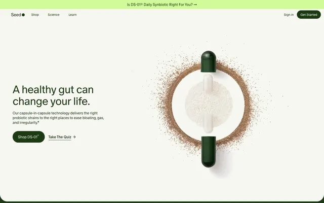
Forest & Snow Laboratory
Color palette
Primary brand color, background for action buttons, primary text in dark sections, and decorative borders. Establishes a natural, scientific tone
Background for product cards (DM-02) indicating product color palette
Background for product cards (AM-02) indicating product color palette
Background for product cards (PM-02) indicating product color palette
Green wash for highlight backgrounds, decorative bands, and soft emphasis behind content.
Primary page background, text on dark backgrounds, and borders for ghost buttons. Acts as a clean, expansive canvas
Subtle background for card surfaces and UI elements, imparting a translucent or diffused feel
Secondary page and section background color, providing visual separation from Snow White
Primary text color on light backgrounds, ensuring high contrast and legibility
Background for ghost buttons, providing a subtle interactive cue against neutral backgrounds
Incidental background color, likely for overlay or modal effects
Typography
- Weights
- 300, 350, 400, 500
- Sizes
- 8px, 10px, 12px, 14px, 16px, 18px, 20px, 24px, 32px, 40px, 48px
- Line height
- 0.9, 1, 1.1, 1.17, 1.2, 1.3, 1.4, 1.5, 2.19
- Letter spacing
- -0.0300em at 48px, -0.0250em at 40px, -0.0200em at 32px, -0.0150em at 24px, -0.0100em at 20px, -0.0070em at 18px, -0.0030em at 16px, -0.0020em at 14px
- Fallback
- Inter
Primary typeface for all UI elements, headlines, body text, and interactive components. The variable letter spacing creates distinct rhythms for display vs. body text, giving headlines a tighter, more impactful feel while maintaining readability at smaller sizes.
- Weights
- 300, 400
- Sizes
- 12px, 16px
- Line height
- 1.5
- Letter spacing
- 0.0150em
- Fallback
- IBM Plex Mono
Mono-spaced typeface, primarily used for technical details, product codes, or metadata. Its consistent width columns lend a precise, structured feel.
Spacing & shape
Components
Solid Forest Green background (#1c3a13), Snow White text (#fcfcf7), 1584px border radius for a pill shape. Padding is 16px vertical, 24px horizontal. This button signifies immediate, primary action.
Transparent background, Forest Green text (#1c3a13) and 1px border (#1c3a13), with 0px border-radius. Padding is 7px vertical, 10.5px horizontal. Used for less prominent actions, often paired with a primary button.
Semi-transparent dark background (rgba(0,0,0,0.3)), Snow White text (#fcfcf7), 1584px border-radius. Padding is 16px vertical, 24px horizontal. Appears commonly in product sections or navigation overlays.
Snow White background (#fcfcf7), Forest Green text (#1c3a13), 1584px border-radius. Padding is 16px vertical, 24px horizontal. Utilized for navigational elements within hero sections or light UI where contrast is desired.
Transparent background, 16px border-radius. Inner padding is not explicitly defined at a card level but elements within will respect 16px padding. Used in grids to showcase different products.
Forest Green background (#1c3a13), 16px border-radius. Padding is 48px vertical, 128px horizontal. Used for prominent product listings.
Transparent background, Snow White text (#fcfcf7) Placeholder text is a lighter shade of Snow White, 1px Snow White border (#fcfcf7), 8px border-radius. Padding is 14px vertical, 20px horizontal.
Pale Green background (#d3fa99), 1188px border-radius for a capsule shape. Used as a small, vivid accent to categorize products.
Guidelines
- Prioritize Forest Green (#1c3a13) for primary actions and key brand elements against light backgrounds.
- Use Snow White (#fcfcf7) for all primary page backgrounds and text on dark UI sections.
- Employ the 1584px border-radius for all primary buttons and interactive pill-shaped elements.
- Apply Seed Sans with appropriate letter-spacing: tighter for headlines (e.g., -1.44px at 48px), looser for body text (e.g., -0.05px at 16px).
- Maintain high contrast (minimum 7:1) for all text against its background to ensure readability.
- Use the 8px base unit for all spacing between elements, creating a comfortable density.
- Feature product imagery with a monochromatic or muted color palette to align with the brand's natural aesthetic.
- Avoid using bright or overly saturated colors unless specifically for a 'Bestseller' badge or similar subtle accent.
- Do not deviate from the rounded 'pill' shape for primary interactive elements; avoid sharp corners for buttons.
- Do not introduce strong shadows or heavy elevation, as the design relies on flat or slightly frosted surfaces.
- Do not use generic system fonts; always use Seed Sans for primary text and Seed Sans Mono for technical details.
- Do not clutter layouts; maintain generous white space and an element gap of 8px to ensure visual calm.
- Do not use gradients unless explicitly defined and approved; the system relies on solid colors and subtle transparency.
- Avoid decorative imagery that clashes with the scientific, nature-inspired product focus.
About this system
ShowHide
Seed's visual system evokes a natural science aesthetic: a dominant muted forest green paired with clean snow white surfaces. Typography is compact and precise, maintaining authority without visual bulk. Rounded 'pill' shapes for interactive elements soften the visual language, contrasting with the scientific rigor suggested by its content. Subtle variations in green and near-white surface colors create depth, while crisp typography and minimal embellishments keep the focus on product clarity and scientific integrity.
The page primarily uses a contained layout with a comfortable maximum width. The hero section often features a full-bleed visual element with text overlaid or alongside. Section rhythm is structured and alternating, with clear vertical spacing and distinct background colors (Snow White and Warm Gray). Content is arranged in alternating text-left/image-right or centered stacks. Product grids are typically 4-column structures, with cards maintaining consistent padding and radius. The navigation is a fixed top bar, often featuring pill-shaped buttons and a centered logo, contributing to a clean and accessible interface.
The visual language focuses on clear product photography, often with soft lighting and muted, natural color palettes. Products are typically shown contained, with minimal backgrounds, emphasizing their form and texture. Icons are largely semantic, outlined or filled, and monochrome. Imagery serves an explanatory or product showcase role, rather than decorative atmosphere. The density is balanced, allowing product visuals to breathe within a text-dominant layout.
Reminiscent of Athletic Greens, Oura Ring, Thrive Market, Whoop.
# Seed — Style Reference
> Forest & Snow Laboratory

**Theme:** light

**Site:** https://seed.com

Seed's visual system evokes a natural science aesthetic: a dominant muted forest green paired with clean snow white surfaces. Typography is compact and precise, maintaining authority without visual bulk. Rounded 'pill' shapes for interactive elements soften the visual language, contrasting with the scientific rigor suggested by its content. Subtle variations in green and near-white surface colors create depth, while crisp typography and minimal embellishments keep the focus on product clarity and scientific integrity.

## Tokens — Colors

| Name | Value | Token | Role |
|------|------|------|------|
| Forest Green | `#1c3a13` | `--color-forest-green` | Primary brand color, background for action buttons, primary text in dark sections, and decorative borders. Establishes a natural, scientific tone |
| Muted Product Green | `#757c5d` | `--color-muted-product-green` | Background for product cards (DM-02) indicating product color palette |
| Muted Product Yellow | `#9f995b` | `--color-muted-product-yellow` | Background for product cards (AM-02) indicating product color palette |
| Muted Product Teal | `#698e79` | `--color-muted-product-teal` | Background for product cards (PM-02) indicating product color palette |
| Pale Green | `#d3fa99` | `--color-pale-green` | Green wash for highlight backgrounds, decorative bands, and soft emphasis behind content. |
| Snow White | `#fcfcf7` | `--color-snow-white` | Primary page background, text on dark backgrounds, and borders for ghost buttons. Acts as a clean, expansive canvas |
| Frosted Glass | `#c4c7c4` | `--color-frosted-glass` | Subtle background for card surfaces and UI elements, imparting a translucent or diffused feel |
| Warm Gray | `#eeeee9` | `--color-warm-gray` | Secondary page and section background color, providing visual separation from Snow White |
| Charcoal Text | `#000000` | `--color-charcoal-text` | Primary text color on light backgrounds, ensuring high contrast and legibility |
| Ghost Button Gray | `#b3b3b3` | `--color-ghost-button-gray` | Background for ghost buttons, providing a subtle interactive cue against neutral backgrounds |
| Dark Overlay | `#666666` | `--color-dark-overlay` | Incidental background color, likely for overlay or modal effects |

## Tokens — Typography

### Seed Sans
- **Substitute:** Inter
- **Weights:** 300, 350, 400, 500
- **Sizes:** 8px, 10px, 12px, 14px, 16px, 18px, 20px, 24px, 32px, 40px, 48px
- **Line height:** 0.9, 1, 1.1, 1.17, 1.2, 1.3, 1.4, 1.5, 2.19
- **Letter spacing:** -0.0300em at 48px, -0.0250em at 40px, -0.0200em at 32px, -0.0150em at 24px, -0.0100em at 20px, -0.0070em at 18px, -0.0030em at 16px, -0.0020em at 14px
- **Role:** Primary typeface for all UI elements, headlines, body text, and interactive components. The variable letter spacing creates distinct rhythms for display vs. body text, giving headlines a tighter, more impactful feel while maintaining readability at smaller sizes.

### Seed Sans Mono
- **Substitute:** IBM Plex Mono
- **Weights:** 300, 400
- **Sizes:** 12px, 16px
- **Line height:** 1.5
- **Letter spacing:** 0.0150em
- **Role:** Mono-spaced typeface, primarily used for technical details, product codes, or metadata. Its consistent width columns lend a precise, structured feel.

## Tokens — Type Scale

Perfect Fourth (1.333) from 16px base.

| Role | Size | Line height | Letter spacing |
|------|------|------|------|
| body | 16px | 1.5 | -0.05em |
| subheading | 24px | 1.17 | -0.36px |
| heading | 32px | 1.1 | -0.64px |
| heading-lg | 40px | 1 | -1px |
| display | 48px | 0.9 | -1.44px |

## Tokens — Spacing

- **Section gap:** 32px
- **Card padding:** 16px
- **Element gap:** 8px

## Tokens — Radius

- **Buttons:** 1584px
- **Inputs:** 8px
- **Cards:** 16px
- **badges:** 1188px

## Layout

The page primarily uses a contained layout with a comfortable maximum width. The hero section often features a full-bleed visual element with text overlaid or alongside. Section rhythm is structured and alternating, with clear vertical spacing and distinct background colors (Snow White and Warm Gray). Content is arranged in alternating text-left/image-right or centered stacks. Product grids are typically 4-column structures, with cards maintaining consistent padding and radius. The navigation is a fixed top bar, often featuring pill-shaped buttons and a centered logo, contributing to a clean and accessible interface.

## Imagery

The visual language focuses on clear product photography, often with soft lighting and muted, natural color palettes. Products are typically shown contained, with minimal backgrounds, emphasizing their form and texture. Icons are largely semantic, outlined or filled, and monochrome. Imagery serves an explanatory or product showcase role, rather than decorative atmosphere. The density is balanced, allowing product visuals to breathe within a text-dominant layout.

## Components

### Primary Action Button
*Main call to action*

Solid Forest Green background (#1c3a13), Snow White text (#fcfcf7), 1584px border radius for a pill shape. Padding is 16px vertical, 24px horizontal. This button signifies immediate, primary action.

### Ghost Action Button
*Secondary action or link*

Transparent background, Forest Green text (#1c3a13) and 1px border (#1c3a13), with 0px border-radius. Padding is 7px vertical, 10.5px horizontal. Used for less prominent actions, often paired with a primary button.

### Ghost Pill Button
*Interactive navigation or filter*

Semi-transparent dark background (rgba(0,0,0,0.3)), Snow White text (#fcfcf7), 1584px border-radius. Padding is 16px vertical, 24px horizontal. Appears commonly in product sections or navigation overlays.

### Nav Pill Button
*Interactive navigation or filter on light backgrounds*

Snow White background (#fcfcf7), Forest Green text (#1c3a13), 1584px border-radius. Padding is 16px vertical, 24px horizontal. Utilized for navigational elements within hero sections or light UI where contrast is desired.

### Product Card
*Displaying product information*

Transparent background, 16px border-radius. Inner padding is not explicitly defined at a card level but elements within will respect 16px padding. Used in grids to showcase different products.

### Product Card with Background
*Featured product display*

Forest Green background (#1c3a13), 16px border-radius. Padding is 48px vertical, 128px horizontal. Used for prominent product listings.

### Frosted Input Field
*User text input*

Transparent background, Snow White text (#fcfcf7) Placeholder text is a lighter shade of Snow White, 1px Snow White border (#fcfcf7), 8px border-radius. Padding is 14px vertical, 20px horizontal.

### Bestseller Badge
*Product differentiator*

Pale Green background (#d3fa99), 1188px border-radius for a capsule shape. Used as a small, vivid accent to categorize products.

## Guidelines

### Do

- Prioritize Forest Green (#1c3a13) for primary actions and key brand elements against light backgrounds.
- Use Snow White (#fcfcf7) for all primary page backgrounds and text on dark UI sections.
- Employ the 1584px border-radius for all primary buttons and interactive pill-shaped elements.
- Apply Seed Sans with appropriate letter-spacing: tighter for headlines (e.g., -1.44px at 48px), looser for body text (e.g., -0.05px at 16px).
- Maintain high contrast (minimum 7:1) for all text against its background to ensure readability.
- Use the 8px base unit for all spacing between elements, creating a comfortable density.
- Feature product imagery with a monochromatic or muted color palette to align with the brand's natural aesthetic.

### Don't

- Avoid using bright or overly saturated colors unless specifically for a 'Bestseller' badge or similar subtle accent.
- Do not deviate from the rounded 'pill' shape for primary interactive elements; avoid sharp corners for buttons.
- Do not introduce strong shadows or heavy elevation, as the design relies on flat or slightly frosted surfaces.
- Do not use generic system fonts; always use Seed Sans for primary text and Seed Sans Mono for technical details.
- Do not clutter layouts; maintain generous white space and an element gap of 8px to ensure visual calm.
- Do not use gradients unless explicitly defined and approved; the system relies on solid colors and subtle transparency.
- Avoid decorative imagery that clashes with the scientific, nature-inspired product focus.

## Agent Prompt Guide

Quick Color Reference:
text: #000000
background: #fcfcf7
border: #1c3a13
accent: #d3fa99
primary action: #1c3a13 (filled action)

Example Component Prompts:
1. Create a Primary Action Button: solid Forest Green background (#1c3a13), Snow White text (#fcfcf7), 1584px border radius, 16px vertical padding, 24px horizontal padding, 'Shop Now' label.
2. Create a Product Card: transparent background, 16px border radius, with a 'Bestseller' badge using Pale Green background (#d3fa99) and 1188px radius, title 'DS-01 Daily Synbiotic' at Seed Sans 24px weight 400 (#000000), and a Ghost Action Button with a Forest Green border (#1c3a13), 'Shop Now' label.
3. Create a Section Header: 'A healthy gut can change your life.' at Seed Sans 48px weight 400 (#000000), letter-spacing -1.44px, left-aligned, followed by body text 'Our capsule-in-capsule technology delivers...' at Seed Sans 16px weight 400 (#000000) with 8px element-gap below the header.
More like this









Keep what you find
A free account saves references to boards and can send you a weekly email of picks based on what you save.
To see every result, go Pro.