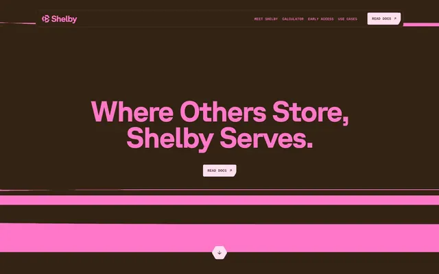
Preview image. Unlock full-res
Cacao and neon pink. A dark, rich canvas illuminated by electric, playful accents.
Color palette
Primary brand accent, main interactive element color (buttons, links), key headlines. Establishes brand energy and focus.
Primary background for dark sections, primary text on light surfaces, borders in specific contexts.
Light background for sections, text on dark backgrounds, secondary button backgrounds.
Subtler background for elevated sections and card surfaces within dark modes.
Subtle card backgrounds, decorative elements, muted text.
Subtle button text and border color for specific dark-mode buttons.
Muted background within dark sections, used for specific icons or less prominent borders.
Subtle border color for non-interactive elements.
Typography
- Weights
- 400
- Sizes
- 10px
- Line height
- 1
Times — detected in extracted data but not described by AI
- Weights
- 300, 400, 500, 700
- Sizes
- 10px, 16px, 18px, 22px, 42px, 48px, 59px, 95px
- Line height
- 0.9, 0.95, 1, 1.15, 1.2, 1.4
- Letter spacing
- -0.0400em at display sizes, -0.0200em at large headings
- Fallback
- Inter
Headlines and primary body text. Its subtle weight variations and precise letter-spacing give it a technical yet approachable feel.
- Weights
- 400
- Sizes
- 10px
- Line height
- 1, 1.2
- Letter spacing
- normal
- Fallback
- Inter
Navigation links and secondary interface elements. Provides a clean, modern contrast to GT-Planar.
- Weights
- 400, 500
- Sizes
- 11px, 12px
- Line height
- 0.79, 1.2
- Letter spacing
- normal
- Fallback
- Space Mono
Specific badge text, code snippets, and fine print. Its monospace nature conveys precision and technicality.
Spacing & shape
Components
Text: Shelby Hibiscus Pink (#FF77C9), background: transparent, border: 1px bottom Shelby Hibiscus Pink (#FF77C9), radius: 0px, padding: 3.95833px 0px 0px 0px.
Text: Shelby Hibiscus Pink (#FF77C9), background: Shelby Rose Dust (#FFDFEF), border: 1px solid Shelby Hibiscus Pink (#FF77C9), radius: 11.875px, padding: 19.7917px.
Text: Shelby Lavender Mist (#EEE2FF), background: Shelby Plum (#470B64), border: 1px solid Shelby Lavender Mist (#EEE2FF), radius: 3.95833px, padding: 12.8646px 14.8438px.
Background: Shelby Hibiscus Pink (#FF77C9), border: none, radius: 9.89583px, padding: 0px.
Background: Shelby Mauve (#FFC2E1), border: none, radius: 5.9375px, padding: 0px.
Background: #DE8AFF, border: none, radius: 7.91667px, padding: 0px.
Text: Shelby Cacao (#322312), background: transparent, border: none, radius: 0px, padding: 0px.
Text: Shelby Rose Dust (#FFDFEF), background: transparent, border: none, radius: 3.95833px, padding: 7.91667px 11.875px.
Text: Shelby Rose Dust (#FFDFEF) for inactive, Shelby Hibiscus Pink (#FF77C9) for active. Font: SuisseIntl 10px, 400. Letter spacing normal. Underline on hover/active.
Guidelines
- Use Shelby Hibiscus Pink (#FF77C9) exclusively for primary interactive elements and key brand accents to maximize impact.
- Maintain high contrast between text and backgrounds, pairing Shelby Cacao (#322312) with Shelby Rose Dust (#FFDFEF) or Shelby Hibiscus Pink (#FF77C9).
- Apply GT-Planar for all headings and substantial body text to leverage its distinctive weight variations and letter spacing.
- Employ the 3.95833px border-radius for buttons and badges, reserving the larger 9.89583px for cards to differentiate components.
- Ensure horizontal padding consistency with elementGap: 15px for most UI elements and cardPadding: 15px for internal card content.
- Transition `color`, `background-color`, and `filter` over 0.3s with `ease` timing for all interactive state changes.
- Do not introduce new saturated colors outside of the defined brand and neutral palette to avoid visual clutter.
- Do not use generic system fonts; stick to GT-Planar, SuisseIntl, and ABCReproMono for all typography to maintain brand identity.
- Avoid using drop shadows for elevation; rely instead on background color changes to denote hierarchy and depth.
- Do not use letter-spacing values other than -0.0400em or -0.0200em for GT-Planar, and normal for other fonts.
- Do not vary border radii arbitrarily; adhere strictly to 3.95833px for small components and 9.89583px for cards.
- Do not use solid borders unless explicitly defined in a component variant (e.g., 1px bottom border for ghost buttons).
About this system
ShowHide
Shelby presents as a bold, almost playful take on enterprise software, fusing a deep, rich cacao-brown with a vibrant, energetic hot pink. This highly chromatic palette creates a high-contrast experience, where text and key elements pop dramatically. The use of custom, strong sans-serif typography paired with a monospaced font reinforces a technical yet approachable identity, while sharp corners are softened by occasional, deliberate slight rounding, hinting at precision within expressiveness.
The site employs a mix of abstract graphics and illustrative elements, rather than photography or detailed product screenshots. These graphics feature blocky, geometric shapes, sometimes layered or angled, often using the brand's core colors (Shelby Hibiscus Pink, Shelby Cacao, Shelby Mauve). Icons are simple, outlined, and monochromatic, primarily used for functional clarity. Overall, imagery serves as decorative atmosphere or to subtly break up text, consistent with the abstract, technical yet bold brand identity. Density is moderate, supporting the text rather than dominating the visual space.
Reminiscent of Rive, Neon, Plaice.ai.
# Shelby — Style Reference
> Cacao and neon pink. A dark, rich canvas illuminated by electric, playful accents.

**Theme:** dark

**Site:** https://shelby.ashfall.studio

Shelby presents as a bold, almost playful take on enterprise software, fusing a deep, rich cacao-brown with a vibrant, energetic hot pink. This highly chromatic palette creates a high-contrast experience, where text and key elements pop dramatically. The use of custom, strong sans-serif typography paired with a monospaced font reinforces a technical yet approachable identity, while sharp corners are softened by occasional, deliberate slight rounding, hinting at precision within expressiveness.

## Tokens — Colors

| Name | Value | Token | Role |
|------|------|------|------|
| Shelby Hibiscus Pink | `#FF77C9` | `--color-shelby-hibiscus-pink` | Primary brand accent, main interactive element color (buttons, links), key headlines. Establishes brand energy and focus. |
| Shelby Cacao | `#322312` | `--color-shelby-cacao` | Primary background for dark sections, primary text on light surfaces, borders in specific contexts. |
| Shelby Rose Dust | `#FFDFEF` | `--color-shelby-rose-dust` | Light background for sections, text on dark backgrounds, secondary button backgrounds. |
| Shelby Plum | `#470B64` | `--color-shelby-plum` | Subtler background for elevated sections and card surfaces within dark modes. |
| Shelby Mauve | `#FFC2E1` | `--color-shelby-mauve` | Subtle card backgrounds, decorative elements, muted text. |
| Shelby Lavender Mist | `#EEE2FF` | `--color-shelby-lavender-mist` | Subtle button text and border color for specific dark-mode buttons. |
| Shelby Deep Rose | `#481D2A` | `--color-shelby-deep-rose` | Muted background within dark sections, used for specific icons or less prominent borders. |
| Shelby Steel Grey | `#5B4F41` | `--color-shelby-steel-grey` | Subtle border color for non-interactive elements. |

## Tokens — Typography

### Times
- **Weights:** 400
- **Sizes:** 10px
- **Line height:** 1
- **Role:** Times — detected in extracted data but not described by AI

### GT-Planar
- **Substitute:** Inter
- **Weights:** 300, 400, 500, 700
- **Sizes:** 10px, 16px, 18px, 22px, 42px, 48px, 59px, 95px
- **Line height:** 0.9, 0.95, 1, 1.15, 1.2, 1.4
- **Letter spacing:** -0.0400em at display sizes, -0.0200em at large headings
- **Role:** Headlines and primary body text. Its subtle weight variations and precise letter-spacing give it a technical yet approachable feel.

### SuisseIntl
- **Substitute:** Inter
- **Weights:** 400
- **Sizes:** 10px
- **Line height:** 1, 1.2
- **Letter spacing:** normal
- **Role:** Navigation links and secondary interface elements. Provides a clean, modern contrast to GT-Planar.

### ABCReproMono
- **Substitute:** Space Mono
- **Weights:** 400, 500
- **Sizes:** 11px, 12px
- **Line height:** 0.79, 1.2
- **Letter spacing:** normal
- **Role:** Specific badge text, code snippets, and fine print. Its monospace nature conveys precision and technicality.

## Tokens — Type Scale

Augmented Fourth (1.414) from 16px base.

| Role | Size | Line height | Letter spacing |
|------|------|------|------|
| caption | 10px | 1 | — |
| body | 16px | 1.2 | — |
| subheading | 18px | 1.2 | — |
| heading-sm | 22px | 1.2 | — |
| heading | 42px | 1.15 | -0.42px |
| heading-lg | 48px | 1.15 | -0.48px |
| display | 59px | 0.95 | -0.47px |
| display-lg | 95px | 0.9 | -0.76px |

## Tokens — Spacing

- **Section gap:** 40px
- **Card padding:** 15px
- **Element gap:** 15px

## Tokens — Radius

- **Default:** 3.95833px
- **Buttons:** 3.95833px
- **Cards:** 9.89583px
- **badges:** 3.95833px
- **secondaryButtons:** 11.875px

## Imagery

The site employs a mix of abstract graphics and illustrative elements, rather than photography or detailed product screenshots. These graphics feature blocky, geometric shapes, sometimes layered or angled, often using the brand's core colors (Shelby Hibiscus Pink, Shelby Cacao, Shelby Mauve). Icons are simple, outlined, and monochromatic, primarily used for functional clarity. Overall, imagery serves as decorative atmosphere or to subtly break up text, consistent with the abstract, technical yet bold brand identity. Density is moderate, supporting the text rather than dominating the visual space.

## Components

### Ghost Button - Hot Pink
*Primary Call to Action*

Text: Shelby Hibiscus Pink (#FF77C9), background: transparent, border: 1px bottom Shelby Hibiscus Pink (#FF77C9), radius: 0px, padding: 3.95833px 0px 0px 0px.

### Outline Button - Rounded Hot Pink
*Secondary Call to Action*

Text: Shelby Hibiscus Pink (#FF77C9), background: Shelby Rose Dust (#FFDFEF), border: 1px solid Shelby Hibiscus Pink (#FF77C9), radius: 11.875px, padding: 19.7917px.

### Filled Button - Plum
*Alternative Call to Action on Dark Backgrounds*

Text: Shelby Lavender Mist (#EEE2FF), background: Shelby Plum (#470B64), border: 1px solid Shelby Lavender Mist (#EEE2FF), radius: 3.95833px, padding: 12.8646px 14.8438px.

### Card - Hot Pink
*Highlight Card*

Background: Shelby Hibiscus Pink (#FF77C9), border: none, radius: 9.89583px, padding: 0px.

### Card - Muted Pink
*Information Card*

Background: Shelby Mauve (#FFC2E1), border: none, radius: 5.9375px, padding: 0px.

### Card - Vivid Violet
*Accent Card*

Background: #DE8AFF, border: none, radius: 7.91667px, padding: 0px.

### Badge - Transparent Dark
*Category Tag*

Text: Shelby Cacao (#322312), background: transparent, border: none, radius: 0px, padding: 0px.

### Badge - Transparent Light
*Highlighted Tag*

Text: Shelby Rose Dust (#FFDFEF), background: transparent, border: none, radius: 3.95833px, padding: 7.91667px 11.875px.

### Navigation Link
*Primary Navigation Element*

Text: Shelby Rose Dust (#FFDFEF) for inactive, Shelby Hibiscus Pink (#FF77C9) for active. Font: SuisseIntl 10px, 400. Letter spacing normal. Underline on hover/active.

## Guidelines

### Do

- Use Shelby Hibiscus Pink (#FF77C9) exclusively for primary interactive elements and key brand accents to maximize impact.
- Maintain high contrast between text and backgrounds, pairing Shelby Cacao (#322312) with Shelby Rose Dust (#FFDFEF) or Shelby Hibiscus Pink (#FF77C9).
- Apply GT-Planar for all headings and substantial body text to leverage its distinctive weight variations and letter spacing.
- Employ the 3.95833px border-radius for buttons and badges, reserving the larger 9.89583px for cards to differentiate components.
- Ensure horizontal padding consistency with elementGap: 15px for most UI elements and cardPadding: 15px for internal card content.
- Transition `color`, `background-color`, and `filter` over 0.3s with `ease` timing for all interactive state changes.

### Don't

- Do not introduce new saturated colors outside of the defined brand and neutral palette to avoid visual clutter.
- Do not use generic system fonts; stick to GT-Planar, SuisseIntl, and ABCReproMono for all typography to maintain brand identity.
- Avoid using drop shadows for elevation; rely instead on background color changes to denote hierarchy and depth.
- Do not use letter-spacing values other than -0.0400em or -0.0200em for GT-Planar, and normal for other fonts.
- Do not vary border radii arbitrarily; adhere strictly to 3.95833px for small components and 9.89583px for cards.
- Do not use solid borders unless explicitly defined in a component variant (e.g., 1px bottom border for ghost buttons).

## Agent Prompt Guide

### Quick Color Reference
- **Text Primary (Dark BG):** Shelby Rose Dust (#FFDFEF)
- **Text Primary (Light BG):** Shelby Cacao (#322312)
- **Background Dark:** Shelby Cacao (#322312)
- **Background Light:** Shelby Rose Dust (#FFDFEF)
- **CTA Button BG:** Shelby Rose Dust (#FFDFEF)
- **CTA Button Text:** Shelby Hibiscus Pink (#FF77C9)
- **Brand Accent:** Shelby Hibiscus Pink (#FF77C9)

### 3-5 Example Component Prompts
1. **Create a hero section:** Background Shelby Cacao (#322312). Centered headline 'Where Others Store, Shelby Serves.' using GT-Planar 95px, weight 700 with letter-spacing -0.76px, and color Shelby Hibiscus Pink (#FF77C9). Below: a prominent Ghost Button - Hot Pink, with text 'Read Docs'. Add a subtle scroll indicator icon at the bottom center, in Shelby Rose Dust (#FFDFEF).
2. **Create a feature card:** Background Shelby Mauve (#FFC2E1), radius 5.9375px. Inside, a heading 'One data layer' using GT-Planar 22px, weight 500, color Shelby Cacao (#322312). Below, body text 'Every side of the AI workflow.' using GT-Planar 16px, weight 400, color Shelby Cacao (#322312).
3. **Create a horizontal navigation bar:** Background Shelby Cacao (#322312). Left-aligned logo (placeholder text 'Shelby' in GT-Planar 16px, weight 700, color Shelby Hibiscus Pink (#FF77C9)). Right-aligned navigation links: 'Meet Shelby', 'Calculator', 'Early Access', 'Use Cases' in SuisseIntl 10px, weight 400, color Shelby Rose Dust (#FFDFEF). Last item is a 'Read Docs' button, using the Filled Button - Plum component variant.
4. **Generate a badge:** Text 'BLOG' in ABCReproMono 12px, weight 400, color Shelby Rose Dust (#FFDFEF). Background transparent, radius 3.95833px, padding 7.91667px 11.875px.
More like this







Keep what you find
A free account saves references to boards and can send you a weekly email of picks based on what you save.
To see every result, go Pro.