Preview image. Unlock full-res
Midnight research lab
Color palette
Hero section backgrounds, prominent visual accents, and decorative elements to convey advanced technology and discovery
Used for abstract visual shapes and background elements, deepening the dark theme and hinting at technological complexity
Secondary accent gradient for abstract illustrations and contextual backgrounds, suggesting scientific process and innovation
Page backgrounds, primary surface for dark mode, primary text color for light surfaces
Primary text and icon color against dark backgrounds. Also used as background for selected component states
Subtle borders for ghost buttons, dividers, and various UI elements, providing structure in the dark theme
Finer, lower-contrast borders and dividers within complex layouts, particularly in navigation
Typography
- Weights
- 300, 400, 700
- Sizes
- 10px, 13px, 15px, 18px, 24px, 30px, 38px, 60px, 100px
- Line height
- 1, 1.2, 1.3, 1.33, 1.4, 1.63
- Letter spacing
- 0.1, 0.08, 0.06, 0.05, -0.013, -0.013, -0.013, -0.027, -0.027
- Fallback
- system-ui
The custom Valo typeface is used for all text, conveying a distinct scientific and sophisticated tone. The wide range of weights and sizes supports a clear typographic hierarchy, from subtle captions to expansive display headlines, with negative letter-spacing on larger sizes to create a modern, composed feel.
Spacing & shape
Components
Text in Silver Text (#ffffff) on Midnight Canvas, appearing as plain text that transforms into an outlined Ghost Border (#e5e7eb) button on hover. The hover state highlights the active area without strong background fills, maintaining the dark, minimalist aesthetic.
Round button with a Silver Text (#ffffff) background and 9999px border-radius, containing a Midnight Canvas (#000000) arrow icon. Text is Midnight Canvas on Silver Text for the text label, visually integrating with the dark theme despite its 'light' appearance, implying forward motion.
Body text in Silver Text (#ffffff) against Midnight Canvas. These links are functional without being prominent, reflecting their secondary importance in the overall information hierarchy.
A 1px solid line in Ghost Border (#e5e7eb) or Subtle Divider (#4d4d4d), used to segment content without heavy visual breaks, preserving the overall spacious and dark design.
Guidelines
- Prioritize Midnight Canvas (#000000) for all main backgrounds and Silver Text (#ffffff) for primary text to maintain the dark theme.
- Use Ghost Border (#e5e7eb) for all subtle structural lines, interactive element borders, and dividers where visual weight needs to be minimal.
- Apply Valo font with negative letter-spacing for all heading and display sizes to achieve a compressed, modern look.
- Utilize 9999px border-radius for all interactive elements like buttons and links to create a consistent 'pill' shape.
- Incorporate Enlightenment Gradient for hero sections or prominent large visual elements to imbue them with brand identity and high-tech feel.
- Maintain consistent vertical rhythm using the defined sectionGap of 45px and elementGap of 20px.
- Ensure all text, apart from gradients, is either Silver Text (#ffffff) or Midnight Canvas (#000000) for high contrast and legibility.
- Avoid using solid background fills for primary calls to action; instead, use ghost buttons with Ghost Border (#e5e7eb) and Silver Text (#ffffff).
- Do not introduce new color families for informational or status elements; leverage existing brand gradients or neutrals.
- Shun any drop shadows or harsh elevation effects; surfaces should remain flat or rely on subtle background gradients.
- Resist using default system fonts or weights not specified in the Valo typography family; the custom font and its specific weights are key to brand identity.
- Avoid decorative imagery with vibrant colors not derived from the brand gradients; the visual language is subtle and controlled.
- Do not deviate from the established max-width of 1400px for page content; maintain the contained and structured layout.
- Steer clear of aggressive hover states that introduce strong background colors or complex animations for standard interactive elements.
About this system
ShowHide
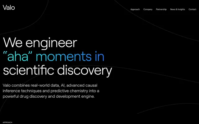
Valo employs a dark, scientific command center aesthetic with high contrast text on a black canvas. Subtle animated gradients and abstract organic shapes introduce visual dynamics, contrasting with highly structured, minimalist typography featuring a distinctive custom font. Interactions are clean and understated, relying on ghost elements and an accent color for 'aha' moments, fostering a sense of controlled innovation and precision.
The page embraces a contained layout with a maximum width of 1400px, centered on the screen. The hero section is full-bleed Midnight Canvas with a large, centered headline and descriptive text. Subsequent sections alternate between the primary dark canvas and occasional gradient-infused abstract backgrounds, maintaining consistent vertical spacing via a 45px sectionGap. Content is primarily arranged in two-column text-left/image-right or text-right/image-left patterns, often featuring large text blocks alongside abstract graphic elements. Navigation is a sticky top bar with minimalist ghost links. The footer is sectioned with a deep tech gradient band and a Midnight Canvas area, maintaining the overall theme.
The site uses abstract, organic, and occasionally geometric graphic elements primarily filled with the brand's linear gradients. These graphics serve a decorative atmosphere and explanatory content role, appearing as large, contained shapes like circular outlines or fluid background patterns. There are no lifestyle photos or product screenshots, enforcing a clean, data-driven, and conceptual approach to visual communication. Icons are simple, outlined, and monochromatic, usually Silver Text on Midnight Canvas, with a consistent stroke weight to support the minimalist UI. Imagery density is low; text dominates, with graphics acting as supporting visual anchors.
Reminiscent of DeepMind, CRISPR Therapeutics, Verily Life Sciences, Stripe.
# Valo — Style Reference
> Midnight research lab

**Theme:** dark

**Site:** https://www.valohealth.com

Valo employs a dark, scientific command center aesthetic with high contrast text on a black canvas. Subtle animated gradients and abstract organic shapes introduce visual dynamics, contrasting with highly structured, minimalist typography featuring a distinctive custom font. Interactions are clean and understated, relying on ghost elements and an accent color for 'aha' moments, fostering a sense of controlled innovation and precision.

## Tokens — Colors

| Name | Value | Token | Role |
|------|------|------|------|
| Enlightenment Gradient | `#9e3db2` | `--color-enlightenment-gradient` | Hero section backgrounds, prominent visual accents, and decorative elements to convey advanced technology and discovery |
| Deep Tech Gradient | `#1e233c` | `--color-deep-tech-gradient` | Used for abstract visual shapes and background elements, deepening the dark theme and hinting at technological complexity |
| Bio-Discovery Gradient | `#1951a2` | `--color-bio-discovery-gradient` | Secondary accent gradient for abstract illustrations and contextual backgrounds, suggesting scientific process and innovation |
| Midnight Canvas | `#000000` | `--color-midnight-canvas` | Page backgrounds, primary surface for dark mode, primary text color for light surfaces |
| Silver Text | `#ffffff` | `--color-silver-text` | Primary text and icon color against dark backgrounds. Also used as background for selected component states |
| Ghost Border | `#e5e7eb` | `--color-ghost-border` | Subtle borders for ghost buttons, dividers, and various UI elements, providing structure in the dark theme |
| Subtle Divider | `#4d4d4d` | `--color-subtle-divider` | Finer, lower-contrast borders and dividers within complex layouts, particularly in navigation |

## Tokens — Typography

### Valo
- **Substitute:** system-ui
- **Weights:** 300, 400, 700
- **Sizes:** 10px, 13px, 15px, 18px, 24px, 30px, 38px, 60px, 100px
- **Line height:** 1, 1.2, 1.3, 1.33, 1.4, 1.63
- **Letter spacing:** 0.1, 0.08, 0.06, 0.05, -0.013, -0.013, -0.013, -0.027, -0.027
- **Role:** The custom Valo typeface is used for all text, conveying a distinct scientific and sophisticated tone. The wide range of weights and sizes supports a clear typographic hierarchy, from subtle captions to expansive display headlines, with negative letter-spacing on larger sizes to create a modern, composed feel.

## Tokens — Type Scale

Perfect Fifth (1.5) from 15px base.

| Role | Size | Line height | Letter spacing |
|------|------|------|------|
| caption | 10px | 1.4 | 0.1px |
| body | 15px | 1.3 | 0.06em |
| subheading | 18px | 1.63 | 0.05em |
| heading-sm | 24px | 1.3 | -0.013em |
| heading | 38px | 1.2 | -0.013em |
| heading-lg | 60px | 1 | -0.027em |
| display | 100px | 1 | -0.027em |

## Tokens — Spacing

- **Max width:** 1400px
- **Section gap:** 45px
- **Card padding:** 18px
- **Element gap:** 20px

## Tokens — Radius

- **Buttons:** 9999px
- **links:** 9999px

## Layout

The page embraces a contained layout with a maximum width of 1400px, centered on the screen. The hero section is full-bleed Midnight Canvas with a large, centered headline and descriptive text. Subsequent sections alternate between the primary dark canvas and occasional gradient-infused abstract backgrounds, maintaining consistent vertical spacing via a 45px sectionGap. Content is primarily arranged in two-column text-left/image-right or text-right/image-left patterns, often featuring large text blocks alongside abstract graphic elements. Navigation is a sticky top bar with minimalist ghost links. The footer is sectioned with a deep tech gradient band and a Midnight Canvas area, maintaining the overall theme.

## Imagery

The site uses abstract, organic, and occasionally geometric graphic elements primarily filled with the brand's linear gradients. These graphics serve a decorative atmosphere and explanatory content role, appearing as large, contained shapes like circular outlines or fluid background patterns. There are no lifestyle photos or product screenshots, enforcing a clean, data-driven, and conceptual approach to visual communication. Icons are simple, outlined, and monochromatic, usually Silver Text on Midnight Canvas, with a consistent stroke weight to support the minimalist UI. Imagery density is low; text dominates, with graphics acting as supporting visual anchors.

## Components

### Ghost Navigation Link
*Primary navigation links*

Text in Silver Text (#ffffff) on Midnight Canvas, appearing as plain text that transforms into an outlined Ghost Border (#e5e7eb) button on hover. The hover state highlights the active area without strong background fills, maintaining the dark, minimalist aesthetic.

### Ghost Arrow Button
*Call to action for external links or advancing sections*

Round button with a Silver Text (#ffffff) background and 9999px border-radius, containing a Midnight Canvas (#000000) arrow icon. Text is Midnight Canvas on Silver Text for the text label, visually integrating with the dark theme despite its 'light' appearance, implying forward motion.

### Footer Link
*Secondary navigation and legal links*

Body text in Silver Text (#ffffff) against Midnight Canvas. These links are functional without being prominent, reflecting their secondary importance in the overall information hierarchy.

### Subtle Divider Line
*Visual separator for content sections*

A 1px solid line in Ghost Border (#e5e7eb) or Subtle Divider (#4d4d4d), used to segment content without heavy visual breaks, preserving the overall spacious and dark design.

## Guidelines

### Do

- Prioritize Midnight Canvas (#000000) for all main backgrounds and Silver Text (#ffffff) for primary text to maintain the dark theme.
- Use Ghost Border (#e5e7eb) for all subtle structural lines, interactive element borders, and dividers where visual weight needs to be minimal.
- Apply Valo font with negative letter-spacing for all heading and display sizes to achieve a compressed, modern look.
- Utilize 9999px border-radius for all interactive elements like buttons and links to create a consistent 'pill' shape.
- Incorporate Enlightenment Gradient for hero sections or prominent large visual elements to imbue them with brand identity and high-tech feel.
- Maintain consistent vertical rhythm using the defined sectionGap of 45px and elementGap of 20px.
- Ensure all text, apart from gradients, is either Silver Text (#ffffff) or Midnight Canvas (#000000) for high contrast and legibility.

### Don't

- Avoid using solid background fills for primary calls to action; instead, use ghost buttons with Ghost Border (#e5e7eb) and Silver Text (#ffffff).
- Do not introduce new color families for informational or status elements; leverage existing brand gradients or neutrals.
- Shun any drop shadows or harsh elevation effects; surfaces should remain flat or rely on subtle background gradients.
- Resist using default system fonts or weights not specified in the Valo typography family; the custom font and its specific weights are key to brand identity.
- Avoid decorative imagery with vibrant colors not derived from the brand gradients; the visual language is subtle and controlled.
- Do not deviate from the established max-width of 1400px for page content; maintain the contained and structured layout.
- Steer clear of aggressive hover states that introduce strong background colors or complex animations for standard interactive elements.

## Agent Prompt Guide

Quick Color Reference:
text: #ffffff
background: #000000
border: #e5e7eb
accent: #9e3db2 (Enlightenment Gradient)
primary action: no distinct CTA color

Example Component Prompts:
Create a hero section: Midnight Canvas background. Headline 'We engineer "aha" moments in scientific discovery' at 100px Valo weight 700 with Silver Text (#ffffff), letter-spacing -0.027px. Subtext 'Valo combines real-world data, AI...' at 18px Valo weight 400 with Silver Text (#ffffff), letter-spacing 0.05px.

Create a ghost button: Text 'Explore our approach' at 15px Valo weight 400 with Silver Text (#ffffff), letter-spacing 0.06px. Border 1px solid Ghost Border (#e5e7eb) with 9999px border-radius, 7px paddingTop/paddingBottom, 27px paddingLeft/paddingRight.

Create a secondary text section: Midnight Canvas background. Heading 'AI-enabled human causal biology' at 24px Valo weight 400 with Silver Text (#ffffff), letter-spacing -0.013px. Body text 'Valo harnesses AI to...' at 15px Valo weight 400 with Silver Text (#ffffff), letter-spacing 0.06px, with 14px marginBottom between paragraphs.

Create a primary navigation item: Text 'Approach' at 13px Valo weight 400 with Silver Text (#ffffff), letter-spacing 0.08px. On hover, apply a 1px Ghost Border (#e5e7eb) to the bottom, 7px paddingTop/paddingBottom, 27px paddingLeft/paddingRight.
More like this









Keep what you find
A free account saves references to boards and can send you a weekly email of picks based on what you save.
To see every result, go Pro.