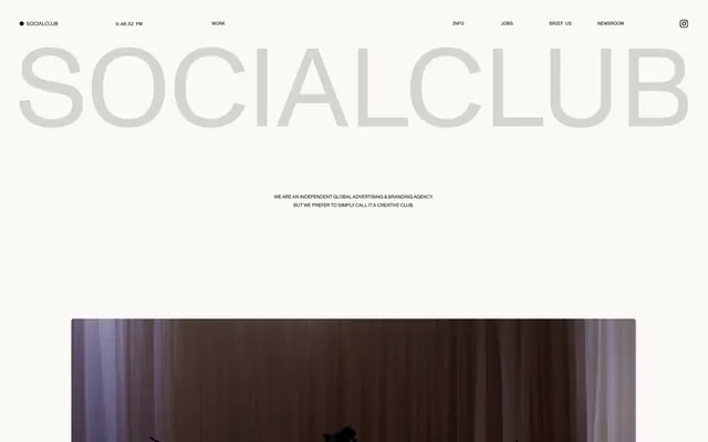
Preview image. Unlock full-res
Bare canvas, whispered giants.
Color palette
Subtle background accents, decorative borders, minor highlights for UI elements
Primary page background, neutral surface
Primary text, borders, decorative UI elements — establishes strong visual contrast
Typography
- Weights
- 400
- Sizes
- 10px, 46px, 62px, 158px
- Line height
- 0.8, 1, 1.67
- Letter spacing
- -0.0200em at 158px/62px/46px, -0.0150em at 10px
- Fallback
- Helvetica Neue
Dominant headlines and large display text, characterized by its wide, sans-serif structure and significant negative letter-spacing for an expansive feel. The extreme sizing variance creates dramatic visual hierarchy.
- Weights
- 400
- Sizes
- 10px, 11px
- Line height
- 1.5, 1.67
- Fallback
- Space Mono
Monospaced headings and sub-headings, used sparingly to provide a technical, structured contrast to the main Monumentgrotesk. Its slightly larger line height offers better readability for short blocks of text.
- Weights
- 400
- Sizes
- 11px, 14px
- Line height
- 1, 1.39
- Fallback
- Inter
Functional text such as navigation links, labels, and small informational text. The system font choice ensures legibility and a neutral voice for secondary content.
Spacing & shape
Components
Arial, 14px, weight 400, Ink Black text on Canvas White background. Hover state shows an Ink Black bottom border of 1px.
Monumentgrotesk, 158px, weight 400, Canvas White text on a background of varied image content. Letter spacing -0.0200em.
Features a 1px border of Muted Gold (#ffdaa7) around content. Can also be used as a background fill.
Monumentgrotesk Semimono, 10px, weight 400, Ink Black text. Line height 1.50 for improved legibility.
Images contained within a 4px border-radius, often with a subtle Muted Gold (#ffdaa7) border and a bottom margin of 26px.
Guidelines
- Prioritize Canvas White (#faf9f6) as the dominant background color for all main content areas.
- Use Ink Black (#000000) for all primary text, ensuring a high-contrast reading experience against light backgrounds.
- Apply Monumentgrotesk with negative letter-spacing for all major headlines to maintain the expansive, bold aesthetic.
- Employ the 4px border-radius for all image containers and small interactive elements.
- Maintain generous section gaps (around 81px) to create ample negative space and visual breathing room between content blocks.
- Reserve Muted Gold (#ffdaa7) for subtle decorative accents or borders, not as a primary action color.
- Use Arial, 14px, weight 400, for all navigation and functional UI text.
- Avoid using saturated or vibrant colors for backgrounds or large content blocks.
- Do not use generic system fonts for headlines; Monumentgrotesk is essential for brand identity.
- Do not combine multiple border-radius values on the same element or within close proximity, maintain the unified 4px radius.
- Do not introduce heavy shadows or gradients; the design relies on flat surfaces and clean lines.
- Avoid tight spacing between elements; ensure an element gap of at least 6px and ample padding.
- Do not use Muted Gold as an active text color; its role is primarily decorative or as a soft background accent.
About this system
ShowHide
Socialclub presents a sparse, high-contrast aesthetic where large, neutral typography dominates the visual field. The design emphasizes content through intentional negative space and a clean, almost monochrome palette. A single muted yellow hue provides a subtle warmth, occasionally appearing as a border or background accent to differentiate sections without overwhelming the stark presentation. The overall impression is one of confident restraint, letting the content speak for itself against minimal interface elements.
The visual language focuses on a mix of curated photography and evocative abstract imagery. Photography is often rich and moody, frequently with muted tones or dramatic lighting, presented within contained frames with a 4px border radius. Imagery serves an atmospheric and sometimes abstract purpose rather than direct product showcase or literal explanation. There are no prominent illustrations, filled icons, or graphic elements; the focus is on photographic or video content.
Reminiscent of AIGA Eye on Design, Kerning Cultures, Minimalissimo, Off-White.
# Socialclub — Style Reference
> Bare canvas, whispered giants.

**Theme:** light

**Site:** https://socialclubparis.com

Socialclub presents a sparse, high-contrast aesthetic where large, neutral typography dominates the visual field. The design emphasizes content through intentional negative space and a clean, almost monochrome palette. A single muted yellow hue provides a subtle warmth, occasionally appearing as a border or background accent to differentiate sections without overwhelming the stark presentation. The overall impression is one of confident restraint, letting the content speak for itself against minimal interface elements.

## Tokens — Colors

| Name | Value | Token | Role |
|------|------|------|------|
| Muted Gold | `#ffdaa7` | `--color-muted-gold` | Subtle background accents, decorative borders, minor highlights for UI elements |
| Canvas White | `#faf9f6` | `--color-canvas-white` | Primary page background, neutral surface |
| Ink Black | `#000000` | `--color-ink-black` | Primary text, borders, decorative UI elements — establishes strong visual contrast |

## Tokens — Typography

### Monumentgrotesk
- **Substitute:** Helvetica Neue
- **Weights:** 400
- **Sizes:** 10px, 46px, 62px, 158px
- **Line height:** 0.8, 1, 1.67
- **Letter spacing:** -0.0200em at 158px/62px/46px, -0.0150em at 10px
- **Role:** Dominant headlines and large display text, characterized by its wide, sans-serif structure and significant negative letter-spacing for an expansive feel. The extreme sizing variance creates dramatic visual hierarchy.

### Monumentgrotesk Semimono
- **Substitute:** Space Mono
- **Weights:** 400
- **Sizes:** 10px, 11px
- **Line height:** 1.5, 1.67
- **Role:** Monospaced headings and sub-headings, used sparingly to provide a technical, structured contrast to the main Monumentgrotesk. Its slightly larger line height offers better readability for short blocks of text.

### Arial
- **Substitute:** Inter
- **Weights:** 400
- **Sizes:** 11px, 14px
- **Line height:** 1, 1.39
- **Role:** Functional text such as navigation links, labels, and small informational text. The system font choice ensures legibility and a neutral voice for secondary content.

## Tokens — Type Scale

| Role | Size | Line height | Letter spacing |
|------|------|------|------|
| caption | 10px | 16.7px | -0.15px |
| body | 14px | 19.46px | — |
| heading | 46px | 36.8px | -0.92px |
| heading-lg | 62px | 49.6px | -1.24px |
| display | 158px | 126.4px | -3.16px |

## Tokens — Spacing

- **Max width:** 1419px
- **Section gap:** 81px
- **Card padding:** 10px
- **Element gap:** 6px

## Tokens — Radius

- **Default:** 4px

## Imagery

The visual language focuses on a mix of curated photography and evocative abstract imagery. Photography is often rich and moody, frequently with muted tones or dramatic lighting, presented within contained frames with a 4px border radius. Imagery serves an atmospheric and sometimes abstract purpose rather than direct product showcase or literal explanation. There are no prominent illustrations, filled icons, or graphic elements; the focus is on photographic or video content.

## Components

### Navigation Link
*Global navigation item*

Arial, 14px, weight 400, Ink Black text on Canvas White background. Hover state shows an Ink Black bottom border of 1px.

### Hero Display Text
*Primary headline text on hero section*

Monumentgrotesk, 158px, weight 400, Canvas White text on a background of varied image content. Letter spacing -0.0200em.

### Muted Gold Accent Box
*Decorative border around content, or subtle background*

Features a 1px border of Muted Gold (#ffdaa7) around content. Can also be used as a background fill.

### Section Subtitle
*Secondary heading for content sections*

Monumentgrotesk Semimono, 10px, weight 400, Ink Black text. Line height 1.50 for improved legibility.

### Image Card
*Container for visual content*

Images contained within a 4px border-radius, often with a subtle Muted Gold (#ffdaa7) border and a bottom margin of 26px.

## Guidelines

### Do

- Prioritize Canvas White (#faf9f6) as the dominant background color for all main content areas.
- Use Ink Black (#000000) for all primary text, ensuring a high-contrast reading experience against light backgrounds.
- Apply Monumentgrotesk with negative letter-spacing for all major headlines to maintain the expansive, bold aesthetic.
- Employ the 4px border-radius for all image containers and small interactive elements.
- Maintain generous section gaps (around 81px) to create ample negative space and visual breathing room between content blocks.
- Reserve Muted Gold (#ffdaa7) for subtle decorative accents or borders, not as a primary action color.
- Use Arial, 14px, weight 400, for all navigation and functional UI text.

### Don't

- Avoid using saturated or vibrant colors for backgrounds or large content blocks.
- Do not use generic system fonts for headlines; Monumentgrotesk is essential for brand identity.
- Do not combine multiple border-radius values on the same element or within close proximity, maintain the unified 4px radius.
- Do not introduce heavy shadows or gradients; the design relies on flat surfaces and clean lines.
- Avoid tight spacing between elements; ensure an element gap of at least 6px and ample padding.
- Do not use Muted Gold as an active text color; its role is primarily decorative or as a soft background accent.

## Agent Prompt Guide

Quick Color Reference:
text: #000000
background: #faf9f6
border: #000000
accent: #ffdaa7
primary action: no distinct CTA color

Example Component Prompts:
Create a primary navigation link: Arial, 14px, weight 400, #000000 text. Hover state adds a 1px solid #000000 bottom border.
Generate a main content section title: Monumentgrotesk, 62px, weight 400, #000000 text, line height 49.6px, letter-spacing -1.24px.
Design an image card container: a simple box with a 4px border-radius, background #ffdaa7, with 10px padding on all sides.
Create a small informational label: Monumentgrotesk Semimono, 10px, weight 400, #000000 text, line height 1.50.
More like this









Keep what you find
A free account saves references to boards and can send you a weekly email of picks based on what you save.
To see every result, go Pro.