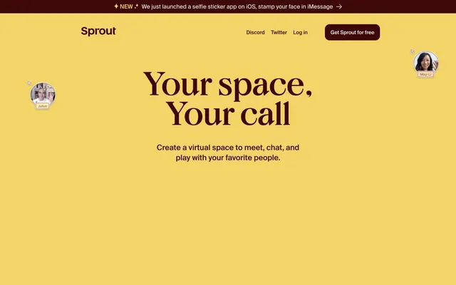
Preview image. Unlock full-res
Earthy, shifting canvases
Color palette
Red action color for filled buttons, selected navigation states, and focused conversion moments
Hero background, decorative accents, highlighted UI elements
Section backgrounds, secondary surface areas, decorative elements
Primary text on light backgrounds, strong accents, icon fills
Hairline borders, dividers, input outlines, and card edges on light surfaces. Do not promote it to the primary CTA color
Subtle surface backgrounds, elevated card backgrounds
Muted text, secondary borders, disabled states
Alternative dark text, button borders and text on light backgrounds
Typography
- Weights
- 400, 600
- Sizes
- 16px, 51px, 104px
- Line height
- 0.9, 1, 1.14, 1.33
- Letter spacing
- -0.0350em at 104px, -0.0200em at 51px, -0.0200em at 16px
- Fallback
- Abril Fatface / Playfair Display
Display headlines and prominent feature titles. Its bold, almost irregular character gives the brand a distinctive, playful voice, emphasizing personality over traditional legibility at larger sizes.
- Weights
- 400, 600, 900
- Sizes
- 16px, 18px, 19px, 24px
- Line height
- 1.19, 1.3, 1.33, 1.5, 1.58
- Letter spacing
- -0.0200em at 24px, -0.0180em at 19px, -0.0100em at 18px
- Fallback
- Inter / Public Sans
Body copy, navigation, buttons, and functional text. Its condensed nature and varied weights provide a structured, readable counterpoint to the display font, maintaining clarity across interface elements.
- Weights
- 400
- Sizes
- 16px
- Line height
- 1.2
- Letter spacing
- normal
- Fallback
- Helvetica / system-ui
System fallback for general interface text where custom fonts may not be available or for specific button labels.
Spacing & shape
Components
Transparent background, text in #000000 or #ffffff depending on context, no visible border, 0px border-radius, 0px padding. Uses SuisseIntl at 16px.
Filled with Earth Berry (#3e0808), text in Canvas White (#ffffff), 20px border-radius, 11px vertical padding, 24px horizontal padding. Uses SuisseIntl at 16px.
Transparent background, text color in Earth Berry (#3e0808), 1px solid Earth Berry border, 20px border-radius, 11px vertical padding, 24px horizontal padding. Uses SuisseIntl at 16px.
Background in Paper Cream (#fcf6f1), 15px border-radius. Padding of 24px.
Background in Canvas White (#ffffff), 15px border-radius, no visible border or shadow. Padding of 24px.
Guidelines
- Use Earth Berry (#3e0808) as the dominant background for body sections and primary calls to action.
- Employ BrickDisplayPro for all primary headings and display text, leveraging its distinct character at sizes 51px and 104px.
- Apply a 15px border-radius to general UI elements like cards and image containers for a softened, approachable feel.
- Ensure interactive elements like buttons consistently use a 20px border-radius.
- Utilize SuisseIntl for all body text, navigation items, and button labels, maintaining a compact and clear typographic hierarchy.
- Implement distinct background changes between sections, alternating between Earth Berry (#3e0808), Sunbeam Yellow (#f3d468), Terracotta (#f39369), and Canvas White (#ffffff).
- Avoid using generic system fonts for headlines; BrickDisplayPro is key to brand identity.
- Do not deviate from the specified border-radii of 15px (default) and 20px (buttons) to preserve the brand's soft aesthetic.
- Refrain from introducing new accent colors; rely on Earth Berry, Sunbeam Yellow, and Terracotta to define highlights and section shifts.
- Do not apply heavy shadows or complex elevation; the system prefers subtle borders or background shifts to define layers.
- Avoid excessive letter-spacing on body text; SuisseIntl is designed for slightly tighter tracking (e.g., -0.0100em at 18px).
- Do not use dark text colors on Earth Berry (#3e0808) backgrounds; always use Canvas White (#ffffff) for readability.
About this system
ShowHide
Sprout embraces a playful, textured aesthetic with a warm, desaturated color palette that shifts between earthy tones, creating distinct spatial zones. Bold, almost cartoonish typography pairs with a more functional, condensed sans-serif, giving the brand a friendly yet authoritative voice. Components feature soft, rounded edges and light borders, suggesting a tactile, approachable interface. The design feels grounded and unconventional, prioritizing character over stark minimalism.
The page primarily uses a full-bleed layout, where hero sections and color bands stretch across the entire viewport width. Content within these sections often centers or uses alternating text-left/image-right compositions. Vertical spacing is generous, with 'sectionGap: 40px' creating clear visual breaks between different content blocks. The hero section is full-bleed, often containing centered text or a split visual, setting a distinct tone with changing background colors. Navigation is a sticky top bar with a clear call-to-action button, ensuring consistent access.
The site uses a mix of candid product screenshots featuring diverse users and abstract graphic elements. Product screenshots are contained within soft, rounded frames (15-30px radius) and often show video calls or interfaces with minimal contextual background, focusing on the human element. Icons are minimal, outlined, and monochromatic, primarily in Midnight Core (#000000) or Canvas White (#ffffff), serving functional purposes without drawing excessive attention. Imagery is used to explain features and showcase the product's social aspect, often taking up significant visual space.
Reminiscent of Framer, Supabase, Linear, Read.cv.
# Sprout — Style Reference
> Earthy, shifting canvases

**Theme:** mixed

**Site:** https://sprout.place

Sprout embraces a playful, textured aesthetic with a warm, desaturated color palette that shifts between earthy tones, creating distinct spatial zones. Bold, almost cartoonish typography pairs with a more functional, condensed sans-serif, giving the brand a friendly yet authoritative voice. Components feature soft, rounded edges and light borders, suggesting a tactile, approachable interface. The design feels grounded and unconventional, prioritizing character over stark minimalism.

## Tokens — Colors

| Name | Value | Token | Role |
|------|------|------|------|
| Earth Berry | `#3e0808` | `--color-earth-berry` | Red action color for filled buttons, selected navigation states, and focused conversion moments |
| Sunbeam Yellow | `#f3d468` | `--color-sunbeam-yellow` | Hero background, decorative accents, highlighted UI elements |
| Terracotta | `#f39369` | `--color-terracotta` | Section backgrounds, secondary surface areas, decorative elements |
| Midnight Core | `#000000` | `--color-midnight-core` | Primary text on light backgrounds, strong accents, icon fills |
| Canvas White | `#ffffff` | `--color-canvas-white` | Hairline borders, dividers, input outlines, and card edges on light surfaces. Do not promote it to the primary CTA color |
| Paper Cream | `#fcf6f1` | `--color-paper-cream` | Subtle surface backgrounds, elevated card backgrounds |
| Stone Gray | `#909090` | `--color-stone-gray` | Muted text, secondary borders, disabled states |
| Ink Wash | `#111111` | `--color-ink-wash` | Alternative dark text, button borders and text on light backgrounds |

## Tokens — Typography

### BrickDisplayPro
- **Substitute:** Abril Fatface / Playfair Display
- **Weights:** 400, 600
- **Sizes:** 16px, 51px, 104px
- **Line height:** 0.9, 1, 1.14, 1.33
- **Letter spacing:** -0.0350em at 104px, -0.0200em at 51px, -0.0200em at 16px
- **Role:** Display headlines and prominent feature titles. Its bold, almost irregular character gives the brand a distinctive, playful voice, emphasizing personality over traditional legibility at larger sizes.

### SuisseIntl
- **Substitute:** Inter / Public Sans
- **Weights:** 400, 600, 900
- **Sizes:** 16px, 18px, 19px, 24px
- **Line height:** 1.19, 1.3, 1.33, 1.5, 1.58
- **Letter spacing:** -0.0200em at 24px, -0.0180em at 19px, -0.0100em at 18px
- **Role:** Body copy, navigation, buttons, and functional text. Its condensed nature and varied weights provide a structured, readable counterpoint to the display font, maintaining clarity across interface elements.

### Arial
- **Substitute:** Helvetica / system-ui
- **Weights:** 400
- **Sizes:** 16px
- **Line height:** 1.2
- **Letter spacing:** normal
- **Role:** System fallback for general interface text where custom fonts may not be available or for specific button labels.

## Tokens — Type Scale

Golden Ratio (1.618) from 16px base.

| Role | Size | Line height | Letter spacing |
|------|------|------|------|
| body | 16px | 1.5 | -0.16px |
| body-lg | 18px | 1.58 | -0.18px |
| subheading | 24px | 1.33 | -0.48px |
| heading | 51px | 1.14 | -1.02px |
| display | 104px | 0.9 | -3.64px |

## Tokens — Spacing

- **Section gap:** 40px
- **Card padding:** 24px
- **Element gap:** 10-24px

## Tokens — Radius

- **Default:** 15px
- **Buttons:** 20px
- **Images:** 30px

## Layout

The page primarily uses a full-bleed layout, where hero sections and color bands stretch across the entire viewport width. Content within these sections often centers or uses alternating text-left/image-right compositions. Vertical spacing is generous, with 'sectionGap: 40px' creating clear visual breaks between different content blocks. The hero section is full-bleed, often containing centered text or a split visual, setting a distinct tone with changing background colors. Navigation is a sticky top bar with a clear call-to-action button, ensuring consistent access.

## Imagery

The site uses a mix of candid product screenshots featuring diverse users and abstract graphic elements. Product screenshots are contained within soft, rounded frames (15-30px radius) and often show video calls or interfaces with minimal contextual background, focusing on the human element. Icons are minimal, outlined, and monochromatic, primarily in Midnight Core (#000000) or Canvas White (#ffffff), serving functional purposes without drawing excessive attention. Imagery is used to explain features and showcase the product's social aspect, often taking up significant visual space.

## Components

### Ghost Link Button
*Text-based actions and navigation links.*

Transparent background, text in #000000 or #ffffff depending on context, no visible border, 0px border-radius, 0px padding. Uses SuisseIntl at 16px.

### Earth Berry Primary Button
*Main call-to-action.*

Filled with Earth Berry (#3e0808), text in Canvas White (#ffffff), 20px border-radius, 11px vertical padding, 24px horizontal padding. Uses SuisseIntl at 16px.

### Outline Ghost Button
*Secondary call-to-action or subtle interactive elements.*

Transparent background, text color in Earth Berry (#3e0808), 1px solid Earth Berry border, 20px border-radius, 11px vertical padding, 24px horizontal padding. Uses SuisseIntl at 16px.

### Hero Section Card
*Visual containers within the hero section.*

Background in Paper Cream (#fcf6f1), 15px border-radius. Padding of 24px.

### Basic Card
*Standard content containers.*

Background in Canvas White (#ffffff), 15px border-radius, no visible border or shadow. Padding of 24px.

## Guidelines

### Do

- Use Earth Berry (#3e0808) as the dominant background for body sections and primary calls to action.
- Employ BrickDisplayPro for all primary headings and display text, leveraging its distinct character at sizes 51px and 104px.
- Apply a 15px border-radius to general UI elements like cards and image containers for a softened, approachable feel.
- Ensure interactive elements like buttons consistently use a 20px border-radius.
- Utilize SuisseIntl for all body text, navigation items, and button labels, maintaining a compact and clear typographic hierarchy.
- Implement distinct background changes between sections, alternating between Earth Berry (#3e0808), Sunbeam Yellow (#f3d468), Terracotta (#f39369), and Canvas White (#ffffff).

### Don't

- Avoid using generic system fonts for headlines; BrickDisplayPro is key to brand identity.
- Do not deviate from the specified border-radii of 15px (default) and 20px (buttons) to preserve the brand's soft aesthetic.
- Refrain from introducing new accent colors; rely on Earth Berry, Sunbeam Yellow, and Terracotta to define highlights and section shifts.
- Do not apply heavy shadows or complex elevation; the system prefers subtle borders or background shifts to define layers.
- Avoid excessive letter-spacing on body text; SuisseIntl is designed for slightly tighter tracking (e.g., -0.0100em at 18px).
- Do not use dark text colors on Earth Berry (#3e0808) backgrounds; always use Canvas White (#ffffff) for readability.

## Agent Prompt Guide

### Quick Color Reference
text: #000000 (on light backgrounds), #ffffff (on dark backgrounds)
background: #3e0808
border: #111111 (neutral), #3e0808 (primary action)
accent: #f3d468, #f39369
primary action: #3e0808 (outlined action border)

### 3-5 Example Component Prompts
1. Create a hero section: Sunbeam Yellow (#f3d468) full-bleed background. Centered headline 'Your space, Your call' using BrickDisplayPro at 104px, weight 400, color Midnight Core (#000000), letter-spacing -3.64px. Subtext 'Create a virtual space to meet, chat, and play with your favorite people.' using SuisseIntl at 18px, weight 400, color Midnight Core (#000000), letter-spacing -0.18px.
2. Create an Outlined Primary Action: Transparent background, #3e0808 border and text, 9999px radius, compact pill padding. Use it for the main CTA instead of a filled button.
3. Implement a Text Card: Canvas White (#ffffff) background, radius 15px, 24px padding. Headline 'Pull up a chair Facedock' using BrickDisplayPro at 51px, weight 600, color Earth Berry (#3e0808), letter-spacing -1.02px. Body text 'Facedocks are flexible, resizable, rearrangeable frames.' using SuisseIntl at 16px, weight 400, color Earth Berry (#3e0808), letter-spacing -0.16px.
4. Create an Outline Ghost Button: Transparent background, border 1px solid Earth Berry (#3e0808), text color Earth Berry (#3e0808). Radius 20px, 11px vertical padding, 24px horizontal padding. Label 'Try it with your face' using SuisseIntl at 16px, weight 400.
More like this







Keep what you find
A free account saves references to boards and can send you a weekly email of picks based on what you save.
To see every result, go Pro.