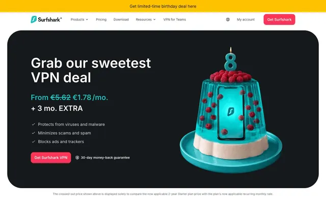
Preview image. Unlock full-res
Animated aquatic security
Color palette
Red action color for filled buttons, selected navigation states, and focused conversion moments
Teal outline accent for tags, dividers, and focused UI edges. Do not promote it to the primary CTA color
Promotional banners, special offers, secondary call to action backgrounds — adds warmth and celebratory feel
Page backgrounds for dark sections, card surfaces, important text
Slightly darker secondary background for subtle depth in dark sections
Subtle border colors, secondary text in dark contexts, icon fills
Muted body text, placeholder text in inputs, decorative elements
Hairline borders, disabled text, subtle divider lines
Input borders, light dividers, background of neutral badges
Default page background, light card surfaces
Elevated surfaces, component backgrounds, primary text in dark contexts
Primary text on light backgrounds, strong borders
Typography
- Weights
- 400, 600, 700
- Sizes
- 12px, 14px, 16px, 18px, 24px, 32px, 40px, 48px, 60px
- Line height
- 1, 1.07, 1.14, 1.15, 1.21, 1.3, 1.33, 1.5, 1.67, 1.71, 1.75
- Letter spacing
- -0.0250em (at 60px), 0.0170em (at 12px), normal otherwise
- Fallback
- system-ui
The primary font for all textual elements. Its strong, sans-serif character supports both impactful headlines and legible body text across various sizes and weights.
Spacing & shape
Components
Filled button with Shark Red (#fa3556) background, Pure White (#ffffff) text, and a 12px border-radius. Padding of 12px vertical, 16px horizontal.
Filled button with Harvest Gold (#ffc200) background, Primary Black (#000000) text, and a 8px border-radius. Padding of 12px vertical, 32px horizontal.
Transparent background, Charcoal Grey (#5b6065) text and a 0px border-radius. Padding of 12px vertical, 32px horizontal.
Transparent background, Primary Black (#000000) text, no border or radius. Padding of 0px.
Card with Midnight Ink (#16191c) background and an asymmetric 48px 0px 0px border-radius. No padding applied by default, intended for content to define internal spacing.
Card with Cloud White (#f9f9f9) background and a 48px border-radius. No padding applied by default, intended for content to define internal spacing.
Transparent background, Silver Mist (#dadadd) border, 0px border-radius. Pale text color. Padding 4px vertical, 8px left, 28px right.
Guidelines
- Use Shark Red (#fa3556) exclusively for primary calls to action to ensure visual hierarchy and prompt decisive interaction.
- Apply Inter font family with weights 400, 600, or 700. Do not use other weights.
- Utilize a 12px border-radius for all filled buttons to maintain a consistent friendly yet modern interaction style.
- Ensure headings use a generous line-height from the type scale values to improve readability and visual breathing room.
- Maintain high contrast (AAA minimum) for all text on background pairings, especially for critical information.
- Employ the 48px asymmetric radius (48px 0px 0px) for cards on the left edge of the screen, mirroring the brand's design language.
- Use Ocean Teal (#1ebfbf) specifically for highlighting key figures like prices or data points, not for interactive elements.
- Do not use Harvest Gold (#ffc200) for primary action buttons; reserve it for distinct promotional banners or secondary accents.
- Avoid arbitrary border-radius values; always refer to the defined spacing.radius tokens (e.g., 48px for cards, 12px for buttons).
- Do not introduce new typefaces or weights outside of the specified Inter family and its defined weights.
- Refrain from using color for purely decorative purposes if it doesn't align with brand, accent, or semantic roles.
- Do not use the transparent Ghost Navigation Button style as a primary call to action, as it lacks sufficient visual weight.
- Do not stretch or distort imagery; maintain original aspect ratios and ensure crisp presentation.
- Avoid using a pageMaxWidth; the page content stretches fluidly, but sections may be contained internally.
About this system
ShowHide
Surfshark's design system projects a dynamic, secure, and user-friendly online presence. It balances informative content with clear calls to action, leveraging high-contrast typography against clean achromatic surfaces. A vibrant red accent color signifies primary interactions, while a teal tone highlights key data points. Asymmetric large radii on cards and a distinct, rounded button style add a modern, approachable edge to the otherwise structured layout, creating an engaging yet trustworthy feel.
The page structure is full-bleed, adapting to the viewport width, with some sections containing content within a conceptual maximum width via internal left/right padding. The hero sections often feature large, impactful visuals on a dark background with centered, bold headlines. Subsequent sections alternate between light and dark themes, creating visual rhythm. Content is typically arranged in clear, stacked blocks or alternating text-left/image-right (or vice-versa) two-column layouts. Navigation is a persistent top bar featuring the brand logo, primary navigation links, and a prominent call-to-action button, ensuring constant access to key areas. Sections are generously spaced vertically, contributing to a comfortable density.
The visual language for imagery is a mix of high-quality product renders, dark-mode focused lifestyle photography, and clean, geometric line icons. Photography tends to be dark and moody with a warm glow, often showing individuals using devices in comfortable, ambient settings, emphasizing privacy and security. Product visuals are crisp and isolated, often placed within abstract or stylized contexts (like the jelly cake). Icons are outlined, conveying functionality without visual clutter, with occasional fills for emphasis. Imagery serves both decorative atmosphere within dark sections and explanatory content within light sections.
Reminiscent of NordVPN, ExpressVPN, ProtonVPN, Tailscale.
# Surfshark — Style Reference
> Animated aquatic security

**Theme:** mixed

**Site:** https://surfshark.com

Surfshark's design system projects a dynamic, secure, and user-friendly online presence. It balances informative content with clear calls to action, leveraging high-contrast typography against clean achromatic surfaces. A vibrant red accent color signifies primary interactions, while a teal tone highlights key data points. Asymmetric large radii on cards and a distinct, rounded button style add a modern, approachable edge to the otherwise structured layout, creating an engaging yet trustworthy feel.

## Tokens — Colors

| Name | Value | Token | Role |
|------|------|------|------|
| Shark Red | `#fa3556` | `--color-shark-red` | Red action color for filled buttons, selected navigation states, and focused conversion moments |
| Ocean Teal | `#1ebfbf` | `--color-ocean-teal` | Teal outline accent for tags, dividers, and focused UI edges. Do not promote it to the primary CTA color |
| Harvest Gold | `#ffc200` | `--color-harvest-gold` | Promotional banners, special offers, secondary call to action backgrounds — adds warmth and celebratory feel |
| Midnight Ink | `#16191c` | `--color-midnight-ink` | Page backgrounds for dark sections, card surfaces, important text |
| Stormy Night | `#1e2327` | `--color-stormy-night` | Slightly darker secondary background for subtle depth in dark sections |
| Deep Graphite | `#393e41` | `--color-deep-graphite` | Subtle border colors, secondary text in dark contexts, icon fills |
| Charcoal Grey | `#5b6065` | `--color-charcoal-grey` | Muted body text, placeholder text in inputs, decorative elements |
| Light Grey | `#bfbfc0` | `--color-light-grey` | Hairline borders, disabled text, subtle divider lines |
| Silver Mist | `#dadadd` | `--color-silver-mist` | Input borders, light dividers, background of neutral badges |
| Cloud White | `#f9f9f9` | `--color-cloud-white` | Default page background, light card surfaces |
| Pure White | `#ffffff` | `--color-pure-white` | Elevated surfaces, component backgrounds, primary text in dark contexts |
| Primary Black | `#000000` | `--color-primary-black` | Primary text on light backgrounds, strong borders |

## Tokens — Typography

### Inter
- **Substitute:** system-ui
- **Weights:** 400, 600, 700
- **Sizes:** 12px, 14px, 16px, 18px, 24px, 32px, 40px, 48px, 60px
- **Line height:** 1, 1.07, 1.14, 1.15, 1.21, 1.3, 1.33, 1.5, 1.67, 1.71, 1.75
- **Letter spacing:** -0.0250em (at 60px), 0.0170em (at 12px), normal otherwise
- **Role:** The primary font for all textual elements. Its strong, sans-serif character supports both impactful headlines and legible body text across various sizes and weights.

## Tokens — Type Scale

Minor Third (1.2) from 16px base.

| Role | Size | Line height | Letter spacing |
|------|------|------|------|
| caption | 12px | 1.71 | 0.204px |
| body-sm | 14px | 1.71 | — |
| body | 16px | 1.67 | — |
| subheading | 18px | 1.5 | — |
| heading-sm | 24px | 1.33 | — |
| heading | 32px | 1.21 | — |
| heading-lg | 40px | 1.15 | — |
| display | 48px | 1.14 | — |

## Tokens — Spacing

- **Section gap:** 32px
- **Card padding:** 16px
- **Element gap:** 4px

## Tokens — Radius

- **Default:** 32px
- **Buttons:** 12px
- **Cards:** 48px
- **hero:** 64px
- **links:** 8px

## Layout

The page structure is full-bleed, adapting to the viewport width, with some sections containing content within a conceptual maximum width via internal left/right padding. The hero sections often feature large, impactful visuals on a dark background with centered, bold headlines. Subsequent sections alternate between light and dark themes, creating visual rhythm. Content is typically arranged in clear, stacked blocks or alternating text-left/image-right (or vice-versa) two-column layouts. Navigation is a persistent top bar featuring the brand logo, primary navigation links, and a prominent call-to-action button, ensuring constant access to key areas. Sections are generously spaced vertically, contributing to a comfortable density.

## Imagery

The visual language for imagery is a mix of high-quality product renders, dark-mode focused lifestyle photography, and clean, geometric line icons. Photography tends to be dark and moody with a warm glow, often showing individuals using devices in comfortable, ambient settings, emphasizing privacy and security. Product visuals are crisp and isolated, often placed within abstract or stylized contexts (like the jelly cake). Icons are outlined, conveying functionality without visual clutter, with occasional fills for emphasis. Imagery serves both decorative atmosphere within dark sections and explanatory content within light sections.

## Components

### Primary Action Button
*Critical call to action.*

Filled button with Shark Red (#fa3556) background, Pure White (#ffffff) text, and a 12px border-radius. Padding of 12px vertical, 16px horizontal.

### Accent Promotion Button
*Highlighting special offers or deals.*

Filled button with Harvest Gold (#ffc200) background, Primary Black (#000000) text, and a 8px border-radius. Padding of 12px vertical, 32px horizontal.

### Ghost Navigation Button
*Secondary navigation or interactive elements.*

Transparent background, Charcoal Grey (#5b6065) text and a 0px border-radius. Padding of 12px vertical, 32px horizontal.

### Text Link Button
*Minimal interactive elements without strong visual emphasis.*

Transparent background, Primary Black (#000000) text, no border or radius. Padding of 0px.

### Dark Hero Card
*Prominent information blocks on dark backgrounds.*

Card with Midnight Ink (#16191c) background and an asymmetric 48px 0px 0px border-radius. No padding applied by default, intended for content to define internal spacing.

### Light Feature Card
*Content presentation on light backgrounds.*

Card with Cloud White (#f9f9f9) background and a 48px border-radius. No padding applied by default, intended for content to define internal spacing.

### Form Input Field
*User input fields.*

Transparent background, Silver Mist (#dadadd) border, 0px border-radius. Pale text color. Padding 4px vertical, 8px left, 28px right.

## Guidelines

### Do

- Use Shark Red (#fa3556) exclusively for primary calls to action to ensure visual hierarchy and prompt decisive interaction.
- Apply Inter font family with weights 400, 600, or 700. Do not use other weights.
- Utilize a 12px border-radius for all filled buttons to maintain a consistent friendly yet modern interaction style.
- Ensure headings use a generous line-height from the type scale values to improve readability and visual breathing room.
- Maintain high contrast (AAA minimum) for all text on background pairings, especially for critical information.
- Employ the 48px asymmetric radius (48px 0px 0px) for cards on the left edge of the screen, mirroring the brand's design language.
- Use Ocean Teal (#1ebfbf) specifically for highlighting key figures like prices or data points, not for interactive elements.

### Don't

- Do not use Harvest Gold (#ffc200) for primary action buttons; reserve it for distinct promotional banners or secondary accents.
- Avoid arbitrary border-radius values; always refer to the defined spacing.radius tokens (e.g., 48px for cards, 12px for buttons).
- Do not introduce new typefaces or weights outside of the specified Inter family and its defined weights.
- Refrain from using color for purely decorative purposes if it doesn't align with brand, accent, or semantic roles.
- Do not use the transparent Ghost Navigation Button style as a primary call to action, as it lacks sufficient visual weight.
- Do not stretch or distort imagery; maintain original aspect ratios and ensure crisp presentation.
- Avoid using a pageMaxWidth; the page content stretches fluidly, but sections may be contained internally.

## Agent Prompt Guide

Quick Color Reference:
text: #000000
background: #f9f9f9
border: #dadadd
accent: #1ebfbf
primary action: #fa3556 (filled action)

Example Component Prompts:
Create a Primary Action Button: #fa3556 background, #ffffff text, 9999px radius, compact pill padding. Use this filled treatment for the main CTA.
More like this






Keep what you find
A free account saves references to boards and can send you a weekly email of picks based on what you save.
To see every result, go Pro.