Preview image. Unlock full-res
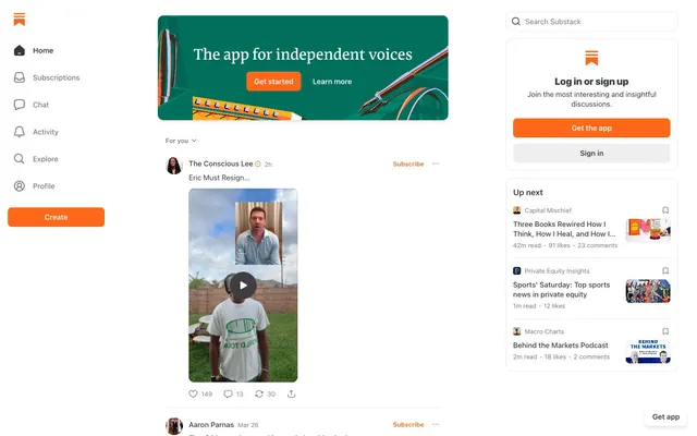
Warm editorial gateway. Like a clean, well-organized newsstand where one striking orange magazine cover catches your eye amidst a collection of white and gray.
Color palette
Primary interactive elements (buttons, active states, key icons) and brand accents in marketing banners. This vivid orange provides a high-contrast focal point against the neutral palette.
Dominant text color for headings, body text, and primary UI elements. Provides strong contrast against white backgrounds.
Secondary text, inactive icons, subtle borders, and placeholder text. Offers visual hierarchy without overwhelming the primary text.
Main page background, card surfaces, and primary button backgrounds.
Subtle background for UI elements like subtle separators or hover states, providing a slight differentiation from pure white.
Used for specific background elements, potentially indicating a grouped or highlighted section.
Borders and dividers, offering a light touch of separation.
Slightly darker borders and strokes for subtle definition.
Background for subtle UI details, defined by `--color_theme_detail`.
Typography
- Weights
- 400, 500, 600
- Sizes
- 12px, 13px, 15px, 19px, 20px
- Line height
- 1, 1.2, 1.33, 1.4, 1.54
- Fallback
- Segoe UI, Roboto, Helvetica Neue, Arial, sans-serif
The primary workhorse for all body text, UI labels, links, and minor headings. Its neutral, readable nature allows content to take precedence across various screen sizes. The slightly tighter line heights (1.00-1.54) optimize for dense information display on a reading-heavy platform.
- Weights
- 500
- Sizes
- 24px, 32px
- Line height
- 1.24, 1.25
Distinctive custom font for prominent headings. Its unique character at medium weight (500) sets apart primary content and section titles, giving the platform a unique, authoritative voice for 'independent voices'.
- Weights
- 400
- Sizes
- 19px
- Line height
- 1.2
- Fallback
- Georgia, Times New Roman, serif
Serif font used for specific text blocks, often in lists or extended quotes, providing a classic editorial feel that complements the custom headings and system UI text.
- Weights
- 700
- Sizes
- 14px
- Line height
- 1.43
- Letter spacing
- -0.14
- Fallback
- Menlo, Monaco, Consolas, 'Courier New', monospace
Monospaced font for code snippets or technical information, its weight and tight letter spacing at 14px distinguish it clearly from other text types, indicating different content semantics.
- Weights
- 400
- Sizes
- 20px
- Line height
- 1.6
- Fallback
- Georgia, Times New Roman, serif
Another serif font, slightly larger than Spectral, potentially for specific body text sections or quotes requiring a more generous leading for emphasis. It enhances the editorial feel.
Spacing & shape
Elevation
Components
Background transparent, text #777777, border #777777, 9999px border-radius, 0px vertical padding, 8px horizontal padding. Thin, discrete, suitable for non-primary actions like 'Subscribe' buttons within content feeds.
Background transparent, text #777777, border #777777, 8px border-radius, 0px vertical padding, 6px horizontal padding. More squared-off than pill, yet still deemphasized, for ancillary interactive elements.
Main color #FF6719, background transparent, border #FF6719, 8px border-radius, 0px vertical padding, 6px horizontal padding. Uses brand accent for emphasis while retaining a ghost style.
Uses Orange Ember (#FF6719) as background, white text (#FFFFFF), with 8px border-radius. Padding varies: often 20px horizontal with 8px-12px vertical. The shadow: `rgba(255, 255, 255, 0.2) 0px 1px 0px 0px inset, rgba(0, 0, 0, 0.1) 0px -1px 0px 0px inset` provides depth. This is the most visually prominent interactive element.
Background transparent, text #777777. Has no border, 0px border-radius. Text aligns with system-ui font at 15px/400 weight.
White background (#FFFFFF), text #363737, border rgba(0, 0, 0, 0.1), 12px border-radius. Padding of 0px vertical, 20px-40px horizontal to accommodate an icon. Placeholder text typically Anchor Gray (#777777) or lighter.
White background (#FFFFFF), 8px border-radius. Features a subtle shadow: `rgba(0, 0, 0, 0.1) 0px 4px 6px -1px, rgba(0, 0, 0, 0.06) 0px 2px 4px -1px`. Internal padding typically 16px to 24px.
No explicit border or background color different from the page background. Relies on internal content structure and surrounding whitespace for definition. Can contain nested elements like images with specific radii (e.g. 12px).
Guidelines
- Always use Orange Ember (#FF6719) for primary calls to action and active states to guide user focus.
- Apply 9999px border-radius for small, interactive pill-shaped elements like 'Subscribe' or 'Like' buttons.
- Use 8px border-radius for cards and larger interactive elements (like main CTA buttons) to maintain a soft but structured appearance.
- Prefer Midnight Graphite (#363737) for all primary text content (headings, body) to ensure excellent readability against white backgrounds.
- Utilize the `system-ui` font family for general UI labels and body text, keeping weights between 400 and 500 for optimal legibility.
- Employ Cahuenga (500 weight, 24px-32px) for page and section titles to express the brand's unique editorial voice.
- Maintain element spacing using a 4px base unit, with `elementGap` values like 4px, 8px, 12px, depending on proximity needs.
- Avoid introducing additional saturated colors; maintain Orange Ember as the sole vibrant accent.
- Do not use sharp 0px corners, as the system consistently uses 8px, 12px, or 9999px radii.
- Do not deviate from the specified font families; `system-ui` for body, `Cahuenga` for headlines, and `Spectral`/`-apple-system-ui-serif` for editorial content.
- Avoid overly dramatic shadows; stick to the subtle `rgba(0,0,0,0.1) 0px 4px 6px` style for card elevation only.
- Do not use generic gray values; always pull from the defined neutral scale (Midnight Graphite, Anchor Gray, Silver Mist, Cool Stone).
- Never use `system-ui` for prominent headings; `Cahuenga` is reserved for this purpose.
- Do not introduce inconsistent padding values; adhere to the 4px base unit and established elementGap tokens like 4px, 8px, 12px.
About this system
ShowHide
This design system presents a clean, content-focused experience reminiscent of a curated editorial platform, prioritizing readability and direct interaction. A single, vibrant orange accent color (#FF6719) cuts through a palette of cool grays, drawing immediate attention to calls to action and active states. Softly rounded corners (8px and 12px) for cards and inputs, contrasting with the nearly pill-shaped interactive elements (9999px), create a subtle tension between structure and approachability. The use of system fonts with custom display typography lends a familiar yet distinct voice, reinforcing its role as a platform for individual expression.
The site uses a fixed-width, centered main content area (approximately 700-900px wide based on the screenshot, though `pageMaxWidth` is null in data, indicating flexibility) with a persistent left-hand sidebar navigation. The hero section often features a contained banner with text and an image, utilizing brand colors. The main content is structured as a single-column feed, primarily text and image blocks, while a right-hand sidebar provides 'Up Next' content recommendations and login/signup calls-to-action within distinct card components. Section rhythm is consistent, separated by whitespace, offering a spacious and readable experience.
The visual language blends product photography within hero sections with a focus on user-generated content in the main feed. Marketing sections feature tight crops of creative tools (pens, notebooks) or abstract graphics, often against branded orange/green gradients, contained within rounded rectangles. User content primarily includes embedded videos, profile pictures, and article thumbnails, treated without masks or heavy stylization, allowing the raw content to shine. Icons are minimal, outlined, monochromatic, and typically in Anchor Gray (#777777), reserving the Orange Ember (#FF6719) for interactive states or the brand logo element. The density is image-heavy in the main content feed, interspersed with text.
Reminiscent of Medium, Ghost, Blogger, The Verge.
# Substack — Style Reference
> Warm editorial gateway. Like a clean, well-organized newsstand where one striking orange magazine cover catches your eye amidst a collection of white and gray.

**Theme:** light

**Site:** https://substack.com

This design system presents a clean, content-focused experience reminiscent of a curated editorial platform, prioritizing readability and direct interaction. A single, vibrant orange accent color (#FF6719) cuts through a palette of cool grays, drawing immediate attention to calls to action and active states. Softly rounded corners (8px and 12px) for cards and inputs, contrasting with the nearly pill-shaped interactive elements (9999px), create a subtle tension between structure and approachability. The use of system fonts with custom display typography lends a familiar yet distinct voice, reinforcing its role as a platform for individual expression.

## Tokens — Colors

| Name | Value | Token | Role |
|------|------|------|------|
| Orange Ember | `#FF6719` | `--color-orange-ember` | Primary interactive elements (buttons, active states, key icons) and brand accents in marketing banners. This vivid orange provides a high-contrast focal point against the neutral palette. |
| Midnight Graphite | `#363737` | `--color-midnight-graphite` | Dominant text color for headings, body text, and primary UI elements. Provides strong contrast against white backgrounds. |
| Anchor Gray | `#777777` | `--color-anchor-gray` | Secondary text, inactive icons, subtle borders, and placeholder text. Offers visual hierarchy without overwhelming the primary text. |
| UI White | `#FFFFFF` | `--color-ui-white` | Main page background, card surfaces, and primary button backgrounds. |
| Silver Mist | `#EEEEEE` | `--color-silver-mist` | Subtle background for UI elements like subtle separators or hover states, providing a slight differentiation from pure white. |
| Dark Overlay | `#232525` | `--color-dark-overlay` | Used for specific background elements, potentially indicating a grouped or highlighted section. |
| Cool Stone | `#C8C8C8` | `--color-cool-stone` | Borders and dividers, offering a light touch of separation. |
| Light Steel | `#B6B6B6` | `--color-light-steel` | Slightly darker borders and strokes for subtle definition. |
| Ghost Shadow | `#E6E6E6` | `--color-ghost-shadow` | Background for subtle UI details, defined by `--color_theme_detail`. |

## Tokens — Typography

### system-ui
- **Substitute:** Segoe UI, Roboto, Helvetica Neue, Arial, sans-serif
- **Weights:** 400, 500, 600
- **Sizes:** 12px, 13px, 15px, 19px, 20px
- **Line height:** 1, 1.2, 1.33, 1.4, 1.54
- **Role:** The primary workhorse for all body text, UI labels, links, and minor headings. Its neutral, readable nature allows content to take precedence across various screen sizes. The slightly tighter line heights (1.00-1.54) optimize for dense information display on a reading-heavy platform.

### Cahuenga
- **Weights:** 500
- **Sizes:** 24px, 32px
- **Line height:** 1.24, 1.25
- **Role:** Distinctive custom font for prominent headings. Its unique character at medium weight (500) sets apart primary content and section titles, giving the platform a unique, authoritative voice for 'independent voices'.

### Spectral
- **Substitute:** Georgia, Times New Roman, serif
- **Weights:** 400
- **Sizes:** 19px
- **Line height:** 1.2
- **Role:** Serif font used for specific text blocks, often in lists or extended quotes, providing a classic editorial feel that complements the custom headings and system UI text.

### Jetbrains Mono
- **Substitute:** Menlo, Monaco, Consolas, 'Courier New', monospace
- **Weights:** 700
- **Sizes:** 14px
- **Line height:** 1.43
- **Letter spacing:** -0.14
- **Role:** Monospaced font for code snippets or technical information, its weight and tight letter spacing at 14px distinguish it clearly from other text types, indicating different content semantics.

### -apple-system-ui-serif
- **Substitute:** Georgia, Times New Roman, serif
- **Weights:** 400
- **Sizes:** 20px
- **Line height:** 1.6
- **Role:** Another serif font, slightly larger than Spectral, potentially for specific body text sections or quotes requiring a more generous leading for emphasis. It enhances the editorial feel.

## Tokens — Type Scale

Major Third (1.25) from 15px base.

| Role | Size | Line height | Letter spacing |
|------|------|------|------|
| caption | 12px | 1.54 | — |
| body | 15px | 1.4 | — |
| subheading | 19px | 1.2 | — |
| heading-lg | 24px | 1.25 | — |
| display | 32px | 1.24 | — |

## Tokens — Spacing

- **Section gap:** 24-32px
- **Card padding:** 16-24px
- **Element gap:** 4-12px

## Tokens — Radius

- **Buttons:** 9999px
- **Inputs:** 12px
- **Cards:** 8px
- **elements:** 8px, 12px

## Tokens — Elevation

- **Card Container:** `rgba(0, 0, 0, 0.1) 0px 4px 6px -1px, rgba(0, 0, 0, 0.06) 0px 2px 4px -1px`
- **Solid Primary Button:** `rgba(255, 255, 255, 0.2) 0px 1px 0px 0px inset, rgba(0, 0, 0, 0.1) 0px -1px 0px 0px inset`

## Layout

The site uses a fixed-width, centered main content area (approximately 700-900px wide based on the screenshot, though `pageMaxWidth` is null in data, indicating flexibility) with a persistent left-hand sidebar navigation. The hero section often features a contained banner with text and an image, utilizing brand colors. The main content is structured as a single-column feed, primarily text and image blocks, while a right-hand sidebar provides 'Up Next' content recommendations and login/signup calls-to-action within distinct card components. Section rhythm is consistent, separated by whitespace, offering a spacious and readable experience.

## Imagery

The visual language blends product photography within hero sections with a focus on user-generated content in the main feed. Marketing sections feature tight crops of creative tools (pens, notebooks) or abstract graphics, often against branded orange/green gradients, contained within rounded rectangles. User content primarily includes embedded videos, profile pictures, and article thumbnails, treated without masks or heavy stylization, allowing the raw content to shine. Icons are minimal, outlined, monochromatic, and typically in Anchor Gray (#777777), reserving the Orange Ember (#FF6719) for interactive states or the brand logo element. The density is image-heavy in the main content feed, interspersed with text.

## Components

### Log In or Sign Up Card

### Up Next Recommendations Card

### Feed Post Card with Engagement Actions

### Pill Ghost Button
*Secondary action, subtle navigation items*

Background transparent, text #777777, border #777777, 9999px border-radius, 0px vertical padding, 8px horizontal padding. Thin, discrete, suitable for non-primary actions like 'Subscribe' buttons within content feeds.

### Rounded Ghost Button
*Tertiary actions, filters, tags*

Background transparent, text #777777, border #777777, 8px border-radius, 0px vertical padding, 6px horizontal padding. More squared-off than pill, yet still deemphasized, for ancillary interactive elements.

### Rounded Accent Button
*Tertiary actions, specific calls to action that need a brand highlight but not full prominence*

Main color #FF6719, background transparent, border #FF6719, 8px border-radius, 0px vertical padding, 6px horizontal padding. Uses brand accent for emphasis while retaining a ghost style.

### Solid Primary Button
*Primary calls to action (CTA), e.g., 'Get started', 'Create'*

Uses Orange Ember (#FF6719) as background, white text (#FFFFFF), with 8px border-radius. Padding varies: often 20px horizontal with 8px-12px vertical. The shadow: `rgba(255, 255, 255, 0.2) 0px 1px 0px 0px inset, rgba(0, 0, 0, 0.1) 0px -1px 0px 0px inset` provides depth. This is the most visually prominent interactive element.

### Navigation Link Button
*Main navigation items in the sidebar*

Background transparent, text #777777. Has no border, 0px border-radius. Text aligns with system-ui font at 15px/400 weight.

### Search Input Field
*Global or section-specific search functionality*

White background (#FFFFFF), text #363737, border rgba(0, 0, 0, 0.1), 12px border-radius. Padding of 0px vertical, 20px-40px horizontal to accommodate an icon. Placeholder text typically Anchor Gray (#777777) or lighter.

### Card Container
*Grouping related content, e.g., 'Log in' module, 'Up next' recommendations*

White background (#FFFFFF), 8px border-radius. Features a subtle shadow: `rgba(0, 0, 0, 0.1) 0px 4px 6px -1px, rgba(0, 0, 0, 0.06) 0px 2px 4px -1px`. Internal padding typically 16px to 24px.

### Media/Content Card
*Displaying articles, videos, or other specific content items in a feed*

No explicit border or background color different from the page background. Relies on internal content structure and surrounding whitespace for definition. Can contain nested elements like images with specific radii (e.g. 12px).

## Guidelines

### Do

- Always use Orange Ember (#FF6719) for primary calls to action and active states to guide user focus.
- Apply 9999px border-radius for small, interactive pill-shaped elements like 'Subscribe' or 'Like' buttons.
- Use 8px border-radius for cards and larger interactive elements (like main CTA buttons) to maintain a soft but structured appearance.
- Prefer Midnight Graphite (#363737) for all primary text content (headings, body) to ensure excellent readability against white backgrounds.
- Utilize the `system-ui` font family for general UI labels and body text, keeping weights between 400 and 500 for optimal legibility.
- Employ Cahuenga (500 weight, 24px-32px) for page and section titles to express the brand's unique editorial voice.
- Maintain element spacing using a 4px base unit, with `elementGap` values like 4px, 8px, 12px, depending on proximity needs.

### Don't

- Avoid introducing additional saturated colors; maintain Orange Ember as the sole vibrant accent.
- Do not use sharp 0px corners, as the system consistently uses 8px, 12px, or 9999px radii.
- Do not deviate from the specified font families; `system-ui` for body, `Cahuenga` for headlines, and `Spectral`/`-apple-system-ui-serif` for editorial content.
- Avoid overly dramatic shadows; stick to the subtle `rgba(0,0,0,0.1) 0px 4px 6px` style for card elevation only.
- Do not use generic gray values; always pull from the defined neutral scale (Midnight Graphite, Anchor Gray, Silver Mist, Cool Stone).
- Never use `system-ui` for prominent headings; `Cahuenga` is reserved for this purpose.
- Do not introduce inconsistent padding values; adhere to the 4px base unit and established elementGap tokens like 4px, 8px, 12px.

## Agent Prompt Guide

### Quick Color Reference
- Text: #363737
- Background: #FFFFFF
- CTA: #FF6719
- Border: #777777
- Accent: #FF6719

### Example Component Prompts
1. Create a Primary CTA button: background Orange Ember (#FF6719), text UI White (#FFFFFF), 8px border-radius, `rgba(255, 255, 255, 0.2) 0px 1px 0px 0px inset, rgba(0, 0, 0, 0.1) 0px -1px 0px 0px inset` shadow, 12px vertical padding, 24px horizontal padding. Text is 'Get Started', system-ui, 500 weight, 15px size, 1.40 lineHeight.
2. Design a Card Container for 'Log in or sign up': background UI White (#FFFFFF), 8px border-radius, `rgba(0, 0, 0, 0.1) 0px 4px 6px -1px, rgba(0, 0, 0, 0.06) 0px 2px 4px -1px` shadow. Internal padding 24px. Add a headline 'Log in or sign up' using Cahuenga, 500 weight, 24px size, 1.25 lineHeight, Midnight Graphite (#363737).
3. Generate a Pill Ghost Button: background transparent, text Anchor Gray (#777777), border Anchor Gray (#777777), 9999px border-radius, 0px vertical padding, 8px horizontal padding. Text 'Subscribe', system-ui, 400 weight, 13px size, 1.54 lineHeight.
4. Create a Search Input Field: background UI White (#FFFFFF), border rgba(0, 0, 0, 0.1), 12px border-radius, 0px vertical padding, 40px left padding, 20px right padding. Placeholder text 'Search Substack' in Anchor Gray (#777777), system-ui, 400 weight, 15px size, 1.40 lineHeight.
5. Render a Navigation Link Button: Background transparent, text Anchor Gray (#777777), 0px border-radius, 0px padding. Text 'Home', system-ui, 400 weight, 15px size, 1.40 lineHeight.
More like this






Keep what you find
A free account saves references to boards and can send you a weekly email of picks based on what you save.
To see every result, go Pro.