Preview image. Unlock full-res
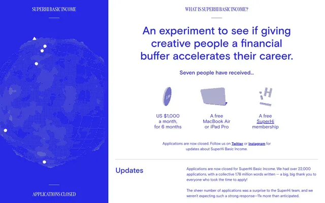
Bifurcated digital canvas
Color palette
Violet accent for outlined action borders, linked labels, and lightweight interactive emphasis
Supporting palette color for small decorative accents when the core palette needs contrast. Do not promote it to the primary CTA color
Page backgrounds, card surfaces, primary text for inverted sections
Typography
- Weights
- 400, 500, 700
- Sizes
- 13px, 14px, 16px, 21px, 24px, 32px, 48px
- Line height
- 1.14, 1.17, 1.25, 1.33, 1.46, 1.5, 1.67
- Fallback
- system-ui
Primary typeface for all body text, headings, and interactive elements. Its neutral yet confident character ensures readability across varied sizes and forms the backbone of the typographic hierarchy.
- Weights
- 400
- Sizes
- 21px, 24px
- Line height
- 1, 1.14
- Fallback
- Georgia, serif
Used sparingly for decorative headings and specific brand elements where a more distinctive, display-oriented serif is desired.
Spacing & shape
Components
Uses SuperHi Blue (#2727e6) for normal state, transitioning to Hover Sky (#9de6fa) on hover, with `text-decoration: underline;`.
A ghost button with a 50% border radius (for a perfect circle), 32px equal padding, and a 1px SuperHi Blue (#2727e6) border. Text color is also SuperHi Blue (#2727e6). Background is transparent.
A ghost button with a 16px border radius, 0px vertical padding and 4px horizontal padding, and a 1px SuperHi Blue (#2727e6) border. Text color is SuperHi Blue (#2727e6). Background is transparent.
The active state implies a border or indicator in SuperHi Blue (#2727e6). Content uses Basis at 16px/1.46lh.
Empty state shows a 1px border in SuperHi Blue (#2727e6). Checked state fills implicitly with SuperHi Blue (#2727e6). Text uses Canvas White (#ffffff) when inverted on SuperHi Blue.
Guidelines
- Always apply vertical sections that divide the page into a 30%/70% column split, with the left column being full-bleed SuperHi Blue (#2727e6) and the right column Canvas White (#ffffff).
- Use Basis font for nearly all textual content, reserving DDC for highly decorative or branded headings.
- Ensure all interactive elements, including links and button borders, use SuperHi Blue (#2727e6) as their primary accent color.
- Implement `ease` timing functions for all transitions to maintain a unified, expressive motion personality.
- Apply 32px padding consistently for card-like elements or content sections.
- Leverage a 16px radius for all button components where a contained shape is needed, and 50px for pill-shaped elements.
- Prioritize single pixel borders in SuperHi Blue (#2727e6) to define interactive zones rather than heavy backgrounds.
- Do not introduce new chromatic colors outside of SuperHi Blue and its hover state; maintain the high-contrast blue/white aesthetic.
- Avoid using drop shadows or complex elevation states; rely on border treatments and color contrast for visual hierarchy.
- Do not use generic system fonts unless absolutely necessary; always prefer Basis and DDC.
- Refrain from using heavily filled buttons; ghost buttons with SuperHi Blue borders are the preferred interactive style.
- Do not deviate from the comfortable density with 8px element gaps and 32px section/card padding.
- Avoid decorative imagery; focus on typography and simple geometrical forms to convey information and brand identity.
About this system
ShowHide
SuperHi Basic Income uses a stark, high-contrast digital poster aesthetic. A dominant, vivid blue acts as both a brand identifier and functional element across an otherwise white canvas, creating a distinctive two-zone layout. Typography is compact and precise, maintaining a clear hierarchy without resorting to heavy weights. Component accents are minimal, often relying on border treatments or small details to signify interactivity, reinforcing a lightweight, almost ephemeral sense of interaction.
The page adheres to a two-zone, full-height vertical division: a full-bleed SuperHi Blue (#2727e6) left column (approx. 30% width) containing branding and key status, and a full-bleed Canvas White (#ffffff) right column (approx. 70% width) for all primary content. The hero section features a centered headline over the right content area. Content flow within the right column is primarily vertical stacking of text blocks, often with left-aligned headings and body text. Interactive elements like questions and checkboxes use simple list structures. There is no explicit grid for cards, but elements like benefit lists are presented as linear stacks. Navigation is minimal, integrated into the header and within content links.
The site's visual language is abstract and functional, dominated by a dynamic, dotted, wireframe-like globe rendering on the left panel, which serves as a decorative brand element rather than contextual content. No photography or complex illustrations are used. Icons are minimal, represented by simple geometric shapes like play triangles and list circles, rendered in SuperHi Blue. The overall density is text-dominant, with imagery taking a atmospheric, abstract role.
Reminiscent of Stripe, linear.app, Figma.
# SuperHi Basic Income — Style Reference
> Bifurcated digital canvas

**Theme:** light

**Site:** https://www.superhibasicincome.com

SuperHi Basic Income uses a stark, high-contrast digital poster aesthetic. A dominant, vivid blue acts as both a brand identifier and functional element across an otherwise white canvas, creating a distinctive two-zone layout. Typography is compact and precise, maintaining a clear hierarchy without resorting to heavy weights. Component accents are minimal, often relying on border treatments or small details to signify interactivity, reinforcing a lightweight, almost ephemeral sense of interaction.

## Tokens — Colors

| Name | Value | Token | Role |
|------|------|------|------|
| SuperHi Blue | `#2727e6` | `--color-superhi-blue` | Violet accent for outlined action borders, linked labels, and lightweight interactive emphasis |
| Hover Sky | `#9de6fa` | `--color-hover-sky` | Supporting palette color for small decorative accents when the core palette needs contrast. Do not promote it to the primary CTA color |
| Canvas White | `#ffffff` | `--color-canvas-white` | Page backgrounds, card surfaces, primary text for inverted sections |

## Tokens — Typography

### Basis
- **Substitute:** system-ui
- **Weights:** 400, 500, 700
- **Sizes:** 13px, 14px, 16px, 21px, 24px, 32px, 48px
- **Line height:** 1.14, 1.17, 1.25, 1.33, 1.46, 1.5, 1.67
- **Role:** Primary typeface for all body text, headings, and interactive elements. Its neutral yet confident character ensures readability across varied sizes and forms the backbone of the typographic hierarchy.

### DDC
- **Substitute:** Georgia, serif
- **Weights:** 400
- **Sizes:** 21px, 24px
- **Line height:** 1, 1.14
- **Role:** Used sparingly for decorative headings and specific brand elements where a more distinctive, display-oriented serif is desired.

## Tokens — Type Scale

| Role | Size | Line height | Letter spacing |
|------|------|------|------|
| caption | 13px | 1.67 | — |
| body | 16px | 1.46 | — |
| subheading | 21px | 1.33 | — |
| heading | 24px | 1.25 | — |
| heading-lg | 32px | 1.17 | — |
| display | 48px | 1.14 | — |

## Tokens — Spacing

- **Section gap:** 32px
- **Card padding:** 32px
- **Element gap:** 8px

## Tokens — Radius

- **Buttons:** 16px
- **tags:** 50px

## Layout

The page adheres to a two-zone, full-height vertical division: a full-bleed SuperHi Blue (#2727e6) left column (approx. 30% width) containing branding and key status, and a full-bleed Canvas White (#ffffff) right column (approx. 70% width) for all primary content. The hero section features a centered headline over the right content area. Content flow within the right column is primarily vertical stacking of text blocks, often with left-aligned headings and body text. Interactive elements like questions and checkboxes use simple list structures. There is no explicit grid for cards, but elements like benefit lists are presented as linear stacks. Navigation is minimal, integrated into the header and within content links.

## Imagery

The site's visual language is abstract and functional, dominated by a dynamic, dotted, wireframe-like globe rendering on the left panel, which serves as a decorative brand element rather than contextual content. No photography or complex illustrations are used. Icons are minimal, represented by simple geometric shapes like play triangles and list circles, rendered in SuperHi Blue. The overall density is text-dominant, with imagery taking a atmospheric, abstract role.

## Components

### Text Link
*Inline navigation, references, and emphasized text.*

Uses SuperHi Blue (#2727e6) for normal state, transitioning to Hover Sky (#9de6fa) on hover, with `text-decoration: underline;`.

### Interactive Orb Button
*Primary call to action in a decorative, circular form.*

A ghost button with a 50% border radius (for a perfect circle), 32px equal padding, and a 1px SuperHi Blue (#2727e6) border. Text color is also SuperHi Blue (#2727e6). Background is transparent.

### Pill Button
*Secondary action or tag, often with text content.*

A ghost button with a 16px border radius, 0px vertical padding and 4px horizontal padding, and a 1px SuperHi Blue (#2727e6) border. Text color is SuperHi Blue (#2727e6). Background is transparent.

### FAQ Accordion Item
*Expandable content block for questions and answers.*

The active state implies a border or indicator in SuperHi Blue (#2727e6). Content uses Basis at 16px/1.46lh.

### Checkbox/Radio Button
*Interactive selections with a custom visual style.*

Empty state shows a 1px border in SuperHi Blue (#2727e6). Checked state fills implicitly with SuperHi Blue (#2727e6). Text uses Canvas White (#ffffff) when inverted on SuperHi Blue.

## Guidelines

### Do

- Always apply vertical sections that divide the page into a 30%/70% column split, with the left column being full-bleed SuperHi Blue (#2727e6) and the right column Canvas White (#ffffff).
- Use Basis font for nearly all textual content, reserving DDC for highly decorative or branded headings.
- Ensure all interactive elements, including links and button borders, use SuperHi Blue (#2727e6) as their primary accent color.
- Implement `ease` timing functions for all transitions to maintain a unified, expressive motion personality.
- Apply 32px padding consistently for card-like elements or content sections.
- Leverage a 16px radius for all button components where a contained shape is needed, and 50px for pill-shaped elements.
- Prioritize single pixel borders in SuperHi Blue (#2727e6) to define interactive zones rather than heavy backgrounds.

### Don't

- Do not introduce new chromatic colors outside of SuperHi Blue and its hover state; maintain the high-contrast blue/white aesthetic.
- Avoid using drop shadows or complex elevation states; rely on border treatments and color contrast for visual hierarchy.
- Do not use generic system fonts unless absolutely necessary; always prefer Basis and DDC.
- Refrain from using heavily filled buttons; ghost buttons with SuperHi Blue borders are the preferred interactive style.
- Do not deviate from the comfortable density with 8px element gaps and 32px section/card padding.
- Avoid decorative imagery; focus on typography and simple geometrical forms to convey information and brand identity.

## Agent Prompt Guide

Quick Color Reference:
text: #2727e6
background: #ffffff
border: #2727e6
accent: #2727e6
primary action: #2727e6 (outlined action border)

Example Component Prompts:
1. Create a primary headline for a new section: 'Unlock Your Potential' using Basis weight 400 at 48px, color SuperHi Blue (#2727e6), with a line height of 1.14.
2. Design an interactive link for navigation: 'Learn More' using Basis weight 400 at 16px, color SuperHi Blue (#2727e6), with `text-decoration: underline`. On hover, change color to Hover Sky (#9de6fa).
3. Generate a circular call-to-action button: with a SuperHi Blue (#2727e6) 1px border and SuperHi Blue (#2727e6) text 'Apply Now', 50% border-radius, and 32px padding on all sides.
4. Create a pill-shaped tag button: 'Application Status' with a SuperHi Blue (#2727e6) 1px border and SuperHi Blue (#2727e6) text, 16px border-radius, 0px vertical padding, and 4px horizontal padding.
More like this






Keep what you find
A free account saves references to boards and can send you a weekly email of picks based on what you save.
To see every result, go Pro.