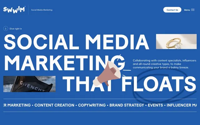
Preview image. Unlock full-res
Deep Ocean Canvas
Color palette
Primary brand color for backgrounds and prominent headings, indicating stability and clarity
Darker variant used for footer backgrounds, subtle textural elements, and deeper tonal contrast
Decorative fill for illustrations and graphical elements, adding visual interest
Subtler fill for decorative graphics, providing depth within brand blue hues
Default page background, primary text color on dark surfaces, and button fills for contrast
Hairline borders, subtle dividers, and inactive states, used for structural separation
Default text color on light backgrounds and for high-contrast icons
Decorative fill and stroke for accent graphics and illustrations
Typography
- Weights
- 400, 500, 700
- Sizes
- 14px, 16px, 18px, 20px, 24px, 30px
- Line height
- 1.2, 1.25, 1.33, 1.4, 1.43, 1.5, 1.56
- Fallback
- system-ui, 'Segoe UI', Roboto, Helvetica, Arial, sans-serif
Primary font for body text, links, and less prominent headings, providing clear readability and a modern aesthetic. Weights 400 and 500 maintain a professional yet approachable feel across UI elements.
- Weights
- 400
- Sizes
- 14px, 16px, 18px, 29px, 36px, 48px, 151px
- Line height
- 1, 1.11, 1.43, 1.5, 1.56
- Fallback
- Impact, 'Arial Black', sans-serif
Signature display font primarily for large, impactful headlines, conveying a bold and authoritative brand voice due to its condensed, blocky nature. Its use is reserved for maximum visual effect.
Spacing & shape
Components
Background: transparent (rgba(0, 0, 0, 0)). Text Color: Canvas White (#ffffff). Border: 1px solid Smoke Grey (#e5e7eb) with 9999px radius. Padding: 8px vertical, 16px horizontal.
Background: Canvas White (#ffffff). Text Color: Ocean Blue (#1658b3). Radius: 9999px. Padding: 8px vertical, 24px horizontal.
Background: transparent (rgba(0, 0, 0, 0)). Text Color: Canvas White (#ffffff). No border, no radius, no padding.
Font: Baton Turbo, weight 400. Font size varies greatly (e.g., 151px in hero). Color: Canvas White (#ffffff). Letter spacing: normal. Appears over Ocean Blue background.
Font: Greycliff, weight 400. Font size 16px. Line height: 1.5. Color: Canvas White (#ffffff) on dark backgrounds, Jet Black (#000000) on light backgrounds.
Font: Greycliff, weight 400. Text Color: Canvas White (#ffffff). No background, border, or radius. Padding: 0px.
Guidelines
- Use Ocean Blue (#1658b3) as the dominant background for hero sections and key informational blocks.
- Employ Baton Turbo font (weight 400) exclusively for large, impactful headlines, ensuring normal letter spacing.
- Style all primary action buttons with Canvas White (#ffffff) background, Ocean Blue (#1658b3) text, and a 9999px border-radius with 8px vertical and 24px horizontal padding.
- Utilize Smoke Grey (#e5e7eb) for subtle 1px borders on cards and dividers, creating clear structural separation without visual weight.
- Apply a 9999px border-radius to all buttons and tags to maintain a consistent soft, modern edge.
- Set default body text in Greycliff (weight 400, 16px) with Canvas White (#ffffff) on dark fields and Jet Black (#000000) on light fields.
- Do not use Baton Turbo for body text or subheadings; reserve it for large display typography only.
- Avoid using multiple accent colors; stick to the brand blue palette and neutrals for all UI elements.
- Do not introduce square corners on interactive elements; all buttons and small components should use the 9999px radius.
- Refrain from heavy drop shadows or complex elevation; maintain a generally flat and clean aesthetic with minimal border emphasis.
- Do not use dark text colors on Ocean Blue (#1658b3) backgrounds, always prioritize Canvas White (#ffffff) for readability.
- Avoid using gradients beyond decorative illustrations; UI surfaces should remain solid color fills.
About this system
ShowHide
Swwim projects a bold, impactful, and trustworthy brand image using a striking primary blue contrasted with crisp white typography. The design emphasizes clear hierarchy through large, confident sans-serif headlines and functional, rounded secondary elements. Its comfortable density allows content to breathe while maintaining a strong visual presence. Accents are primarily subtle and tonal, reinforcing the main brand blue.
The page uses a maximum-width contained layout at 1080px, with content centered. The hero section is full-bleed Ocean Blue (#1658b3) with a large, centered headline and secondary descriptive text, often featuring abstract illustrations or small, contrast-rich photographs. Sections primarily feature comfortable vertical spacing (around 24px) but can vary. Content arrangement favors a stacked approach, especially for headlines and body text, with occasional two-column layouts pairing text with imagery. Card grids are not prominently featured in the provided view. The navigation is a minimalist top bar with 'Contact Us' and 'Menu' buttons on the right, floating above the hero.
The imagery style is a mix of high-quality, muted photographs and blocky, abstract illustrations. Photographs, when present, appear as small, contained visual accents, often cropped tightly on products or context-setting elements (e.g., a hand, a flag) rather than expansive lifestyle shots. Illustrations use the brand's blue palette and parchment, featuring bold, geometric shapes and limited detail, serving a decorative atmosphere rather than explanatory content. Icons are minimal, outlined, and primarily monochromatic white on dark backgrounds or black on light backgrounds, maintaining a light stroke weight. The overall density is text-dominant, with imagery serving as visual punctuation or supporting accents.
Reminiscent of Social Chain, Wave.video, Buzzer, Hootsuite.
# Swwim — Style Reference
> Deep Ocean Canvas

**Theme:** light

**Site:** https://www.weswwim.com

Swwim projects a bold, impactful, and trustworthy brand image using a striking primary blue contrasted with crisp white typography. The design emphasizes clear hierarchy through large, confident sans-serif headlines and functional, rounded secondary elements. Its comfortable density allows content to breathe while maintaining a strong visual presence. Accents are primarily subtle and tonal, reinforcing the main brand blue.

## Tokens — Colors

| Name | Value | Token | Role |
|------|------|------|------|
| Ocean Blue | `#1658b3` | `--color-ocean-blue` | Primary brand color for backgrounds and prominent headings, indicating stability and clarity |
| Midnight Indigo | `#0d3c88` | `--color-midnight-indigo` | Darker variant used for footer backgrounds, subtle textural elements, and deeper tonal contrast |
| Sky Blue | `#015fee` | `--color-sky-blue` | Decorative fill for illustrations and graphical elements, adding visual interest |
| Horizon Blue | `#01295f` | `--color-horizon-blue` | Subtler fill for decorative graphics, providing depth within brand blue hues |
| Canvas White | `#ffffff` | `--color-canvas-white` | Default page background, primary text color on dark surfaces, and button fills for contrast |
| Smoke Grey | `#e5e7eb` | `--color-smoke-grey` | Hairline borders, subtle dividers, and inactive states, used for structural separation |
| Jet Black | `#000000` | `--color-jet-black` | Default text color on light backgrounds and for high-contrast icons |
| Parchment | `#eee1d9` | `--color-parchment` | Decorative fill and stroke for accent graphics and illustrations |

## Tokens — Typography

### Greycliff
- **Substitute:** system-ui, 'Segoe UI', Roboto, Helvetica, Arial, sans-serif
- **Weights:** 400, 500, 700
- **Sizes:** 14px, 16px, 18px, 20px, 24px, 30px
- **Line height:** 1.2, 1.25, 1.33, 1.4, 1.43, 1.5, 1.56
- **Role:** Primary font for body text, links, and less prominent headings, providing clear readability and a modern aesthetic. Weights 400 and 500 maintain a professional yet approachable feel across UI elements.

### Baton Turbo
- **Substitute:** Impact, 'Arial Black', sans-serif
- **Weights:** 400
- **Sizes:** 14px, 16px, 18px, 29px, 36px, 48px, 151px
- **Line height:** 1, 1.11, 1.43, 1.5, 1.56
- **Role:** Signature display font primarily for large, impactful headlines, conveying a bold and authoritative brand voice due to its condensed, blocky nature. Its use is reserved for maximum visual effect.

## Tokens — Type Scale

Perfect Fifth (1.5) from 16px base.

| Role | Size | Line height | Letter spacing |
|------|------|------|------|
| caption | 14px | 1.5 | — |
| body | 16px | 1.5 | — |
| subheading | 18px | 1.43 | — |
| heading-sm | 20px | 1.4 | — |
| heading | 24px | 1.33 | — |
| heading-lg | 30px | 1.25 | — |
| display | 151px | 1 | — |

## Tokens — Spacing

- **Max width:** 1080px
- **Section gap:** 24px
- **Card padding:** 24px
- **Element gap:** 4px

## Tokens — Radius

- **Buttons:** 9999px
- **Cards:** 0px
- **tags:** 9999px

## Layout

The page uses a maximum-width contained layout at 1080px, with content centered. The hero section is full-bleed Ocean Blue (#1658b3) with a large, centered headline and secondary descriptive text, often featuring abstract illustrations or small, contrast-rich photographs. Sections primarily feature comfortable vertical spacing (around 24px) but can vary. Content arrangement favors a stacked approach, especially for headlines and body text, with occasional two-column layouts pairing text with imagery. Card grids are not prominently featured in the provided view. The navigation is a minimalist top bar with 'Contact Us' and 'Menu' buttons on the right, floating above the hero.

## Imagery

The imagery style is a mix of high-quality, muted photographs and blocky, abstract illustrations. Photographs, when present, appear as small, contained visual accents, often cropped tightly on products or context-setting elements (e.g., a hand, a flag) rather than expansive lifestyle shots. Illustrations use the brand's blue palette and parchment, featuring bold, geometric shapes and limited detail, serving a decorative atmosphere rather than explanatory content. Icons are minimal, outlined, and primarily monochromatic white on dark backgrounds or black on light backgrounds, maintaining a light stroke weight. The overall density is text-dominant, with imagery serving as visual punctuation or supporting accents.

## Components

### Outline Ghost Button
*Interactive element for secondary actions.*

Background: transparent (rgba(0, 0, 0, 0)). Text Color: Canvas White (#ffffff). Border: 1px solid Smoke Grey (#e5e7eb) with 9999px radius. Padding: 8px vertical, 16px horizontal.

### Solid White Button
*Primary Call to Action.*

Background: Canvas White (#ffffff). Text Color: Ocean Blue (#1658b3). Radius: 9999px. Padding: 8px vertical, 24px horizontal.

### Text Link Button
*Minor interactive elements and navigation links.*

Background: transparent (rgba(0, 0, 0, 0)). Text Color: Canvas White (#ffffff). No border, no radius, no padding.

### Hero Headline
*Primary visual communication on section headers.*

Font: Baton Turbo, weight 400. Font size varies greatly (e.g., 151px in hero). Color: Canvas White (#ffffff). Letter spacing: normal. Appears over Ocean Blue background.

### Body Text
*Standard conveying informational detail.*

Font: Greycliff, weight 400. Font size 16px. Line height: 1.5. Color: Canvas White (#ffffff) on dark backgrounds, Jet Black (#000000) on light backgrounds.

### Navigation Item
*Interactive element for site navigation.*

Font: Greycliff, weight 400. Text Color: Canvas White (#ffffff). No background, border, or radius. Padding: 0px.

## Guidelines

### Do

- Use Ocean Blue (#1658b3) as the dominant background for hero sections and key informational blocks.
- Employ Baton Turbo font (weight 400) exclusively for large, impactful headlines, ensuring normal letter spacing.
- Style all primary action buttons with Canvas White (#ffffff) background, Ocean Blue (#1658b3) text, and a 9999px border-radius with 8px vertical and 24px horizontal padding.
- Utilize Smoke Grey (#e5e7eb) for subtle 1px borders on cards and dividers, creating clear structural separation without visual weight.
- Apply a 9999px border-radius to all buttons and tags to maintain a consistent soft, modern edge.
- Set default body text in Greycliff (weight 400, 16px) with Canvas White (#ffffff) on dark fields and Jet Black (#000000) on light fields.

### Don't

- Do not use Baton Turbo for body text or subheadings; reserve it for large display typography only.
- Avoid using multiple accent colors; stick to the brand blue palette and neutrals for all UI elements.
- Do not introduce square corners on interactive elements; all buttons and small components should use the 9999px radius.
- Refrain from heavy drop shadows or complex elevation; maintain a generally flat and clean aesthetic with minimal border emphasis.
- Do not use dark text colors on Ocean Blue (#1658b3) backgrounds, always prioritize Canvas White (#ffffff) for readability.
- Avoid using gradients beyond decorative illustrations; UI surfaces should remain solid color fills.

## Agent Prompt Guide

Quick Color Reference:
text: #ffffff (on dark), #000000 (on light)
Create an Outlined Primary Action: Transparent background, #1658b3 border and text, 9999px radius, compact pill padding. Use it for the main CTA instead of a filled button.
border: #e5e7eb
accent: #0d3c88
primary action: #1658b3 (outlined action border)

Example Component Prompts:
1. Create a hero banner with an Ocean Blue (#1658b3) background. The main headline should be 'SOCIAL MEDIA MARKETING THAT FLOATS' using Baton Turbo 151px, weight 400, color Canvas White (#ffffff). Include a body text below it, 'Collaborating with content specialists, influencers and all-round creative types...' in Greycliff 16px, weight 400, color Canvas White (#ffffff).
3. Create a navigation item: text 'Services' using Greycliff 16px, weight 400, color Canvas White (#ffffff), no background, no padding.
4. Design a ghost button: Outline Ghost Button (transparent background, #ffffff text, 1px solid #e5e7eb border, 9999px radius, 8px vertical 16px horizontal padding) with the text 'Dive right in'.
More like this








Keep what you find
A free account saves references to boards and can send you a weekly email of picks based on what you save.
To see every result, go Pro.