Preview image. Unlock full-res
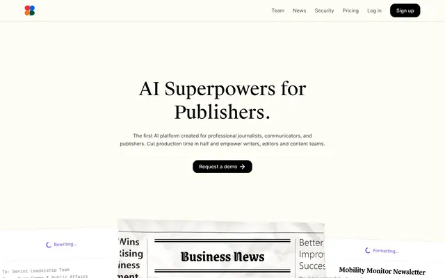
Paper-white canvas, ink-on-page UI.
Color palette
Distinctive brand accent for specific card backgrounds and decorative highlight elements, drawing attention with urgency
Violet outline accent for tags, dividers, and focused UI edges
Decorative details and occasional background fills for specific UI components, offering a cool contrast to the warm neutrals
Page background — a warm, off-white tone that mimics natural paper
Card backgrounds, secondary surfaces, and embedded UI elements, offering a lighter contrast against the main canvas
Primary text, headings, icons, and filled button backgrounds, providing strong legibility against light surfaces
Subtle text like helper text, link underlines, and secondary borders, creating softer contrast
Muted details, tertiary text, and placeholder states
Subtle box shadows and outlined card borders, evoking a soft, tactile presence
Typography
- Weights
- 400
- Sizes
- 12px
- Line height
- 1.2
- Fallback
- system-ui
Default system font for basic UI elements and small text where a custom font is not explicitly defined, ensuring broad compatibility.
- Weights
- 400, 500, 600, 700, 900
- Sizes
- 12px, 14px, 16px
- Line height
- 1.5, 1.6, 1.63, 1.71
- Fallback
- Inter
Body text and supporting information. Its readability and classic appearance ground the informational aspects of the interface.
- Fallback
- Inter SemiBold
Subheadings and section titles that require a subtle emphasis without overpowering the content.
- Weights
- 450
- Sizes
- 28px, 36px, 58px
- Line height
- 1.31, 1.5
- Fallback
- Lora
Primary headings, capturing attention with a distinctive, slightly condensed style. The medium weight provides refinement.
- Weights
- 400, 600, 700
- Sizes
- 14px
- Line height
- 1.71
- Fallback
- IBM Plex Mono
Monospaced text for code blocks, data displays, or distinct informational labels, signaling technical content.
- Weights
- 500, 700
- Sizes
- 20px
- Line height
- 1.3
- Fallback
- Lora Medium
Section headlines, providing a strong but elegant presence, maintaining hierarchy below the main display headings.
- Weights
- 400, 700
- Sizes
- 48px
- Line height
- 1
- Fallback
- Josefin Sans
Display text for impactful, large-scale typography, suggesting a crafted, editorial feel.
- Weights
- 700
- Sizes
- 14px
- Line height
- 1.71
Inter — detected in extracted data but not described by AI
Spacing & shape
Components
Rounded shape at 2000px radius, transparent background, with text color #000000 and 8px padding around content.
Filled with #000000, text color #0000ee (browser default link color for buttons detected), with a 16px border-radius and 8px 20px padding.
White background #ffffff, 24px border-radius, with a soft shadow rgba(213, 208, 184, 0.4) 0px 2px 6px 0px, and 20px padding.
Background rgba(213, 208, 184, 0.1), 8px border-radius, with a faint border shadow rgba(213, 208, 184, 0.3) 0px 0px 0px 1px. No internal padding.
Background in Accent Red #f42c2b, with a highly rounded left edge at 11429px, sharp right edge, and no shadow or padding.
White background #ffffff, organic/irregular border-radius (6.86% / 15.38% from raw data), soft shadow rgba(213, 208, 184, 0.4) 0px 2px 6px 0px, content padded 20px 20px 24px 20px.
Guidelines
- Use Canvas Parchment #fdfcf5 as the dominant background color for most page sections, simulating a textured paper feel.
- Apply Ink Black #000000 for all primary text and headings, maintaining high contrast and legibility.
- For interactive elements, default to Pill Button, Outlined, or Filled Button, Subtle Corners, reserving Accent Red #f42c2b for impactful, specific calls to attention.
- Ensure all cards use soft, subtle shadows with Faded Stone #d5d0b8 as the primary shadow color, creating a floating-paper effect.
- Maintain a clear hierarchy in headings using Suisse Works Book for display and main headings, and Open Runde for subheadings and body text.
- Utilize Geist Mono for any code snippets or technical representations to visually segment developer-oriented content.
- Apply 24px border-radius to main content cards and 16px for buttons, contributing to the soft, friendly aesthetic.
- Avoid using harsh, strong shadows; rely instead on the subtle Faded Stone #d5d0b8 variants.
- Do not introduce new saturated primary colors; limit the use of vivid hues to Accent Red #f42c2b and Electric Violet #6938ef for specific functional highlights.
- Do not use system default blue text for links or buttons unless it's a specific button type that is already using it as its text color (as is the case with some button variants observed); instead, use Ink Black #000000 or Charcoal Grey #4c4c4a.
- Do not use sharp, right-angled corners for interactive elements or primary content containers; maintain the soft, rounded aesthetic.
- Avoid overly dense layouts; leverage the sectionGap of '40px' and cardPadding of '20px' to provide ample whitespace.
- Do not use dark backgrounds for main content sections; the system is designed for a light theme with paper-like surfaces.
- Do not deviate from the specified font families; their unique characteristics are central to the brand's typographic identity.
About this system
ShowHide
Symbolic.ai presents a minimalist canvas, emphasizing content clarity through high contrast typography and subtle, paper-like surface treatments. The primary visual distinction comes from the interplay of a warm off-white background with crisp dark text, occasionally punctuated by a single vibrant red accent. Components echo this ethos with soft, organic shapes and understated shadows, simulating physical objects resting on a textured page. The overall impression is one of calm, focused utility with a hint of analog charm.
The page primarily uses a full-bleed layout for the overall background, with core content constrained to a max-width container, though the explicit pageMaxWidth cannot be confidently determined from the data. The hero section features a centered headline over the Canvas Parchment background. Section rhythm is dictated by consistent vertical spacing of 40px, with alternating background textures and card treatments rather than stark color blocks. Content arrangement often appears as centered stacks or grid-based displays (implied by card variants), showcasing product UI within overlaid card components. Navigation is a simple top bar with text links and a 'Sign up' button, sticky at the top.
The visual language predominantly features abstract, paper-like product screenshots and UI snippets, often layered and appearing to peel or fold, creating a tactile, analog feel. Icons are typically outlined or simple filled shapes, in monochrome or a single accent color like Electric Violet and Subtle Teal, maintaining a clean, functional aesthetic. Imagery serves primarily to explain product functionality and illustrate processes rather than decorative atmosphere, often showing text content within the simulated paper environment. Density is text-dominant, with visuals supporting and enriching the information.
Reminiscent of Notion, Substack, Linear, Readwise Reader.
# Symbolic.ai — Style Reference
> Paper-white canvas, ink-on-page UI.

**Theme:** light

**Site:** https://symbolic.ai

Symbolic.ai presents a minimalist canvas, emphasizing content clarity through high contrast typography and subtle, paper-like surface treatments. The primary visual distinction comes from the interplay of a warm off-white background with crisp dark text, occasionally punctuated by a single vibrant red accent. Components echo this ethos with soft, organic shapes and understated shadows, simulating physical objects resting on a textured page. The overall impression is one of calm, focused utility with a hint of analog charm.

## Tokens — Colors

| Name | Value | Token | Role |
|------|------|------|------|
| Accent Red | `#f42c2b` | `--color-accent-red` | Distinctive brand accent for specific card backgrounds and decorative highlight elements, drawing attention with urgency |
| Electric Violet | `#6938ef` | `--color-electric-violet` | Violet outline accent for tags, dividers, and focused UI edges |
| Subtle Teal | `#10756a` | `--color-subtle-teal` | Decorative details and occasional background fills for specific UI components, offering a cool contrast to the warm neutrals |
| Canvas Parchment | `#fdfcf5` | `--color-canvas-parchment` | Page background — a warm, off-white tone that mimics natural paper |
| Paper White | `#ffffff` | `--color-paper-white` | Card backgrounds, secondary surfaces, and embedded UI elements, offering a lighter contrast against the main canvas |
| Ink Black | `#000000` | `--color-ink-black` | Primary text, headings, icons, and filled button backgrounds, providing strong legibility against light surfaces |
| Charcoal Grey | `#4c4c4a` | `--color-charcoal-grey` | Subtle text like helper text, link underlines, and secondary borders, creating softer contrast |
| Mid Grey | `#7f7e7b` | `--color-mid-grey` | Muted details, tertiary text, and placeholder states |
| Faded Stone | `#d5d0b8` | `--color-faded-stone` | Subtle box shadows and outlined card borders, evoking a soft, tactile presence |

## Tokens — Typography

### sans-serif
- **Substitute:** system-ui
- **Weights:** 400
- **Sizes:** 12px
- **Line height:** 1.2
- **Role:** Default system font for basic UI elements and small text where a custom font is not explicitly defined, ensuring broad compatibility.

### Open Runde
- **Substitute:** Inter
- **Weights:** 400, 500, 600, 700, 900
- **Sizes:** 12px, 14px, 16px
- **Line height:** 1.5, 1.6, 1.63, 1.71
- **Role:** Body text and supporting information. Its readability and classic appearance ground the informational aspects of the interface.

### Open Runde
- **Substitute:** Inter SemiBold
- **Role:** Subheadings and section titles that require a subtle emphasis without overpowering the content.

### Suisse Works Book
- **Substitute:** Lora
- **Weights:** 450
- **Sizes:** 28px, 36px, 58px
- **Line height:** 1.31, 1.5
- **Role:** Primary headings, capturing attention with a distinctive, slightly condensed style. The medium weight provides refinement.

### Geist Mono
- **Substitute:** IBM Plex Mono
- **Weights:** 400, 600, 700
- **Sizes:** 14px
- **Line height:** 1.71
- **Role:** Monospaced text for code blocks, data displays, or distinct informational labels, signaling technical content.

### Suisse Works Medium
- **Substitute:** Lora Medium
- **Weights:** 500, 700
- **Sizes:** 20px
- **Line height:** 1.3
- **Role:** Section headlines, providing a strong but elegant presence, maintaining hierarchy below the main display headings.

### Grenze Gotisch
- **Substitute:** Josefin Sans
- **Weights:** 400, 700
- **Sizes:** 48px
- **Line height:** 1
- **Role:** Display text for impactful, large-scale typography, suggesting a crafted, editorial feel.

### Inter
- **Weights:** 700
- **Sizes:** 14px
- **Line height:** 1.71
- **Role:** Inter — detected in extracted data but not described by AI

## Tokens — Type Scale

| Role | Size | Line height | Letter spacing |
|------|------|------|------|
| caption | 12px | 1.63 | — |
| body-sm | 14px | 1.63 | — |
| body | 16px | 1.63 | — |

## Tokens — Spacing

- **Section gap:** 40px
- **Card padding:** 20px
- **Element gap:** 10px

## Tokens — Radius

- **Buttons:** 16px
- **Cards:** 24px
- **icons:** 8px
- **pill:** 2000px
- **tags:** 13px

## Layout

The page primarily uses a full-bleed layout for the overall background, with core content constrained to a max-width container, though the explicit pageMaxWidth cannot be confidently determined from the data. The hero section features a centered headline over the Canvas Parchment background. Section rhythm is dictated by consistent vertical spacing of 40px, with alternating background textures and card treatments rather than stark color blocks. Content arrangement often appears as centered stacks or grid-based displays (implied by card variants), showcasing product UI within overlaid card components. Navigation is a simple top bar with text links and a 'Sign up' button, sticky at the top.

## Imagery

The visual language predominantly features abstract, paper-like product screenshots and UI snippets, often layered and appearing to peel or fold, creating a tactile, analog feel. Icons are typically outlined or simple filled shapes, in monochrome or a single accent color like Electric Violet and Subtle Teal, maintaining a clean, functional aesthetic. Imagery serves primarily to explain product functionality and illustrate processes rather than decorative atmosphere, often showing text content within the simulated paper environment. Density is text-dominant, with visuals supporting and enriching the information.

## Components

### Pill Button, Outlined
*Ghost buttons for secondary actions or navigation.*

Rounded shape at 2000px radius, transparent background, with text color #000000 and 8px padding around content.

### Filled Button, Subtle Corners
*Primary Call-to-actions, signaling key user interactions.*

Filled with #000000, text color #0000ee (browser default link color for buttons detected), with a 16px border-radius and 8px 20px padding.

### Elevated Card
*Content containers for features, articles, or testimonials.*

White background #ffffff, 24px border-radius, with a soft shadow rgba(213, 208, 184, 0.4) 0px 2px 6px 0px, and 20px padding.

### Subtle Border Card
*Informational panels or meta-content displays with low prominence.*

Background rgba(213, 208, 184, 0.1), 8px border-radius, with a faint border shadow rgba(213, 208, 184, 0.3) 0px 0px 0px 1px. No internal padding.

### Accent Red Card
*Highlight cards for urgent messages or prominent features.*

Background in Accent Red #f42c2b, with a highly rounded left edge at 11429px, sharp right edge, and no shadow or padding.

### Image Card
*Cards designed to feature images or visual content predominantly.*

White background #ffffff, organic/irregular border-radius (6.86% / 15.38% from raw data), soft shadow rgba(213, 208, 184, 0.4) 0px 2px 6px 0px, content padded 20px 20px 24px 20px.

## Guidelines

### Do

- Use Canvas Parchment #fdfcf5 as the dominant background color for most page sections, simulating a textured paper feel.
- Apply Ink Black #000000 for all primary text and headings, maintaining high contrast and legibility.
- For interactive elements, default to Pill Button, Outlined, or Filled Button, Subtle Corners, reserving Accent Red #f42c2b for impactful, specific calls to attention.
- Ensure all cards use soft, subtle shadows with Faded Stone #d5d0b8 as the primary shadow color, creating a floating-paper effect.
- Maintain a clear hierarchy in headings using Suisse Works Book for display and main headings, and Open Runde for subheadings and body text.
- Utilize Geist Mono for any code snippets or technical representations to visually segment developer-oriented content.
- Apply 24px border-radius to main content cards and 16px for buttons, contributing to the soft, friendly aesthetic.

### Don't

- Avoid using harsh, strong shadows; rely instead on the subtle Faded Stone #d5d0b8 variants.
- Do not introduce new saturated primary colors; limit the use of vivid hues to Accent Red #f42c2b and Electric Violet #6938ef for specific functional highlights.
- Do not use system default blue text for links or buttons unless it's a specific button type that is already using it as its text color (as is the case with some button variants observed); instead, use Ink Black #000000 or Charcoal Grey #4c4c4a.
- Do not use sharp, right-angled corners for interactive elements or primary content containers; maintain the soft, rounded aesthetic.
- Avoid overly dense layouts; leverage the sectionGap of '40px' and cardPadding of '20px' to provide ample whitespace.
- Do not use dark backgrounds for main content sections; the system is designed for a light theme with paper-like surfaces.
- Do not deviate from the specified font families; their unique characteristics are central to the brand's typographic identity.

## Agent Prompt Guide

Quick Color Reference:
text: #000000
background: #fdfcf5
border: #d5d0b8
accent: #f42c2b
primary action: #000000 (filled action)

Example Component Prompts:
1. Create a Hero Section: background Canvas Parchment #fdfcf5. Headline 'AI Superpowers for Publishers.' using Suisse Works Book weight 450, 58px, #000000. Subtext 'The first AI platform created for professional journalists.' using Open Runde weight 400, 16px, #000000. Below, a Filled Button, Subtle Corners labeled 'Request a demo →'.
2. Create an Elevated Feature Card: background Paper White #ffffff, 24px border-radius, shadow rgba(213, 208, 184, 0.4) 0px 2px 6px 0px, 20px padding. Inside, 'Business News' as Suisse Works Medium weight 500, 20px, #000000, and body text as Open Runde weight 400, 14px, #000000.
3. Create a Progress Indicator: A small element showing 'Generating...' using Open Runde weight 400, 14px, Electric Violet #6938ef. Place it on a Subtle Border Card with background rgba(213, 208, 184, 0.1), 8px border-radius, and border shadow rgba(213, 208, 184, 0.3) 0px 0px 0px 1px.
4. Create a Navigation Bar: Canvas Parchment #fdfcf5 background. Left aligned logo (replace with placeholder). Right-aligned text links 'Team', 'News', 'Security', 'Pricing', 'Log in' using Open Runde weight 400, 14px, #000000. End with a Filled Button, Subtle Corners for 'Sign up'.
5. Create an Accent Highlight Card: Accent Red #f42c2b background, 11429px 0px 0px 11429px border-radius. No padding or shadow.
More like this






Keep what you find
A free account saves references to boards and can send you a weekly email of picks based on what you save.
To see every result, go Pro.