Preview image. Unlock full-res
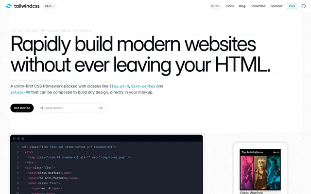
Type specimen as product demo — a typographer's proof sheet where the headline IS the interface, bold black at 96px demanding attention through size alone.
Tailwind CSS's homepage feels like a live code editor bleeding into a marketing page — black type hammered at near-display scale, monospace code fragments interrupting prose, and a white canvas that never apologizes for its blankness. The near-black #030712 dominates everything: headings, body copy, borders, and buttons all collapse toward the same ink-black anchor, creating a stark tonal discipline rarely seen on developer tools sites that usually reach for blue. The signature move is scale contrast: 96px Inter at weight 700 next to 14px monospace code, the size gulf doing all the visual work that color usually handles. Accent colors (sky blue #00a6f4, hot pink #e60076) appear exclusively inside inline code snippets as syntax highlights, never as UI chrome — they're content, not decoration. The color palette swatch section generates a systematic rainbow of every Tailwind hue, but the actual UI uses only ink-black, white, and near-grays.
Use Inter with font-feature-settings: '"cv02", "cv03", "cv04", "cv11"' at all sizes — these alternates are non-negotiable for Tailwind's typographic identity.
Apply -0.05em letter-spacing globally on Inter text; at 96px this compresses to ~-4.8px, giving display text the tightly-set newspaper feel visible in the hero.
Use the inset 1px ring shadow (oklab(0.129999 -0.00404751 -0.027702 / 0.1) 0px 0px 0px 1px inset) instead of CSS borders on cards — this prevents layout shift and matches the exact surface treatment used throughout.
Reserve 32px pill-radius buttons exclusively for primary CTAs; use 4px radius for all secondary tags, version badges, and code labels.
Render inline code references with IBM Plex Mono at +0.1em letter-spacing and features '"ss02", "zero"' — the wide tracking visually separates code tokens from surrounding prose at a glance.
Use syntax colors (#00a6f4, #e60076, #96f7e4) ONLY inside code blocks and inline code references — never as UI chrome, button colors, or decorative fills.
Place section eyebrow labels in all-caps Inter 600 at 12px in Syntax Sky (#00a6f4) — this is the only recurring non-black UI element on the marketing page.
Don't use any background color other than #ffffff or #030712-family darks for page sections — the entire marketing site alternates between pure white and near-black; any mid-gray background breaks the tonal discipline.
Don't use rounded corners larger than 8px on cards or content containers — only pill buttons (32px) and version badges (16px) use high-radius; cards stay at 8px.
Don't apply accent colors (sky blue, hot pink, mint) to navigation items, headings, or UI buttons — they belong exclusively in code syntax contexts.
Don't use IBM Plex Mono for anything except code blocks and inline code badges — no headings, nav items, or body copy should appear in monospace.
Don't add drop shadows to sponsor logos or section-level card grids — the inset ring shadow is the only depth signal; external shadows are reserved for elevated overlay cards only.
Don't set heading weights below 700 at display sizes — the hero's authority comes entirely from weight-plus-scale, not color or decoration.
Don't introduce gradients into UI chrome — the extensive gradient color data represents the Tailwind color palette documentation swatch system, not page decoration.