Preview image. Unlock full-res
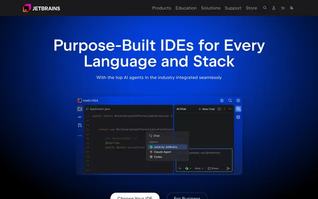
Neon nebula on obsidian — a black-ground page where violet-blue gradients bloom upward like deep-space imagery, punctuated by hot-pink neon and per-product chromatic icon light.
Color palette
Primary link color, info badges, active state highlights — the most-used chromatic color site-wide, giving the dark UI its cool electric temperature
Button borders, badge backgrounds, primary CTA outlines — the core violet brand hue from the JetBrains logo
Badge fills, body accent — slightly darker violet variant for surfaces needing more saturation
Heading accent color, primary dark-theme color token (--rs-color-primary-dark-theme)
CTA button background — deep space purple that pairs with Electric Blue (#18a3fa) text for a neon-on-void feel
Category labels ('For businesses', 'For developers'), brand highlight moments — the signature hot-pink neon that fires sparingly against black like a neon sign (--main-page-pink)
Gradient start color for violet nebula gradient, card border accents
Hero gradient bloom origin
Section accent headings, icon fills, gradient stop — teal-to-blue gradient used on feature callouts
Radial glow behind hero content — the deep blue spotlight effect that dominates the first viewport
Page background — the absolute black base all gradients and glows emerge from
Nav bar background, footer, elevated surface one step above absolute black
Most-used color on site; borders, dividers, muted icon strokes, body text secondary contexts
Subtle borders, inactive state outlines
Card borders, inactive dividers
Tertiary icons, ghost button labels, disabled states
Body text on dark backgrounds, list items, secondary link labels
Primary headings, button labels on dark, high-emphasis body text
Error states, destructive actions (--rs-color-danger)
Success states (--rs-color-success)
Warning states (--rs-color-warning)
Typography
- Weights
- 300, 400, 500, 600
- Sizes
- 13px, 16px, 20px, 29px, 35px, 43px, 72px, 79px
- Line height
- 0.9, 1.5
- Letter spacing
- -0.40px at large sizes (72-79px, -0.005em), -0.08px at mid sizes (29-43px, -0.001em), +0.032px at small sizes (16px, +0.002em), +0.065px at 13px (+0.005em)
- Fallback
- Inter, Plus Jakarta Sans
The single typeface for the entire site at all sizes and weights. 600 at 72-79px for hero headlines — unusual that even at this weight the custom letterSpacing tightening (-0.005em to -0.001em) keeps the large type dense and technical rather than editorial. Weight 300 appears at mid-sizes giving subheadings a lighter counterpoint to bold display text. JetBrains Sans is custom-designed — it carries optical metrics tuned for code-adjacent contexts, slightly wider than Inter at body sizes, with liga/calt features active that echo the IDE typographic environment.
Spacing & shape
Components
White fill (#ffffff), #19191c text, 26px border-radius (pill), 12px top/bottom padding, 32px left/right padding. JetBrains Sans 16px weight 500. Used for 'Choose Your IDE' — solid white stands out starkly against the dark gradient hero.
Background #2e106a (Deep Violet), text #18a3fa (Electric Blue), border #7b61ff (Violet Pulse) 1px, 16px border-radius, 24px padding all sides. The neon-blue text on deep-violet background creates an illuminated button that reads like an active screen element inside the IDE itself.
Background transparent, #ffffff text, 1px #ffffff border, 20px border-radius, 8px padding all sides. Used in nav contexts and as paired secondary to primary CTAs.
Background transparent, #ffffff text, no border (0px radius, 0px top/bottom padding, 10px left/right padding). Pure text with horizontal padding only — becomes a tab-style navigation element.
Background transparent with 1px border #5a1fd0 (Magenta Glow / vivid violet), 24px radius, internal padding 24-64px. Contains product name at 29-35px weight 600, body at 16px #bababb, IDE icon grid at 32px, and a 3D/abstract gradient visual asset on the right half. The violet border glows against black.
Background linear-gradient(130deg, rgb(90,31,208) 10%, rgba(46,16,106,0) 70%) overlaid with organic blob shapes in deep red/purple, 24px radius, 64px padding. White headlines at 35-43px weight 600, #bababb body at 16px, white ghost pill button (26px radius, 32px horizontal padding). The gradient gives the impression of colored light bleeding from within.
Background rgba(243,17,180,0.2) (20% opacity Neon Pink), 24px radius, 23px padding. The translucent magenta tint reads as a glowing selection highlight against the dark ground.
Background #6b57ff (Iris), #ffffff text, 4px radius, 1px top/bottom padding, 7px left/right padding, JetBrains Sans 13px weight 500. Sharp-cornered relative to other components — badges are the most rectangular element in the system.
Background rgba(107,87,255,0.5) (50% opacity Violet Pulse), #ffffff text, border-radius 6px 6px 0px 0px (top-rounded only), 5px top/bottom padding, 11px left/right padding. The flat bottom connects visually to the card it labels.
32px square icons with each IDE's distinct multicolor gradient fill (no single token — each product has unique chromatic identity: IntelliJ IDEA uses orange/red/purple, PyCharm uses green/yellow, DataGrip uses teal/dark). Displayed on 16px radius containers. These are the primary chromatic diversity element of the system — the only place vivid orange (#ff8100), vivid green (#00d886), vivid yellow (#f0eb18) appear.
Full-width, 72px height, background #19191c (Deep Charcoal). JetBrains logo mark (multicolor cube icon) + 'JETBRAINS' wordmark in #ffffff weight 500 at 16px, left-aligned. Nav items (#ffffff, no border, 10px horizontal padding) centered. Utility icons (search, account, cart, language) right-aligned in #a3a3a4 at 20px. No border-bottom — the header floats above the hero gradient.
Left/right arrow buttons with transparent background, 1px #474749 border, 20px radius, 8px padding. Counter text '1 / 2' in #bababb at 16px between arrows. Sits below card carousels, horizontally centered.
Horizontal pill-group container with transparent background, each segment as a ghost button (20px radius). Active segment uses 1px #7b61ff border, #ffffff text. Inactive segments have no border, #bababb text. The group appears as a floating pill selector centered in the content area.
Guidelines
- Use #000000 as the absolute page background — never a near-black like #0a0a0a or #111; the true black is what makes the gradient glows feel luminous
- Apply the radial blue glow (rgba(0,71,253,0.8) → transparent) behind hero content at ~87% width spread, centered on the content, so text appears spotlit from behind
- Use Neon Pink (#f31199) only for category labels and brand punctuation — 1-3 instances per page maximum; it reads as a signal color, not a fill color
- Set all card and feature panel border-radius to 24px; use 4px only for badges, never mix these on the same component
- Use translucent fills for card backgrounds: rgba(90,31,208,0.3) for violet-tinted cards, rgba(243,17,180,0.2) for pink-tinted cards — never opaque colored fills
- Apply JetBrains Sans with fontFeatureSettings '"calt", "kern", "liga"' active at all sizes, and apply negative letter-spacing (-0.005em) at display sizes 43px and above
- Give each JetBrains product its own distinct multicolor icon — the chromatic icon grid is the primary visual diversity mechanism; do not apply a single brand color to all icons
- Do not use #18a3fa (Electric Blue) as a fill color for buttons or large surfaces — it is a text/border/link color only; as a fill it would overpower the dark palette
- Do not add box-shadows to cards — elevation is expressed through gradient fills and translucent backgrounds, never drop shadows
- Do not use border-radius below 16px on interactive elements (buttons, cards); sharp-cornered shapes are reserved exclusively for badges (4-6px)
- Do not place white text directly on the pure black background without a gradient zone or translucent card beneath for longer body text — use #bababb for body on raw black
- Do not use Neon Pink (#f31199) as a background fill for large areas — its opacity 0.2 translucent form (rgba(243,17,180,0.2)) is the maximum surface application
- Do not add a visible border-bottom to the navigation bar — the #19191c header transitions into the hero gradient without a line
- Do not apply uniform icon color — product icons must retain their individual per-product chromatic gradient identity; monochromatic treatment breaks the identity system
About this system
ShowHide
JetBrains' site feels like the interior of a deep-space control room — pure black (#000000) ground plane with electric violet-to-blue gradients erupting from the darkness like bioluminescent nebulae. The defining moves are the chromatic product icon ecosystem (each IDE gets a vivid multicolor badge) floating against near-black surfaces, and the blue radial glow (rgba(0,71,253,0.8) at 75% opacity) diffused behind hero content like a spotlight on a dark stage. Headlines at 72-79px use JetBrains Sans weight 600 with tight letter-spacing, while the hot-pink accent (#f31199, CSS var --main-page-pink) fires only on category labels and brand moments — a neon sign in a dark corridor. Cards use 24px radius with translucent violet or pink fills (rgba(90,31,208,0.3), rgba(243,17,180,0.2)) that glow rather than separate.
Full-bleed dark canvas with a max-width content container of ~1280px centered. Hero is full-viewport with centered headline text over a radial blue glow, with an IDE screenshot mockup below the fold. Section rhythm moves from the blue-glow hero → card carousel section (full-bleed black) → audience segmentation tabs with gradient feature panels → product grid sections. No alternating light/dark bands — the entire page stays on the dark black ground, with section separation achieved via gradient card backgrounds and spacing (80-120px between sections) rather than background color changes. The 'For businesses' section temporarily shifts to a near-black #19191c ground for contrast. Card grids use 2-column layouts for feature panels and 4-5 column grids for the IDE product icon array. Navigation is a fixed top bar at 72px with logo-left, nav-center, utilities-right structure.
Heavy use of abstract 3D rendered data-mesh visuals — luminous wireframe surfaces in pink/purple/blue forming curved grid planes, as seen in the 'JetBrains IDEs 2026.1' announcement card. These renders have no photographic elements; they're pure light-on-dark mathematical geometry suggesting data structures or network topology. Product screenshots are treated as dark-themed UI mockups (the IDE itself shown with dark editor theme) with rounded 8-16px corners, embedded within dark card contexts rather than on white backgrounds. No lifestyle photography or people imagery visible. Icons are 32px product logos with individual per-product multicolor gradient fills — each is a distinct chromatic identity mark, not a unified icon set. The overall image language is code-and-compute: abstract renders + UI screenshots + chromatic product icons, with zero real-world photography.
Reminiscent of GitHub, Vercel, Linear, Raycast, Framer.
# JetBrains — Style Reference
> Neon nebula on obsidian — a black-ground page where violet-blue gradients bloom upward like deep-space imagery, punctuated by hot-pink neon and per-product chromatic icon light.

**Theme:** dark

**Site:** https://jetbrains.com

JetBrains' site feels like the interior of a deep-space control room — pure black (#000000) ground plane with electric violet-to-blue gradients erupting from the darkness like bioluminescent nebulae. The defining moves are the chromatic product icon ecosystem (each IDE gets a vivid multicolor badge) floating against near-black surfaces, and the blue radial glow (rgba(0,71,253,0.8) at 75% opacity) diffused behind hero content like a spotlight on a dark stage. Headlines at 72-79px use JetBrains Sans weight 600 with tight letter-spacing, while the hot-pink accent (#f31199, CSS var --main-page-pink) fires only on category labels and brand moments — a neon sign in a dark corridor. Cards use 24px radius with translucent violet or pink fills (rgba(90,31,208,0.3), rgba(243,17,180,0.2)) that glow rather than separate.

## Tokens — Colors

| Name | Value | Token | Role |
|------|------|------|------|
| Electric Blue | `#18a3fa` | `--color-electric-blue` | Primary link color, info badges, active state highlights — the most-used chromatic color site-wide, giving the dark UI its cool electric temperature |
| Violet Pulse | `#7b61ff` | `--color-violet-pulse` | Button borders, badge backgrounds, primary CTA outlines — the core violet brand hue from the JetBrains logo |
| Iris | `#6b57ff` | `--color-iris` | Badge fills, body accent — slightly darker violet variant for surfaces needing more saturation |
| Amethyst | `#8473ff` | `--color-amethyst` | Heading accent color, primary dark-theme color token (--rs-color-primary-dark-theme) |
| Deep Violet | `#2e106a` | `--color-deep-violet` | CTA button background — deep space purple that pairs with Electric Blue (#18a3fa) text for a neon-on-void feel |
| Neon Pink | `#f31199` | `--color-neon-pink` | Category labels ('For businesses', 'For developers'), brand highlight moments — the signature hot-pink neon that fires sparingly against black like a neon sign (--main-page-pink) |
| Magenta Glow | `#5a1fd0` | `--color-magenta-glow` | Gradient start color for violet nebula gradient, card border accents |
| Nebula Violet | `#5a1fd0` | `--color-nebula-violet` | Hero gradient bloom origin |
| Aurora Teal | `#08deaa` | `--color-aurora-teal` | Section accent headings, icon fills, gradient stop — teal-to-blue gradient used on feature callouts |
| Hero Blue Glow | `#0047fd` | `--color-hero-blue-glow` | Radial glow behind hero content — the deep blue spotlight effect that dominates the first viewport |
| Obsidian Ground | `#000000` | `--color-obsidian-ground` | Page background — the absolute black base all gradients and glows emerge from |
| Deep Charcoal | `#19191c` | `--color-deep-charcoal` | Nav bar background, footer, elevated surface one step above absolute black |
| Graphite | `#343434` | `--color-graphite` | Most-used color on site; borders, dividers, muted icon strokes, body text secondary contexts |
| Iron | `#474749` | `--color-iron` | Subtle borders, inactive state outlines |
| Ash | `#757577` | `--color-ash` | Card borders, inactive dividers |
| Silver | `#a3a3a4` | `--color-silver` | Tertiary icons, ghost button labels, disabled states |
| Fog | `#bababb` | `--color-fog` | Body text on dark backgrounds, list items, secondary link labels |
| Pure White | `#ffffff` | `--color-pure-white` | Primary headings, button labels on dark, high-emphasis body text |
| Danger Red | `#f45c4a` | `--color-danger-red` | Error states, destructive actions (--rs-color-danger) |
| Success Green | `#4dbb5f` | `--color-success-green` | Success states (--rs-color-success) |
| Warning Amber | `#f3c033` | `--color-warning-amber` | Warning states (--rs-color-warning) |

## Tokens — Typography

### JetBrains Sans
- **Substitute:** Inter, Plus Jakarta Sans
- **Weights:** 300, 400, 500, 600
- **Sizes:** 13px, 16px, 20px, 29px, 35px, 43px, 72px, 79px
- **Line height:** 0.9, 1.5
- **Letter spacing:** -0.40px at large sizes (72-79px, -0.005em), -0.08px at mid sizes (29-43px, -0.001em), +0.032px at small sizes (16px, +0.002em), +0.065px at 13px (+0.005em)
- **Role:** The single typeface for the entire site at all sizes and weights. 600 at 72-79px for hero headlines — unusual that even at this weight the custom letterSpacing tightening (-0.005em to -0.001em) keeps the large type dense and technical rather than editorial. Weight 300 appears at mid-sizes giving subheadings a lighter counterpoint to bold display text. JetBrains Sans is custom-designed — it carries optical metrics tuned for code-adjacent contexts, slightly wider than Inter at body sizes, with liga/calt features active that echo the IDE typographic environment.

## Tokens — Type Scale

| Role | Size | Line height | Letter spacing |
|------|------|------|------|
| caption | 13px | 1.2 | 0.065em |
| body-sm | 16px | 1.5 | 0.032em |
| body | 20px | 1.4 | — |
| subheading | 29px | 1.34 | -0.029em |
| heading-sm | 35px | 1.2 | -0.035em |
| heading | 43px | 1.14 | -0.043em |
| heading-lg | 72px | 1 | -0.36px |
| display | 79px | 0.9 | -0.395px |

## Tokens — Spacing

- **Max width:** 1280px
- **Section gap:** 80-120px
- **Card padding:** 24px
- **Element gap:** 8-16px

## Tokens — Radius

- **Buttons:** 20-26px
- **Cards:** 24px
- **Images:** 16px
- **badges:** 4-6px
- **modals:** 24px

## Layout

Full-bleed dark canvas with a max-width content container of ~1280px centered. Hero is full-viewport with centered headline text over a radial blue glow, with an IDE screenshot mockup below the fold. Section rhythm moves from the blue-glow hero → card carousel section (full-bleed black) → audience segmentation tabs with gradient feature panels → product grid sections. No alternating light/dark bands — the entire page stays on the dark black ground, with section separation achieved via gradient card backgrounds and spacing (80-120px between sections) rather than background color changes. The 'For businesses' section temporarily shifts to a near-black #19191c ground for contrast. Card grids use 2-column layouts for feature panels and 4-5 column grids for the IDE product icon array. Navigation is a fixed top bar at 72px with logo-left, nav-center, utilities-right structure.

## Imagery

Heavy use of abstract 3D rendered data-mesh visuals — luminous wireframe surfaces in pink/purple/blue forming curved grid planes, as seen in the 'JetBrains IDEs 2026.1' announcement card. These renders have no photographic elements; they're pure light-on-dark mathematical geometry suggesting data structures or network topology. Product screenshots are treated as dark-themed UI mockups (the IDE itself shown with dark editor theme) with rounded 8-16px corners, embedded within dark card contexts rather than on white backgrounds. No lifestyle photography or people imagery visible. Icons are 32px product logos with individual per-product multicolor gradient fills — each is a distinct chromatic identity mark, not a unified icon set. The overall image language is code-and-compute: abstract renders + UI screenshots + chromatic product icons, with zero real-world photography.

## Components

### Audience Segmentation Tab Row + Business Feature Card

### Feature Announcement Card with IDE Grid

### Button Group — Primary, Violet Deep, and Ghost

### Hero CTA Button — Primary Dark
*Main call-to-action on hero sections*

White fill (#ffffff), #19191c text, 26px border-radius (pill), 12px top/bottom padding, 32px left/right padding. JetBrains Sans 16px weight 500. Used for 'Choose Your IDE' — solid white stands out starkly against the dark gradient hero.

### CTA Button — Violet Deep
*Secondary prominent CTA on feature cards*

Background #2e106a (Deep Violet), text #18a3fa (Electric Blue), border #7b61ff (Violet Pulse) 1px, 16px border-radius, 24px padding all sides. The neon-blue text on deep-violet background creates an illuminated button that reads like an active screen element inside the IDE itself.

### Ghost Button — White Outlined
*Navigation links, secondary actions with text context*

Background transparent, #ffffff text, 1px #ffffff border, 20px border-radius, 8px padding all sides. Used in nav contexts and as paired secondary to primary CTAs.

### Ghost Link Button — Borderless
*Nav bar top-level items, inline text actions*

Background transparent, #ffffff text, no border (0px radius, 0px top/bottom padding, 10px left/right padding). Pure text with horizontal padding only — becomes a tab-style navigation element.

### Feature Announcement Card
*Hero carousel cards for product announcements like 'JetBrains IDEs 2026.1'*

Background transparent with 1px border #5a1fd0 (Magenta Glow / vivid violet), 24px radius, internal padding 24-64px. Contains product name at 29-35px weight 600, body at 16px #bababb, IDE icon grid at 32px, and a 3D/abstract gradient visual asset on the right half. The violet border glows against black.

### Business Feature Card
*Gradient content card for audience-segmented sections*

Background linear-gradient(130deg, rgb(90,31,208) 10%, rgba(46,16,106,0) 70%) overlaid with organic blob shapes in deep red/purple, 24px radius, 64px padding. White headlines at 35-43px weight 600, #bababb body at 16px, white ghost pill button (26px radius, 32px horizontal padding). The gradient gives the impression of colored light bleeding from within.

### Pink Tinted Feature Card
*Highlight cards for specific product moments*

Background rgba(243,17,180,0.2) (20% opacity Neon Pink), 24px radius, 23px padding. The translucent magenta tint reads as a glowing selection highlight against the dark ground.

### Violet Badge — Filled
*Status labels like 'Now Live', 'Featured', 'Free for non-commercial use'*

Background #6b57ff (Iris), #ffffff text, 4px radius, 1px top/bottom padding, 7px left/right padding, JetBrains Sans 13px weight 500. Sharp-cornered relative to other components — badges are the most rectangular element in the system.

### Violet Badge — Tab Style
*Contextual tab labels attached to card tops*

Background rgba(107,87,255,0.5) (50% opacity Violet Pulse), #ffffff text, border-radius 6px 6px 0px 0px (top-rounded only), 5px top/bottom padding, 11px left/right padding. The flat bottom connects visually to the card it labels.

### IDE Product Icon Badge
*Per-product identity marks in product grids and navigation*

32px square icons with each IDE's distinct multicolor gradient fill (no single token — each product has unique chromatic identity: IntelliJ IDEA uses orange/red/purple, PyCharm uses green/yellow, DataGrip uses teal/dark). Displayed on 16px radius containers. These are the primary chromatic diversity element of the system — the only place vivid orange (#ff8100), vivid green (#00d886), vivid yellow (#f0eb18) appear.

### Navigation Bar
*Top-level site navigation, always visible*

Full-width, 72px height, background #19191c (Deep Charcoal). JetBrains logo mark (multicolor cube icon) + 'JETBRAINS' wordmark in #ffffff weight 500 at 16px, left-aligned. Nav items (#ffffff, no border, 10px horizontal padding) centered. Utility icons (search, account, cart, language) right-aligned in #a3a3a4 at 20px. No border-bottom — the header floats above the hero gradient.

### Carousel Pagination Control
*Slide navigation for announcement cards*

Left/right arrow buttons with transparent background, 1px #474749 border, 20px radius, 8px padding. Counter text '1 / 2' in #bababb at 16px between arrows. Sits below card carousels, horizontally centered.

### Audience Segmentation Tab Row
*Segment switcher for 'For developers / For teams / For businesses'*

Horizontal pill-group container with transparent background, each segment as a ghost button (20px radius). Active segment uses 1px #7b61ff border, #ffffff text. Inactive segments have no border, #bababb text. The group appears as a floating pill selector centered in the content area.

## Guidelines

### Do

- Use #000000 as the absolute page background — never a near-black like #0a0a0a or #111; the true black is what makes the gradient glows feel luminous
- Apply the radial blue glow (rgba(0,71,253,0.8) → transparent) behind hero content at ~87% width spread, centered on the content, so text appears spotlit from behind
- Use Neon Pink (#f31199) only for category labels and brand punctuation — 1-3 instances per page maximum; it reads as a signal color, not a fill color
- Set all card and feature panel border-radius to 24px; use 4px only for badges, never mix these on the same component
- Use translucent fills for card backgrounds: rgba(90,31,208,0.3) for violet-tinted cards, rgba(243,17,180,0.2) for pink-tinted cards — never opaque colored fills
- Apply JetBrains Sans with fontFeatureSettings '"calt", "kern", "liga"' active at all sizes, and apply negative letter-spacing (-0.005em) at display sizes 43px and above
- Give each JetBrains product its own distinct multicolor icon — the chromatic icon grid is the primary visual diversity mechanism; do not apply a single brand color to all icons

### Don't

- Do not use #18a3fa (Electric Blue) as a fill color for buttons or large surfaces — it is a text/border/link color only; as a fill it would overpower the dark palette
- Do not add box-shadows to cards — elevation is expressed through gradient fills and translucent backgrounds, never drop shadows
- Do not use border-radius below 16px on interactive elements (buttons, cards); sharp-cornered shapes are reserved exclusively for badges (4-6px)
- Do not place white text directly on the pure black background without a gradient zone or translucent card beneath for longer body text — use #bababb for body on raw black
- Do not use Neon Pink (#f31199) as a background fill for large areas — its opacity 0.2 translucent form (rgba(243,17,180,0.2)) is the maximum surface application
- Do not add a visible border-bottom to the navigation bar — the #19191c header transitions into the hero gradient without a line
- Do not apply uniform icon color — product icons must retain their individual per-product chromatic gradient identity; monochromatic treatment breaks the identity system

## Gradient System

Five gradient roles operate on the site: (1) HERO GLOW — radial-gradient(87.36% 97.44% at 54.14% 23.32%, rgba(0,71,253,0.8) 0px, rgba(0,71,253,0.8) 15%, rgba(0,0,0,0) 75%) — the defining visual of the homepage, a blue spotlight over absolute black. (2) VIOLET NEBULA — linear-gradient(130deg, rgb(90,31,208) 10%, rgba(46,16,106,0) 70%) — used on announcement card backgrounds, creates directional light bloom. (3) AURORA SWEEP — linear-gradient(90deg, rgb(8,222,170) -12.99%, rgb(0,170,250) 176.77%) — teal-to-blue, used on feature callout headings and icon fills. (4) EMERALD FADE — linear-gradient(130deg, rgba(33,215,137,0.6) -10%, rgba(106,16,70,0) 80%) — green-to-void, used as secondary section accent. (5) PRODUCT ILLUSTRATION — complex teal-to-navy multi-stop gradient (linear-gradient(0deg, rgb(78,197,185) 2.53%, ... rgb(22,24,27) 99.4%)) used in specific product feature visuals. All gradients fade to transparent or near-black — none have hard stops on both ends.

## Agent Prompt Guide

QUICK COLOR REFERENCE:
• Text (primary): #ffffff
• Text (secondary): #bababb
• Page background: #000000
• Nav/footer surface: #19191c
• CTA border/badge fill: #7b61ff
• CTA button text: #18a3fa
• CTA button background: #2e106a
• Accent/category label: #f31199
• Border (subtle): #474749

EXAMPLE COMPONENT PROMPTS:

1. HERO SECTION: Black background (#000000) with centered radial glow (rgba(0,71,253,0.8) spreading to transparent over ~87% width). Headline 'Purpose-Built IDEs for Every Language and Stack' at 72px JetBrains Sans weight 600, #ffffff, letter-spacing -0.36px, line-height 1.0, centered. Subtext at 20px weight 400, #bababb, centered below. Two CTA buttons side by side: (a) White pill button — #ffffff bg, #19191c text, 26px radius, 12px/32px padding, 16px weight 500; (b) Ghost outline — transparent bg, #ffffff text, 1px #ffffff border, 20px radius, 8px padding.

2. ANNOUNCEMENT CARD: Full-width card, 24px radius, 1px solid #5a1fd0 border, background linear-gradient(130deg, rgb(90,31,208) 10%, rgba(46,16,106,0) 70%). Left half: headline at 35px weight 600 #ffffff, badge 'Now Live' at 13px weight 500 #ffffff on #6b57ff bg 4px radius 7px padding. Product icon grid at 32px, labels at 13px #bababb. Right half: abstract 3D mesh illustration. Overall padding 24-64px.

3. AUDIENCE TAB ROW: Horizontally centered pill selector, three tabs ('For developers' / 'For teams' / 'For businesses'). Each tab: JetBrains Sans 16px weight 400, 20px radius, 8px padding. Active state: 1px solid #7b61ff border, #ffffff text, transparent background. Inactive: no border, #bababb text.

4. FEATURE CARD — PINK TINTED: 24px radius, background rgba(243,17,180,0.2), 23px padding all sides. Category label in #f31199 at 16px weight 500 above headline. Headline 29-35px weight 600 #ffffff. Body 16px #bababb. No border, no shadow.

5. BADGE: Background #6b57ff, #ffffff text, 4px radius, 1px vertical padding, 7px horizontal padding, JetBrains Sans 13px weight 500, font-features calt/kern/liga active.
More like this


Keep what you find
A free account saves references to boards and can send you a weekly email of picks based on what you save.
To see every result, go Pro.