Preview image. Unlock full-res
Midnight Command Center
Color palette
Primary call-to-action buttons – a forceful, vivid accent against dark surfaces
Page backgrounds, button text, icon fills
Muted body text, subtle link borders
Medium-contrast borders, control outlines, and structural separators. Do not promote it to the primary CTA color
Header links, occasionally used as an elevated background color for content sections contrasting the dark base
Typography
- Weights
- 300, 400, 500, 700
- Sizes
- 10px, 14px, 15px, 17px, 18px, 27px, 72px, 91px, 198px
- Line height
- 0.92, 0.96, 1, 1.1, 1.15, 1.2, 1.25, 1.5, 2.14
- Letter spacing
- -0.0670em, -0.0200em, -0.0090em
- Fallback
- Arial, Helvetica, sans-serif
Captures a versatile brand voice, ranging from expansive, large-scale headlines to functional body text across various digital experiences. The tighter letter spacing on larger sizes adds to the brand's sharp, modern feel.
Spacing & shape
Components
Filled with Action Red (#fc1c46), using Snow Drift (#ffffff) text, with a full pill radius of 9999px. Padding is 0px top/bottom and 30px left/right. Text uses sui font.
Transparent background, Midnight Black (#000000) text. No border or radius. Padding is 0px. Text is sui font.
Transparent background, Snow Drift (#ffffff) text and border. No radius. Padding is 7.2px top/bottom and 21.6px left/right. Uses sui font.
Transparent background, no border, no shadow, and no radius. Padding is 0. Content within it typically leverages standard text and link styles.
Guidelines
- Use Midnight Black (#000000) as the primary background color for all main sections and canvases.
- Apply Action Red (#fc1c46) exclusively for primary action buttons, ensuring a visible contrast and clear hierarchy.
- Implement the sui font family with a letter-spacing of -0.0670em for all 'display' and 'heading-lg' roles to maintain a tight, impactful visual.
- Utilize a full pill radius of 9999px for all buttons to reinforce a consistent, distinctive shape.
- Maintain generous vertical spacing between sections, defaulting to 65px as a section gap to create an open and spacious feel.
- Employ Ghost White (#cccccc) for primary text elements against dark backgrounds.
- Employ transparent cards with no visible borders or shadows to maintain flat product surfaces.
- Do not use accent colors for descriptive text or non-interactive elements; reserve them for direct action.
- Avoid applying heavy shadows or complex elevation to components, as the system favors a flat, minimalist aesthetic.
- Do not vary border radii across buttons; all interactive buttons should adhere to the 9999px pill shape.
- Do not use letter-spacing on small body text unless explicitly defined in the type scale to avoid readability issues.
- Do not introduce additional bold text weights beyond 700; the system relies on lighter weights for authority.
- Avoid adding unnecessary decorative borders or fills to cards; they should maintain a transparent, subtle presence.
- Do not use tight spatial arrangements; ensure all elements have sufficient breathing room guided by the 9px element gap.
About this system
ShowHide
ThoughtLab's design system evokes a dark, cerebral command center. Bold typography punches through deep black backgrounds, while a singular vibrant red accent highlights critical calls-to-action. The spatial experience is generous, allowing components to breathe within wide page margins, contributing to an atmosphere of focused, high-stakes digital experience.
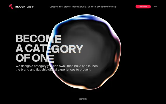
The page employs a full-bleed dark background with a max-width content container, likely around 1200px, but it's not explicitly fixed, allowing for flexibility. The hero section is full-bleed, featuring large, centered headlines over an abstract 3D graphic. Content beneath the hero generally follows a spacious, centered vertical stack with generous section gaps. The navigation is a minimalist top bar with a clear 'Contact Us' primary action button on the right and a hamburger menu icon.
The imagery primarily features abstract, organic 3D rendered forms with luminous, iridescent edges, positioned centrally as a visual anchor. These graphics are contained and serve a decorative, atmospheric role rather than explanatory content. There are minimal other images; the focus is on UI and text, making the 3D element a powerful, singular visual statement.
Reminiscent of Stripe, Linear, Framer, Supabase.
# ThoughtLab — Style Reference
> Midnight Command Center

**Theme:** dark

**Site:** https://www.thoughtlab.com

ThoughtLab's design system evokes a dark, cerebral command center. Bold typography punches through deep black backgrounds, while a singular vibrant red accent highlights critical calls-to-action. The spatial experience is generous, allowing components to breathe within wide page margins, contributing to an atmosphere of focused, high-stakes digital experience.

## Tokens — Colors

| Name | Value | Token | Role |
|------|------|------|------|
| Action Red | `#fc1c46` | `--color-action-red` | Primary call-to-action buttons – a forceful, vivid accent against dark surfaces |
| Midnight Black | `#000000` | `--color-midnight-black` | Page backgrounds, button text, icon fills |
| Stone Grey | `#4c4c4c` | `--color-stone-grey` | Muted body text, subtle link borders |
| Ghost White | `#cccccc` | `--color-ghost-white` | Medium-contrast borders, control outlines, and structural separators. Do not promote it to the primary CTA color |
| Snow Drift | `#ffffff` | `--color-snow-drift` | Header links, occasionally used as an elevated background color for content sections contrasting the dark base |

## Tokens — Typography

### sui
- **Substitute:** Arial, Helvetica, sans-serif
- **Weights:** 300, 400, 500, 700
- **Sizes:** 10px, 14px, 15px, 17px, 18px, 27px, 72px, 91px, 198px
- **Line height:** 0.92, 0.96, 1, 1.1, 1.15, 1.2, 1.25, 1.5, 2.14
- **Letter spacing:** -0.0670em, -0.0200em, -0.0090em
- **Role:** Captures a versatile brand voice, ranging from expansive, large-scale headlines to functional body text across various digital experiences. The tighter letter spacing on larger sizes adds to the brand's sharp, modern feel.

## Tokens — Type Scale

| Role | Size | Line height | Letter spacing |
|------|------|------|------|
| caption | 10px | 1.5 | -0.009em |
| body-sm | 14px | 1.25 | -0.009em |
| subheading | 18px | 1.2 | -0.02em |
| heading | 27px | 1.15 | -0.02em |
| heading-lg | 72px | 0.96 | -0.067em |
| display | 198px | 0.92 | -0.067em |

## Tokens — Spacing

- **Section gap:** 65px
- **Card padding:** 22px
- **Element gap:** 9px

## Tokens — Radius

- **Buttons:** 9999px

## Layout

The page employs a full-bleed dark background with a max-width content container, likely around 1200px, but it's not explicitly fixed, allowing for flexibility. The hero section is full-bleed, featuring large, centered headlines over an abstract 3D graphic. Content beneath the hero generally follows a spacious, centered vertical stack with generous section gaps. The navigation is a minimalist top bar with a clear 'Contact Us' primary action button on the right and a hamburger menu icon.

## Imagery

The imagery primarily features abstract, organic 3D rendered forms with luminous, iridescent edges, positioned centrally as a visual anchor. These graphics are contained and serve a decorative, atmospheric role rather than explanatory content. There are minimal other images; the focus is on UI and text, making the 3D element a powerful, singular visual statement.

## Components

### Primary Action Button
*Main call-to-action.*

Filled with Action Red (#fc1c46), using Snow Drift (#ffffff) text, with a full pill radius of 9999px. Padding is 0px top/bottom and 30px left/right. Text uses sui font.

### Ghost Nav Link
*Header and navigation links.*

Transparent background, Midnight Black (#000000) text. No border or radius. Padding is 0px. Text is sui font.

### Text Input
*Standard input fields.*

Transparent background, Snow Drift (#ffffff) text and border. No radius. Padding is 7.2px top/bottom and 21.6px left/right. Uses sui font.

### Content Card
*Information grouping.*

Transparent background, no border, no shadow, and no radius. Padding is 0. Content within it typically leverages standard text and link styles.

## Guidelines

### Do

- Use Midnight Black (#000000) as the primary background color for all main sections and canvases.
- Apply Action Red (#fc1c46) exclusively for primary action buttons, ensuring a visible contrast and clear hierarchy.
- Implement the sui font family with a letter-spacing of -0.0670em for all 'display' and 'heading-lg' roles to maintain a tight, impactful visual.
- Utilize a full pill radius of 9999px for all buttons to reinforce a consistent, distinctive shape.
- Maintain generous vertical spacing between sections, defaulting to 65px as a section gap to create an open and spacious feel.
- Employ Ghost White (#cccccc) for primary text elements against dark backgrounds.
- Employ transparent cards with no visible borders or shadows to maintain flat product surfaces.

### Don't

- Do not use accent colors for descriptive text or non-interactive elements; reserve them for direct action.
- Avoid applying heavy shadows or complex elevation to components, as the system favors a flat, minimalist aesthetic.
- Do not vary border radii across buttons; all interactive buttons should adhere to the 9999px pill shape.
- Do not use letter-spacing on small body text unless explicitly defined in the type scale to avoid readability issues.
- Do not introduce additional bold text weights beyond 700; the system relies on lighter weights for authority.
- Avoid adding unnecessary decorative borders or fills to cards; they should maintain a transparent, subtle presence.
- Do not use tight spatial arrangements; ensure all elements have sufficient breathing room guided by the 9px element gap.

## Agent Prompt Guide

Quick Color Reference:
text: #cccccc
background: #000000
border: #cccccc
accent: #fc1c46
primary action: #fc1c46 (filled action)

Example Component Prompts:
Create a hero section: background Midnight Black (#000000). Headline at 198px sui weight 700, Ghost White (#cccccc), letter-spacing -0.0670em. Subtext at 18px sui weight 500, Stone Grey (#4c4c4c), letter-spacing -0.0200em.
Create a Primary Action Button: Action Red (#fc1c46) background, Snow Drift (#ffffff) text, 9999px radius, padding 0px top/bottom and 30px left/right. Text 'Get Started' sui font weight 500.
Create a Ghost Nav Link: transparent background, Midnight Black (#000000) text, no border or radius, 0px padding. Text 'About Us' sui font weight 400.
Create a Text Input: transparent background, Snow Drift (#ffffff) text, Snow Drift (#ffffff) border, no radius. Padding 7.2px top/bottom and 21.6px left/right. Font sui, placeholder 'Your Email'.
More like this






Keep what you find
A free account saves references to boards and can send you a weekly email of picks based on what you save.
To see every result, go Pro.