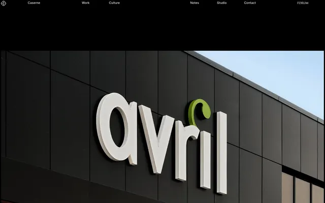
Preview image. Unlock full-res
Gallery Grid, Dark Canvas
Color palette
Orange outline accent for tags, dividers, and focused UI edges. Do not promote it to the primary CTA color
Page backgrounds, large content blocks — creates a deep, infinite canvas for content
Primary text, prominent links, card borders, subtle dividing lines — forms the central contrast against dark backgrounds
Hairline borders, dividers, input outlines, and card edges on light surfaces. Do not promote it to the primary CTA color
Muted helper text, secondary descriptions, subdued captions — provides hierarchical separation without visual noise
Icon outlines, subtle borders in light areas (if present) — provides a soft contrast without being stark black
Typography
- Weights
- 100, 400, 700
- Sizes
- 13px, 14px
- Line height
- 1.29, 1.38, 1.43
- Letter spacing
- normal
- Fallback
- Inter
Primary typeface for all text content, from navigation to body text. Its range of weights allows for subtle differentiation in hierarchy, from the light weight often used in navigation to the more substantial for emphasis.
Spacing & shape
Components
Text uses ABC Oracle, weight 400, 13px size, Cloud Burst (#ffffff) color. On hover, the text color changes to Ember Glow (#ff4513).
Uses ABC Oracle, weight 400, 14px size, Ghost White (#f2f2f2) color, with a line-height of 1.38.
Uses ABC Oracle, weight 400, 14px size, Steel Gaze (#858484) color, with a line-height of 1.38.
Text uses ABC Oracle, weight 400, 13px size, Ghost White (#f2f2f2) color. No explicit hover state provided, implying standard browser link behavior if not overridden.
Guidelines
- Maintain a high contrast ratio between text and background, predominantly using Ghost White (#f2f2f2) or Cloud Burst (#ffffff) on Absolute Zero (#000000).
- Utilize Ember Glow (#ff4513) exclusively for interactive states or minimal decorative accents, ensuring it never competes with primary content.
- Employ ABC Oracle's lighter weights (100, 400) for navigation and body text, reserving the 700 weight for critical emphasis.
- Apply a default border-radius of 0px to all elements, maintaining crisp, sharp edges throughout the interface.
- Implement consistent vertical spacing with 90px between major content sections and 5px between closely related elements.
- Position all navigation links and key interactive elements with top and left padding of 5px to ensure consistent visual alignment.
- Allow large-format photography to occupy significant screen real estate, often full-bleed, as the primary visual content.
- Avoid introducing additional chromatic colors; Ember Glow (#ff4513) is the sole acceptable accent color.
- Do not use shadows or complex elevation techniques; the design relies on flat planes and strong contrast for depth.
- Refrain from using heavily rounded corners; all elements should maintain sharp, angular forms.
- Do not break the dark background scheme with light-themed sections or cards; maintain an overall dark aesthetic.
- Avoid excessive ornamental elements or decorative visuals that detract from the content and minimalist ethos.
- Do not use generic system fonts; ABC Oracle must be used for all text content to maintain brand identity.
- Avoid small unreadable text sizes; ensure minimum text size is 13px, with adequate line height for readability.
About this system
ShowHide
Caserne employs a stark, high-contrast dark mode aesthetic, emphasizing content through its absence of clutter. Typography is the primary visual element, with a single, highly legible sans-serif font deployed across various weights. A singular vivid orange serves as the functional accent, acting as a precise visual punctuation against the expansive black and white canvas. The design prioritizes a minimalist presentation, allowing large-format imagery and bold type to command attention.
The page maintains a full-bleed layout, with content extending to the edges of the viewport rather than being constrained by a `pageMaxWidth`. The hero section features large, immersive photography as its background, usually with minimal overlaid text. Section rhythm is driven by alternating content blocks, often full-width images or black quadrants, maintaining consistent vertical spacing. Content arrangement frequently uses a grid-like structure for displaying work, where large image tiles with minimal text details are presented. The overall density leans towards spacious and impactful presentation rather than information-heavy blocks. Navigation is a simple, fixed top bar presenting minimal links without complex menus.
This system primarily features large-format, full-bleed photography and product screenshots. The photography style is direct, often showcasing structures or branding elements with a focus on clean lines and real-world application. Imagery is contained within sharp, unrounded edges and occupies significant visual space, acting as hero content. Icons, if present, are minimal (e.g., Apple logo) and monochromatic, aligning with the stark visual language. The density is image-heavy, with visuals frequently dominating sections over text.
Reminiscent of Stripe, AIGA, ACME, Basic Type Co.
# Caserne — Style Reference
> Gallery Grid, Dark Canvas

**Theme:** dark

**Site:** https://caserne.com

Caserne employs a stark, high-contrast dark mode aesthetic, emphasizing content through its absence of clutter. Typography is the primary visual element, with a single, highly legible sans-serif font deployed across various weights. A singular vivid orange serves as the functional accent, acting as a precise visual punctuation against the expansive black and white canvas. The design prioritizes a minimalist presentation, allowing large-format imagery and bold type to command attention.

## Tokens — Colors

| Name | Value | Token | Role |
|------|------|------|------|
| Ember Glow | `#ff4513` | `--color-ember-glow` | Orange outline accent for tags, dividers, and focused UI edges. Do not promote it to the primary CTA color |
| Absolute Zero | `#000000` | `--color-absolute-zero` | Page backgrounds, large content blocks — creates a deep, infinite canvas for content |
| Ghost White | `#f2f2f2` | `--color-ghost-white` | Primary text, prominent links, card borders, subtle dividing lines — forms the central contrast against dark backgrounds |
| Cloud Burst | `#ffffff` | `--color-cloud-burst` | Hairline borders, dividers, input outlines, and card edges on light surfaces. Do not promote it to the primary CTA color |
| Steel Gaze | `#858484` | `--color-steel-gaze` | Muted helper text, secondary descriptions, subdued captions — provides hierarchical separation without visual noise |
| Deep Graphite | `#333333` | `--color-deep-graphite` | Icon outlines, subtle borders in light areas (if present) — provides a soft contrast without being stark black |

## Tokens — Typography

### ABC Oracle
- **Substitute:** Inter
- **Weights:** 100, 400, 700
- **Sizes:** 13px, 14px
- **Line height:** 1.29, 1.38, 1.43
- **Letter spacing:** normal
- **Role:** Primary typeface for all text content, from navigation to body text. Its range of weights allows for subtle differentiation in hierarchy, from the light weight often used in navigation to the more substantial for emphasis.

## Tokens — Spacing

- **Section gap:** 90px
- **Card padding:** 5px
- **Element gap:** 5px

## Tokens — Radius

- **Default:** 0px

## Layout

The page maintains a full-bleed layout, with content extending to the edges of the viewport rather than being constrained by a `pageMaxWidth`. The hero section features large, immersive photography as its background, usually with minimal overlaid text. Section rhythm is driven by alternating content blocks, often full-width images or black quadrants, maintaining consistent vertical spacing. Content arrangement frequently uses a grid-like structure for displaying work, where large image tiles with minimal text details are presented. The overall density leans towards spacious and impactful presentation rather than information-heavy blocks. Navigation is a simple, fixed top bar presenting minimal links without complex menus.

## Imagery

This system primarily features large-format, full-bleed photography and product screenshots. The photography style is direct, often showcasing structures or branding elements with a focus on clean lines and real-world application. Imagery is contained within sharp, unrounded edges and occupies significant visual space, acting as hero content. Icons, if present, are minimal (e.g., Apple logo) and monochromatic, aligning with the stark visual language. The density is image-heavy, with visuals frequently dominating sections over text.

## Components

### Navigation Link
*Top-level navigation items*

Text uses ABC Oracle, weight 400, 13px size, Cloud Burst (#ffffff) color. On hover, the text color changes to Ember Glow (#ff4513).

### Work Item Title
*Titles for portfolio pieces or content cards*

Uses ABC Oracle, weight 400, 14px size, Ghost White (#f2f2f2) color, with a line-height of 1.38.

### Work Item Subtitle
*Descriptive text for portfolio pieces or content cards*

Uses ABC Oracle, weight 400, 14px size, Steel Gaze (#858484) color, with a line-height of 1.38.

### Info / Contact Link
*Small, functional links in footer or secondary sections*

Text uses ABC Oracle, weight 400, 13px size, Ghost White (#f2f2f2) color. No explicit hover state provided, implying standard browser link behavior if not overridden.

## Guidelines

### Do

- Maintain a high contrast ratio between text and background, predominantly using Ghost White (#f2f2f2) or Cloud Burst (#ffffff) on Absolute Zero (#000000).
- Utilize Ember Glow (#ff4513) exclusively for interactive states or minimal decorative accents, ensuring it never competes with primary content.
- Employ ABC Oracle's lighter weights (100, 400) for navigation and body text, reserving the 700 weight for critical emphasis.
- Apply a default border-radius of 0px to all elements, maintaining crisp, sharp edges throughout the interface.
- Implement consistent vertical spacing with 90px between major content sections and 5px between closely related elements.
- Position all navigation links and key interactive elements with top and left padding of 5px to ensure consistent visual alignment.
- Allow large-format photography to occupy significant screen real estate, often full-bleed, as the primary visual content.

### Don't

- Avoid introducing additional chromatic colors; Ember Glow (#ff4513) is the sole acceptable accent color.
- Do not use shadows or complex elevation techniques; the design relies on flat planes and strong contrast for depth.
- Refrain from using heavily rounded corners; all elements should maintain sharp, angular forms.
- Do not break the dark background scheme with light-themed sections or cards; maintain an overall dark aesthetic.
- Avoid excessive ornamental elements or decorative visuals that detract from the content and minimalist ethos.
- Do not use generic system fonts; ABC Oracle must be used for all text content to maintain brand identity.
- Avoid small unreadable text sizes; ensure minimum text size is 13px, with adequate line height for readability.

## Agent Prompt Guide

Quick Color Reference:
text: #f2f2f2
background: #000000
border: #f2f2f2
accent: #ff4513
primary action: no distinct CTA color

Example Component Prompts:
1. Create a top navigation bar: background Absolute Zero (#000000). Links are 'Caserne', 'Work', 'Culture', 'Notes', 'Studio', 'Contact', 'FORUM' using ABC Oracle, weight 400, 13px, Cloud Burst (#ffffff). Padding-left for each link is 5px.
2. Design a work item card: background Absolute Zero (#000000), with a Ghost White (#f2f2f2) border on hover. Title 'Avril supermarket' uses ABC Oracle, weight 400, 14px, Ghost White (#f2f2f2). Subtitle 'A new standard for accessible healthy living' uses ABC Oracle, weight 400, 14px, Steel Gaze (#858484). Padding around text should be 5px.
3. Create a decorative accent dot: color Ember Glow (#ff4513), 3px, used before a text label.
More like this





Keep what you find
A free account saves references to boards and can send you a weekly email of picks based on what you save.
To see every result, go Pro.