Preview image. Unlock full-res
Gallery at Dusk
Color palette
Supporting palette color for small decorative accents when the core palette needs contrast. Do not promote it to the primary CTA color
Page backgrounds, card backgrounds, primary surface for content blocks
Hairline borders, dividers, input outlines, and card edges on light surfaces. Do not promote it to the primary CTA color
Medium-contrast borders, control outlines, and structural separators. Do not promote it to the primary CTA color
Footer borders, subtle dividers, and structural outlines that recede into the background
Typography
- Weights
- 300, 400
- Sizes
- 16px, 24px, 32px, 80px
- Line height
- 1, 1.13, 1.25
- Letter spacing
- -0.0200em at 80px, -0.0100em at 16px
- Fallback
- Inter
Primary typeface for all headings, body text, and UI elements. The consistent usage of lighter weights (300, 400) even for large headlines (#80px at 300 weight feels more like a whisper than a shout, conveying authority through restraint and elegance rather than visual density.)
Spacing & shape
Components
Text in Ghost White (#ffffff), on Midnight Canvas (#000000) background. No distinct padding, hover state likely involves a subtle background change or underline.
Full-bleed visuals or text blocks on Midnight Canvas (#000000) with no border or radius, relying on layout for separation. Text within is typically Ghost White (#ffffff) or Whisper Gray (#a0a0a0).
Text in Whisper Gray (#a0a0a0), specifically 16px NextBook Regular with 1.25 line-height and -0.0100em letter spacing. Renders on Midnight Canvas (#000000) background.
A 1px solid line in Charcoal Edge (#484848), providing visual separation without being visually heavy. Often paired with 64px section gap.
Text in Brand Red (#cf2e2e), typically 16px NextBook Regular (weight 400). Often appears with a subtle leading arrow icon. No background or border.
Text in Ghost White (#ffffff), size likely 24px and weight 400, on Midnight Canvas (#000000). Occupies the top-left of the header.
Guidelines
- Prioritize Midnight Canvas (#000000) for all backgrounds to maintain the dark theme.
- Use Ghost White (#ffffff) for primary text and headings, employing NextBook weights 300 or 400.
- Apply Whisper Gray (#a0a0a0) for all secondary text, links, and borders that require less prominence.
- Introduce Brand Red (#cf2e2e) sparingly as a functional accent for links and interactive elements, never for large blocks of content.
- Maintain a clear page structure using a max-width of 969px, centered, with generous 64px section gaps.
- Ensure all interactive elements, especially ghost elements, have a 1px border in Ghost White (#ffffff) or Whisper Gray (#a0a0a0).
- Employ the NextBook font with its lighter weights (300, 400) and specific letter spacing to achieve an airy and precise typographic feel.
- Avoid using heavy font weights (e.g., 600+) for headlines; the system relies on lighter weights for authority.
- Do not introduce additional saturated colors beyond Brand Red (#cf2e2e) unless for semantic states like success/error, maintaining a strict monochrome palette.
- Refrain from adding shadows or complex elevation; the design emphasizes flat surfaces and crisp outlines.
- Do not deviate from the specified NextBook font; system fonts would compromise the distinctive typographic identity.
- Avoid tight spacing between sections; allow elements ample room with 64px vertical gaps.
- Do not use border-radius; all UI elements are designed with sharp, geometric edges.
- Never use Brand Red (#cf2e2e) as a background color for large sections or primary buttons; it is strictly an accent.
About this system
ShowHide
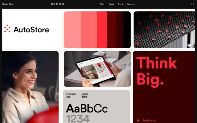
Studio Oker employs a high-contrast dark aesthetic that feels like an art gallery at dusk. Content surfaces are monochromatic, punctuated by moments of intense red that act as both brand accent and interactive cues. Typography is precise and airy, favoring lighter weights and generous line-heights over heavy, dense blocks. Layouts are spacious and structured, using wide content areas for impact and clear visual separation between elements, emphasizing a curated, editorial feel.
The page adheres to a contained layout with a maximum width of 969px, centered, creating a focused content area. The hero section is a full-width dark canvas with a large, centered headline. Subsequent sections often feature a grid-based content arrangement, alternating between large visual cards and text blocks, with a consistent vertical rhythm of 64px section gaps. Navigation is minimal, consisting of a simple top bar with Ghost White text links. The overall density is comfortable, giving ample whitespace for each content block to stand out.
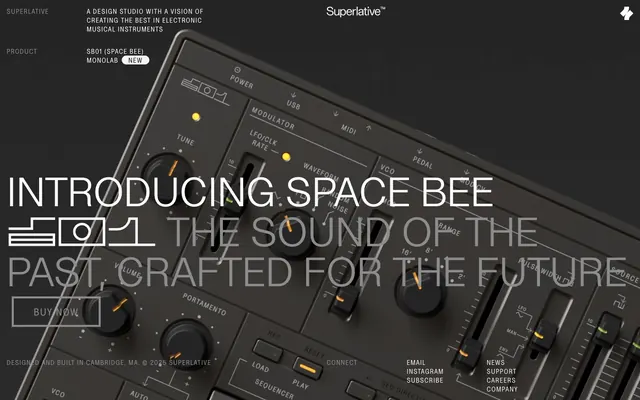
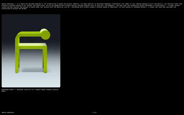
This site predominantly uses clean, product-focused photography and abstract graphics. Product shots are typically tight crops, often on neutral or dark backgrounds, showcasing the object as the hero without lifestyle context. Illustrations are minimal, seemingly abstract or geometric. Icons are simple, outlined or filled, and monochrome (Ghost White or Whisper Gray). Imagery serves to showcase project examples or provide visual texture, often treated as full-bleed within content cards or sections, integrated seamlessly with the UI.
Reminiscent of B&O, AIGA, Anagram, Certain Measures.
# Studio Oker — Style Reference
> Gallery at Dusk

**Theme:** dark

**Site:** https://oker.com

Studio Oker employs a high-contrast dark aesthetic that feels like an art gallery at dusk. Content surfaces are monochromatic, punctuated by moments of intense red that act as both brand accent and interactive cues. Typography is precise and airy, favoring lighter weights and generous line-heights over heavy, dense blocks. Layouts are spacious and structured, using wide content areas for impact and clear visual separation between elements, emphasizing a curated, editorial feel.

## Tokens — Colors

| Name | Value | Token | Role |
|------|------|------|------|
| Brand Red | `#cf2e20` | `--color-brand-red` | Supporting palette color for small decorative accents when the core palette needs contrast. Do not promote it to the primary CTA color |
| Midnight Canvas | `#000000` | `--color-midnight-canvas` | Page backgrounds, card backgrounds, primary surface for content blocks |
| Ghost White | `#ffffff` | `--color-ghost-white` | Hairline borders, dividers, input outlines, and card edges on light surfaces. Do not promote it to the primary CTA color |
| Whisper Gray | `#a0a0a0` | `--color-whisper-gray` | Medium-contrast borders, control outlines, and structural separators. Do not promote it to the primary CTA color |
| Charcoal Edge | `#484848` | `--color-charcoal-edge` | Footer borders, subtle dividers, and structural outlines that recede into the background |

## Tokens — Typography

### NextBook
- **Substitute:** Inter
- **Weights:** 300, 400
- **Sizes:** 16px, 24px, 32px, 80px
- **Line height:** 1, 1.13, 1.25
- **Letter spacing:** -0.0200em at 80px, -0.0100em at 16px
- **Role:** Primary typeface for all headings, body text, and UI elements. The consistent usage of lighter weights (300, 400) even for large headlines (#80px at 300 weight feels more like a whisper than a shout, conveying authority through restraint and elegance rather than visual density.)

## Tokens — Type Scale

| Role | Size | Line height | Letter spacing |
|------|------|------|------|
| body | 16px | 1.25 | -0.16px |
| subheading | 24px | 1.13 | -0.24px |
| heading | 32px | 1 | -0.32px |
| display | 80px | 1 | -1.6px |

## Tokens — Spacing

- **Max width:** 969px
- **Section gap:** 64px
- **Card padding:** 16px
- **Element gap:** 16px

## Tokens — Radius

- **Buttons:** 0px
- **Cards:** 0px
- **Images:** 0px

## Layout

The page adheres to a contained layout with a maximum width of 969px, centered, creating a focused content area. The hero section is a full-width dark canvas with a large, centered headline. Subsequent sections often feature a grid-based content arrangement, alternating between large visual cards and text blocks, with a consistent vertical rhythm of 64px section gaps. Navigation is minimal, consisting of a simple top bar with Ghost White text links. The overall density is comfortable, giving ample whitespace for each content block to stand out.

## Imagery

This site predominantly uses clean, product-focused photography and abstract graphics. Product shots are typically tight crops, often on neutral or dark backgrounds, showcasing the object as the hero without lifestyle context. Illustrations are minimal, seemingly abstract or geometric. Icons are simple, outlined or filled, and monochrome (Ghost White or Whisper Gray). Imagery serves to showcase project examples or provide visual texture, often treated as full-bleed within content cards or sections, integrated seamlessly with the UI.

## Components

### Ghost Navigation Link
*Primary navigation elements in the header.*

Text in Ghost White (#ffffff), on Midnight Canvas (#000000) background. No distinct padding, hover state likely involves a subtle background change or underline.

### Grid Content Card
*Displaying portfolio items or features on the main content area.*

Full-bleed visuals or text blocks on Midnight Canvas (#000000) with no border or radius, relying on layout for separation. Text within is typically Ghost White (#ffffff) or Whisper Gray (#a0a0a0).

### Muted Text Block
*Secondary details or related information, often with links.*

Text in Whisper Gray (#a0a0a0), specifically 16px NextBook Regular with 1.25 line-height and -0.0100em letter spacing. Renders on Midnight Canvas (#000000) background.

### Section Divider (Subtle)
*Separating major content sections with a minimalist approach.*

A 1px solid line in Charcoal Edge (#484848), providing visual separation without being visually heavy. Often paired with 64px section gap.

### Accent Read More Link
*Prominent click targets for detailed content.*

Text in Brand Red (#cf2e2e), typically 16px NextBook Regular (weight 400). Often appears with a subtle leading arrow icon. No background or border.

### Header Branding
*Main site title/logo in the header.*

Text in Ghost White (#ffffff), size likely 24px and weight 400, on Midnight Canvas (#000000). Occupies the top-left of the header.

## Guidelines

### Do

- Prioritize Midnight Canvas (#000000) for all backgrounds to maintain the dark theme.
- Use Ghost White (#ffffff) for primary text and headings, employing NextBook weights 300 or 400.
- Apply Whisper Gray (#a0a0a0) for all secondary text, links, and borders that require less prominence.
- Introduce Brand Red (#cf2e2e) sparingly as a functional accent for links and interactive elements, never for large blocks of content.
- Maintain a clear page structure using a max-width of 969px, centered, with generous 64px section gaps.
- Ensure all interactive elements, especially ghost elements, have a 1px border in Ghost White (#ffffff) or Whisper Gray (#a0a0a0).
- Employ the NextBook font with its lighter weights (300, 400) and specific letter spacing to achieve an airy and precise typographic feel.

### Don't

- Avoid using heavy font weights (e.g., 600+) for headlines; the system relies on lighter weights for authority.
- Do not introduce additional saturated colors beyond Brand Red (#cf2e2e) unless for semantic states like success/error, maintaining a strict monochrome palette.
- Refrain from adding shadows or complex elevation; the design emphasizes flat surfaces and crisp outlines.
- Do not deviate from the specified NextBook font; system fonts would compromise the distinctive typographic identity.
- Avoid tight spacing between sections; allow elements ample room with 64px vertical gaps.
- Do not use border-radius; all UI elements are designed with sharp, geometric edges.
- Never use Brand Red (#cf2e2e) as a background color for large sections or primary buttons; it is strictly an accent.

## Agent Prompt Guide

**Quick Color Reference:**
- text: #ffffff
- background: #000000
- border: #a0a0a0
- accent: #cf2e2e
- primary action: no distinct CTA color

**3-5 Example Component Prompts:**
- Create a hero section: Midnight Canvas (#000000) background. Headline 'Studio Oker' at 80px NextBook Light (weight 300), Ghost White (#ffffff), letter-spacing -1.6px. Subtitle 'Brand and design' at 32px NextBook Regular (weight 400), Ghost White (#ffffff).
- Design a Grid Content Card: Midnight Canvas (#000000) background, 16px padding. Image inset. Title 'AutoStore' at 24px NextBook Regular (weight 400), Ghost White (#ffffff). Caption 'Logistics design' at 16px NextBook Regular (weight 400), Whisper Gray (#a0a0a0).
- Build a Muted Text Block: Midnight Canvas (#000000) background. Body text: 'Studio Oker is a design studio based in Norway...' at 16px NextBook Regular (weight 400), Whisper Gray (#a0a0a0). Link 'Full feed' at 16px NextBook Regular (weight 400), Brand Red (#cf2e2e). Element gap 16px.
More like this





Keep what you find
A free account saves references to boards and can send you a weekly email of picks based on what you save.
To see every result, go Pro.