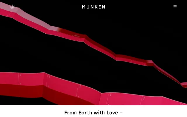
Preview image. Unlock full-res
High-contrast theatrical canvas
Color palette
Supporting palette color for small decorative accents when the core palette needs contrast. Do not promote it to the primary CTA color
Page backgrounds, heading text, button backgrounds, primary links
Body text, navigation text, button text, ghost button borders
Typography
- Weights
- 400, 700, 900
- Sizes
- 16px, 20px, 40px, 68px
- Line height
- 1.2, 1.5
- Letter spacing
- 0.0500em
- Fallback
- Inter
Primary typeface for all text elements, ranging from body to large headlines. Its distinct custom character supports the brand's unique identity, replacing standard sans-serifs for a memorable presence.
Spacing & shape
Components
Solid black background with white text, no border radius for a sharp, direct aesthetic. Uses 13.75px vertical and 37.5px horizontal padding. Text is Munken Sans Web, color Paper White.
Transparent background with a white 1px border and white text, maintaining the high-contrast theme. No border radius. Uses 6px vertical and 6px horizontal padding. Text is Munken Sans Web, color Paper White.
Completely transparent background, no border, no shadow, and 0px border radius. This card functions as a content wrapper without adding any visual ornamentation, letting content define its own boundaries and flow seamlessly with the background.
Plain text in Paper White against the Midnight Canvas header, with default letter spacing and 10px top margin for spacing from header top. Interactive states are highly subtle or implied by context.
White text on the Midnight Canvas footer, visually consistent with main navigation but with distinct grouping provided by ul elements, 72px bottom padding.
Guidelines
- Use Midnight Canvas (#000000) as the dominant background color for most sections to maintain the high-contrast aesthetic.
- Apply Paper White (#ffffff) for all primary text elements, including headlines, body copy, and navigation to ensure stark readability.
- Prioritize the Munken Sans Web typeface for all typographic content, leveraging its unique character and defined weights (400, 700, 900) and letter spacing of 0.0500em.
- Implement 0px border-radius for all UI elements (buttons, cards) to maintain a sharp, unadorned visual style.
- Adhere strictly to 80px vertical spacing between major page sections and 10px element gaps for moderate density.
- Reserve Process Red (#ee1c5b) exclusively for brand accents, interactive highlights, or subtle graphic elements, using it sparingly to maximize its impact.
- Ensure all interactive elements, like buttons and links, use either the Primary Filled Button or Ghost Button styles with their specified padding and no radius.
- Do not introduce rounded corners or border-radius values greater than 0px on any components or elements.
- Avoid using drop shadows or elevation effects; the design relies on flat surfaces and high contrast for visual hierarchy.
- Do not deviate from the specified Munken Sans Web font or its defined weights and line heights.
- Refrain from adding unnecessary decorative gradients or complex backgrounds; surfaces should remain solid color for starkness.
- Do not introduce additional color to text or interactive elements beyond Midnight Canvas, Paper White, or Process Red.
- Avoid dense, information-heavy layouts; maintain generous padding and spacing between elements and sections.
- Do not use generic system fonts; always utilize Munken Sans Web for all text to preserve brand identity.
About this system
ShowHide
Colab establishes a stark, high-contrast visual system where deep black is the canvas for crisp white typography and a vibrant accent red, creating a bold and theatrical presentation. The design leverages strong spatial separation with ample padding and minimalist components, emphasizing content through scale and isolation rather than embellishment. Typography is distinct, guiding the eye with a custom sans-serif that retains a unique character within a largely monochromatic palette. Sharp edges and the absence of shadows contribute to an unadorned, direct aesthetic.
The page adheres to a full-bleed layout, where content stretches edge-to-edge, especially prominent in hero sections featuring large visuals. The overall page model is contained vertically by generous section gaps (80px). The hero section typically features a full-viewport dark background with a centered, high-contrast headline. Section rhythm is consistent, separated by substantial vertical spacing, often introducing large image sections followed by text blocks. Content arrangement frequently uses centered stacks of text, particularly for headings and body copy, promoting a direct and impactful presentation. There is no explicit grid usage beyond implied vertical alignment for text blocks. Navigation is a fixed top bar with a logo and hamburger menu, minimal and integrated into the dark canvas. The footer maintains this dark theme containing minimal links and a copyright notice, also using generous padding.
This system primarily features photography with strong visual impact. Images are typically full-bleed or large blocks, often presenting product showcases or abstract compositions with specific color palettes, including notable use of the Process Red accent. There are no obvious illustrations or 3D renders. The iconography is minimal, indicated by simple white hamburger menus and social icons against dark backgrounds, suggesting an outlined or filled white style with a medium stroke weight. Imagery serves both decorative atmosphere and product showcase, with a moderate density, allowing text to also breathe.
Reminiscent of AIGA (American Institute of Graphic Arts), ACNE Studios, The New York Times (digital), Future Fonts.
# Colab — Style Reference
> High-contrast theatrical canvas

**Theme:** dark

**Site:** https://colab.munken.com

Colab establishes a stark, high-contrast visual system where deep black is the canvas for crisp white typography and a vibrant accent red, creating a bold and theatrical presentation. The design leverages strong spatial separation with ample padding and minimalist components, emphasizing content through scale and isolation rather than embellishment. Typography is distinct, guiding the eye with a custom sans-serif that retains a unique character within a largely monochromatic palette. Sharp edges and the absence of shadows contribute to an unadorned, direct aesthetic.

## Tokens — Colors

| Name | Value | Token | Role |
|------|------|------|------|
| Process Red | `#ee1c5b` | `--color-process-red` | Supporting palette color for small decorative accents when the core palette needs contrast. Do not promote it to the primary CTA color |
| Midnight Canvas | `#000000` | `--color-midnight-canvas` | Page backgrounds, heading text, button backgrounds, primary links |
| Paper White | `#ffffff` | `--color-paper-white` | Body text, navigation text, button text, ghost button borders |

## Tokens — Typography

### Munken Sans Web
- **Substitute:** Inter
- **Weights:** 400, 700, 900
- **Sizes:** 16px, 20px, 40px, 68px
- **Line height:** 1.2, 1.5
- **Letter spacing:** 0.0500em
- **Role:** Primary typeface for all text elements, ranging from body to large headlines. Its distinct custom character supports the brand's unique identity, replacing standard sans-serifs for a memorable presence.

## Tokens — Type Scale

Golden Ratio (1.618) from 40px base.

| Role | Size | Line height | Letter spacing |
|------|------|------|------|
| caption | 16px | 1.5 | — |
| body-sm | 20px | 1.5 | — |
| body | 40px | 1.3 | — |
| body-lg | 68px | 1.3 | — |

## Tokens — Spacing

- **Section gap:** 80px
- **Card padding:** 14px
- **Element gap:** 10px

## Tokens — Radius

- **none:** 0px

## Layout

The page adheres to a full-bleed layout, where content stretches edge-to-edge, especially prominent in hero sections featuring large visuals. The overall page model is contained vertically by generous section gaps (80px). The hero section typically features a full-viewport dark background with a centered, high-contrast headline. Section rhythm is consistent, separated by substantial vertical spacing, often introducing large image sections followed by text blocks. Content arrangement frequently uses centered stacks of text, particularly for headings and body copy, promoting a direct and impactful presentation. There is no explicit grid usage beyond implied vertical alignment for text blocks. Navigation is a fixed top bar with a logo and hamburger menu, minimal and integrated into the dark canvas. The footer maintains this dark theme containing minimal links and a copyright notice, also using generous padding.

## Imagery

This system primarily features photography with strong visual impact. Images are typically full-bleed or large blocks, often presenting product showcases or abstract compositions with specific color palettes, including notable use of the Process Red accent. There are no obvious illustrations or 3D renders. The iconography is minimal, indicated by simple white hamburger menus and social icons against dark backgrounds, suggesting an outlined or filled white style with a medium stroke weight. Imagery serves both decorative atmosphere and product showcase, with a moderate density, allowing text to also breathe.

## Components

### Primary Filled Button
*Call to action button for key interactions.*

Solid black background with white text, no border radius for a sharp, direct aesthetic. Uses 13.75px vertical and 37.5px horizontal padding. Text is Munken Sans Web, color Paper White.

### Ghost Button
*Secondary action button or navigation element.*

Transparent background with a white 1px border and white text, maintaining the high-contrast theme. No border radius. Uses 6px vertical and 6px horizontal padding. Text is Munken Sans Web, color Paper White.

### Naked Card
*Content container for images or text blocks*

Completely transparent background, no border, no shadow, and 0px border radius. This card functions as a content wrapper without adding any visual ornamentation, letting content define its own boundaries and flow seamlessly with the background.

### Site Navigation Link
*Top-level navigation items.*

Plain text in Paper White against the Midnight Canvas header, with default letter spacing and 10px top margin for spacing from header top. Interactive states are highly subtle or implied by context.

### Footer Navigation Link
*Secondary navigation in the footer.*

White text on the Midnight Canvas footer, visually consistent with main navigation but with distinct grouping provided by ul elements, 72px bottom padding.

## Guidelines

### Do

- Use Midnight Canvas (#000000) as the dominant background color for most sections to maintain the high-contrast aesthetic.
- Apply Paper White (#ffffff) for all primary text elements, including headlines, body copy, and navigation to ensure stark readability.
- Prioritize the Munken Sans Web typeface for all typographic content, leveraging its unique character and defined weights (400, 700, 900) and letter spacing of 0.0500em.
- Implement 0px border-radius for all UI elements (buttons, cards) to maintain a sharp, unadorned visual style.
- Adhere strictly to 80px vertical spacing between major page sections and 10px element gaps for moderate density.
- Reserve Process Red (#ee1c5b) exclusively for brand accents, interactive highlights, or subtle graphic elements, using it sparingly to maximize its impact.
- Ensure all interactive elements, like buttons and links, use either the Primary Filled Button or Ghost Button styles with their specified padding and no radius.

### Don't

- Do not introduce rounded corners or border-radius values greater than 0px on any components or elements.
- Avoid using drop shadows or elevation effects; the design relies on flat surfaces and high contrast for visual hierarchy.
- Do not deviate from the specified Munken Sans Web font or its defined weights and line heights.
- Refrain from adding unnecessary decorative gradients or complex backgrounds; surfaces should remain solid color for starkness.
- Do not introduce additional color to text or interactive elements beyond Midnight Canvas, Paper White, or Process Red.
- Avoid dense, information-heavy layouts; maintain generous padding and spacing between elements and sections.
- Do not use generic system fonts; always utilize Munken Sans Web for all text to preserve brand identity.

## Agent Prompt Guide

**Quick Color Reference:**
- text: #ffffff
- background: #000000
- border: #ffffff
- accent: #ee1c5b
- primary action: no distinct CTA color

**3-5 Example Component Prompts:**
No distinct primary action color was observed; use the extracted neutral button treatments instead of inventing a filled CTA color.
- Design a text block: Midnight Canvas (#000000) background. Heading "Check out the collection" using Munken Sans Web, weight 700, size 40px, Paper White (#ffffff) color, letter spacing 0.0500em. Body text "This is Munken Colab" using Munken Sans Web, weight 400, size 16px, Paper White (#ffffff) color, letter spacing 0.0500em. Ensure 80px section gap above and below.
- Construct a ghost navigation item: Use a Ghost Button style with "About Munken" as the text, Munken Sans Web, Paper White (#ffffff) text color, and a 1px Paper White border, 0px radius, 6px padding on all sides.
More like this





Keep what you find
A free account saves references to boards and can send you a weekly email of picks based on what you save.
To see every result, go Pro.