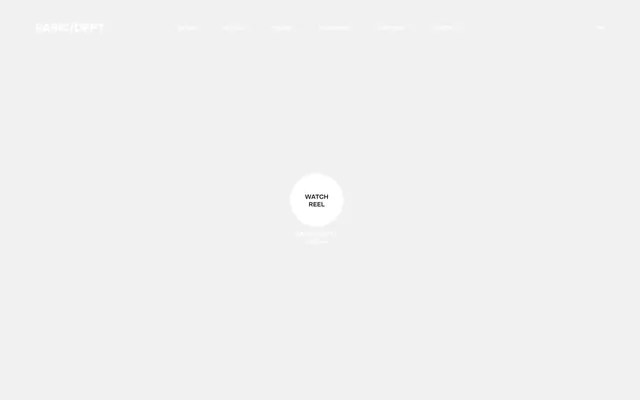
Preview image. Unlock full-res
Gallery Grid and Whisper
Color palette
Interactive states, subtle accents, badge backgrounds — a singular, muted chromatic touch that injects a quiet hint of warmth.
Primary text, deep backgrounds, icon fills — provides a strong, authoritative contrast against light surfaces.
Interactive elements, inverse text on dark backgrounds, secondary backgrounds — offers a crisp, clean counterpoint.
Page backgrounds, subtle dividers — provides a soft, expansive base layer, avoiding harsh pure white.
Typography
- Weights
- 400, 700
- Sizes
- 12px, 13px, 14px, 18px, 22px
- Line height
- 1, 1.1, 1.11, 1.14, 1.2, 1.4
- Letter spacing
- -0.0350em (for 22px), -0.0200em (for 18px), -0.0140em (for 14px), -0.0130em (for 13px), -0.0100em (for 12px)
- Fallback
- Inter
The primary and sole typeface, it dominates all content from headlines to body text and navigation. Its custom nature and precise, slightly condensed letter-spacing at larger sizes ensure a distinctive, sharp typographic voice. There are no decorative fonts; all typographic expression comes from size, weight, and spacing variations within this single family.
Spacing & shape
Components
A circular button with a 50% border-radius, no background color (rgba(0,0,0,0)), white text (rgb(255,255,255)), and a 1px white border (rgb(255,255,255)). Minimal padding (0px) suggests the interactivity is primarily through the circular shape rather than an expansive hit area.
A button with no background (rgba(0,0,0,0)), white text (rgb(255,255,255)), and no border-radius. Padding is 0px, suggesting these are text-based links styled as buttons for interactive context. Used for header navigation.
A badge with no background color (rgba(0,0,0,0)), text color Azalea Frost (#f9cdcd), and 0px border-radius. Significant left padding (80px) indicates a layout-specific use case, possibly for aligning text within a larger interactive area or image overlay.
Cards feature minimal visual adornment: a rectangular image on top, with text below in Storm Graphite (#252422) using SctoGroteskA. No border-radius. Padding is implicit for content blocks within sections, structured by the grid system.
A text-only button with no background (rgba(0,0,0,0)), Storm Graphite text (#252422), and a 1px Storm Graphite border. 0px border-radius. Padding is consistent with other interactive elements for cohesive feel.
Guidelines
- Prioritize SctoGroteskA for all typography, leveraging its weight and letter-spacing variations for hierarchy.
- Maintain a monochromatic base with Storm Graphite (#252422) for primary text and elements, and Canvas White (#ffffff) or Cloud Whisper (#f4f4f4) for backgrounds and inverse elements.
- Use Azalea Frost (#f9cdcd) explicitly for interactive states, badges, or subtle, emotionally resonant accents.
- Employ `0px` border-radius almost universally, reserving `50%` radius only for prominent circular interactive elements.
- Ensure generous `sectionGap` of 150px to create ample negative space and a sense of calm visual rhythm.
- Utilize a precise typographic scale where letter-spacing is systematically decreased for larger font sizes: e.g., 22px text uses -0.0350em letter-spacing.
- Implement the `Cloud Whisper` (#f4f4f4) neutral background for primary page content, providing a soft, subtle backdrop.
- Avoid introducing additional chromatic colors; the Azalea Frost (#f9cdcd) is the sole accent.
- Do not use box-shadows or other elevation techniques; all depth is implied through color contrast and compositional layering.
- Refrain from using heavily saturated images; prefer desaturated or monochrome photography that blends with the system's muted palette.
- Do not deviate from the single typeface SctoGroteskA; typographic diversity comes from size and weight.
- Avoid excessive padding on ghost buttons; they should appear as underlined text links unless styled with a border for emphasis.
- Do not introduce rounded corners (e.g. 4px, 8px) on cards, containers, or general elements; maintain sharp, angular forms.
- Never use pure black (#000000) for body text on light backgrounds; always opt for Storm Graphite (#252422) for softer contrast.
About this system
ShowHide
This design system projects a refined, minimalist aesthetic through a stark monochrome palette punctuated by a single, muted accent. Predominantly light backgrounds with subtle texture create an expansive, almost gallery-like feel. Typography is paramount, delivered in a custom-designed, highly legible sans-serif with precise letter-spacing adjustments, fostering a sense of sharp, intellectual precision. The restrained use of an "azalea" pink shade for subtle interactive cues or emotive accents prevents the system from feeling cold, adding an unexpected, almost artistic touch amidst the otherwise severe structure.
The page structure favors a max-width, centered container for most content, providing a clear visual boundary against the expansive Cloud Whisper background. The hero section is characterized by a central, iconic interactive element (the 'WATCH REEL' button) on a softly textured, light background. Sections are distinctly separated by generous vertical `sectionGap` of 150px, establishing a spacious rhythmic flow rather than continuous scrolling. Content blocks often employ a two-column layout, typically alternating text and image, creating dynamic, asymmetrical compositions. There are prevalent usage of card grids for showcasing work, although the exact column count and card padding are fluid based on content, but maintaining the underlying grid structure. Navigation is a minimalist top bar, likely sticky, with ghost links or text-only buttons that are visually subtle to avoid distracting from the main content. The overall impression is one of intentional, unhurried presentation.
The visual language for imagery is specific and curated. Photography features tight product crops or evocative, desaturated lifestyle shots, often with a raw, candid feel rather than overly staged perfection. Images are typically full-bleed within their containers, maintaining sharp, unrounded edges to align with the overall angular aesthetic. Product screenshots are clean and precise. Illustrations, when present, are likely minimal, line-based, or geometric, adhering to the limited brand palette. The role of imagery is primarily to showcase work and evoke emotion, rather than just decorate. There's a deliberate choice for image density to be balanced, allowing visuals space to breathe without overwhelming text content.
Reminiscent of AIGA Design, Pentagram, Huge Inc., AREA 17, Figma.
# BASIC/DEPT® — Style Reference
> Gallery Grid and Whisper

**Theme:** light

**Site:** https://basicagency.com

This design system projects a refined, minimalist aesthetic through a stark monochrome palette punctuated by a single, muted accent. Predominantly light backgrounds with subtle texture create an expansive, almost gallery-like feel. Typography is paramount, delivered in a custom-designed, highly legible sans-serif with precise letter-spacing adjustments, fostering a sense of sharp, intellectual precision. The restrained use of an "azalea" pink shade for subtle interactive cues or emotive accents prevents the system from feeling cold, adding an unexpected, almost artistic touch amidst the otherwise severe structure.

## Tokens — Colors

| Name | Value | Token | Role |
|------|------|------|------|
| Azalea Frost | `#f9cdcd` | `--color-azalea-frost` | Interactive states, subtle accents, badge backgrounds — a singular, muted chromatic touch that injects a quiet hint of warmth. |
| Storm Graphite | `#252422` | `--color-storm-graphite` | Primary text, deep backgrounds, icon fills — provides a strong, authoritative contrast against light surfaces. |
| Canvas White | `#ffffff` | `--color-canvas-white` | Interactive elements, inverse text on dark backgrounds, secondary backgrounds — offers a crisp, clean counterpoint. |
| Cloud Whisper | `#f4f4f4` | `--color-cloud-whisper` | Page backgrounds, subtle dividers — provides a soft, expansive base layer, avoiding harsh pure white. |

## Tokens — Typography

### SctoGroteskA
- **Substitute:** Inter
- **Weights:** 400, 700
- **Sizes:** 12px, 13px, 14px, 18px, 22px
- **Line height:** 1, 1.1, 1.11, 1.14, 1.2, 1.4
- **Letter spacing:** -0.0350em (for 22px), -0.0200em (for 18px), -0.0140em (for 14px), -0.0130em (for 13px), -0.0100em (for 12px)
- **Role:** The primary and sole typeface, it dominates all content from headlines to body text and navigation. Its custom nature and precise, slightly condensed letter-spacing at larger sizes ensure a distinctive, sharp typographic voice. There are no decorative fonts; all typographic expression comes from size, weight, and spacing variations within this single family.

## Tokens — Type Scale

Perfect Fourth (1.333) from 12px base.

| Role | Size | Line height | Letter spacing |
|------|------|------|------|
| caption | 12px | 1.4 | -0.12px |
| heading | 18px | 1.1 | -0.36px |
| display | 22px | 1 | -0.77px |

## Tokens — Spacing

- **Max width:** 1440px
- **Section gap:** 150px
- **Element gap:** 10-38px

## Tokens — Radius

- **Default:** 0px
- **Buttons:** 50%

## Layout

The page structure favors a max-width, centered container for most content, providing a clear visual boundary against the expansive Cloud Whisper background. The hero section is characterized by a central, iconic interactive element (the 'WATCH REEL' button) on a softly textured, light background. Sections are distinctly separated by generous vertical `sectionGap` of 150px, establishing a spacious rhythmic flow rather than continuous scrolling. Content blocks often employ a two-column layout, typically alternating text and image, creating dynamic, asymmetrical compositions. There are prevalent usage of card grids for showcasing work, although the exact column count and card padding are fluid based on content, but maintaining the underlying grid structure. Navigation is a minimalist top bar, likely sticky, with ghost links or text-only buttons that are visually subtle to avoid distracting from the main content. The overall impression is one of intentional, unhurried presentation.

## Imagery

The visual language for imagery is specific and curated. Photography features tight product crops or evocative, desaturated lifestyle shots, often with a raw, candid feel rather than overly staged perfection. Images are typically full-bleed within their containers, maintaining sharp, unrounded edges to align with the overall angular aesthetic. Product screenshots are clean and precise. Illustrations, when present, are likely minimal, line-based, or geometric, adhering to the limited brand palette. The role of imagery is primarily to showcase work and evoke emotion, rather than just decorate. There's a deliberate choice for image density to be balanced, allowing visuals space to breathe without overwhelming text content.

## Components

### Watch Reel CTA Button

### Awards Recognition Strip

### Work Showcase Cards

### Circular Call to Action (CTA) Button
*Primary interactive element on hero sections for media playback or key actions.*

A circular button with a 50% border-radius, no background color (rgba(0,0,0,0)), white text (rgb(255,255,255)), and a 1px white border (rgb(255,255,255)). Minimal padding (0px) suggests the interactivity is primarily through the circular shape rather than an expansive hit area.

### Ghost Navigation Button
*Tertiary interactive elements for navigation or less critical actions.*

A button with no background (rgba(0,0,0,0)), white text (rgb(255,255,255)), and no border-radius. Padding is 0px, suggesting these are text-based links styled as buttons for interactive context. Used for header navigation.

### Accent Badge (Azalea Frost)
*Visual indicator or tag, often highlighting status or category.*

A badge with no background color (rgba(0,0,0,0)), text color Azalea Frost (#f9cdcd), and 0px border-radius. Significant left padding (80px) indicates a layout-specific use case, possibly for aligning text within a larger interactive area or image overlay.

### Work Showcase Card
*Presentation of portfolio items, typically featuring an image and brief text.*

Cards feature minimal visual adornment: a rectangular image on top, with text below in Storm Graphite (#252422) using SctoGroteskA. No border-radius. Padding is implicit for content blocks within sections, structured by the grid system.

### Inverse Ghost Button
*Call to action button for secondary actions on light backgrounds.*

A text-only button with no background (rgba(0,0,0,0)), Storm Graphite text (#252422), and a 1px Storm Graphite border. 0px border-radius. Padding is consistent with other interactive elements for cohesive feel.

## Guidelines

### Do

- Prioritize SctoGroteskA for all typography, leveraging its weight and letter-spacing variations for hierarchy.
- Maintain a monochromatic base with Storm Graphite (#252422) for primary text and elements, and Canvas White (#ffffff) or Cloud Whisper (#f4f4f4) for backgrounds and inverse elements.
- Use Azalea Frost (#f9cdcd) explicitly for interactive states, badges, or subtle, emotionally resonant accents.
- Employ `0px` border-radius almost universally, reserving `50%` radius only for prominent circular interactive elements.
- Ensure generous `sectionGap` of 150px to create ample negative space and a sense of calm visual rhythm.
- Utilize a precise typographic scale where letter-spacing is systematically decreased for larger font sizes: e.g., 22px text uses -0.0350em letter-spacing.
- Implement the `Cloud Whisper` (#f4f4f4) neutral background for primary page content, providing a soft, subtle backdrop.

### Don't

- Avoid introducing additional chromatic colors; the Azalea Frost (#f9cdcd) is the sole accent.
- Do not use box-shadows or other elevation techniques; all depth is implied through color contrast and compositional layering.
- Refrain from using heavily saturated images; prefer desaturated or monochrome photography that blends with the system's muted palette.
- Do not deviate from the single typeface SctoGroteskA; typographic diversity comes from size and weight.
- Avoid excessive padding on ghost buttons; they should appear as underlined text links unless styled with a border for emphasis.
- Do not introduce rounded corners (e.g. 4px, 8px) on cards, containers, or general elements; maintain sharp, angular forms.
- Never use pure black (#000000) for body text on light backgrounds; always opt for Storm Graphite (#252422) for softer contrast.

## Agent Prompt Guide

### Quick Color Reference
- **Primary Text:** Storm Graphite (#252422)
- **Background:** Cloud Whisper (#f4f4f4)
- **Accent/Interactive:** Azalea Frost (#f9cdcd)
- **Inverse Text:** Canvas White (#ffffff)
- **Secondary Text:** Subtle Ash (#5e5e5e)

### Example Component Prompts
1. **Create a hero section:** Set background to Cloud Whisper (#f4f4f4). Center a 'WATCH REEL' button using the Circular Call to Action Button component: no background, Canvas White text, 1px Canvas White border, 50% border-radius, 0px padding. Below it, display secondary text 'BY BASIC/DEPT®' in SctoGroteskA 12px, weight 400, Storm Graphite (#252422), letter-spacing -0.010em.
2. **Generate a 'See the Work' section:** Use Cloud Whisper (#f4f4f4) background. Add a headline 'OUR WORK' in SctoGroteskA 22px, weight 700, Storm Graphite (#252422), letter-spacing -0.0350em. Below, add an Inverse Ghost Button 'SEE THE WORK' in SctoGroteskA 14px, weight 400, Storm Graphite (#252422) text and 1px Storm Graphite border, 0px border-radius. Follow with a two-column grid of Work Showcase Cards, each containing a sharp-edged image and text block below it using SctoGroteskA 14px for titles and 13px for descriptions, Storm Graphite for all text.
3. **Design a navigation bar:** Use Storm Graphite (#252422) for the logo 'BASIC/DEPT®' (SctoGroteskA 18px, weight 700). Create a right-aligned navigation menu with Ghost Navigation Buttons for 'Work', 'About', 'News', 'Thinking', 'Careers', 'Contact'. Each link should be SctoGroteskA 14px, weight 400, Canvas White (#ffffff) text, no background, no border, 0px padding.
4. **Display an awards section:** Set background to Cloud Whisper (#f4f4f4). Place three company logos (e.g., AdAge, The Webby Awards, Campaign) horizontally centered, with associated descriptive text below each, using SctoGroteskA 13px, weight 400, Storm Graphite (#252422), letter-spacing -0.013em. Ensure `elementGap` of 80px between each award block.
More like this







Keep what you find
A free account saves references to boards and can send you a weekly email of picks based on what you save.
To see every result, go Pro.