Preview image. Unlock full-res
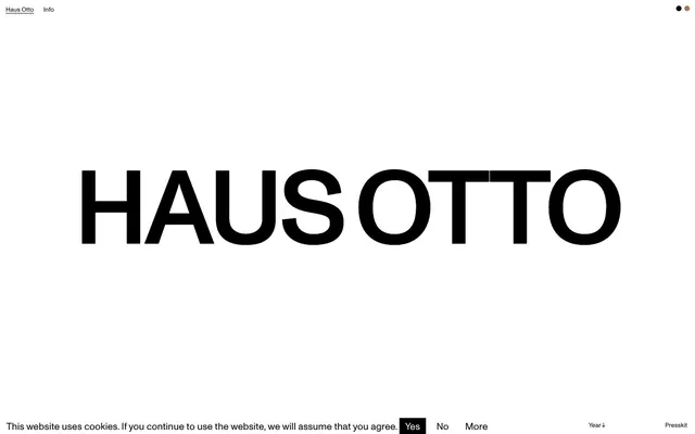
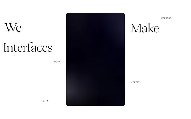
Gallery Wall Monolith — A single, massive black typographic form commands attention against an expansive white background.
Color palette
Subtle, very-low prominence accent color, used sparingly for specific states or indicators, providing a warm, earthy counterpoint to the stark monochromes.
Page backgrounds, significant surface areas, text on accent blocks.
Primary text, borders, interactive elements like button backgrounds, creating maximum contrast against the white canvas.
Typography
- Weights
- 400
- Sizes
- 13px, 20px, 23px
- Line height
- 1.15, 1.16, 1.23, 1.77, 2
- Letter spacing
- normal
- Fallback
- IBM Plex Sans
General body text, navigation links, and smaller headings. The consistently regular (400) weight maintains a sense of understated authority across all informational text.
- Weights
- 400
- Sizes
- 216px
- Line height
- normal
- Letter spacing
- -0.033em
- Fallback
- IBM Plex Sans
Dominant display headlines. The monumental size at weight 400 with tight letter-spacing is the signature visual element, asserting brand identity through sheer scale rather than bolding or expressive typefaces.
Spacing & shape
Components
Text in Monument-Regular, 13px, #000000, 1.15 line height. No visible active states or backgrounds, relying on context for interaction.
Monument-Medium, 216px, #000000, normal line height, letter-spacing -0.033em. Centered and massive, this is the core visual identifier.
Monument-Regular, 13px text, 4px padding-top/bottom, 8px padding-left/right, #000000 background, #ffffff text. Square, no radius.
Monument-Regular, 13px text, no background, #000000 text. Simple text-only button for secondary actions.
Monument-Regular, 13px text, #000000, 1.15 line height. Identical to main nav links, appearing understated at the bottom.
Guidelines
- Prioritize extreme visual contrast: #000000 text on #ffffff backgrounds, or vice-versa, for all core content.
- Use Monument-Medium at a monumental scale (216px) with tight letter-spacing (-0.033em) for key brand or section headings, ensuring singular visual impact.
- Maintain a strict achromatic palette, introducing Desert Ochre (#af7653) only for minimal accentuation on extremely low-prominence elements.
- Employ the 4px base unit for all spacing, particularly in elemental gaps, using tokens like 3px, 4px, 5px, 8px, 12px, 20px, 30px.
- All interactive elements, including buttons, must appear as sharp, unrounded rectangles, reinforcing a precise and unembellished aesthetic.
- Implement the 13px Monument-Regular type for all body copy and navigation, maintaining consistency and an understated, informational tone.
- Avoid decorative elements like shadows, gradients, or complex borders; the design relies on purity of form and stark contrast.
- Do not introduce additional saturated colors beyond the very limited use of Desert Ochre (#af7653); maintain the monochrome discipline.
- Never use rounded corners on any element; all shapes must be rectilinear, reflecting rigidity and structure.
- Refrain from using bold or heavy font weights; the visual weight is achieved through size and contrast, not typographic emphasis.
- Do not deviate from the specified tight letter-spacing for display typography or normal letter-spacing for body text; typographic precision is key.
- Avoid complex layouts or multi-column grids that would dilute the singular focus; prefer centered or directly aligned compositions.
About this system
ShowHide
This system projects an aesthetic of stark minimalism and purposeful absence, like a gallery wall with a single, monumental exhibit. It leverages extreme contrast and sparse visual elements to emphasize a singular brand presence. The visual impact is created by the massive, centrally-aligned, uppercase sans-serif typography on an absolute white canvas, demanding full attention without clutter.
The page exhibits a full-bleed, unconstrained layout, meaning elements are not restricted by a maximum content width, though content generally appears centrally aligned or to the far edges. The hero section is dominated by a singularly massive, centered typographic element, covering most of the viewport. Section rhythm is sparse, primarily defined by vast expanses of white space separating minimal textual blocks. Content is arranged in stacked, centered blocks, with some elements (like cookie consent) pinned to the page bottom. Navigation is minimal, consisting of small text links at the top-left and bottom-right corners, not occupying a dedicated sticky header or sidebar.
The site uses no visible raster imagery or illustrations. Its visual language relies exclusively on typography and whitespace. The absence of images reinforces the stark, minimalist, and conceptual nature of the brand, directing focus entirely onto textual information and the brand's name as a monumental graphic element. Icons are also absent; interaction cues are purely textual (Yes, No, More, Year ↓).
Reminiscent of A.P.C., COS, The Row, Acne Studios.
# Haus Otto — Style Reference
> Gallery Wall Monolith — A single, massive black typographic form commands attention against an expansive white background.

**Theme:** light

**Site:** https://hausotto.com

This system projects an aesthetic of stark minimalism and purposeful absence, like a gallery wall with a single, monumental exhibit. It leverages extreme contrast and sparse visual elements to emphasize a singular brand presence. The visual impact is created by the massive, centrally-aligned, uppercase sans-serif typography on an absolute white canvas, demanding full attention without clutter.

## Tokens — Colors

| Name | Value | Token | Role |
|------|------|------|------|
| Desert Ochre | `#af7653` | `--color-desert-ochre` | Subtle, very-low prominence accent color, used sparingly for specific states or indicators, providing a warm, earthy counterpoint to the stark monochromes. |
| Absolute White | `#ffffff` | `--color-absolute-white` | Page backgrounds, significant surface areas, text on accent blocks. |
| Deep Black | `#000000` | `--color-deep-black` | Primary text, borders, interactive elements like button backgrounds, creating maximum contrast against the white canvas. |

## Tokens — Typography

### Monument-Regular
- **Substitute:** IBM Plex Sans
- **Weights:** 400
- **Sizes:** 13px, 20px, 23px
- **Line height:** 1.15, 1.16, 1.23, 1.77, 2
- **Letter spacing:** normal
- **Role:** General body text, navigation links, and smaller headings. The consistently regular (400) weight maintains a sense of understated authority across all informational text.

### Monument-Medium
- **Substitute:** IBM Plex Sans
- **Weights:** 400
- **Sizes:** 216px
- **Line height:** normal
- **Letter spacing:** -0.033em
- **Role:** Dominant display headlines. The monumental size at weight 400 with tight letter-spacing is the signature visual element, asserting brand identity through sheer scale rather than bolding or expressive typefaces.

## Tokens — Type Scale

| Role | Size | Line height | Letter spacing |
|------|------|------|------|
| caption | 13px | 1.15 | — |
| body | 20px | 1.16 | — |
| subheading | 23px | 1.23 | — |
| display | 216px | 1 | -0.033em |

## Tokens — Spacing

- **Section gap:** 30px
- **Card padding:** 12px
- **Element gap:** 4px

## Tokens — Radius

- **Default:** 0px
- **Buttons:** 0px

## Layout

The page exhibits a full-bleed, unconstrained layout, meaning elements are not restricted by a maximum content width, though content generally appears centrally aligned or to the far edges. The hero section is dominated by a singularly massive, centered typographic element, covering most of the viewport. Section rhythm is sparse, primarily defined by vast expanses of white space separating minimal textual blocks. Content is arranged in stacked, centered blocks, with some elements (like cookie consent) pinned to the page bottom. Navigation is minimal, consisting of small text links at the top-left and bottom-right corners, not occupying a dedicated sticky header or sidebar.

## Imagery

The site uses no visible raster imagery or illustrations. Its visual language relies exclusively on typography and whitespace. The absence of images reinforces the stark, minimalist, and conceptual nature of the brand, directing focus entirely onto textual information and the brand's name as a monumental graphic element. Icons are also absent; interaction cues are purely textual (Yes, No, More, Year ↓).

## Components

### Cookie Consent Banner

### Navigation Bar

### Footer Meta Bar

### Global Navigation Link
*Primary site navigation*

Text in Monument-Regular, 13px, #000000, 1.15 line height. No visible active states or backgrounds, relying on context for interaction.

### Main Display Headline
*Brand identity, section titles*

Monument-Medium, 216px, #000000, normal line height, letter-spacing -0.033em. Centered and massive, this is the core visual identifier.

### Cookie Consent Button (Default)
*User interaction, consent actions*

Monument-Regular, 13px text, 4px padding-top/bottom, 8px padding-left/right, #000000 background, #ffffff text. Square, no radius.

### Cookie Consent Button (Hover/Inactive)
*User interaction, consent actions*

Monument-Regular, 13px text, no background, #000000 text. Simple text-only button for secondary actions.

### Footer Link / Meta Info
*Secondary navigation and legal text*

Monument-Regular, 13px text, #000000, 1.15 line height. Identical to main nav links, appearing understated at the bottom.

## Guidelines

### Do

- Prioritize extreme visual contrast: #000000 text on #ffffff backgrounds, or vice-versa, for all core content.
- Use Monument-Medium at a monumental scale (216px) with tight letter-spacing (-0.033em) for key brand or section headings, ensuring singular visual impact.
- Maintain a strict achromatic palette, introducing Desert Ochre (#af7653) only for minimal accentuation on extremely low-prominence elements.
- Employ the 4px base unit for all spacing, particularly in elemental gaps, using tokens like 3px, 4px, 5px, 8px, 12px, 20px, 30px.
- All interactive elements, including buttons, must appear as sharp, unrounded rectangles, reinforcing a precise and unembellished aesthetic.
- Implement the 13px Monument-Regular type for all body copy and navigation, maintaining consistency and an understated, informational tone.

### Don't

- Avoid decorative elements like shadows, gradients, or complex borders; the design relies on purity of form and stark contrast.
- Do not introduce additional saturated colors beyond the very limited use of Desert Ochre (#af7653); maintain the monochrome discipline.
- Never use rounded corners on any element; all shapes must be rectilinear, reflecting rigidity and structure.
- Refrain from using bold or heavy font weights; the visual weight is achieved through size and contrast, not typographic emphasis.
- Do not deviate from the specified tight letter-spacing for display typography or normal letter-spacing for body text; typographic precision is key.
- Avoid complex layouts or multi-column grids that would dilute the singular focus; prefer centered or directly aligned compositions.

## Agent Prompt Guide

### Quick Color Reference
- Text: #000000 (Deep Black)
- Background: #ffffff (Absolute White)
- Accent: #af7653 (Desert Ochre)
- Button Background: #000000 (Deep Black)
- Button Text: #ffffff (Absolute White)

### 3-5 Example Component Prompts
1. Create a cookie consent bar pinned to the bottom of the viewport: background Absolute White, text Deep Black, size 13px Monument-Regular. Include a 'Yes' button with an Deep Black background, Absolute White text, no border-radius, and 4px vertical / 8px horizontal padding. The 'No' button is text-only, Deep Black, no background, 4px vertical / 8px horizontal padding. Element gaps are 3px.
2. Design a primary page header for 'Haus Otto' centered in the viewport, using Monument-Medium, 216px, Deep Black, normal line-height, and -0.033em letter-spacing.
3. Implement a footer section with two links: 'Year ↓' and 'Presskit', both using Monument-Regular, 13px, Deep Black. Space elements 20px apart horizontally.
More like this






Keep what you find
A free account saves references to boards and can send you a weekly email of picks based on what you save.
To see every result, go Pro.