Preview image. Unlock full-res
Electric theater spotlight
Color palette
Backgrounds for key sections and immersive content blocks, footer background — provides a deep, dramatic stage for content
Primary action backgrounds, interactive elements, highlights, and decorative borders — a high-energy accent that demands attention
Decorative text accents and borders, especially for quotes and urgent information — an even more vivid highlight than magenta
Primary text, borders, and image backgrounds — provides stark contrast to lighter elements and acts as a foundation
Page background, input fields, and subtle UI surfaces — a warm, off-white base that softens the high contrast
Secondary text, button text, and card backgrounds — used sparingly for contrast against darker backgrounds or as a clean surface
Subtle card backgrounds – provides minor visual distinction from the page background without heavy contrast
Default input border color — a utilitarian neutral for form elements
Typography
- Weights
- 400, 700, 800, 900
- Sizes
- 16px, 18px, 22px, 24px, 40px, 56px, 80px
- Line height
- 1, 1.1, 1.2, 1.38, 1.45
- Letter spacing
- -0.0200em
- Fallback
- Montserrat
All textual content, from navigation to headings, body text, and button labels. Its bold, condensed nature contributes to the site's distinct, impactful voice.
Spacing & shape
Components
Filled button with Neon Magenta (#fb00c2) background, Canvas White (#ffffff) text, and square corners (0px radius). Padding of 8px all around. Used for primary calls to action.
Circular button with Paper Beige (#f4ede9) background, Neon Magenta (#fb00c2) text, and a circular radius (50% or 50px). No explicit padding, hinting at icon-only functionality. Used for slide navigation dots.
Filled button with Midnight Plum (#340068) background, Canvas White (#ffffff) text, and square corners (0px radius). Padding of 16px all around. Used for calls to action within dark backgrounds.
Clean card with Canvas White (#ffffff) background, 0px border radius, and 16px padding inside. No box shadow, relying on spacing for separation. Contains text and often an image.
Card with Concrete Gray (#d9d9d9) background, 0px border radius, and no explicit padding, implying content dictates spacing. No box shadow, used for subtle grouping.
Input field with Paper Beige (#f4ede9) background, Coal Black (#000000) text, and Square corners (0px radius). Padding of 16px all around. Border is implied or appears on focus.
Guidelines
- Use Midnight Plum (#340068) for all large background sections that require a dramatic, immersive feel.
- Apply Neon Magenta (#fb00c2) as the primary accent color for all calls to action, interactive states, and important graphical elements.
- Set all headlines and impactful text in Walsheim at weight 700 or 800 with a letter-spacing of -0.0200em for a condensed, bold presence.
- Maintain high contrast by pairing Coal Black (#000000) text on Paper Beige (#f4ede9) or Canvas White (#ffffff) backgrounds for readability.
- Utilize 0px border radius for most UI elements like cards and buttons, favoring sharp, defined edges.
- Employ a base spacing unit of 8px, building up to 16px for element gaps and 48-56px for section separation.
- Avoid using gradients; the design relies on stark, solid color blocks.
- Do not introduce soft shadows or elevated effects; surfaces are flat and defined by color and boundaries.
- Do not use highly saturated colors for large areas of body text, reserve chromatic colors for accents and headings.
- Avoid decorative border radii for cards or buttons, maintaining the 0px radius aesthetic unless specifically for a circular element.
- Do not use subtle gray for primary action backgrounds; reserve Neon Magenta (#fb00c2) for clear interactive elements.
- Refrain from using lightweight fonts or open letter-spacing for headlines; Walsheim's condensed, bold nature is critical to the brand.
About this system
ShowHide
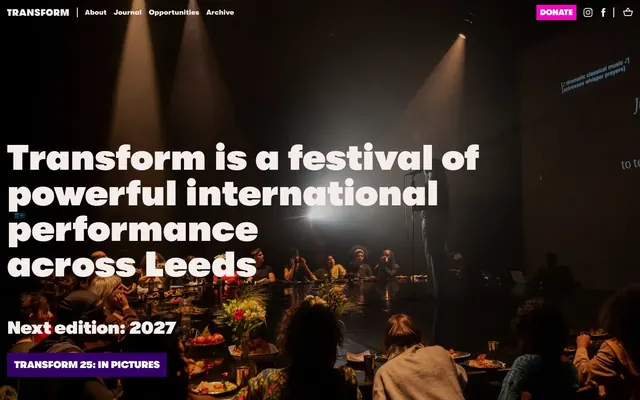
Transform's visual system evokes a dark, pulsating theater space with bursts of electrifying color. Deep, immersive purples and magenta accents cut through stark black and white typography, creating a high-contrast experience that feels both bold and immediate. Typefaces are impactful and condensed, anchoring the dynamic palette and drawing attention to key announcements, while ample negative space ensures clarity amidst the visual energy.
The site uses a max-width contained layout generally, but a full-bleed hero section is often employed, characterized by a dark background with a large, centered, high-contrast headline. Section rhythm varies but includes distinct alternating bands of color (e.g., dark with light text, then light with dark text). Content is often arranged in prominent centered stacks for headlines and quotes, with occasional two-column layouts for information blocks. There is a prominent sticky top navigation bar. The overall density is comfortable, with generous vertical spacing between major sections, letting dramatic headlines breathe.
This design system uses a mix of candid, dark-lit photography capturing live performance environments and abstract patterns. Photography is often full-bleed or presented as background elements, creating an immersive, atmospheric context for text. Product-style visuals are not present. Icons are simple, outlined, and monochromatic, primarily serving a functional role in navigation or social links. Imagery typically serves a decorative and atmospheric role, rather than strictly explanatory, allowing the bold typography to convey key messages. The density of imagery can be high in hero sections, giving way to more text-dominant layouts in content sections.
Reminiscent of AIGA, The Shed, Design Museum.
# Transform — Style Reference
> Electric theater spotlight

**Theme:** light

**Site:** https://transformfestival.org

Transform's visual system evokes a dark, pulsating theater space with bursts of electrifying color. Deep, immersive purples and magenta accents cut through stark black and white typography, creating a high-contrast experience that feels both bold and immediate. Typefaces are impactful and condensed, anchoring the dynamic palette and drawing attention to key announcements, while ample negative space ensures clarity amidst the visual energy.

## Tokens — Colors

| Name | Value | Token | Role |
|------|------|------|------|
| Midnight Plum | `#340068` | `--color-midnight-plum` | Backgrounds for key sections and immersive content blocks, footer background — provides a deep, dramatic stage for content |
| Neon Magenta | `#fb00c2` | `--color-neon-magenta` | Primary action backgrounds, interactive elements, highlights, and decorative borders — a high-energy accent that demands attention |
| Live Event Red | `#ff1e00` | `--color-live-event-red` | Decorative text accents and borders, especially for quotes and urgent information — an even more vivid highlight than magenta |
| Coal Black | `#000000` | `--color-coal-black` | Primary text, borders, and image backgrounds — provides stark contrast to lighter elements and acts as a foundation |
| Paper Beige | `#f4ede9` | `--color-paper-beige` | Page background, input fields, and subtle UI surfaces — a warm, off-white base that softens the high contrast |
| Canvas White | `#ffffff` | `--color-canvas-white` | Secondary text, button text, and card backgrounds — used sparingly for contrast against darker backgrounds or as a clean surface |
| Concrete Gray | `#d9d9d9` | `--color-concrete-gray` | Subtle card backgrounds – provides minor visual distinction from the page background without heavy contrast |
| Input Border Gray | `#767676` | `--color-input-border-gray` | Default input border color — a utilitarian neutral for form elements |

## Tokens — Typography

### Walsheim
- **Substitute:** Montserrat
- **Weights:** 400, 700, 800, 900
- **Sizes:** 16px, 18px, 22px, 24px, 40px, 56px, 80px
- **Line height:** 1, 1.1, 1.2, 1.38, 1.45
- **Letter spacing:** -0.0200em
- **Role:** All textual content, from navigation to headings, body text, and button labels. Its bold, condensed nature contributes to the site's distinct, impactful voice.

## Tokens — Type Scale

Perfect Fourth (1.333) from 18px base.

| Role | Size | Line height | Letter spacing |
|------|------|------|------|
| body-sm | 16px | 1.45 | — |
| body | 18px | 1.45 | — |
| subheading | 22px | 1.38 | — |
| heading-sm | 24px | 1.38 | — |
| heading | 40px | 1.2 | — |
| heading-lg | 56px | 1.1 | -1.12px |
| display | 80px | 1 | -1.6px |

## Tokens — Spacing

- **Section gap:** 48-56px
- **Card padding:** 16px
- **Element gap:** 8-16px

## Tokens — Radius

- **circular:** 50px

## Layout

The site uses a max-width contained layout generally, but a full-bleed hero section is often employed, characterized by a dark background with a large, centered, high-contrast headline. Section rhythm varies but includes distinct alternating bands of color (e.g., dark with light text, then light with dark text). Content is often arranged in prominent centered stacks for headlines and quotes, with occasional two-column layouts for information blocks. There is a prominent sticky top navigation bar. The overall density is comfortable, with generous vertical spacing between major sections, letting dramatic headlines breathe.

## Imagery

This design system uses a mix of candid, dark-lit photography capturing live performance environments and abstract patterns. Photography is often full-bleed or presented as background elements, creating an immersive, atmospheric context for text. Product-style visuals are not present. Icons are simple, outlined, and monochromatic, primarily serving a functional role in navigation or social links. Imagery typically serves a decorative and atmospheric role, rather than strictly explanatory, allowing the bold typography to convey key messages. The density of imagery can be high in hero sections, giving way to more text-dominant layouts in content sections.

## Components

### Primary Action Button
*Fills and calls to action prominently*

Filled button with Neon Magenta (#fb00c2) background, Canvas White (#ffffff) text, and square corners (0px radius). Padding of 8px all around. Used for primary calls to action.

### Subtle Circular Button
*Decorative page navigation, subtle actions*

Circular button with Paper Beige (#f4ede9) background, Neon Magenta (#fb00c2) text, and a circular radius (50% or 50px). No explicit padding, hinting at icon-only functionality. Used for slide navigation dots.

### Footer Action Button
*Call to action within dark footer sections*

Filled button with Midnight Plum (#340068) background, Canvas White (#ffffff) text, and square corners (0px radius). Padding of 16px all around. Used for calls to action within dark backgrounds.

### Monochromatic Feature Card
*Displays related content, news, or blog posts*

Clean card with Canvas White (#ffffff) background, 0px border radius, and 16px padding inside. No box shadow, relying on spacing for separation. Contains text and often an image.

### Subtle Feature Card
*Displays related content using a lighter background*

Card with Concrete Gray (#d9d9d9) background, 0px border radius, and no explicit padding, implying content dictates spacing. No box shadow, used for subtle grouping.

### Standard Input Field
*Text input forms*

Input field with Paper Beige (#f4ede9) background, Coal Black (#000000) text, and Square corners (0px radius). Padding of 16px all around. Border is implied or appears on focus.

## Guidelines

### Do

- Use Midnight Plum (#340068) for all large background sections that require a dramatic, immersive feel.
- Apply Neon Magenta (#fb00c2) as the primary accent color for all calls to action, interactive states, and important graphical elements.
- Set all headlines and impactful text in Walsheim at weight 700 or 800 with a letter-spacing of -0.0200em for a condensed, bold presence.
- Maintain high contrast by pairing Coal Black (#000000) text on Paper Beige (#f4ede9) or Canvas White (#ffffff) backgrounds for readability.
- Utilize 0px border radius for most UI elements like cards and buttons, favoring sharp, defined edges.
- Employ a base spacing unit of 8px, building up to 16px for element gaps and 48-56px for section separation.

### Don't

- Avoid using gradients; the design relies on stark, solid color blocks.
- Do not introduce soft shadows or elevated effects; surfaces are flat and defined by color and boundaries.
- Do not use highly saturated colors for large areas of body text, reserve chromatic colors for accents and headings.
- Avoid decorative border radii for cards or buttons, maintaining the 0px radius aesthetic unless specifically for a circular element.
- Do not use subtle gray for primary action backgrounds; reserve Neon Magenta (#fb00c2) for clear interactive elements.
- Refrain from using lightweight fonts or open letter-spacing for headlines; Walsheim's condensed, bold nature is critical to the brand.

## Agent Prompt Guide

Quick Color Reference:
text: #000000 (Coal Black)
background: #f4ede9 (Paper Beige)
border: #000000 (Coal Black)
accent: #fb00c2 (Neon Magenta)
primary action: #fb00c2 (filled action)

Example Component Prompts:
1. Create a hero section with a full-bleed Midnight Plum (#340068) background. Headline 'Transform is a festival of powerful international performance across Leeds' in Canvas White (#ffffff) using Walsheim weight 900 at 80px, line-height 1.00, letter-spacing -1.6px. Include a Secondary Action Button with Canvas White (#ffffff) text 'Transform 25: in pictures', on a Midnight Plum (#340068) background, 0px radius, 16px padding.
2. Create a Primary Action Button: #fb00c2 background, #000000 text, 9999px radius, compact pill padding. Use this filled treatment for the main CTA.
3. Create a content section starting with a quote: '“the character of Leeds is baked into the programme”' in Live Event Red (#ff1e00) using Walsheim weight 800 at 56px, line-height 1.10, letter-spacing -1.12px, on a Paper Beige (#f4ede9) background.
4. Design a 'Latest News' section with three Monochromatic Feature Cards side-by-side. Each card should have a Canvas White (#ffffff) background, 0px radius, 16px inner padding, and headline text in Coal Black (#000000) using Walsheim weight 700 at 24px, line-height 1.38.
More like this







Keep what you find
A free account saves references to boards and can send you a weekly email of picks based on what you save.
To see every result, go Pro.