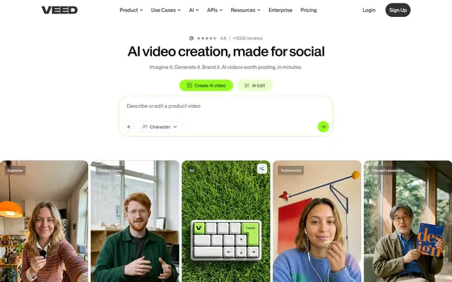
Preview image. Unlock full-res
Vivid green workspace.
Color palette
Primary call-to-action buttons, active states, key interactive elements — serves as the site's primary accent color, drawing immediate attention
Card backgrounds, section highlights — a lighter, still vibrant green that softens areas while maintaining brand identity
Text and icon color on bright green backgrounds, borders for outlined buttons — provides contrast and depth to the greens
Subtle button backgrounds — a very pale green used for ghost or secondary actions
Page background, card surfaces, secondary button background — establishes a clean, expansive base for content
Prominent headings and body text, deep background for section accents — provides strong contrast against white and serves as a foundational dark surface
Primary text for body copy, button text, navigation links — ensures high readability on light backgrounds
Section backgrounds, elevated surface treatments — creates depth and separation from the primary canvas
Neutral form states, badge text, and quiet UI feedback where color should stay understated. Do not promote it to the primary CTA color
Secondary button backgrounds, subtle dividers — offers a soft, almost imperceptible neutral contrast
Typography
- Weights
- 400
- Sizes
- 11px, 12px, 13px, 14px, 16px, 40px, 44px, 54px
- Line height
- 0.88, 0.9, 1, 1.3, 1.36, 1.4, 1.43, 1.5, 1.8
- Letter spacing
- -0.050em, -0.040em, -0.025em, -0.016em, -0.005em, -0.002em, 0.010em
- Fallback
- Inter
Primary font for body text, navigation, buttons, and form elements. Its utilitarian geometry balances clarity and a modern, slightly technical feel.
- Weights
- 500
- Sizes
- 11px, 12px, 13px, 14px, 16px, 40px, 44px, 54px
- Line height
- 0.88, 0.9, 1, 1.3, 1.36, 1.4, 1.43, 1.5, 1.8
- Letter spacing
- -0.050em, -0.040em, -0.025em, -0.016em, -0.005em, -0.002em, 0.010em
- Fallback
- Inter
Used for emphasized body text, subheadings, and interactive components to provide slight visual weight without being overly bold.
- Weights
- 600
- Sizes
- 11px, 12px, 13px, 14px, 16px, 40px, 44px, 54px
- Line height
- 0.88, 0.9, 1, 1.3, 1.36, 1.4, 1.43, 1.5, 1.8
- Letter spacing
- -0.050em, -0.040em, -0.025em, -0.016em, -0.005em, -0.002em, 0.010em
- Fallback
- Inter
For strong accents in body copy, and navigation links. Provides a confident visual presence.
- Weights
- 400
- Sizes
- 40px, 44px, 54px
- Line height
- 0.88, 0.9, 0.96, 1
- Letter spacing
- -0.050em, -0.040em, -0.030em
- Fallback
- Playfair Display
Exclusively for display headings, this typeface provides a distinctive, slightly condensed and elegant presence, contrasting with the SwissNow for branding impact.
Spacing & shape
Elevation
Components
Filled button with Electric Green background and Forest Shade text, using 'pill' radius. Padded 14px vertically and horizontally. Font: SwissNow weight 500.
Outlined button with a Light Ash background and Slate Gray text, using a 12px radius. Padded 8px vertically and 12px horizontally. Font: SwissNow weight 500.
Transparent background with Slate Gray text, 8px radius, padded 8px vertically and 12px horizontally. Font: SwissNow weight 500.
Dark Granite background with Charcoal Black text, 16px radius, no padding inside, acts as a container for content. Font: SwissNow weight 500.
Vivid Leaf background with 16px radius. Internally padded 24px on all sides. Content styled with Charcoal Black text. No box shadow.
Canvas White background with 10px radius. Internally padded 16px on all sides. Content styled with Slate Gray text. No box shadow.
Charcoal Black background with 16px radius. Internally padded 40px vertically, no horizontal padding. Used for prominent full-width content blocks.
Transparent background with Slate Gray text, a bottom border of 1px solid Medium Gray. Padded 20px top, 12px horizontal, 6px bottom. No explicit border radius on main input area.
Guidelines
- Use Electric Green (#96ff1a) for primary calls to action, drawing immediate attention and signifying interactivity.
- Maintain a high contrast between text and background colors, primarily using Charcoal Black (#121212) or Slate Gray (#323232) on Canvas White (#ffffff) or Vivid Leaf (#d6ffa6).
- Apply 'pill' radius (58px) to all primary action buttons for a soft, approachable feel.
- Use PPEditorialNew weight 400 for all display headings to convey a distinctive, editorial brand voice at sizes 40px, 44px, and 54px.
- Employ consistent 16px element gaps for comfortable content separation, especially between cards and form elements.
- Structure large content blocks with a minimum of 24px internal padding to ensure ample breathing room.
- Utilize Dark Granite (#292a2e) for distinct section backgrounds to create visual separation and dynamic alternation with Canvas White.
- Avoid using multiple chromatic colors for primary interactive elements; reserve Electric Green (#96ff1a) for this role.
- Do not introduce sharp corners; components should adhere to the established radii of 4px, 10px, 16px, or 58px.
- Refrain from heavy drop shadows; elevation should be minimal, primarily relying on background color shifts and subtle border treatments.
- Do not break the established type scale; use the defined sizes and letter-spacing values to maintain typographic rhythm.
- Avoid dense, information-heavy blocks of text; prioritize generous line heights and ample whitespace to enhance readability.
- Do not use generic system fonts; SwissNow and PPEditorialNew are key to the brand's unique typographic identity.
- Do not use gradients as primary backgrounds or borders; color changes should primarily be solid for clarity and directness.
About this system
ShowHide
VEED champions a dynamic, high-contrast digital production studio feel, where rich dark surfaces meet a vibrant, almost neon, green for interactive elements. Typography is confident and direct, set against a backdrop of crisp white and dark gray panels that convey a sophisticated, tool-like precision. Visual hierarchy is established through a strong interplay of bold headings and generously spaced content blocks, punctuated by responsive, rounded components.
The site favors highly curated, lifestyle-oriented photography and clean, product-focused screenshots. Photography often features candid, brightly lit individuals making eye contact, conveying authenticity and engagement. Product screenshots highlight UI elements with clarity, frequently against plain white or abstract backgrounds, sometimes with graphic overlays. Icons are simple, outlined, and monocolor, primarily in Forest Shade or Electric Green. Imagery is thoughtfully contained within card components with rounded corners rather than full-bleed, creating a gallery-like presentation. The density is moderate; visuals are prominent but always balanced with significant text blocks.
Reminiscent of Descript, RunwayML, Canva, Copilot.gg.
# VEED — Style Reference
> Vivid green workspace.

**Theme:** light

**Site:** https://www.veed.io

VEED champions a dynamic, high-contrast digital production studio feel, where rich dark surfaces meet a vibrant, almost neon, green for interactive elements. Typography is confident and direct, set against a backdrop of crisp white and dark gray panels that convey a sophisticated, tool-like precision. Visual hierarchy is established through a strong interplay of bold headings and generously spaced content blocks, punctuated by responsive, rounded components.

## Tokens — Colors

| Name | Value | Token | Role |
|------|------|------|------|
| Electric Green | `#96ff1a` | `--color-electric-green` | Primary call-to-action buttons, active states, key interactive elements — serves as the site's primary accent color, drawing immediate attention |
| Vivid Leaf | `#d6ffa6` | `--color-vivid-leaf` | Card backgrounds, section highlights — a lighter, still vibrant green that softens areas while maintaining brand identity |
| Forest Shade | `#083300` | `--color-forest-shade` | Text and icon color on bright green backgrounds, borders for outlined buttons — provides contrast and depth to the greens |
| Misty Mint | `#e6ffc8` | `--color-misty-mint` | Subtle button backgrounds — a very pale green used for ghost or secondary actions |
| Canvas White | `#ffffff` | `--color-canvas-white` | Page background, card surfaces, secondary button background — establishes a clean, expansive base for content |
| Charcoal Black | `#121212` | `--color-charcoal-black` | Prominent headings and body text, deep background for section accents — provides strong contrast against white and serves as a foundational dark surface |
| Slate Gray | `#323232` | `--color-slate-gray` | Primary text for body copy, button text, navigation links — ensures high readability on light backgrounds |
| Dark Granite | `#292a2e` | `--color-dark-granite` | Section backgrounds, elevated surface treatments — creates depth and separation from the primary canvas |
| Medium Gray | `#71737a` | `--color-medium-gray` | Neutral form states, badge text, and quiet UI feedback where color should stay understated. Do not promote it to the primary CTA color |
| Light Ash | `#f2f1f0` | `--color-light-ash` | Secondary button backgrounds, subtle dividers — offers a soft, almost imperceptible neutral contrast |

## Tokens — Typography

### SwissNow
- **Substitute:** Inter
- **Weights:** 400
- **Sizes:** 11px, 12px, 13px, 14px, 16px, 40px, 44px, 54px
- **Line height:** 0.88, 0.9, 1, 1.3, 1.36, 1.4, 1.43, 1.5, 1.8
- **Letter spacing:** -0.050em, -0.040em, -0.025em, -0.016em, -0.005em, -0.002em, 0.010em
- **Role:** Primary font for body text, navigation, buttons, and form elements. Its utilitarian geometry balances clarity and a modern, slightly technical feel.

### SwissNow
- **Substitute:** Inter
- **Weights:** 500
- **Sizes:** 11px, 12px, 13px, 14px, 16px, 40px, 44px, 54px
- **Line height:** 0.88, 0.9, 1, 1.3, 1.36, 1.4, 1.43, 1.5, 1.8
- **Letter spacing:** -0.050em, -0.040em, -0.025em, -0.016em, -0.005em, -0.002em, 0.010em
- **Role:** Used for emphasized body text, subheadings, and interactive components to provide slight visual weight without being overly bold.

### SwissNow
- **Substitute:** Inter
- **Weights:** 600
- **Sizes:** 11px, 12px, 13px, 14px, 16px, 40px, 44px, 54px
- **Line height:** 0.88, 0.9, 1, 1.3, 1.36, 1.4, 1.43, 1.5, 1.8
- **Letter spacing:** -0.050em, -0.040em, -0.025em, -0.016em, -0.005em, -0.002em, 0.010em
- **Role:** For strong accents in body copy, and navigation links. Provides a confident visual presence.

### PPEditorialNew
- **Substitute:** Playfair Display
- **Weights:** 400
- **Sizes:** 40px, 44px, 54px
- **Line height:** 0.88, 0.9, 0.96, 1
- **Letter spacing:** -0.050em, -0.040em, -0.030em
- **Role:** Exclusively for display headings, this typeface provides a distinctive, slightly condensed and elegant presence, contrasting with the SwissNow for branding impact.

## Tokens — Type Scale

Perfect Fifth (1.5) from 11px base.

| Role | Size | Line height | Letter spacing |
|------|------|------|------|
| caption | 11px | 1.43 | 0.11px |
| body-lg | 16px | 1.3 | 0.16px |
| heading-sm | 40px | 1 | -0.64px |
| heading | 44px | 0.9 | -1.76px |
| display | 54px | 0.88 | -2.7px |

## Tokens — Spacing

- **Section gap:** 32px
- **Card padding:** 16px
- **Element gap:** 16px

## Tokens — Radius

- **lg:** 16px
- **md:** 10px
- **pill:** 58px
- **sm:** 4px

## Tokens — Elevation

- **Button (hover/active):** `rgba(68, 68, 70, 0.15) 0px 1px 2px -1px, rgba(68, 68, 70, 0.05) 0px 2px 5px 0px`

## Imagery

The site favors highly curated, lifestyle-oriented photography and clean, product-focused screenshots. Photography often features candid, brightly lit individuals making eye contact, conveying authenticity and engagement. Product screenshots highlight UI elements with clarity, frequently against plain white or abstract backgrounds, sometimes with graphic overlays. Icons are simple, outlined, and monocolor, primarily in Forest Shade or Electric Green. Imagery is thoughtfully contained within card components with rounded corners rather than full-bleed, creating a gallery-like presentation. The density is moderate; visuals are prominent but always balanced with significant text blocks.

## Components

### Primary Action Button
*Call to action*

Filled button with Electric Green background and Forest Shade text, using 'pill' radius. Padded 14px vertically and horizontally. Font: SwissNow weight 500.

### Secondary Action Button
*Alternative action*

Outlined button with a Light Ash background and Slate Gray text, using a 12px radius. Padded 8px vertically and 12px horizontally. Font: SwissNow weight 500.

### Ghost Button
*Minimal interaction*

Transparent background with Slate Gray text, 8px radius, padded 8px vertically and 12px horizontally. Font: SwissNow weight 500.

### Dark Elevated Button
*Content container button*

Dark Granite background with Charcoal Black text, 16px radius, no padding inside, acts as a container for content. Font: SwissNow weight 500.

### Promotional Card - Vivid Leaf
*Highlight content block*

Vivid Leaf background with 16px radius. Internally padded 24px on all sides. Content styled with Charcoal Black text. No box shadow.

### Feature Card - Canvas White
*Standard content block*

Canvas White background with 10px radius. Internally padded 16px on all sides. Content styled with Slate Gray text. No box shadow.

### Dark Section Card
*Full-width section background*

Charcoal Black background with 16px radius. Internally padded 40px vertically, no horizontal padding. Used for prominent full-width content blocks.

### Input Field
*Data entry*

Transparent background with Slate Gray text, a bottom border of 1px solid Medium Gray. Padded 20px top, 12px horizontal, 6px bottom. No explicit border radius on main input area.

## Guidelines

### Do

- Use Electric Green (#96ff1a) for primary calls to action, drawing immediate attention and signifying interactivity.
- Maintain a high contrast between text and background colors, primarily using Charcoal Black (#121212) or Slate Gray (#323232) on Canvas White (#ffffff) or Vivid Leaf (#d6ffa6).
- Apply 'pill' radius (58px) to all primary action buttons for a soft, approachable feel.
- Use PPEditorialNew weight 400 for all display headings to convey a distinctive, editorial brand voice at sizes 40px, 44px, and 54px.
- Employ consistent 16px element gaps for comfortable content separation, especially between cards and form elements.
- Structure large content blocks with a minimum of 24px internal padding to ensure ample breathing room.
- Utilize Dark Granite (#292a2e) for distinct section backgrounds to create visual separation and dynamic alternation with Canvas White.

### Don't

- Avoid using multiple chromatic colors for primary interactive elements; reserve Electric Green (#96ff1a) for this role.
- Do not introduce sharp corners; components should adhere to the established radii of 4px, 10px, 16px, or 58px.
- Refrain from heavy drop shadows; elevation should be minimal, primarily relying on background color shifts and subtle border treatments.
- Do not break the established type scale; use the defined sizes and letter-spacing values to maintain typographic rhythm.
- Avoid dense, information-heavy blocks of text; prioritize generous line heights and ample whitespace to enhance readability.
- Do not use generic system fonts; SwissNow and PPEditorialNew are key to the brand's unique typographic identity.
- Do not use gradients as primary backgrounds or borders; color changes should primarily be solid for clarity and directness.

## Agent Prompt Guide

Quick Color Reference:
text: #323232
background: #ffffff
border: #71737a
accent: #96ff1a
primary action: #96ff1a (filled action)

Example Component Prompts:
1. Create a Primary Action Button: #96ff1a background, #0c0a09 text, 9999px radius, compact pill padding. Use this filled treatment for the main CTA.
2. Create a Feature Card: Vivid Leaf background #d6ffa6, 16px radius, internally padded 24px. Headline 'Generate videos' at 40px SwissNow weight 600, #121212, letter-spacing -2.0px. Body text 'Turn any idea into a video worth posting - no camera needed' at 14px SwissNow weight 400, #323232.
3. Create a dark section background: Dark Granite background #292a2e, with a centered headline 'Generate videos that look like your brand, not AI' at 44px PPEditorialNew weight 400, #ffffff, letter-spacing -1.76px. Ensure vertical padding of 40px at the top and bottom of the section.
More like this








Keep what you find
A free account saves references to boards and can send you a weekly email of picks based on what you save.
To see every result, go Pro.