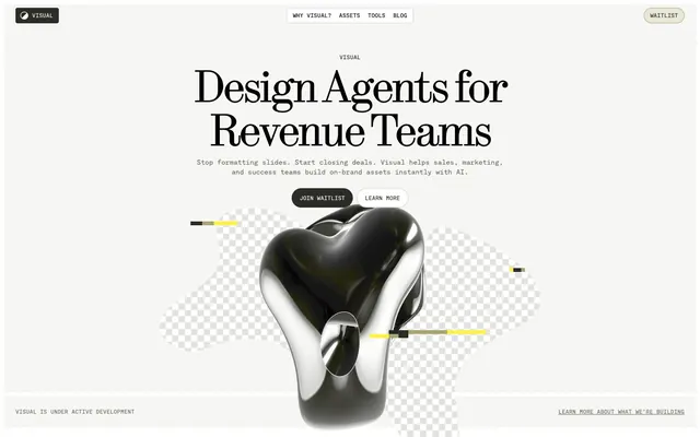
Preview image. Unlock full-res
Editorial blueprint on parchment
Color palette
Vivid functional highlights, small decorative elements, indicators for active states or new content. Used very sparingly
Subtle decorative elements, ghost button borders, background highlights in some contexts
Page background, large section backgrounds for breathing room
Card backgrounds, secondary section backgrounds, light panels
Primary text, darker section backgrounds, filled buttons, footer background. Serves as the primary dark contrast element
Headings, strong text, icon fills – provides maximum contrast against light backgrounds
Subtle borders, helper text, inactive navigation items, faint dividers
Hover states, subtle background accents, default button backgrounds
Muted icon color, secondary text, descriptive body text for readability
Hairline borders, subtle strokes, structural lines
Typography
- Weights
- 300, 400
- Sizes
- 24px, 32px, 48px, 64px, 96px
- Line height
- 0.94, 1, 1.13
- Letter spacing
- -0.050em at 48px to -0.025em at 24px
- Fallback
- Playfair Display
Primary headings and large display text. The low weights (300, 400) give an authoritative yet approachable feel, avoiding the harshness of bold serif headlines.
- Weights
- 300, 400, 500
- Sizes
- 12px, 14px, 16px, 20px, 28px, 48px
- Line height
- 1, 1.33, 1.41, 1.5
- Letter spacing
- -0.067em at 48px to -0.025em at 28px, normal at smaller sizes
- Fallback
- IBM Plex Mono
Body text, navigation, buttons, and all functional interface elements. The monospaced feel adds a technical, precise undertone without sacrificing readability, especially at smaller sizes.
Spacing & shape
Components
Used as the primary action for key interactive elements like 'Join waitlist' on dark backgrounds. Features Surface White text with a 1px Surface White border, no fill, 0px border-radius, and 16px vertical / 32px horizontal padding. The squared edges signify a distinct, modern identity.
A compact pill-shaped button for secondary actions or tags. Uses Charcoal Ink for background, Surface White text, and a massive 1.67772e+07px border-radius for the pill shape, with 0px vertical / 16px horizontal padding. Text uses fontMono.
Similar to the filled pill button, but uses Surface White background with Charcoal Ink text, and a matched 1.67772e+07px border-radius for a pill shape.
A softer pill-shaped button for less prominent actions, like 'Waitlist' in the header. Uses Warm Gray background, Charcoal Ink text, and Muted Gold border, with 1.67772e+07px border-radius and 0px vertical / 12px horizontal padding.
Standard content container, using Surface White background, with an 8px border-radius and no shadow. Used for blog posts and featurettes. Padding is determined by content.
A specific content card variant with an 8px radius on the top-left and no radius on other corners. Used for distinct content blocks, likely for visual interest or a specific layout split. Background is Surface White.
Individual navigation links in the header, utilizing fontMono. Text color defaults to Content Black, changing on hover/active. Contains 3px border-radius for internal elements or highlighting.
The footer area, characterized by a solid Charcoal Ink background and Surface White text. Uses a generous 24px vertical padding.
Guidelines
- Prioritize fontSerif for all primary headlines, with a weight of 300 or 400, not bolder.
- Use fontMono for all body text, navigation, and button labels to maintain the technical, precise feel.
- Maintain generous vertical spacing between sections, primarily using 80px for section gaps.
- Apply Canvas Parchment (#f6f6f4) as the default background for most page sections.
- Use Charcoal Ink (#2c2c26) for filled button backgrounds and dark section backgrounds, paired with Surface White text.
- Accent key functional elements and interactive states with Accent Lime (#fff347), used sparingly and punctually.
- Ensure all buttons and interactive tags maintain an aggressively pill-shaped radius (1.67772e+07px) or a sharp 0px radius for ghost actions.
- Avoid arbitrary use of strong colors; color should always serve a functional purpose.
- Do not use heavy shadows or strong elevation effects; surfaces should remain flat or subtly bordered.
- Do not use generic system fonts; stick strictly to fontMono and fontSerif for all text.
- Avoid excessively long line lengths for body text to preserve the editorial clarity.
- Do not apply rounded corners to elements unless explicitly specified with 8px for cards or 3px for navigation elements.
- Do not use images as primary branding elements, maintain the emphasis on typography and structured content.
- Avoid decorative gradients; stick to solid color backgrounds unless for specific imagery.
About this system
ShowHide
Visual employs an editorial-minimalist aesthetic, using a muted, near-achromatic palette to emphasize typography and content. A primary accent of deep charcoal and secondary highlights of yellow are used sparingly to draw attention to key functional elements. The design prioritizes generous spacing and a deliberate grid, creating a sense of calm authority and allowing the AI-generated content to take center stage without visual clutter. Surfaces are mostly light, acting as a clean canvas.
Reminiscent of Linear, Framer, Amie, Read.cv.
# Visual — Style Reference
> Editorial blueprint on parchment

**Theme:** light

**Site:** https://designstripe.com

Visual employs an editorial-minimalist aesthetic, using a muted, near-achromatic palette to emphasize typography and content. A primary accent of deep charcoal and secondary highlights of yellow are used sparingly to draw attention to key functional elements. The design prioritizes generous spacing and a deliberate grid, creating a sense of calm authority and allowing the AI-generated content to take center stage without visual clutter. Surfaces are mostly light, acting as a clean canvas.

## Tokens — Colors

| Name | Value | Token | Role |
|------|------|------|------|
| Accent Lime | `#fff347` | `--color-accent-lime` | Vivid functional highlights, small decorative elements, indicators for active states or new content. Used very sparingly |
| Muted Gold | `#aaa674` | `--color-muted-gold` | Subtle decorative elements, ghost button borders, background highlights in some contexts |
| Canvas Parchment | `#f6f6f4` | `--color-canvas-parchment` | Page background, large section backgrounds for breathing room |
| Surface White | `#ffffff` | `--color-surface-white` | Card backgrounds, secondary section backgrounds, light panels |
| Charcoal Ink | `#2c2c26` | `--color-charcoal-ink` | Primary text, darker section backgrounds, filled buttons, footer background. Serves as the primary dark contrast element |
| Content Black | `#000000` | `--color-content-black` | Headings, strong text, icon fills – provides maximum contrast against light backgrounds |
| Muted Stone | `#d0d0c8` | `--color-muted-stone` | Subtle borders, helper text, inactive navigation items, faint dividers |
| Warm Gray | `#e8e7d9` | `--color-warm-gray` | Hover states, subtle background accents, default button backgrounds |
| Icon Gray | `#aaab9c` | `--color-icon-gray` | Muted icon color, secondary text, descriptive body text for readability |
| Border Khaki | `#57584b` | `--color-border-khaki` | Hairline borders, subtle strokes, structural lines |

## Tokens — Typography

### fontSerif
- **Substitute:** Playfair Display
- **Weights:** 300, 400
- **Sizes:** 24px, 32px, 48px, 64px, 96px
- **Line height:** 0.94, 1, 1.13
- **Letter spacing:** -0.050em at 48px to -0.025em at 24px
- **Role:** Primary headings and large display text. The low weights (300, 400) give an authoritative yet approachable feel, avoiding the harshness of bold serif headlines.

### fontMono
- **Substitute:** IBM Plex Mono
- **Weights:** 300, 400, 500
- **Sizes:** 12px, 14px, 16px, 20px, 28px, 48px
- **Line height:** 1, 1.33, 1.41, 1.5
- **Letter spacing:** -0.067em at 48px to -0.025em at 28px, normal at smaller sizes
- **Role:** Body text, navigation, buttons, and all functional interface elements. The monospaced feel adds a technical, precise undertone without sacrificing readability, especially at smaller sizes.

## Tokens — Type Scale

Perfect Fourth (1.333) from 16px base.

| Role | Size | Line height | Letter spacing |
|------|------|------|------|
| caption | 12px | 1.5 | — |
| body | 16px | 1.5 | — |
| subheading | 20px | 1.41 | -0.025em |
| heading-sm | 28px | 1.33 | -0.025em |
| heading | 32px | 1.13 | -0.05em |
| heading-lg | 48px | 1 | -0.05em |
| display | 64px | 0.94 | -0.05em |

## Tokens — Spacing

- **Max width:** 1200px
- **Section gap:** 80px
- **Card padding:** 16px
- **Element gap:** 8px

## Tokens — Radius

- **Buttons:** 9999px
- **Cards:** 8px
- **navigation:** 3px

## Components

### Primary Ghost Button
*Outlined action button*

Used as the primary action for key interactive elements like 'Join waitlist' on dark backgrounds. Features Surface White text with a 1px Surface White border, no fill, 0px border-radius, and 16px vertical / 32px horizontal padding. The squared edges signify a distinct, modern identity.

### Filled Pill Button
*Secondary action button/Tag*

A compact pill-shaped button for secondary actions or tags. Uses Charcoal Ink for background, Surface White text, and a massive 1.67772e+07px border-radius for the pill shape, with 0px vertical / 16px horizontal padding. Text uses fontMono.

### Light Pill Button
*Neutral secondary button*

Similar to the filled pill button, but uses Surface White background with Charcoal Ink text, and a matched 1.67772e+07px border-radius for a pill shape.

### Light Muted Pill Button
*Tertiary or ghost action button*

A softer pill-shaped button for less prominent actions, like 'Waitlist' in the header. Uses Warm Gray background, Charcoal Ink text, and Muted Gold border, with 1.67772e+07px border-radius and 0px vertical / 12px horizontal padding.

### Content Card
*Container for content blocks*

Standard content container, using Surface White background, with an 8px border-radius and no shadow. Used for blog posts and featurettes. Padding is determined by content.

### Half-Rounded Card
*Asymmetric content container*

A specific content card variant with an 8px radius on the top-left and no radius on other corners. Used for distinct content blocks, likely for visual interest or a specific layout split. Background is Surface White.

### Navigation Bar Item
*Top navigation link*

Individual navigation links in the header, utilizing fontMono. Text color defaults to Content Black, changing on hover/active. Contains 3px border-radius for internal elements or highlighting.

### Footer Block
*Bottom page section*

The footer area, characterized by a solid Charcoal Ink background and Surface White text. Uses a generous 24px vertical padding.

## Guidelines

### Do

- Prioritize fontSerif for all primary headlines, with a weight of 300 or 400, not bolder.
- Use fontMono for all body text, navigation, and button labels to maintain the technical, precise feel.
- Maintain generous vertical spacing between sections, primarily using 80px for section gaps.
- Apply Canvas Parchment (#f6f6f4) as the default background for most page sections.
- Use Charcoal Ink (#2c2c26) for filled button backgrounds and dark section backgrounds, paired with Surface White text.
- Accent key functional elements and interactive states with Accent Lime (#fff347), used sparingly and punctually.
- Ensure all buttons and interactive tags maintain an aggressively pill-shaped radius (1.67772e+07px) or a sharp 0px radius for ghost actions.

### Don't

- Avoid arbitrary use of strong colors; color should always serve a functional purpose.
- Do not use heavy shadows or strong elevation effects; surfaces should remain flat or subtly bordered.
- Do not use generic system fonts; stick strictly to fontMono and fontSerif for all text.
- Avoid excessively long line lengths for body text to preserve the editorial clarity.
- Do not apply rounded corners to elements unless explicitly specified with 8px for cards or 3px for navigation elements.
- Do not use images as primary branding elements, maintain the emphasis on typography and structured content.
- Avoid decorative gradients; stick to solid color backgrounds unless for specific imagery.

## Agent Prompt Guide

### Quick Color Reference
- text: #000000
- background: #f6f6f4
- border: #d0d0c8
- accent: #fff347
- primary action: #2c2c26 (filled action)

### 3-5 Example Component Prompts
1. Create a Primary Action Button: #2c2c26 background, #ffffff text, 9999px radius, compact pill padding. Use this filled treatment for the main CTA.
2. Create a content card for a blog post: Surface White background, 8px border-radius, no shadow. Title '30+ Creative Direction Ideas to Kickstart Your Next Campaign' using fontSerif weight 400, 24px, Content Black, letter-spacing -0.025em. Date '06.09.2025' and author 'MICHAELA BROWN' using fontMono weight 400, 12px, Icon Gray, letter-spacing normal. Use a 1px Muted Stone border on the bottom of the card content.
3. Create a secondary navigation menu (e.g., 'Why Visual? | Assets | Tools | Blog'): Use fontMono weight 400, 16px, Content Black text. Underline links on hover with a 1px solid Muted Stone. Ensure elements have an 8px left/right padding and 4px element gap.
More like this







Keep what you find
A free account saves references to boards and can send you a weekly email of picks based on what you save.
To see every result, go Pro.