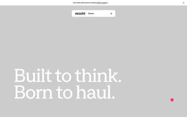
Preview image. Unlock full-res
monochromatic impact with magenta precision
Color palette
Primary action buttons, active indicators, decorative highlights — the sole vibrant accent for interactivity and emphasis
Primary text, deep surface backgrounds, strong borders — establishing a high-contrast foundation
Page backgrounds, primary card surfaces, most content areas — serving as the clean default canvas
Secondary card backgrounds, subtle section dividers, muted background fills — adding a soft, layered depth
Secondary text, subtle borders, inactive states — providing lower contrast detail without disappearing
Helper text, ghost button borders, subtle lines — for less prominent informational elements
Divider lines, subtle card borders — for thin graphical separation
Card backgrounds, subtle graphic elements — offering an alternative light neutral surface
Typography
- Weights
- 400
- Sizes
- 10px, 16px, 20px, 24px, 40px, 60px, 80px, 130px, 150px
- Line height
- 0.85, 0.9, 1.1, 1.2, 1.25, 1.4, 1.5
- Letter spacing
- -0.0480em, -0.0400em, -0.0300em, -0.0300em, -0.0200em
- Fallback
- Montserrat
Headlines, expressive titles, and large display text — characterized by its expansive tracking and compact line height, making it feel vast yet impactful.
- Weights
- 400, 500
- Sizes
- 10px, 11px, 12px, 15px
- Line height
- 1.4, 1.6
- Letter spacing
- 0.0100em, 0.0200em
- Fallback
- Open Sans
Body text, captions, and functional UI labels — providing a readable, slightly narrow contrast to the display font. Its subtle positive letter-spacing ensures legibility at smaller sizes.
Spacing & shape
Components
Solid filled button with Accent Magenta background (#ff2c6b), Canvas White text (#ffffff), and a generous 50px border-radius for a soft, pill-like appearance. Padding is 0px top/bottom and 24px left/right, relying on line-height for vertical alignment.
Transparent background with Canvas White text (#ffffff). Border color is a very subtle transparent white, `oklab(0.999994 0.0000455678 0.0000200868 / 0.15)`, and a 1.67772e+07px radius for maximum rounding. No explicit padding, text-based sizing.
Transparent background with Midnight Graphite text (#191818). Border color is a subtle transparent gray, `oklab(0.210168 0.00151306 0.000472009 / 0.15)`, and a 1.67772e+07px radius. No explicit padding, text-based sizing.
Styled as a text link with transparent background, Midnight Graphite text (#191818). Padding is 0px top/bottom and 10px left/right, no border or radius.
Cloud Gray background (#e8e6e3) with a 12px border-radius and no box-shadow, for a flat, matte surface. No intrinsic padding.
Midnight Graphite background (#191818) with a 12px border-radius and no box-shadow, creating a strong contrast or section break. No intrinsic padding.
Muted Stone background (#d1d5dc) with a 12px border-radius and no box-shadow, for a slightly warmer, less stark surface than Cloud Gray. No intrinsic padding.
Guidelines
- Always use a 12px border-radius for all content cards to maintain a consistent soft edge.
- Apply Accent Magenta (#ff2c6b) exclusively for primary calls-to-action or critical active states.
- Prioritize large, compact 'Zagma' typography for headlines, using its negative letter-spacing for visual density.
- Utilize Cloud Gray (#e8e6e3) and Canvas White (#ffffff) as the primary alternating background surfaces for section differentiation.
- Ensure interactive elements like buttons have a 50px border-radius, creating a distinct pill shape.
- Break up large content sections with a sectionGap of 96px for ample breathing room.
- Use NeueHaas for all body text and UI labels, ensuring letter-spacing of 0.01em or 0.02em for legibility.
- Do not introduce new vibrant colors outside of Accent Magenta (#ff2c6b); maintain the strict monochromatic palette.
- Avoid excessive use of drop shadows; the design relies on bold color blocks and border-radius for visual separation.
- Refrain from using long line lengths for body text; keep text blocks concise to maintain readability with NeueHaas.
- Do not deviate from the established type scale; maintain the precise sizes and letter-spacing for Zagma and NeueHaas.
- Avoid small, subtle changes in neutral tones for background; use the defined Cloud Gray, Canvas White, Midnight Graphite, and Muted Stone for clear surface distinction.
- Do not use generic square corners; aim for the established soft radii on all containers and interactive elements.
- Never use text as the primary call-to-action unless it is a defined Link Button with appropriate padding and transparent background.
About this system
ShowHide
Waabi operates on a robust, authoritative visual language, characterized by stark contrasts between light and dark surfaces and bold, compact typography. A single vibrant magenta provides functional accents, drawing attention to calls-to-action and active states against the predominantly monochromatic palette. Components are designed for clarity and impact, with generous rounded corners hinting at a friendly usability layer beneath the serious brand posture. The overall impression is one of confident, high-tech efficiency.
The page maintains a centered, max-width layout, typically around 1200px. The hero section often features a large, impactful Zagma headline against a clean background. Sections alternate between Canvas White and Cloud Gray or Midnight Graphite, creating clear visual segmentation with a consistent vertical rhythm of 96px section gaps. Content is arranged in alternating text-left/image-right or vertical stacks, often utilizing 2-column or 3-column card grids for features and insights. Navigation is a sticky top bar with a centralized logo and right-aligned links. The overall density is comfortable, with generous white space around elements.
Photography features tight product crops of trucks for self-driving technology or abstract, graphic representations of digital systems. Images are usually contained within cards or masked shapes, never full-bleed. Illustrations are minimal, predominantly flat, geometric, and often outlined, using the brand's monochromatic colors or Accent Magenta. Icons are outlined, simple, and monochrome, often appearing as subtle functional elements. Imagery serves to showcase technology and provide visual context in a clean, contained manner rather than decorative atmosphere, often presented against stark white or dark backgrounds.
Reminiscent of Aurora, Waymo, Plus.ai, TuSimple.
# Waabi — Style Reference
> monochromatic impact with magenta precision

**Theme:** light

**Site:** https://waabi.ai

Waabi operates on a robust, authoritative visual language, characterized by stark contrasts between light and dark surfaces and bold, compact typography. A single vibrant magenta provides functional accents, drawing attention to calls-to-action and active states against the predominantly monochromatic palette. Components are designed for clarity and impact, with generous rounded corners hinting at a friendly usability layer beneath the serious brand posture. The overall impression is one of confident, high-tech efficiency.

## Tokens — Colors

| Name | Value | Token | Role |
|------|------|------|------|
| Accent Magenta | `#ff2c6b` | `--color-accent-magenta` | Primary action buttons, active indicators, decorative highlights — the sole vibrant accent for interactivity and emphasis |
| Midnight Graphite | `#191818` | `--color-midnight-graphite` | Primary text, deep surface backgrounds, strong borders — establishing a high-contrast foundation |
| Canvas White | `#ffffff` | `--color-canvas-white` | Page backgrounds, primary card surfaces, most content areas — serving as the clean default canvas |
| Cloud Gray | `#e8e6e3` | `--color-cloud-gray` | Secondary card backgrounds, subtle section dividers, muted background fills — adding a soft, layered depth |
| Silver Pine | `#808080` | `--color-silver-pine` | Secondary text, subtle borders, inactive states — providing lower contrast detail without disappearing |
| Soft Fog | `#8c8b8b` | `--color-soft-fog` | Helper text, ghost button borders, subtle lines — for less prominent informational elements |
| Steel Light | `#cccccc` | `--color-steel-light` | Divider lines, subtle card borders — for thin graphical separation |
| Muted Stone | `#d1d5dc` | `--color-muted-stone` | Card backgrounds, subtle graphic elements — offering an alternative light neutral surface |

## Tokens — Typography

### Zagma
- **Substitute:** Montserrat
- **Weights:** 400
- **Sizes:** 10px, 16px, 20px, 24px, 40px, 60px, 80px, 130px, 150px
- **Line height:** 0.85, 0.9, 1.1, 1.2, 1.25, 1.4, 1.5
- **Letter spacing:** -0.0480em, -0.0400em, -0.0300em, -0.0300em, -0.0200em
- **Role:** Headlines, expressive titles, and large display text — characterized by its expansive tracking and compact line height, making it feel vast yet impactful.

### NeueHaas
- **Substitute:** Open Sans
- **Weights:** 400, 500
- **Sizes:** 10px, 11px, 12px, 15px
- **Line height:** 1.4, 1.6
- **Letter spacing:** 0.0100em, 0.0200em
- **Role:** Body text, captions, and functional UI labels — providing a readable, slightly narrow contrast to the display font. Its subtle positive letter-spacing ensures legibility at smaller sizes.

## Tokens — Type Scale

| Role | Size | Line height | Letter spacing |
|------|------|------|------|
| body-sm | 15px | 1.4 | 0.15px |
| subheading | 20px | 1.4 | -0.6px |
| heading | 40px | 1.25 | -1.2px |
| heading-lg | 80px | 1.2 | -2.4px |
| display | 150px | 0.85 | -7.2px |

## Tokens — Spacing

- **Max width:** 1200px
- **Section gap:** 96px
- **Card padding:** 24px
- **Element gap:** 16px

## Tokens — Radius

- **Buttons:** 50px
- **Cards:** 12px
- **containers-lg:** 63.4059px

## Layout

The page maintains a centered, max-width layout, typically around 1200px. The hero section often features a large, impactful Zagma headline against a clean background. Sections alternate between Canvas White and Cloud Gray or Midnight Graphite, creating clear visual segmentation with a consistent vertical rhythm of 96px section gaps. Content is arranged in alternating text-left/image-right or vertical stacks, often utilizing 2-column or 3-column card grids for features and insights. Navigation is a sticky top bar with a centralized logo and right-aligned links. The overall density is comfortable, with generous white space around elements.

## Imagery

Photography features tight product crops of trucks for self-driving technology or abstract, graphic representations of digital systems. Images are usually contained within cards or masked shapes, never full-bleed. Illustrations are minimal, predominantly flat, geometric, and often outlined, using the brand's monochromatic colors or Accent Magenta. Icons are outlined, simple, and monochrome, often appearing as subtle functional elements. Imagery serves to showcase technology and provide visual context in a clean, contained manner rather than decorative atmosphere, often presented against stark white or dark backgrounds.

## Components

### Primary Action Button
*Main CTA for key actions*

Solid filled button with Accent Magenta background (#ff2c6b), Canvas White text (#ffffff), and a generous 50px border-radius for a soft, pill-like appearance. Padding is 0px top/bottom and 24px left/right, relying on line-height for vertical alignment.

### Ghost Button - Light Text
*Secondary action on dark backgrounds*

Transparent background with Canvas White text (#ffffff). Border color is a very subtle transparent white, `oklab(0.999994 0.0000455678 0.0000200868 / 0.15)`, and a 1.67772e+07px radius for maximum rounding. No explicit padding, text-based sizing.

### Ghost Button - Dark Text
*Secondary action on light backgrounds*

Transparent background with Midnight Graphite text (#191818). Border color is a subtle transparent gray, `oklab(0.210168 0.00151306 0.000472009 / 0.15)`, and a 1.67772e+07px radius. No explicit padding, text-based sizing.

### Link Button
*Tertiary action for navigation or emphasis*

Styled as a text link with transparent background, Midnight Graphite text (#191818). Padding is 0px top/bottom and 10px left/right, no border or radius.

### Neutral Card - Light
*Content container on light backgrounds*

Cloud Gray background (#e8e6e3) with a 12px border-radius and no box-shadow, for a flat, matte surface. No intrinsic padding.

### Neutral Card - Dark
*Content container on dark backgrounds*

Midnight Graphite background (#191818) with a 12px border-radius and no box-shadow, creating a strong contrast or section break. No intrinsic padding.

### Muted Card
*Subtle content container on light backgrounds*

Muted Stone background (#d1d5dc) with a 12px border-radius and no box-shadow, for a slightly warmer, less stark surface than Cloud Gray. No intrinsic padding.

## Guidelines

### Do

- Always use a 12px border-radius for all content cards to maintain a consistent soft edge.
- Apply Accent Magenta (#ff2c6b) exclusively for primary calls-to-action or critical active states.
- Prioritize large, compact 'Zagma' typography for headlines, using its negative letter-spacing for visual density.
- Utilize Cloud Gray (#e8e6e3) and Canvas White (#ffffff) as the primary alternating background surfaces for section differentiation.
- Ensure interactive elements like buttons have a 50px border-radius, creating a distinct pill shape.
- Break up large content sections with a sectionGap of 96px for ample breathing room.
- Use NeueHaas for all body text and UI labels, ensuring letter-spacing of 0.01em or 0.02em for legibility.

### Don't

- Do not introduce new vibrant colors outside of Accent Magenta (#ff2c6b); maintain the strict monochromatic palette.
- Avoid excessive use of drop shadows; the design relies on bold color blocks and border-radius for visual separation.
- Refrain from using long line lengths for body text; keep text blocks concise to maintain readability with NeueHaas.
- Do not deviate from the established type scale; maintain the precise sizes and letter-spacing for Zagma and NeueHaas.
- Avoid small, subtle changes in neutral tones for background; use the defined Cloud Gray, Canvas White, Midnight Graphite, and Muted Stone for clear surface distinction.
- Do not use generic square corners; aim for the established soft radii on all containers and interactive elements.
- Never use text as the primary call-to-action unless it is a defined Link Button with appropriate padding and transparent background.

## Agent Prompt Guide

Quick Color Reference:
text: #191818
background: #ffffff
border: #191818
accent: #ff2c6b
primary action: #ff2c6b (filled action)

Example Component Prompts:
1. Create a Primary Action Button: #ff2c6b background, #000000 text, 9999px radius, compact pill padding. Use this filled treatment for the main CTA.
2. Create a content card: Cloud Gray background (#e8e6e3), 12px radius, no shadow. Inside, have a subheading at 40px Zagma weight 400, #191818, letter-spacing -1.2px. Below that, a paragraph of body text at 15px NeueHaas weight 400, #808080, line-height 1.4, letter-spacing 0.15px. Ensure card has 24px padding.
3. Create a navigation button for a dark background: Ghost Button - Light Text. Label it 'Home' with Canvas White text (#ffffff). Ensure it has a very subtle transparent white border.
More like this







Keep what you find
A free account saves references to boards and can send you a weekly email of picks based on what you save.
To see every result, go Pro.