Preview image. Unlock full-res
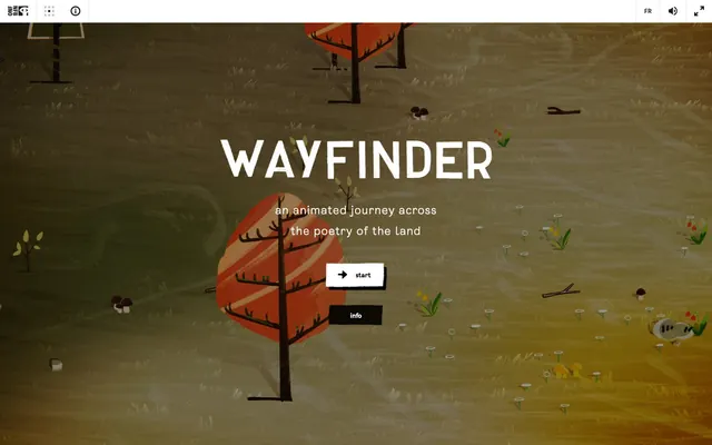
Enchanted forest parchment
Color palette
Page background, primary text
Dark borders and separators for elevated surfaces and inverted UI. Do not promote it to the primary CTA color
Hairline borders, dividers, input outlines, and card edges on light surfaces. Do not promote it to the primary CTA color
Hairline borders for inactive states
Subtle background shading for content blocks
Typography
- Weights
- 300, 400, 700
- Sizes
- 14px, 16px, 24px
- Line height
- 1.2, 1.75
- Letter spacing
- 0.0420em at all sizes
- Fallback
- Montserrat
Main display font for headlines and prominent text. The consistent positive letter-spacing creates an open, readable feel.
- Weights
- 400
- Sizes
- 13px
- Line height
- 1.2
- Letter spacing
- normal
- Fallback
- Helvetica Neue
Functional text for buttons and small interface elements, providing a clear, widely available fallback.
- Weights
- 300
- Sizes
- 14px
- Line height
- 1
- Letter spacing
- normal
- Fallback
- San Francisco Display
Secondary text for links and body content, chosen for visual lightness to complement the bolder Enreal.
Spacing & shape
Components
Text in Graphite (#1a1a1a) on a transparent background, with a 1px border in Graphite (#1a1a1a) when active. Corners are sharp at 0px radius. Padding is 0px top/bottom, 16px left/right. Emphasizes content over strong visual buttons.
Text color is Graphite (#1a1a1a). Subtle 1px border in Mercury (#e3e3e2) for inactive states, transforming to Graphite (#1a1a1a) on hover/focus to indicate interactivity.
Uses Enreal font at 24px, weight 700, color Canvas (#ffffff), with positive letter-spacing for prominence.
Uses Ciutadella-Medium font at 14px, weight 300, color Graphite (#1a1a1a), with normal letter-spacing for legibility.
Guidelines
- Prioritize Ebon (#000000) for large background areas to maintain the dark, immersive aesthetic.
- Use Canvas (#ffffff) sparingly for primary headings and highlighted interactive elements to create strong contrast against dark backgrounds.
- Apply Graphite (#1a1a1a) for all functional text and subtle borders to keep the interface understated.
- Reinforce interactivity with 1px borders in Graphite (#1a1a1a) for hover or active states on ghost buttons and links.
- Maintain sharp 0px radius on all interactive elements to preserve visual precision and a lack of overt softness.
- Allow a generous 40px vertical `sectionGap` between distinct content areas for clear separation.
- Employ the Enreal font with its distinct positive letter-spacing for all significant headings to establish brand identity.
- Avoid introducing saturated colors for UI elements; stick strictly to the achromatic palette.
- Do not use heavy shadows or gradients; elevation should be primarily achieved through contrast or subtle bordering.
- Refrain from using rounded corners; all interface elements should maintain a square or rectangular form.
- Do not vary `letterSpacing` for Enreal; keep it consistently 0.0420em across all sizes.
- Do not use any spacing unit smaller than 4px, and minimize its usage to tight element gaps.
- Avoid filling buttons with solid background colors; interactive elements should appear as ghost buttons or text links.
- Do not rely on color alone to convey interactive states; always supplement with border changes.
About this system
ShowHide
Wayfinder presents a dark, immersive canvas for interactive storytelling, drawing the user into an experience where content is paramount. Typography is both functional and expressive, set against a backdrop of deep, muted neutrals. Interactions are subtly highlighted through minimal borders and a deliberate avoidance of strong color, making the interface feel integrated with the narrative rather than superimposed upon it.
The page implements a full-bleed layout, where the background imagery extends across the entire viewport. The hero section features a large, centered headline and descriptive text in Canvas (#ffffff), with interactive ghost buttons below. Content sections appear to flow seamlessly without distinct visual dividers, leveraging consistent vertical spacing. The overarching pattern is a centered stack for primary content, with elements visually integrated into the background rather than enclosed in distinct panels. Navigation is minimal, likely a fixed top bar with ghost interactive elements that appear in the header.
The site uses stylized, illustrative imagery featuring a muted, autumnal color palette. The illustrations are organic rather than geometric, with a hand-drawn quality and an emphasis on natural forms like trees, mushrooms, and grassy textures. They serve a decorative and atmospheric role, immersing the user in the 'animated journey' theme. Imagery is dense and covers the full background, creating a continuous visual experience without clear separation from UI elements. Icons are filled with a strong stroke weight, black on white background, and white on black background, indicating a high-contrast binary style.
Reminiscent of Monument Valley (mobile game), The Witness (video game art style), Journey (video game aesthetics), Inside (video game visuals).
# Wayfinder — Style Reference
> Enchanted forest parchment

**Theme:** dark

**Site:** https://wayfinder.nfb.ca

Wayfinder presents a dark, immersive canvas for interactive storytelling, drawing the user into an experience where content is paramount. Typography is both functional and expressive, set against a backdrop of deep, muted neutrals. Interactions are subtly highlighted through minimal borders and a deliberate avoidance of strong color, making the interface feel integrated with the narrative rather than superimposed upon it.

## Tokens — Colors

| Name | Value | Token | Role |
|------|------|------|------|
| Ebon | `#000000` | `--color-ebon` | Page background, primary text |
| Graphite | `#1a1a1a` | `--color-graphite` | Dark borders and separators for elevated surfaces and inverted UI. Do not promote it to the primary CTA color |
| Canvas | `#ffffff` | `--color-canvas` | Hairline borders, dividers, input outlines, and card edges on light surfaces. Do not promote it to the primary CTA color |
| Mercury | `#e3e3e2` | `--color-mercury` | Hairline borders for inactive states |
| Stone | `#c0bfbe` | `--color-stone` | Subtle background shading for content blocks |

## Tokens — Typography

### Enreal
- **Substitute:** Montserrat
- **Weights:** 300, 400, 700
- **Sizes:** 14px, 16px, 24px
- **Line height:** 1.2, 1.75
- **Letter spacing:** 0.0420em at all sizes
- **Role:** Main display font for headlines and prominent text. The consistent positive letter-spacing creates an open, readable feel.

### Arial
- **Substitute:** Helvetica Neue
- **Weights:** 400
- **Sizes:** 13px
- **Line height:** 1.2
- **Letter spacing:** normal
- **Role:** Functional text for buttons and small interface elements, providing a clear, widely available fallback.

### Ciutadella-Medium
- **Substitute:** San Francisco Display
- **Weights:** 300
- **Sizes:** 14px
- **Line height:** 1
- **Letter spacing:** normal
- **Role:** Secondary text for links and body content, chosen for visual lightness to complement the bolder Enreal.

## Tokens — Type Scale

Perfect Fourth (1.333) from 24px base.

| Role | Size | Line height | Letter spacing |
|------|------|------|------|
| caption | 14px | 1.75 | — |
| body-sm | 16px | 1.75 | — |
| body | 24px | 1.3 | — |

## Tokens — Spacing

- **Section gap:** 40px
- **Card padding:** 16px
- **Element gap:** 4px

## Tokens — Radius

- **Default:** 0px

## Layout

The page implements a full-bleed layout, where the background imagery extends across the entire viewport. The hero section features a large, centered headline and descriptive text in Canvas (#ffffff), with interactive ghost buttons below. Content sections appear to flow seamlessly without distinct visual dividers, leveraging consistent vertical spacing. The overarching pattern is a centered stack for primary content, with elements visually integrated into the background rather than enclosed in distinct panels. Navigation is minimal, likely a fixed top bar with ghost interactive elements that appear in the header.

## Imagery

The site uses stylized, illustrative imagery featuring a muted, autumnal color palette. The illustrations are organic rather than geometric, with a hand-drawn quality and an emphasis on natural forms like trees, mushrooms, and grassy textures. They serve a decorative and atmospheric role, immersing the user in the 'animated journey' theme. Imagery is dense and covers the full background, creating a continuous visual experience without clear separation from UI elements. Icons are filled with a strong stroke weight, black on white background, and white on black background, indicating a high-contrast binary style.

## Components

### Ghost Button
*Interactive element for navigation and actions*

Text in Graphite (#1a1a1a) on a transparent background, with a 1px border in Graphite (#1a1a1a) when active. Corners are sharp at 0px radius. Padding is 0px top/bottom, 16px left/right. Emphasizes content over strong visual buttons.

### Text Link
*Navigation and informational links*

Text color is Graphite (#1a1a1a). Subtle 1px border in Mercury (#e3e3e2) for inactive states, transforming to Graphite (#1a1a1a) on hover/focus to indicate interactivity.

### Primary Heading
*Main titles and key feature statements*

Uses Enreal font at 24px, weight 700, color Canvas (#ffffff), with positive letter-spacing for prominence.

### Subtle Information Text
*Descriptive text under headings or alongside imagery*

Uses Ciutadella-Medium font at 14px, weight 300, color Graphite (#1a1a1a), with normal letter-spacing for legibility.

## Guidelines

### Do

- Prioritize Ebon (#000000) for large background areas to maintain the dark, immersive aesthetic.
- Use Canvas (#ffffff) sparingly for primary headings and highlighted interactive elements to create strong contrast against dark backgrounds.
- Apply Graphite (#1a1a1a) for all functional text and subtle borders to keep the interface understated.
- Reinforce interactivity with 1px borders in Graphite (#1a1a1a) for hover or active states on ghost buttons and links.
- Maintain sharp 0px radius on all interactive elements to preserve visual precision and a lack of overt softness.
- Allow a generous 40px vertical `sectionGap` between distinct content areas for clear separation.
- Employ the Enreal font with its distinct positive letter-spacing for all significant headings to establish brand identity.

### Don't

- Avoid introducing saturated colors for UI elements; stick strictly to the achromatic palette.
- Do not use heavy shadows or gradients; elevation should be primarily achieved through contrast or subtle bordering.
- Refrain from using rounded corners; all interface elements should maintain a square or rectangular form.
- Do not vary `letterSpacing` for Enreal; keep it consistently 0.0420em across all sizes.
- Do not use any spacing unit smaller than 4px, and minimize its usage to tight element gaps.
- Avoid filling buttons with solid background colors; interactive elements should appear as ghost buttons or text links.
- Do not rely on color alone to convey interactive states; always supplement with border changes.

## Agent Prompt Guide

Quick Color Reference:
text: #1a1a1a
background: #000000
border: #1a1a1a
accent: no distinct accent color
primary action: no distinct CTA color

Example Component Prompts:
1. Create a primary hero title: 'WAYFINDER' in Enreal, 24px, weight 700, color Canvas (#ffffff), letter-spacing 0.0420em, centered on the page.
2. Design a ghost button for a primary action: no distinct CTA color
3. Implement a descriptive subtitle: 'an animated journey across the poetry of the land' in Ciutadella-Medium, 14px, weight 300, color Canvas (#ffffff), line-height 1.0, centered, positioned 40px below a primary heading.
4. Create a top navigation link: 'FR' in Ciutadella-Medium, 14px, weight 300, color Graphite (#1a1a1a), with a 1px solid border in Mercury (#e3e3e2) for an inactive state, 16px top/bottom, 16px left/right padding.
More like this



Keep what you find
A free account saves references to boards and can send you a weekly email of picks based on what you save.
To see every result, go Pro.