Preview image. Unlock full-res
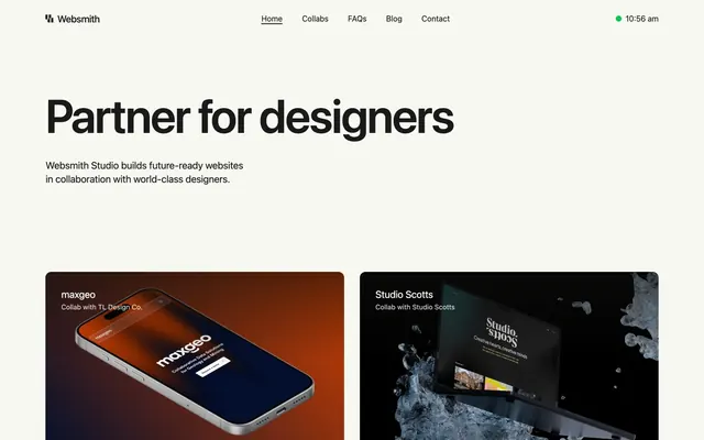
Artisanal precision on a calm canvas: a meticulously crafted UI using refined typography and a neutral palette, where subtle interactions and product imagery take center stage.
Color palette
Accent background for specific content cards, providing a soft, natural highlight without being overtly vibrant
Accent background for specific content cards, introducing a cool, muted tone for differentiation
Accent background for specific content cards, adding a warm, gentle touch
Green wash for highlight backgrounds, decorative bands, and soft emphasis behind content
Primary text, button backgrounds, outline borders for interactive elements – providing crisp contrast against light surfaces
Dominant background for the entire page, creating a soft, warm, and inviting base
Card backgrounds, section dividers, and subtle background for internal page elements, offering a slightly brighter surface contrast to the Canvas
Decorative SVG fills, high-contrast UI elements where maximum visual weight is needed, such as the logo
Typography
- Weights
- 400, 500, 600, 700
- Sizes
- 14px, 16px, 20px, 30px, 48px, 88px, 96px
- Line height
- 1, 1.2, 1.4, 1.43, 1.5
- Letter spacing
- -0.025
- Fallback
- system-ui, sans-serif
All text elements, from large display headlines to body copy and navigation. The consistent use of a system font at a wide range of sizes and precise negative letter-spacing for larger text creates a sense of modern efficiency and clarity.
Spacing & shape
Components
Solid Ink background (#1a1a1a) with Fog text (#ffffff), 8px border-radius, and generous 16px vertical, 32px horizontal padding. The stark contrast ensures it stands out without being loud.
Fog background (#ffffff), 12px border-radius, no shadow, and 32px internal padding on all sides. Used for a clean, contained presentation of content.
Mint background (#a4f4cf), 12px border-radius, no shadow, and 32px internal padding. Offers a soft chromatic variation for specific content.
Sky Tint background (#bedbff), 12px border-radius, no shadow, and 32px internal padding. Introduces a cool chromatic nuance for content grouping.
Blush background (#ffc9c9), 12px border-radius, no shadow, and 32px internal padding. Provides a warm, muted background for particular content blocks.
Ink text (#1a1a1a) at 16px size, weight 400. Hover state should show a subtle underline without color change, maintaining elegance.
Websmith logo uses Deep Space (#000000) for high contrast and immediate brand recognition at 16px font size.
Card-like components with 12px border-radius and 32px padding, using varied soft accent colors (#bedbff, #a4f4cf, #ffc9c9) as backgrounds. Typography is Ink (#1a1a1a) 30px for titles, 16px for descriptions.
Guidelines
- Prioritize the Canvas (#f8f8f2) for page backgrounds, reserving Fog (#ffffff) for contained UI surfaces like cards.
- Use Ink (#1a1a1a) for all primary text, headlines, and interactive elements to maintain high contrast and legibility.
- Apply a consistent 12px border-radius to all image containers, content cards, and major UI blocks for a unified soft aesthetic.
- Maintain ample negative space using elementGap up to 16px and sectionGap up to 96px, allowing content to breathe.
- Use the system font `-apple-system` with `letter-spacing: -0.025em` for headlines 48px and larger, to achieve a tight, modern typographic feel.
- Introduce subtle accent colors (Mint, Sky Tint, Blush) primarily as card backgrounds for visual differentiation, avoiding their use as primary text or action colors.
- Keep elevation minimal or absent; when used, rely on subtle borders rather than heavy shadows to define elements.
- Never use vibrant saturated colors for large UI areas; they are reserved for small, functional accent points like the Online Green status dot.
- Avoid decorative gradients; the design relies on flat colors and subtle textural differences between surfaces.
- Do not introduce strong drop shadows; the system prefers a flat, clean aesthetic with elevation defined by background color shifts or hairline borders.
- Refrain from using thin, light fonts for body copy; ensure sufficient contrast and readability with Ink (#1a1a1a) and appropriate weights.
- Do not deviate from the established 8px and 12px radii for buttons and cards; these values define the component softness.
- Avoid overly dense layouts or packing too much information into one section; maintain the spacious rhythm with generous padding and section gaps.
- Do not use browser default link colors; all links should be styled with Ink (#1a1a1a) and rely on subtle hover effects for interaction.
About this system
ShowHide
Websmith Studio presents a visually understated design system built on a calming off-white canvas and grounded in dark, confident typography. The UI is characterized by lightweight components, ample whitespace, and minimal elevation, allowing product visuals to pop with their own distinct color palettes. Interactions are subtle and deliberate, maintaining the overall sense of quiet sophistication and focus on content.
The page maintains a max-width contained layout of 1340px, centered on the Canvas background. The hero section features a prominent, centered headline and subtext. Content follows a rhythm of alternating section types: large text blocks, 2-column card grids for collaborations and features, and a testimonial block with an image alongside text. Vertical section gaps are generous (64-96px), creating breathing room. Navigation is a sticky top bar with logo left and textual links right. There are distinct section headers aligned left, followed by the respective content blocks.
The site predominantly uses contained product screenshots, often depicting devices (phones, tablets, laptops) displaying digital user interfaces. These images are typically full-color, sharp, and placed within cards with 12px rounded corners. Photography is minimal, appearing in black and white for testimonials, treated with a softer, slightly desaturated feel. Icons are monochrome, simple, and outlined, serving as functional or decorative visual cues within content blocks.
Reminiscent of Stripe, Linear, Framer, Vercel.
# Websmith Studio — Style Reference
> Artisanal precision on a calm canvas: a meticulously crafted UI using refined typography and a neutral palette, where subtle interactions and product imagery take center stage.

**Theme:** light

**Site:** https://websmith.studio

Websmith Studio presents a visually understated design system built on a calming off-white canvas and grounded in dark, confident typography. The UI is characterized by lightweight components, ample whitespace, and minimal elevation, allowing product visuals to pop with their own distinct color palettes. Interactions are subtle and deliberate, maintaining the overall sense of quiet sophistication and focus on content.

## Tokens — Colors

| Name | Value | Token | Role |
|------|------|------|------|
| Mint | `#a4f4cf` | `--color-mint` | Accent background for specific content cards, providing a soft, natural highlight without being overtly vibrant |
| Sky Tint | `#bedbff` | `--color-sky-tint` | Accent background for specific content cards, introducing a cool, muted tone for differentiation |
| Blush | `#ffc9c9` | `--color-blush` | Accent background for specific content cards, adding a warm, gentle touch |
| Online Green | `#00c950` | `--color-online-green` | Green wash for highlight backgrounds, decorative bands, and soft emphasis behind content |
| Ink | `#1a1a1a` | `--color-ink` | Primary text, button backgrounds, outline borders for interactive elements – providing crisp contrast against light surfaces |
| Canvas | `#f8f8f2` | `--color-canvas` | Dominant background for the entire page, creating a soft, warm, and inviting base |
| Fog | `#ffffff` | `--color-fog` | Card backgrounds, section dividers, and subtle background for internal page elements, offering a slightly brighter surface contrast to the Canvas |
| Deep Space | `#000000` | `--color-deep-space` | Decorative SVG fills, high-contrast UI elements where maximum visual weight is needed, such as the logo |

## Tokens — Typography

### -apple-system
- **Substitute:** system-ui, sans-serif
- **Weights:** 400, 500, 600, 700
- **Sizes:** 14px, 16px, 20px, 30px, 48px, 88px, 96px
- **Line height:** 1, 1.2, 1.4, 1.43, 1.5
- **Letter spacing:** -0.025
- **Role:** All text elements, from large display headlines to body copy and navigation. The consistent use of a system font at a wide range of sizes and precise negative letter-spacing for larger text creates a sense of modern efficiency and clarity.

## Tokens — Type Scale

Augmented Fourth (1.414) from 14px base.

| Role | Size | Line height | Letter spacing |
|------|------|------|------|
| caption | 14px | 1.43 | -0.35px |
| body-sm | 16px | 1.43 | -0.4px |
| subheading | 20px | 1.43 | -0.5px |
| heading-sm | 30px | 1.2 | -0.75px |
| heading | 48px | 1.2 | -1.2px |
| display | 88px | 1 | -2.2px |

## Tokens — Spacing

- **Max width:** 1340px
- **Section gap:** 64-96px
- **Card padding:** 32px
- **Element gap:** 16px

## Tokens — Radius

- **Buttons:** 8px
- **Cards:** 12px
- **Images:** 12px
- **elements:** 24px

## Layout

The page maintains a max-width contained layout of 1340px, centered on the Canvas background. The hero section features a prominent, centered headline and subtext. Content follows a rhythm of alternating section types: large text blocks, 2-column card grids for collaborations and features, and a testimonial block with an image alongside text. Vertical section gaps are generous (64-96px), creating breathing room. Navigation is a sticky top bar with logo left and textual links right. There are distinct section headers aligned left, followed by the respective content blocks.

## Imagery

The site predominantly uses contained product screenshots, often depicting devices (phones, tablets, laptops) displaying digital user interfaces. These images are typically full-color, sharp, and placed within cards with 12px rounded corners. Photography is minimal, appearing in black and white for testimonials, treated with a softer, slightly desaturated feel. Icons are monochrome, simple, and outlined, serving as functional or decorative visual cues within content blocks.

## Components

### Primary Filled Button
*Main call-to-action button for initiating key actions*

Solid Ink background (#1a1a1a) with Fog text (#ffffff), 8px border-radius, and generous 16px vertical, 32px horizontal padding. The stark contrast ensures it stands out without being loud.

### Content Card - Default
*Container for product showcases, case studies, and informational blocks*

Fog background (#ffffff), 12px border-radius, no shadow, and 32px internal padding on all sides. Used for a clean, contained presentation of content.

### Content Card - Mint Accent
*Alternative content card for visual variation or thematic grouping*

Mint background (#a4f4cf), 12px border-radius, no shadow, and 32px internal padding. Offers a soft chromatic variation for specific content.

### Content Card - Sky Accent
*Alternative content card for visual variation or thematic grouping*

Sky Tint background (#bedbff), 12px border-radius, no shadow, and 32px internal padding. Introduces a cool chromatic nuance for content grouping.

### Content Card - Blush Accent
*Alternative content card for visual variation or thematic grouping*

Blush background (#ffc9c9), 12px border-radius, no shadow, and 32px internal padding. Provides a warm, muted background for particular content blocks.

### Navigation Link
*Top-level navigation items*

Ink text (#1a1a1a) at 16px size, weight 400. Hover state should show a subtle underline without color change, maintaining elegance.

### Header Logo
*Brand identity in the header*

Websmith logo uses Deep Space (#000000) for high contrast and immediate brand recognition at 16px font size.

### Feature Box (Plan/Build)
*Small informational boxes describing services*

Card-like components with 12px border-radius and 32px padding, using varied soft accent colors (#bedbff, #a4f4cf, #ffc9c9) as backgrounds. Typography is Ink (#1a1a1a) 30px for titles, 16px for descriptions.

## Guidelines

### Do

- Prioritize the Canvas (#f8f8f2) for page backgrounds, reserving Fog (#ffffff) for contained UI surfaces like cards.
- Use Ink (#1a1a1a) for all primary text, headlines, and interactive elements to maintain high contrast and legibility.
- Apply a consistent 12px border-radius to all image containers, content cards, and major UI blocks for a unified soft aesthetic.
- Maintain ample negative space using elementGap up to 16px and sectionGap up to 96px, allowing content to breathe.
- Use the system font `-apple-system` with `letter-spacing: -0.025em` for headlines 48px and larger, to achieve a tight, modern typographic feel.
- Introduce subtle accent colors (Mint, Sky Tint, Blush) primarily as card backgrounds for visual differentiation, avoiding their use as primary text or action colors.
- Keep elevation minimal or absent; when used, rely on subtle borders rather than heavy shadows to define elements.

### Don't

- Never use vibrant saturated colors for large UI areas; they are reserved for small, functional accent points like the Online Green status dot.
- Avoid decorative gradients; the design relies on flat colors and subtle textural differences between surfaces.
- Do not introduce strong drop shadows; the system prefers a flat, clean aesthetic with elevation defined by background color shifts or hairline borders.
- Refrain from using thin, light fonts for body copy; ensure sufficient contrast and readability with Ink (#1a1a1a) and appropriate weights.
- Do not deviate from the established 8px and 12px radii for buttons and cards; these values define the component softness.
- Avoid overly dense layouts or packing too much information into one section; maintain the spacious rhythm with generous padding and section gaps.
- Do not use browser default link colors; all links should be styled with Ink (#1a1a1a) and rely on subtle hover effects for interaction.

## Agent Prompt Guide

Quick Color Reference:
text: #1a1a1a
background: #f8f8f2
border: #1a1a1a
accent: #a4f4cf (Mint or Sky Tint #bedbff for cards, Online Green #00c950 for status)
primary action: #1a1a1a (filled action)

Example Component Prompts:
Create a hero section: Canvas background (#f8f8f2). Headline 'Your Partner' at 88px -apple-system weight 700 with letter-spacing -2.2px, Ink (#1a1a1a). Subtext at 20px -apple-system weight 400, Ink (#1a1a1a).
Create a Primary Filled Button: Ink background (#1a1a1a), Fog text (#ffffff), 8px border-radius, 16px vertical padding, 32px horizontal padding.
Create a Content Card (Mint accent): Mint background (#a4f4cf), 12px border-radius, 32px internal padding. Title at 30px -apple-system weight 600, Ink (#1a1a1a). Description at 16px -apple-system weight 400, Ink (#1a1a1a).
Create a Navigation Link: Text 'About Us' at 16px -apple-system weight 400, Ink (#1a1a1a). On hover, show a subtle underline.
More like this









Keep what you find
A free account saves references to boards and can send you a weekly email of picks based on what you save.
To see every result, go Pro.