Preview image. Unlock full-res
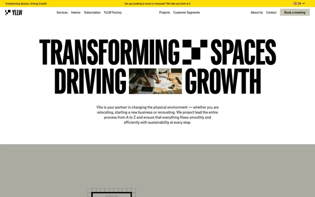
Industrial Blueprint on Fog
Color palette
Prominent alert banners, attention-grabbing accents for utility messaging, and distinct section backgrounds — a vivid, high-energy punctuation
Neutral form states, badge text, and quiet UI feedback where color should stay understated. Do not promote it to the primary CTA color
Page backgrounds, card surfaces, ghost button backgrounds, specific text highlights — acts as a clean, expansive canvas
Secondary page backgrounds, alternative card surfaces, muted button fills, and subtle borders — a desaturated, cool gray that maintains neutrality
Darker surface backgrounds for contrast sections
Subtle border lines and dividers
Typography
- Weights
- 400, 500, 600, 700
- Sizes
- 13px, 14px, 16px, 18px, 20px, 26px, 36px, 40px, 44px, 64px, 90px, 97px, 116px, 166px, 216px
- Line height
- 0.88, 0.9, 0.96, 1, 1.04, 1.18, 1.24, 1.28, 1.5
- Letter spacing
- -0.0250em at 216px, -0.0050em at 13px
- Fallback
- Archivo Black, Anton
All textual content, from body to display headings. The variable font allows for fine control over weight, contributing to the impactful, almost architectural feel of the typography. Letter spacing is consistently tightened for larger sizes to maintain density and visual weight.
Spacing & shape
Elevation
Components
Background: Foggy Gray (#cac7b4), Text: Midnight Ink (#000000), Border: 1px solid Midnight Ink (#000000), Radius: 2px, Padding: 12px vertical, 20px horizontal.
Background: transparent, Text: Midnight Ink (#000000), Border: 1px solid Midnight Ink (#000000), Radius: 2px, Padding: 12px vertical, 20px horizontal.
Background: Ghost White (#ffffff), Text: Midnight Ink (#000000), Border: 1px solid Midnight Ink (#000000), Radius: 2px, Padding: 12px vertical, 20px horizontal.
Background: transparent, Text: Ghost White (#ffffff), Border: 1px solid Ghost White (#ffffff), Radius: 2px, Padding: 12px vertical, 20px horizontal.
Background: transparent, Border: none, Radius: 0px, Padding: 0px vertical, 24px horizontal, 16px bottom.
Background: Ghost White (#ffffff), Border: none, Radius: 0px, Padding: 0px.
Background: Foggy Gray (#cac7b4), Border: none, Radius: 0px, Padding: 1px.
Background: Midnight Ink (#000000), Border: none, Radius: 0px, Padding: 0px.
Background: transparent, Text: Midnight Ink (#000000), Border: none, Radius: 0px, Padding: 0px. Features hidden content revealed on click, typically marked with a '+' icon.
Background: School Bus Yellow (#ffdd00), Text: Midnight Ink (#000000), Height: 32px (calculated from screenshot of top banner).
Guidelines
- Prioritize high contrast with Midnight Ink (#000000) for all primary text and critical UI elements against lighter backgrounds.
- Use Foggy Gray (#cac7b4) and Ghost White (#ffffff) as the primary background and surface colors, alternating them to create visual rhythm between sections.
- Apply Gd Grio Vf with dense, impactful kerning, especially at larger sizes, to convey a strong, architectural typographic presence (e.g., -0.0250em for display text).
- Employ the 2px border radius for all interactive elements like buttons and navigation items, maintaining a sharp, precise feel.
- Reserve School Bus Yellow (#ffdd00) sparingly for high-attention alerts, banners, and functional highlights rather than decorative purposes.
- Maintain consistent 1px Midnight Ink (#000000) borders for all outline buttons and visual separators to reinforce a structured system.
- Use 64px for section gaps to create generous breathing room between major content blocks, with 16px as the primary element spacing within sections.
- Avoid using multiple chromatic colors; restrict non-neutral color to School Bus Yellow (#ffdd00) for accent and utility.
- Do not introduce soft shadows or gradients for elevation; rely on stark color contrast and 1px borders for depth.
- Refrain from using heavily rounded corners; adhere to the 2px default radius for buttons and links, and 6px for cards.
- Do not break away from the Gd Grio Vf font; avoid generic sans-serif substitutes that dilute the bold, industrial aesthetic.
- Do not vary line heights significantly for body text; keep it tight and consistent to maintain readability and density.
- Avoid decorative imagery that is not aligned with the brand's architectural, industrial, or blueprint aesthetic.
About this system
ShowHide
Yllw employs a bold, industrial aesthetic: stark black typography makes an immediate impact against a mostly white and 'foggy gray' canvas. The layout often alternates between dense, high-contrast text blocks and more spacious sections featuring architectural line drawings, giving a sense of technical precision without being overly rigid. Component borders are crisp, often 1px black, reinforcing the structured, no-nonse feel, while a single vivid yellow accent provides a punch of energetic utility for alerts and interactive prompts.
The page primarily follows a max-width contained layout, typically centered around a 1200px content area, with some full-bleed sections (e.g., the top alert bar, some hero elements, or alternating background bands). The hero section is a full-width header featuring oversized, impactful typography 'TRANSFORMING SPACES DRIVING GROWTH' often with an embedded image or video within the text itself. Sections alternate between Ghost White and Foggy Gray backgrounds, creating a clear vertical rhythm. Content often appears in centered stacks, or in 2-column or 3-column feature grids for services and solutions. Distinct structural elements are often outlined with thin Midnight Ink (#000000) borders, especially in areas featuring architectural drawings. Navigation is a minimalist sticky top bar within a contained layout, with a prominent 'Book a meeting' call to action button.
This site uses a mix of high-contrast photography integrated into large typographic fields and abstract architectural line drawings or blueprints. Photography tends to be tightly cropped, often showcasing people collaboratively working in modern office environments, serving as a backdrop or infill for bold text. Illustrations are highly stylized, consisting of geometric, outlined floor plans and structural elements, usually in white against Foggy Gray backgrounds, functioning as explanatory content or decorative accents. Icons are minimal, outlined, and monochromatic (Midnight Ink) with a thin stroke weight, primarily for functional purposes (e.g., accordion toggles, navigation arrows). The overall role of imagery is to support the structured, architectural narrative and enhance content explanation, keeping a text-dominant feel.
Reminiscent of Linear, Figma, Architectural firms' websites, Supabase.
# Yllw — Style Reference
> Industrial Blueprint on Fog

**Theme:** light

**Site:** https://www.yllw.com/en

Yllw employs a bold, industrial aesthetic: stark black typography makes an immediate impact against a mostly white and 'foggy gray' canvas. The layout often alternates between dense, high-contrast text blocks and more spacious sections featuring architectural line drawings, giving a sense of technical precision without being overly rigid. Component borders are crisp, often 1px black, reinforcing the structured, no-nonse feel, while a single vivid yellow accent provides a punch of energetic utility for alerts and interactive prompts.

## Tokens — Colors

| Name | Value | Token | Role |
|------|------|------|------|
| School Bus Yellow | `#ffdd00` | `--color-school-bus-yellow` | Prominent alert banners, attention-grabbing accents for utility messaging, and distinct section backgrounds — a vivid, high-energy punctuation |
| Midnight Ink | `#000000` | `--color-midnight-ink` | Neutral form states, badge text, and quiet UI feedback where color should stay understated. Do not promote it to the primary CTA color |
| Ghost White | `#ffffff` | `--color-ghost-white` | Page backgrounds, card surfaces, ghost button backgrounds, specific text highlights — acts as a clean, expansive canvas |
| Foggy Gray | `#cac7b4` | `--color-foggy-gray` | Secondary page backgrounds, alternative card surfaces, muted button fills, and subtle borders — a desaturated, cool gray that maintains neutrality |
| Deep Charcoal | `#191919` | `--color-deep-charcoal` | Darker surface backgrounds for contrast sections |
| Light Gray | `#cccccc` | `--color-light-gray` | Subtle border lines and dividers |

## Tokens — Typography

### Gd Grio Vf
- **Substitute:** Archivo Black, Anton
- **Weights:** 400, 500, 600, 700
- **Sizes:** 13px, 14px, 16px, 18px, 20px, 26px, 36px, 40px, 44px, 64px, 90px, 97px, 116px, 166px, 216px
- **Line height:** 0.88, 0.9, 0.96, 1, 1.04, 1.18, 1.24, 1.28, 1.5
- **Letter spacing:** -0.0250em at 216px, -0.0050em at 13px
- **Role:** All textual content, from body to display headings. The variable font allows for fine control over weight, contributing to the impactful, almost architectural feel of the typography. Letter spacing is consistently tightened for larger sizes to maintain density and visual weight.

## Tokens — Type Scale

Golden Ratio (1.618) from 16px base.

| Role | Size | Line height | Letter spacing |
|------|------|------|------|
| caption | 13px | 1.5 | -0.005em |
| body | 16px | 1.5 | -0.006em |
| subheading | 26px | 1.24 | -0.01em |
| heading-sm | 36px | 1.18 | -0.015em |
| heading | 44px | 1.04 | -0.02em |
| heading-lg | 90px | 0.9 | -0.025em |
| display | 216px | 0.88 | -0.025em |

## Tokens — Spacing

- **Max width:** 1200px
- **Section gap:** 64px
- **Card padding:** 16px
- **Element gap:** 16px

## Tokens — Radius

- **Default:** 2px
- **Cards:** 6px

## Tokens — Elevation

- **Button Inset Shadow - Black:** `rgb(0, 0, 0) 0px 0px 0px 1px inset`
- **Button Inset Shadow - White:** `rgb(255, 255, 255) 0px 0px 0px 1px inset`
- **Button Outline Shadow - White:** `rgb(255, 255, 255) 0px 0px 0px 1px`

## Layout

The page primarily follows a max-width contained layout, typically centered around a 1200px content area, with some full-bleed sections (e.g., the top alert bar, some hero elements, or alternating background bands). The hero section is a full-width header featuring oversized, impactful typography 'TRANSFORMING SPACES DRIVING GROWTH' often with an embedded image or video within the text itself. Sections alternate between Ghost White and Foggy Gray backgrounds, creating a clear vertical rhythm. Content often appears in centered stacks, or in 2-column or 3-column feature grids for services and solutions. Distinct structural elements are often outlined with thin Midnight Ink (#000000) borders, especially in areas featuring architectural drawings. Navigation is a minimalist sticky top bar within a contained layout, with a prominent 'Book a meeting' call to action button.

## Imagery

This site uses a mix of high-contrast photography integrated into large typographic fields and abstract architectural line drawings or blueprints. Photography tends to be tightly cropped, often showcasing people collaboratively working in modern office environments, serving as a backdrop or infill for bold text. Illustrations are highly stylized, consisting of geometric, outlined floor plans and structural elements, usually in white against Foggy Gray backgrounds, functioning as explanatory content or decorative accents. Icons are minimal, outlined, and monochromatic (Midnight Ink) with a thin stroke weight, primarily for functional purposes (e.g., accordion toggles, navigation arrows). The overall role of imagery is to support the structured, architectural narrative and enhance content explanation, keeping a text-dominant feel.

## Components

### Filled Button - Foggy
*Primary action button for key calls to action.*

Background: Foggy Gray (#cac7b4), Text: Midnight Ink (#000000), Border: 1px solid Midnight Ink (#000000), Radius: 2px, Padding: 12px vertical, 20px horizontal.

### Outlined Button - Foggy
*Secondary action button, providing a less prominent interactive element.*

Background: transparent, Text: Midnight Ink (#000000), Border: 1px solid Midnight Ink (#000000), Radius: 2px, Padding: 12px vertical, 20px horizontal.

### Filled Button - White
*Action button used on darker backgrounds or for specific content blocks.*

Background: Ghost White (#ffffff), Text: Midnight Ink (#000000), Border: 1px solid Midnight Ink (#000000), Radius: 2px, Padding: 12px vertical, 20px horizontal.

### Outlined Button - White Text
*Ghost button variant, typically used on dark or image backgrounds.*

Background: transparent, Text: Ghost White (#ffffff), Border: 1px solid Ghost White (#ffffff), Radius: 2px, Padding: 12px vertical, 20px horizontal.

### Borderless Card
*Content container for features or descriptions, emphasizing content without visual heavy lifting.*

Background: transparent, Border: none, Radius: 0px, Padding: 0px vertical, 24px horizontal, 16px bottom.

### White Card
*Elevated content block, typically for feature outlines or detailed information.*

Background: Ghost White (#ffffff), Border: none, Radius: 0px, Padding: 0px.

### Foggy Card Border
*Decorative card with a subtle contextual background, indicating a section.*

Background: Foggy Gray (#cac7b4), Border: none, Radius: 0px, Padding: 1px.

### Black Card
*High-contrast card for specific standout content sections.*

Background: Midnight Ink (#000000), Border: none, Radius: 0px, Padding: 0px.

### Accordion Item
*Collapsible content area, often seen in FAQs or service listings.*

Background: transparent, Text: Midnight Ink (#000000), Border: none, Radius: 0px, Padding: 0px. Features hidden content revealed on click, typically marked with a '+' icon.

### Info Banner - Yellow
*Top-level communication bar for important, temporary messages.*

Background: School Bus Yellow (#ffdd00), Text: Midnight Ink (#000000), Height: 32px (calculated from screenshot of top banner).

## Guidelines

### Do

- Prioritize high contrast with Midnight Ink (#000000) for all primary text and critical UI elements against lighter backgrounds.
- Use Foggy Gray (#cac7b4) and Ghost White (#ffffff) as the primary background and surface colors, alternating them to create visual rhythm between sections.
- Apply Gd Grio Vf with dense, impactful kerning, especially at larger sizes, to convey a strong, architectural typographic presence (e.g., -0.0250em for display text).
- Employ the 2px border radius for all interactive elements like buttons and navigation items, maintaining a sharp, precise feel.
- Reserve School Bus Yellow (#ffdd00) sparingly for high-attention alerts, banners, and functional highlights rather than decorative purposes.
- Maintain consistent 1px Midnight Ink (#000000) borders for all outline buttons and visual separators to reinforce a structured system.
- Use 64px for section gaps to create generous breathing room between major content blocks, with 16px as the primary element spacing within sections.

### Don't

- Avoid using multiple chromatic colors; restrict non-neutral color to School Bus Yellow (#ffdd00) for accent and utility.
- Do not introduce soft shadows or gradients for elevation; rely on stark color contrast and 1px borders for depth.
- Refrain from using heavily rounded corners; adhere to the 2px default radius for buttons and links, and 6px for cards.
- Do not break away from the Gd Grio Vf font; avoid generic sans-serif substitutes that dilute the bold, industrial aesthetic.
- Do not vary line heights significantly for body text; keep it tight and consistent to maintain readability and density.
- Avoid decorative imagery that is not aligned with the brand's architectural, industrial, or blueprint aesthetic.

## Agent Prompt Guide

### Quick Color Reference
- text: #000000
- background: #ffffff
- border: #000000
- accent: #ffdd00
- primary action: no distinct CTA color

### 3-5 Example Component Prompts
1. Create a hero section: transparent background, large headline 'TRANSFORMING SPACES' using Gd Grio Vf, weight 700, 166px size, Midnight Ink (#000000) color, letter-spacing -0.025em. Below, a bolded `p` tag with Gd Grio Vf, weight 700, 16px size, Midnight Ink (#000000) color, letter-spacing -0.006em.
No distinct primary action color was observed; use the extracted neutral button treatments instead of inventing a filled CTA color.
3. Design a section with alternating background: Start with a Ghost White (#ffffff) background, then a Section Fog (#cac7b4) background. Each section should have a 'heading' from the type scale in Midnight Ink (#000000) with 64px vertical padding and 16px element gaps.
4. Produce an outlined button on a dark background: Use transparent background, Ghost White (#ffffff) text, 1px Ghost White (#ffffff) solid border, 2px radius, with 12px vertical and 20px horizontal padding.
5. Create a School Bus Yellow (#ffdd00) info banner: a full-width background, 32px height, with a 14px Gd Grio Vf, weight 400, Midnight Ink (#000000) colored text, centered.
More like this







Keep what you find
A free account saves references to boards and can send you a weekly email of picks based on what you save.
To see every result, go Pro.