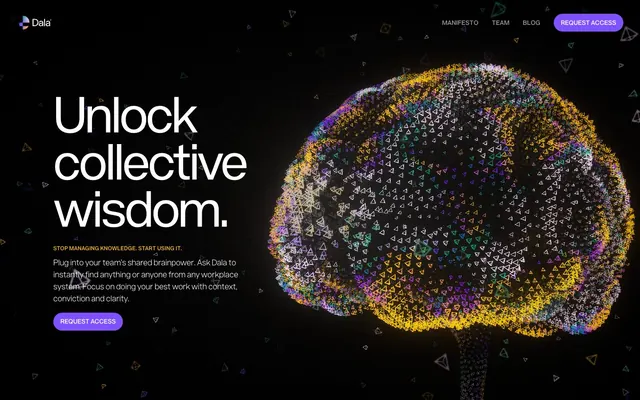
Preview image. Unlock full-res
Deep space digital holo-deck
Color palette
Primary action buttons, active navigation, interactive elements — a vivid highlight against the dark canvas
Accent text highlights, decorative borders, secondary interactive states — adds a warm, vivid contrast
Subtle background fills, decorative elements in navigation – a cool undertone in some UI spaces
Page background, primary text on light elements, subtle borders
Primary text, major headings, key UI components against dark backgrounds, border accents
Muted text, secondary information, decorative borders
Tertiary text, inactive navigation items, ghost button borders
Typography
- Weights
- 200, 400, 600, 700
- Sizes
- 12px, 14px, 15px, 18px, 24px, 27px, 36px, 42px, 48px, 78px, 113px
- Line height
- 0.81, 0.9, 1, 1.1, 1.2, 1.25, 1.3, 1.5
- Letter spacing
- -0.0400em for headings at 113px, 0.0500em for uppercase navigation, 0.0210em for larger body copy, 0.0250em for smaller body copy.
- Fallback
- Montserrat, Raleway
Primary typeface for all text. Its varied weights and negative letter-spacing for large headlines create a modern, impactful, yet legible digital aesthetic. The use of specific positive letter-spacing for navigation and smaller text maintains readability even with all caps.
Spacing & shape
Components
Filled button with Cosmic Violet background (#8052ff), Holo White text (#ffffff), and a 24px border-radius. Padding of 14.4px vertical and 15.96px horizontal.
Transparent background button with Ghost Gray text (#9a9a9a) and no border-radius. Padding is minimal at 1px vertical and 6px horizontal; often uppercase and letter-spaced.
Transparent background with Holo White text (#ffffff), no specific padding or border-radius. Relies on text color for distinction.
Transparent background that floats over the page content. Contains Holo White text elements (logo, navigation) with Cosmic Violet (#8052ff) used for active states or accent colors. Padding 14px vertical, 16px horizontal. Navigation items have a 24px border-radius.
Guidelines
- Prioritize Cosmic Violet (#8052ff) for all primary interactive elements.
- Use Holo White (#ffffff) for main headings and key UI text against Midnight Void (#000000) backgrounds to ensure high contrast and readability.
- Apply a 24px border-radius consistently to all interactive elements such as buttons and navigation items, and for card-like structures.
- Maintain a clear visual hierarchy by utilizing the large headline type sizes (48px, 78px, 113px) with reduced letter-spacing for impactful statements.
- Employ Ghost Gray (#9a9a9a) for subtle secondary navigation and text, ensuring it recedes while remaining legible.
- Use Sunflare Yellow (#ffb829) sparingly as an accent for highlighted text or decorative borders to draw attention.
- Avoid using flat, opaque background colors unless for specific branded components, preserving the dark, spacious canvas.
- Do not introduce new color palettes; stick to the defined chromatically vivid or achromatic colors.
- Do not use generic system fonts; always utilize Acronym or its designated substitutes.
- Avoid heavy drop shadows or physical metaphors; embrace the flat, digital aesthetic with strong color contrast.
- Do not add conflicting border-radii; adhere strictly to the 24px value for UI elements and cards.
- Resist dense layouts; use the established elementGap and sectionGap for comfortable content separation and a sense of depth.
About this system
ShowHide
Dala adopts a deep space digital aesthetic: a completely dark canvas punctuated by holographic, energetic typography and interactive elements. Its visual identity relies on vibrant, glowing accents against achromatic backgrounds. Components are lightweight and often border-driven, emphasizing digital dimensionality over physical presence. The overall mood is futuristic and intelligent, with strong visual hierarchy created through size and color contrast.
Reminiscent of Anthropic, Linear, Cognition Labs (Devin AI), Replit.
# Your workplace has the answer. Just ask Dala for it. — Style Reference
> Deep space digital holo-deck

**Theme:** dark

**Site:** https://dala.craftedbygc.com

Dala adopts a deep space digital aesthetic: a completely dark canvas punctuated by holographic, energetic typography and interactive elements. Its visual identity relies on vibrant, glowing accents against achromatic backgrounds. Components are lightweight and often border-driven, emphasizing digital dimensionality over physical presence. The overall mood is futuristic and intelligent, with strong visual hierarchy created through size and color contrast.

## Tokens — Colors

| Name | Value | Token | Role |
|------|------|------|------|
| Cosmic Violet | `#8052ff` | `--color-cosmic-violet` | Primary action buttons, active navigation, interactive elements — a vivid highlight against the dark canvas |
| Sunflare Yellow | `#ffb829` | `--color-sunflare-yellow` | Accent text highlights, decorative borders, secondary interactive states — adds a warm, vivid contrast |
| Quantum Teal | `#15846e` | `--color-quantum-teal` | Subtle background fills, decorative elements in navigation – a cool undertone in some UI spaces |
| Midnight Void | `#000000` | `--color-midnight-void` | Page background, primary text on light elements, subtle borders |
| Holo White | `#ffffff` | `--color-holo-white` | Primary text, major headings, key UI components against dark backgrounds, border accents |
| Stardust Gray | `#bdbdbd` | `--color-stardust-gray` | Muted text, secondary information, decorative borders |
| Ghost Gray | `#9a9a9a` | `--color-ghost-gray` | Tertiary text, inactive navigation items, ghost button borders |

## Tokens — Typography

### Acronym
- **Substitute:** Montserrat, Raleway
- **Weights:** 200, 400, 600, 700
- **Sizes:** 12px, 14px, 15px, 18px, 24px, 27px, 36px, 42px, 48px, 78px, 113px
- **Line height:** 0.81, 0.9, 1, 1.1, 1.2, 1.25, 1.3, 1.5
- **Letter spacing:** -0.0400em for headings at 113px, 0.0500em for uppercase navigation, 0.0210em for larger body copy, 0.0250em for smaller body copy.
- **Role:** Primary typeface for all text. Its varied weights and negative letter-spacing for large headlines create a modern, impactful, yet legible digital aesthetic. The use of specific positive letter-spacing for navigation and smaller text maintains readability even with all caps.

## Tokens — Type Scale

| Role | Size | Line height | Letter spacing |
|------|------|------|------|
| caption | 12px | 1.5 | 0.025em |
| body-sm | 14px | 1.5 | 0.025em |
| subheading | 24px | 1.25 | — |
| heading-sm | 36px | 1.1 | — |
| heading | 48px | 1 | — |
| heading-lg | 78px | 0.9 | — |
| display | 113px | 0.81 | -0.04em |

## Tokens — Spacing

- **Section gap:** 60px
- **Card padding:** 15px
- **Element gap:** 6px

## Tokens — Radius

- **Buttons:** 24px
- **Cards:** 24px
- **navItems:** 24px

## Components

### Primary Action Button
*Main call-to-action*

Filled button with Cosmic Violet background (#8052ff), Holo White text (#ffffff), and a 24px border-radius. Padding of 14.4px vertical and 15.96px horizontal.

### Ghost Navigation Button
*Secondary navigation or text-based actions*

Transparent background button with Ghost Gray text (#9a9a9a) and no border-radius. Padding is minimal at 1px vertical and 6px horizontal; often uppercase and letter-spaced.

### Naked Link
*Inline text links*

Transparent background with Holo White text (#ffffff), no specific padding or border-radius. Relies on text color for distinction.

### Main Header
*Site-wide sticky header*

Transparent background that floats over the page content. Contains Holo White text elements (logo, navigation) with Cosmic Violet (#8052ff) used for active states or accent colors. Padding 14px vertical, 16px horizontal. Navigation items have a 24px border-radius.

## Guidelines

### Do

- Prioritize Cosmic Violet (#8052ff) for all primary interactive elements.
- Use Holo White (#ffffff) for main headings and key UI text against Midnight Void (#000000) backgrounds to ensure high contrast and readability.
- Apply a 24px border-radius consistently to all interactive elements such as buttons and navigation items, and for card-like structures.
- Maintain a clear visual hierarchy by utilizing the large headline type sizes (48px, 78px, 113px) with reduced letter-spacing for impactful statements.
- Employ Ghost Gray (#9a9a9a) for subtle secondary navigation and text, ensuring it recedes while remaining legible.
- Use Sunflare Yellow (#ffb829) sparingly as an accent for highlighted text or decorative borders to draw attention.

### Don't

- Avoid using flat, opaque background colors unless for specific branded components, preserving the dark, spacious canvas.
- Do not introduce new color palettes; stick to the defined chromatically vivid or achromatic colors.
- Do not use generic system fonts; always utilize Acronym or its designated substitutes.
- Avoid heavy drop shadows or physical metaphors; embrace the flat, digital aesthetic with strong color contrast.
- Do not add conflicting border-radii; adhere strictly to the 24px value for UI elements and cards.
- Resist dense layouts; use the established elementGap and sectionGap for comfortable content separation and a sense of depth.

## Agent Prompt Guide

Quick Color Reference:
text: #ffffff
background: #000000
border: #bdbdbd
accent: #ffb829
primary action: #8052ff (filled action)

Example Component Prompts:
Create a Primary Action Button: #8052ff background, #ffffff text, 9999px radius, compact pill padding. Use this filled treatment for the main CTA.

Create a standard navigation item: 'M a n i f e s t o' in Ghost Gray, Acronym font, 15px size, weight 400, lineHeight 1.5, letter-spacing 0.05em. When active, text color changes to Cosmic Violet. Apply a 24px border-radius.

Create a small information block: Background Midnight Void. Text in Stardust Gray, Acronym font, 14px size, weight 400, lineHeight 1.5. Highlighted keywords in Sunflare Yellow with no background. Element gap 6px between lines of text.
More like this









Keep what you find
A free account saves references to boards and can send you a weekly email of picks based on what you save.
To see every result, go Pro.