Preview image. Unlock full-res
Operating System Interface — clean-cut, functional, and digital.
Color palette
Accents for decorative elements and visual interest. Its vividness pops against the neutral palette.
Page backgrounds, neutral surfaces.
Primary text, prominent UI elements. High contrast for readability.
Button backgrounds, light interactive states.
Text on dark backgrounds, selected icons.
Secondary text, backgrounds for dark components, internal card surfaces. Offers good contrast against Snow.
Button backgrounds for less prominent actions.
Subtle stroke and icon details.
Typography
- Weights
- 500, 700, 800
- Sizes
- 12px, 16px, 18px, 28px
- Line height
- 1.25
- Letter spacing
- -0.432, -0.256, -0.288, -1.008
- Fallback
- system-ui, sans-serif
Primary typeface for all UI text, headings, and buttons. Variable letter spacing maintains visual density across sizes, making UI feel compact and precise.
- Weights
- 800
- Sizes
- 12px
- Line height
- 1.25
- Fallback
- Menlo, Monaco, Consolas, 'Liberation Mono', 'Courier New', monospace
Used for specific technical or code-like elements, offering a distinct visual break. The bold weight ensures it remains legible at small sizes.
Spacing & shape
Components
Circular button with a 50% border radius acting as an info icon. Background: Light Steel (#dddddd), text: Graphite (#2d2d2d). No internal padding specified, implies icon fitting tightly.
Circular button with a 50% border radius for active states. Background: Mid Grey (#b4b4b4), text: Snow (#ffffff). No internal padding, indicates a toggle or enabled state.
A light content container with Cloud Cover (#f1f2f3) background and a 25px border-radius. Features a prominent shadow: rgba(51, 51, 51, 0.1) 0px 0px 40px 0px, suggesting an elevated, floating presence on the page.
Guidelines
- Prioritize the achromatic palette with Cloud Cover (#f1f2f3) as background and Graphite (#111111) as primary text for core content.
- Apply a 25px border-radius to all primary content cards, reinforcing the soft, digital aesthetic.
- Use the specific letter-spacing values from the -apple-system font profiles (-0.0360em at 12px, -0.0160em at 16px, etc.) for all text to maintain visual density.
- Implement the rgba(51, 51, 51, 0.1) 0px 0px 40px 0px shadow for all elevated card components to create subtle depth.
- Reserve Neon Green (#009942) exclusively for decorative elements or non-critical accents in illustrations and icons.
- Use Dark Slate (#2d2d2d) for primary call-to-action buttons, with 5px vertical and 20px horizontal padding and 20px border-radius.
- Avoid strong, saturated colors outside of the designated accent palette; maintain the dominant neutral scheme.
- Do not deviate from the specified border radii; avoid sharp corners or excessively rounded elements beyond the 20px/25px standard.
- Do not use generic shadows; adhere strictly to the defined card shadow for all elevated elements.
- Avoid large negative letter spacing on display type; only apply the precisely defined values for -apple-system.
- Do not introduce additional font families; stick to -apple-system (or its system-ui substitute) and monospace.
- Do not use more than two distinct button styles on a single screen without a clear hierarchy.
About this system
ShowHide
This design system evokes a sense of digital minimalism, like an operating system interface. It uses a predominantly achromatic palette with subtle gradients on surfaces, creating depth without heavy shadows. The overall feel is one of understated functionality and quiet efficiency, utilizing precise typography and a singular vibrant accent for interactive elements.
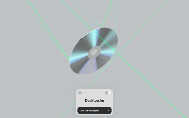
The layout is primarily centered and minimal, focusing on a single hero element. The page operates on a full-bleed model with a light gray background, presenting a single focal point (the 3D CD render) with interactive elements centered beneath it. Elements are stacked vertically with compact spacing, creating a dense yet clean presentation. There is no visible navigation or complex grid structure, suggesting a single-purpose landing page rather than a multi-page site.
The site uses abstract 3D renders with strong reflections and geometric light lines. The central image of a reflective silver CD-ROM, bathed in dynamic blue-green light, is surrounded by thin, vivid Neon Green (#009942) laser-like lines that crisscross the background. Imagery serves a decorative and atmospheric role, establishing a futuristic, tech-oriented mood without direct product representation. The treatment is full-bleed for the background element, with a contained, center-stage main object.
Reminiscent of Linear, Dropbox (new branding), Raycast.
# Desktop.fm — Style Reference
> Operating System Interface — clean-cut, functional, and digital.

**Theme:** light

**Site:** https://desktop.fm

This design system evokes a sense of digital minimalism, like an operating system interface. It uses a predominantly achromatic palette with subtle gradients on surfaces, creating depth without heavy shadows. The overall feel is one of understated functionality and quiet efficiency, utilizing precise typography and a singular vibrant accent for interactive elements.

## Tokens — Colors

| Name | Value | Token | Role |
|------|------|------|------|
| Neon Green | `#009942` | `--color-neon-green` | Accents for decorative elements and visual interest. Its vividness pops against the neutral palette. |
| Cloud Cover | `#f1f2f3` | `--color-cloud-cover` | Page backgrounds, neutral surfaces. |
| Graphite | `#111111` | `--color-graphite` | Primary text, prominent UI elements. High contrast for readability. |
| Light Steel | `#dddddd` | `--color-light-steel` | Button backgrounds, light interactive states. |
| Snow | `#ffffff` | `--color-snow` | Text on dark backgrounds, selected icons. |
| Dark Slate | `#2d2d2d` | `--color-dark-slate` | Secondary text, backgrounds for dark components, internal card surfaces. Offers good contrast against Snow. |
| Mid Grey | `#b4b4b4` | `--color-mid-grey` | Button backgrounds for less prominent actions. |
| Ash | `#777777` | `--color-ash` | Subtle stroke and icon details. |

## Tokens — Typography

### -apple-system
- **Substitute:** system-ui, sans-serif
- **Weights:** 500, 700, 800
- **Sizes:** 12px, 16px, 18px, 28px
- **Line height:** 1.25
- **Letter spacing:** -0.432, -0.256, -0.288, -1.008
- **Role:** Primary typeface for all UI text, headings, and buttons. Variable letter spacing maintains visual density across sizes, making UI feel compact and precise.

### monospace
- **Substitute:** Menlo, Monaco, Consolas, 'Liberation Mono', 'Courier New', monospace
- **Weights:** 800
- **Sizes:** 12px
- **Line height:** 1.25
- **Role:** Used for specific technical or code-like elements, offering a distinct visual break. The bold weight ensures it remains legible at small sizes.

## Tokens — Spacing

- **Section gap:** 30px
- **Card padding:** 0px
- **Element gap:** 2px

## Tokens — Radius

- **Default:** 1.5px
- **Buttons:** 20px
- **Cards:** 25px

## Layout

The layout is primarily centered and minimal, focusing on a single hero element. The page operates on a full-bleed model with a light gray background, presenting a single focal point (the 3D CD render) with interactive elements centered beneath it. Elements are stacked vertically with compact spacing, creating a dense yet clean presentation. There is no visible navigation or complex grid structure, suggesting a single-purpose landing page rather than a multi-page site.

## Imagery

The site uses abstract 3D renders with strong reflections and geometric light lines. The central image of a reflective silver CD-ROM, bathed in dynamic blue-green light, is surrounded by thin, vivid Neon Green (#009942) laser-like lines that crisscross the background. Imagery serves a decorative and atmospheric role, establishing a futuristic, tech-oriented mood without direct product representation. The treatment is full-bleed for the background element, with a contained, center-stage main object.

## Components

### Main CTA Card

### Button Group — Primary & Utility

### Status Badge & Monospace Tag Collection

### Info Button
*Utility button*

Circular button with a 50% border radius acting as an info icon. Background: Light Steel (#dddddd), text: Graphite (#2d2d2d). No internal padding specified, implies icon fitting tightly.

### Selected Info Button
*Active utility button*

Circular button with a 50% border radius for active states. Background: Mid Grey (#b4b4b4), text: Snow (#ffffff). No internal padding, indicates a toggle or enabled state.

### Main Card
*Content container*

A light content container with Cloud Cover (#f1f2f3) background and a 25px border-radius. Features a prominent shadow: rgba(51, 51, 51, 0.1) 0px 0px 40px 0px, suggesting an elevated, floating presence on the page.

## Guidelines

### Do

- Prioritize the achromatic palette with Cloud Cover (#f1f2f3) as background and Graphite (#111111) as primary text for core content.
- Apply a 25px border-radius to all primary content cards, reinforcing the soft, digital aesthetic.
- Use the specific letter-spacing values from the -apple-system font profiles (-0.0360em at 12px, -0.0160em at 16px, etc.) for all text to maintain visual density.
- Implement the rgba(51, 51, 51, 0.1) 0px 0px 40px 0px shadow for all elevated card components to create subtle depth.
- Reserve Neon Green (#009942) exclusively for decorative elements or non-critical accents in illustrations and icons.
- Use Dark Slate (#2d2d2d) for primary call-to-action buttons, with 5px vertical and 20px horizontal padding and 20px border-radius.

### Don't

- Avoid strong, saturated colors outside of the designated accent palette; maintain the dominant neutral scheme.
- Do not deviate from the specified border radii; avoid sharp corners or excessively rounded elements beyond the 20px/25px standard.
- Do not use generic shadows; adhere strictly to the defined card shadow for all elevated elements.
- Avoid large negative letter spacing on display type; only apply the precisely defined values for -apple-system.
- Do not introduce additional font families; stick to -apple-system (or its system-ui substitute) and monospace.
- Do not use more than two distinct button styles on a single screen without a clear hierarchy.

## Agent Prompt Guide

### Quick Color Reference
- Text: #111111 (Graphite)
- Background: #f1f2f3 (Cloud Cover)
- CTA Background: #2d2d2d (Dark Slate)
- CTA Text: #ffffff (Snow)
- Accent: #009942 (Neon Green)

### 3-5 Example Component Prompts
1. Create a primary call to action button: 5px vertical padding, 20px horizontal padding, 20px border-radius, background Dark Slate (#2d2d2d), text Snow (#ffffff) in -apple-system 500, letter-spacing -0.256px (for 16px font).
2. Generate a main content card: background Cloud Cover (#f1f2f3), 25px border-radius, box-shadow rgba(51, 51, 51, 0.1) 0px 0px 40px 0px, with internal text Graphite (#111111) in -apple-system 500.
3. Design a small info button: circular (50% border radius), background Light Steel (#dddddd), text Graphite (#2d2d2d) in -apple-system 500. No specific padding.
More like this








Keep what you find
A free account saves references to boards and can send you a weekly email of picks based on what you save.
To see every result, go Pro.