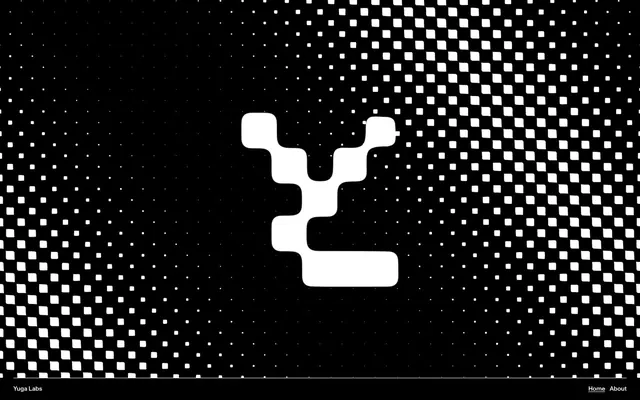
Preview image. Unlock full-res
Blocky digital canvas
Color palette
Accent for graphical elements, occasional background tint, or highlights. Its low contrast against white suggests decorative use rather than functional text
Page backgrounds, card surfaces, primary text, button backgrounds, interactive borders
Hairline borders, dividers, input outlines, and card edges on light surfaces. Do not promote it to the primary CTA color
Subtle surface differentiation for elevated elements
Typography
- Weights
- 200, 400, 700, 800
- Sizes
- 14px, 16px, 24px, 26px, 32px, 52px, 102px, 160px
- Line height
- 0.78, 0.82, 0.83, 0.9, 0.94, 1, 1.1
- Letter spacing
- -0.0300em at large sizes, -0.0200em at intermediate sizes
- Fallback
- Monument Extended or Space Grotesk
All text elements from body to display headlines. Its proprietary nature and wide range of weights allow for high-impact brand expression.
Spacing & shape
Components
Black background (#000000) with white text (#ffffff) using AK Monument Grotesk. Full pill shape with a 90px border-radius, 20px horizontal padding, and minimal vertical padding (0px) for a compact and bold look.
White text (#ffffff) on a dark background, in AK Monument Grotesk at 16px. Can have underline or border on hover and active states. Uses a 40px radius when used as a rounded interactive element.
Black background (#000000) with generous 30px border-radius. Contains white or inverse-color content. Padding is likely 20px, giving content breathing room.
White text (#ffffff) in AK Monument Grotesk at smaller sizes (e.g., 14px or 16px). Frequently accompanied by an underline or subtle border on hover.
Guidelines
- Prioritize high contrast between foreground (#ffffff) and background (#000000) for all primary content.
- Apply AK Monument Grotesk consistently across all typographic elements, leveraging its varying weights for hierarchy.
- Use 90px border-radius for all primary interactive elements like buttons to achieve a distinct pill shape.
- Maintain a comfortable information density with `elementGap` of 15px and `cardPadding` of 20px.
- Use the Lime Glow accent color (#d3de5d) sparingly for decorative elements or subtle brand highlights, not for essential text or interactive states.
- Avoid using the Lime Glow accent color (#d3de5d) for large blocks of text or critical interface elements due to its low contrast against light backgrounds.
- Do not introduce additional custom fonts; 'AK Monument Grotesk' is the singular typographic voice.
- Do not use subtle elevation or complex shadow effects; surfaces should remain flat.
- Avoid using standard square or lightly rounded corners; consistently apply 30px-90px radii for a specific blocky-yet-rounded aesthetic.
- Do not deviate from the predominantly dark theme; light sections should be exceptions, not the rule.
About this system
ShowHide
Yuga Labs employs a high-contrast digital-native aesthetic, leveraging stark black and white with minimal color accents. Typography is compact and commanding, featuring a proprietary heavy sans-serif that defines the brand's voice. Surfaces are predominantly flat, and interactivity is signaled through subtle highlights and generous border radii, resulting in a bold, direct, and slightly playful presentation.
The page primarily uses a full-bleed structure, often with the main content centered within a maximum-width constraint. The hero section frequently features large, centered headlines over a dark background with dynamic, pixel-like graphic treatments. Sections are distinctly separated, often by background color changes (though mostly black and dark grays). Content arrangement favors centered stacks for headlines and buttons, with multi-column card grids (e.g., 2-column for collections) for showcasing items. Vertical spacing between sections is consistent and generous, creating a spacious and airy feel.
The visual language focuses on bold, abstract, and often monochromatic graphics with a pixelated or blocky aesthetic, reminiscent of early digital art or NFT styles. The Yuga Labs logo itself exemplifies this blocky, 'building block' approach. Product imagery, when present, is tightly cropped and often isolated on black backgrounds, showcasing the asset (e.g., NFT artwork) as the central focus without much context. Icons are simple, outlined, and monochromatic, aligning with the overall high-contrast theme. Imagery plays a decorative and brand-reinforcing role, rather than purely informational or product showcase.
Reminiscent of OpenSea, Rarible, Foundation, Dapper Labs.
# Yuga — Style Reference
> Blocky digital canvas

**Theme:** dark

**Site:** https://yuga.com

Yuga Labs employs a high-contrast digital-native aesthetic, leveraging stark black and white with minimal color accents. Typography is compact and commanding, featuring a proprietary heavy sans-serif that defines the brand's voice. Surfaces are predominantly flat, and interactivity is signaled through subtle highlights and generous border radii, resulting in a bold, direct, and slightly playful presentation.

## Tokens — Colors

| Name | Value | Token | Role |
|------|------|------|------|
| Lime Glow | `#d3de5d` | `--color-lime-glow` | Accent for graphical elements, occasional background tint, or highlights. Its low contrast against white suggests decorative use rather than functional text |
| Midnight Void | `#000000` | `--color-midnight-void` | Page backgrounds, card surfaces, primary text, button backgrounds, interactive borders |
| Cloud Canvas | `#ffffff` | `--color-cloud-canvas` | Hairline borders, dividers, input outlines, and card edges on light surfaces. Do not promote it to the primary CTA color |
| Digital Gray | `#131313` | `--color-digital-gray` | Subtle surface differentiation for elevated elements |

## Tokens — Typography

### AK Monument Grotesk
- **Substitute:** Monument Extended or Space Grotesk
- **Weights:** 200, 400, 700, 800
- **Sizes:** 14px, 16px, 24px, 26px, 32px, 52px, 102px, 160px
- **Line height:** 0.78, 0.82, 0.83, 0.9, 0.94, 1, 1.1
- **Letter spacing:** -0.0300em at large sizes, -0.0200em at intermediate sizes
- **Role:** All text elements from body to display headlines. Its proprietary nature and wide range of weights allow for high-impact brand expression.

## Tokens — Type Scale

Augmented Fourth (1.414) from 16px base.

| Role | Size | Line height | Letter spacing |
|------|------|------|------|
| caption | 14px | 1.1 | — |
| body | 16px | 1.1 | — |
| subheading | 24px | 0.94 | — |
| heading-sm | 26px | 0.94 | — |
| heading | 32px | 0.9 | — |
| heading-lg | 52px | 0.83 | -0.83px |
| display | 102px | 0.82 | -2.04px |
| display-xl | 160px | 0.78 | -3.2px |

## Tokens — Spacing

- **Section gap:** 40px
- **Card padding:** 20px
- **Element gap:** 15px

## Tokens — Radius

- **Buttons:** 90px
- **Cards:** 30px
- **elements:** 30px
- **links:** 40px

## Layout

The page primarily uses a full-bleed structure, often with the main content centered within a maximum-width constraint. The hero section frequently features large, centered headlines over a dark background with dynamic, pixel-like graphic treatments. Sections are distinctly separated, often by background color changes (though mostly black and dark grays). Content arrangement favors centered stacks for headlines and buttons, with multi-column card grids (e.g., 2-column for collections) for showcasing items. Vertical spacing between sections is consistent and generous, creating a spacious and airy feel.

## Imagery

The visual language focuses on bold, abstract, and often monochromatic graphics with a pixelated or blocky aesthetic, reminiscent of early digital art or NFT styles. The Yuga Labs logo itself exemplifies this blocky, 'building block' approach. Product imagery, when present, is tightly cropped and often isolated on black backgrounds, showcasing the asset (e.g., NFT artwork) as the central focus without much context. Icons are simple, outlined, and monochromatic, aligning with the overall high-contrast theme. Imagery plays a decorative and brand-reinforcing role, rather than purely informational or product showcase.

## Components

### Primary Filled Button
*Call to action button*

Black background (#000000) with white text (#ffffff) using AK Monument Grotesk. Full pill shape with a 90px border-radius, 20px horizontal padding, and minimal vertical padding (0px) for a compact and bold look.

### Navigation Link
*Primary navigation item*

White text (#ffffff) on a dark background, in AK Monument Grotesk at 16px. Can have underline or border on hover and active states. Uses a 40px radius when used as a rounded interactive element.

### Product Display Card
*Container for product imagery or information*

Black background (#000000) with generous 30px border-radius. Contains white or inverse-color content. Padding is likely 20px, giving content breathing room.

### Footer Link
*Secondary navigation or informational link*

White text (#ffffff) in AK Monument Grotesk at smaller sizes (e.g., 14px or 16px). Frequently accompanied by an underline or subtle border on hover.

## Guidelines

### Do

- Prioritize high contrast between foreground (#ffffff) and background (#000000) for all primary content.
- Apply AK Monument Grotesk consistently across all typographic elements, leveraging its varying weights for hierarchy.
- Use 90px border-radius for all primary interactive elements like buttons to achieve a distinct pill shape.
- Maintain a comfortable information density with `elementGap` of 15px and `cardPadding` of 20px.
- Use the Lime Glow accent color (#d3de5d) sparingly for decorative elements or subtle brand highlights, not for essential text or interactive states.

### Don't

- Avoid using the Lime Glow accent color (#d3de5d) for large blocks of text or critical interface elements due to its low contrast against light backgrounds.
- Do not introduce additional custom fonts; 'AK Monument Grotesk' is the singular typographic voice.
- Do not use subtle elevation or complex shadow effects; surfaces should remain flat.
- Avoid using standard square or lightly rounded corners; consistently apply 30px-90px radii for a specific blocky-yet-rounded aesthetic.
- Do not deviate from the predominantly dark theme; light sections should be exceptions, not the rule.

## Agent Prompt Guide

Quick Color Reference:
text: #ffffff
background: #000000
border: #000000
accent: #d3de5d
primary action: #000000 (filled action)

Example Component Prompts:
1. Create a large display heading: AK Monument Grotesk weight 800, 160px, line-height 0.78, letter-spacing -3.2px, color #ffffff, on a #000000 background.
2. Create a primary call-to-action button: background #000000, text #ffffff, AK Monument Grotesk 16px, 90px border-radius, 20px horizontal padding, 0px vertical padding.
3. Create a product card: background #000000, 30px border-radius, 20px padding. Inside, place a 'subheading' text label at AK Monument Grotesk weight 700, 24px, line-height 0.94, color #ffffff.
4. Create a footer copyright link: AK Monument Grotesk 14px, color #ffffff, no special adornments by default.
More like this




Keep what you find
A free account saves references to boards and can send you a weekly email of picks based on what you save.
To see every result, go Pro.