Preview image. Unlock full-res
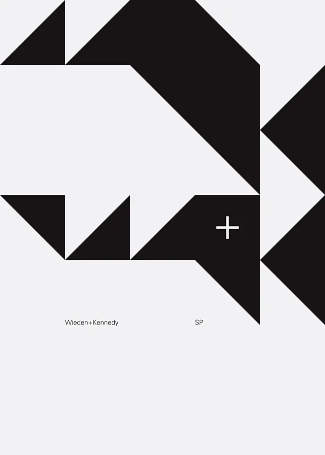
Black geometric triangular shapes compose a minimalist rebrand for Wieden+Kennedy.
Summary
A rebrand identity for Wieden+Kennedy that uses sharp black triangular forms arranged asymmetrically to create a dynamic, geometric mark. The design achieves impact through geometric simplicity and high contrast against a light background.
Visual description
Light gray background with black geometric triangular shapes arranged in an asymmetric composition. The triangles interlocking and rotating create a stylized lettermark with angular precision. Small studio name text and location "SP" positioned in the lower right. The overall effect is sharp, contemporary, and scalable.
Key takeaway
High-contrast geometric abstraction can create distinctive, modern brand marks. The strength lies in the confident simplification of the form into clean triangular shapes that maintain visual interest through asymmetric arrangement.
Reuse notes
Effective for design studios and creative agencies seeking a bold, contemporary identity. The geometric approach works at all scales. Pairs well with minimal typography and spacious layouts.
More like this



Keep what you find
A free account saves references to boards and can send you a weekly email of picks based on what you save.
To see every result, go Pro.