Preview image. Unlock full-res
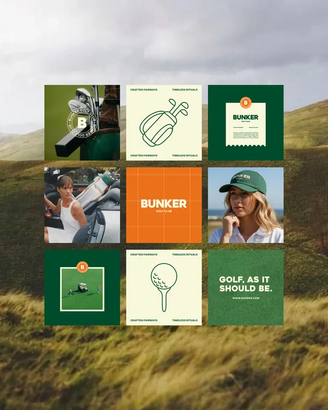
A nine-cell brand-identity grid for Bunker Golf Club, alternating deep-green and cream tiles with golf photography, a badge logo, line icons and the line GOLF, AS IT SHOULD BE.
Summary
A 3x3 brand-collateral grid for Bunker Golf Club, composited over a muted hillside photo, alternating deep-green and cream tiles that mix golf lifestyle photography, a circular "B" badge, line illustrations and short taglines.
Visual description
Nine roughly square panels are laid out in a clean grid floating on a soft-focus grassy-hill background. The system runs on two core colors, a forest green and a warm cream, with a small orange accent on the badge mark. Content rotates across the cells: a photo of golf clubs in a bag stamped with a circular "B" emblem; a cream tile with a line-drawn golf bag icon and the words "CRAFTED FAIRWAYS / TIMELESS RITUALS"; a cream receipt-style card with the orange-badged logo; lifestyle photos of a woman in a cart and a woman in a green cap; an orange tile with the "BUNKER GOLF CLUB" wordmark; a green tile holding a small framed scene; a cream tile with a line-art golf ball on a tee; and a green closing tile reading "GOLF, AS IT SHOULD BE." with a URL. Sans-serif all-caps type and consistent margins tie the panels together.
Key takeaway
Presenting an identity as a feed-style grid lets one badge, two brand colors and a single icon style read as a coherent system across photo, illustration and type tiles. Alternating photographic and flat-color cells keeps a nine-up grid from feeling monotonous while the repeated green/cream palette holds it together.
Reuse notes
A go-to layout for pitching a brand's Instagram presence or collateral suite in one frame, especially for heritage, outdoor or club-style brands. The earthy two-color palette plus a badge mark signals premium and traditional. Mounting the grid over a real-world photo background is a quick way to make a flat brand board feel placed in context.
More like this




Keep what you find
A free account saves references to boards and can send you a weekly email of picks based on what you save.
To see every result, go Pro.