Preview image. Unlock full-res
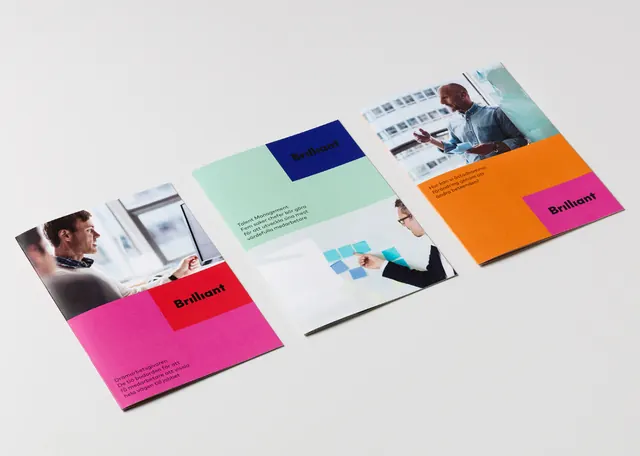
A flat-lay of folded brochures and cards for one identity, each panel a different saturated block (magenta, orange, mint, indigo) tied together by a consistent sans-serif logo.
Summary
A printed brochure and card system shot as a flat-lay, where each cover takes a different fully saturated color block and a small black corporate-photo inset, all unified by one repeated sans-serif logotype.
Visual description
Several folded brochures and loose cards are laid across a white surface at a shallow angle, casting soft shadows so the pieces read as physical print rather than screen mockups. The covers cycle through a hot magenta, a bright orange, a pale mint, and a deep indigo, each one a solid flood of color with the small logo reversed out in a corner. Interspersed are spreads showing grayscale corporate photography of people in an office, plus an inner page with a small bar or pie chart in the same palette. The arrangement runs diagonally from lower-left to upper-right, layering pieces so edges overlap and create depth.
Key takeaway
The system logic: hold the logo, typeface, and layout constant, then let a different saturated color carry each piece so the suite feels varied but unmistakably one family. Pairing each loud color cover with restrained grayscale photography inside keeps the energy on the covers without overwhelming the content pages.
Reuse notes
A strong reference for a stationery or collateral rollout where you need to show range across many touchpoints. The diagonal flat-lay is a clean way to present a print system in a portfolio or pitch deck. Needs at least four to five pieces to make the color-rotation idea land; with only one or two it looks accidental.
More like this


Keep what you find
A free account saves references to boards and can send you a weekly email of picks based on what you save.
To see every result, go Pro.