Preview image. Unlock full-res
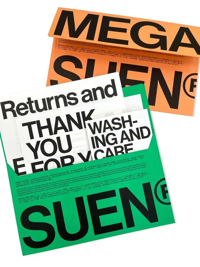
Overlapping printed stationery for MEGA SUEN sets oversized black Helvetica-style display type and dense bilingual fine print across bright orange, green, and white sheets.
Summary
A flat-lay of MEGA SUEN brand collateral where the company name is set in enormous black sans-serif that bleeds off every edge, fragmented across overlapping orange, green, and white sheets.
Visual description
Three or four printed pieces are stacked diagonally over a white surface. The wordmark "MEGA SUEN" with a registered-trademark mark runs across the sheets in oversized black Helvetica-like capitals so large that individual letters are cropped by the page edges. A small block of tightly leaded bilingual Japanese and English body copy sits below the big type on the orange and green sheets. White inner sheets carry headings "Returns and", "THANK YOU FOR Y", and "WASHING AND CARE" in upper and mixed case, signalling care-label and packaging inserts. The palette is limited to a saturated orange, a kelly green, off-white, and black, with no imagery, illustration, or gradient.
Key takeaway
Crop a display wordmark so hard it reads as texture and color-block rather than legible text, letting fragments across stacked sheets imply a full system. Pair that loud headline scale with a deliberately tiny bilingual fine-print block for tension between shout and whisper.
Reuse notes
Good reference for a type-led retail or fashion identity, especially care tags, hangtags, and packaging inserts where one display face does all the work. The cropped-letter trick needs a recognizable, geometric sans to survive being cut. Two flat brand colors plus black keep print costs and cohesion in check.
More like this





Keep what you find
A free account saves references to boards and can send you a weekly email of picks based on what you save.
To see every result, go Pro.