Preview image. Unlock full-res
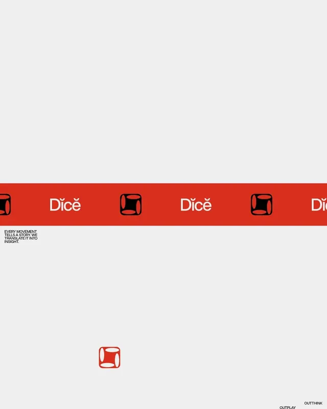
A modular identity system for Dièce featuring a bold red horizontal band with repeating wordmark and icon, paired with a standalone stacked mark.
Summary
A corporate identity for Dièce using a bold red accent band anchored by a geometric icon mark, paired with stacked wordmark and tagline statement.
Visual description
The composition spans three main zones. The top half is cream-colored negative space. The middle features a 3x4 grid of identical rounded-square icon marks in red, separated by the repeated wordmark "Dièce" in sans-serif capitals, all set against a deep red horizontal band. The band is flanked by black rounded-square icons at both edges. Below the band sits a small black sans-serif line: "EVERY MOVEMENT TELLS A STORY. WE TRANSLATE IT INTO INSIGHT." At the bottom, a large centered red rounded-square icon mark stands alone, with gray text "OUTPLAY" and "OUTTHINX" positioned in the lower right corner.
Key takeaway
The red accent band as a unifying element that organizes and energizes the layout. The pairing of the geometric icon with sans-serif wordmark, which creates immediate brand recognition. The stacked mark (icon above tagline) as a compact lockup for smaller applications.
Reuse notes
Effective for brands emphasizing movement, process, or methodology. The icon's geometric simplicity scales well across applications. Works best with strong color contrast to the background.
More like this







Keep what you find
A free account saves references to boards and can send you a weekly email of picks based on what you save.
To see every result, go Pro.