Preview image. Unlock full-res
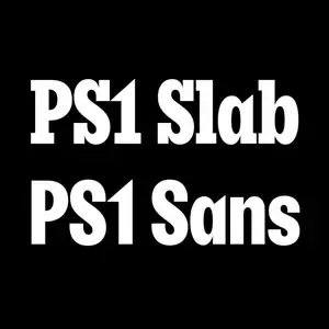
Black-on-white type specimen stacking the words 'PS1 Slab' and 'PS1 Sans' to compare a heavy slab serif against its matching sans-serif companion.
Summary
A two-line type specimen that sets the same label, "PS1 Slab" and "PS1 Sans," in two weights of a single type system so the slab serif and its sans companion can be read side by side.
Visual description
Solid black square with two centered white words stacked vertically. The top line, "PS1 Slab," carries chunky bracketed slab serifs on every stem; the bottom line, "PS1 Sans," is the same letterforms stripped to clean unseriffed terminals. Both are set heavy and tightly fitted, near identical in width and x-height so the eye reads only the serif difference. Generous black margins frame the pair, no other marks or rules.
Key takeaway
Demonstrate a type family by repeating one identical string across its variants, so the only variable a viewer perceives is the design difference itself. Pure black and maximum-weight white removes color and decoration so the letterform comparison carries the whole frame.
Reuse notes
A clean template for foundry specimen tiles, font-pairing posts, or a brand's type-system documentation page. Works wherever you need to show that a slab and a sans belong to the same family. Pairs with a wider grid of weight or size variations.
More like this



Keep what you find
A free account saves references to boards and can send you a weekly email of picks based on what you save.
To see every result, go Pro.