Preview image. Unlock full-res
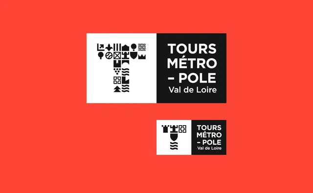
A branding system for Tours Metro-Pole featuring a modular symbolic mark and sans-serif typography on bold red and black components.
Summary
A brand identity system for a regional transportation authority featuring a modular geometric symbol and sans-serif wordmark arranged on contrasting red and black backgrounds.
Visual description
Horizontal composition on a bright red background. Two logotype variations are displayed: a larger version at the top and a condensed version below. Each logo comprises a white square containing geometric symbols arranged in a grid pattern on the left, paired with a black rectangle containing white sans-serif typography on the right. The wordmark reads "TOURS MÉTRO-POLE Val de Loire" in clean, bold capitals. The symbols appear to represent various transit-related forms and architectural elements using simple geometric shapes. The color palette is strictly limited to the vibrant red background, white, and black.
Key takeaway
The modular symbolic system provides flexibility for application across touchpoints while maintaining a cohesive visual language. The bold primary color palette ensures high visibility and memorability for a public transit context. The geometric mark system is scalable and distinctive.
Reuse notes
Excellent reference for public sector branding, transportation authority identity, and modular symbol systems. Works well for regional organizations needing a bold, recognizable mark that functions across applications. The high-contrast color scheme is practical for wayfinding and signage applications. The geometric approach is timeless and adaptable. Effective for communications requiring clarity and immediate visual recognition.
More like this

Keep what you find
A free account saves references to boards and can send you a weekly email of picks based on what you save.
To see every result, go Pro.