Preview image. Unlock full-res
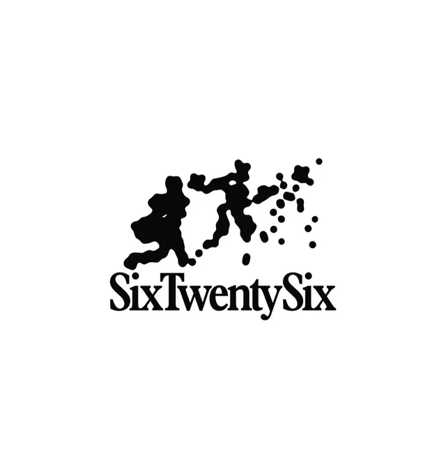
Black-on-white logo of two sprinting figures whose trailing edge fragments into scattered dots, set above a tight serif 'SixTwentySix' wordmark.
Summary
A solid black silhouette of two figures mid-stride whose trailing back edge breaks apart into a scatter of dots, signalling speed, paired with a classical serif "SixTwentySix" wordmark beneath.
Visual description
On a plain white field, a single inky mass reads as two overlapping runners leaning forward in a sprint. The leading half is solid and figurative; the rear half dissolves into progressively smaller free-floating blobs and dots drifting up and to the right, like a dispersion or pixel-shatter trailing the motion. The mark sits dead center above the brand name. The wordmark "SixTwentySix" is set tight in a high-contrast serif with prominent bracketed serifs, capitalized at each word boundary, giving an editorial, almost literary counterpoint to the kinetic image above.
Key takeaway
The dispersion device: keep one half of a silhouette solid and let the opposite edge fragment into shrinking particles to imply direction and velocity without any motion lines. Also the deliberate mismatch of a gritty action mark with a refined serif wordmark, which keeps an athletic brand from looking generic-sporty.
Reuse notes
Good for run clubs, training apps, performance apparel, or event branding that wants energy plus a premium edge. The dispersion detail thins out at small sizes, so prepare a simplified one-color version for favicons and embroidery.