Preview image. Unlock full-res
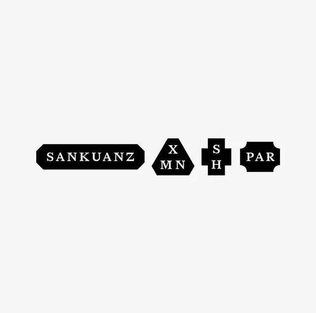
A row of four solid-black logo badges in distinct shapes (notched bar, hexagon, plus, scalloped tag) carrying white serif lettering against a pale grey ground.
Summary
A suite of four solid-black logo badges, each a different label shape, holding reversed-out serif lettering and short monograms, lined up horizontally on a pale grey field.
Visual description
Centered on a light grey background, four black marks sit in a single row, vertically aligned to a shared center line. From left: a wide notched-corner bar reading "SANKUANZ" in a Roman serif; a rounded hexagon stacking "X / MN"; a thick plus or cross shape stacking "S / H"; and a scalloped-edge tag reading "PAR". Every badge is a flat black silhouette with no gradient or outline, and all lettering is white, all-caps, and serif with classic thick-thin contrast. The varied container geometry, each a recognizable label or seal shape, does the differentiating work while the type style stays constant across the set.
Key takeaway
The system move: keep one typographic voice (a single reversed serif) and vary only the badge silhouette to generate a whole family of marks for collaborations or sub-labels. Solid-black flat shapes on a near-white ground read instantly at any size and survive embroidery, woven labels, and stamps. Stacking two-letter monograms inside small geometric shapes is a compact way to abbreviate partner names.
Reuse notes
Reach for this when a brand needs a kit of related marks, capsule collections, collaborations, garment labels, or seasonal seals, rather than a single logo. The Roman serif lends a heritage or fashion feel; swap to a grotesque if you want it more utilitarian. Stay strictly monochrome so the shapes, not color, carry the distinction.