Preview image. Unlock full-res
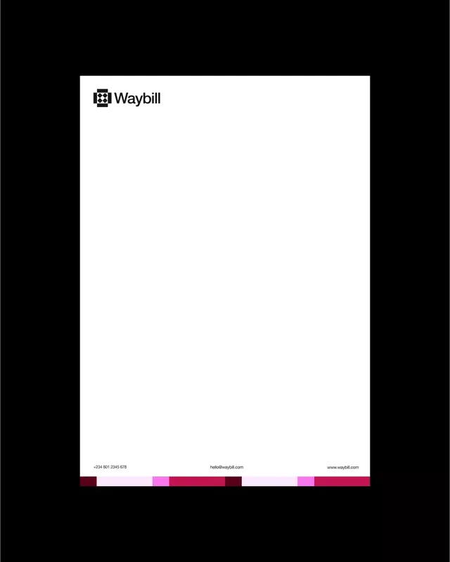
A4 letterhead for Waybill pairing a black diamond-mark logo at top-left with a footer contact row sitting on a strip of maroon, pink and magenta color blocks.
Summary
An A4 letterhead mockup for the brand "Waybill", defined by a near-empty white page that anchors a black logo at the top and a vivid color-block strip at the very bottom.
Visual description
A portrait sheet on a black backdrop. Top-left sits the logo lockup: a square mark built from black geometric diamond shapes, followed by the wordmark "Waybill" in a medium-weight black sans-serif. The page body is left intentionally blank. A thin footer row carries three left-aligned contact items in small gray type (a phone number, an email, and a web address), evenly spaced across the width. Directly beneath the footer runs an edge-to-edge band of rectangular color blocks in alternating tones: dark maroon, pale pink, hot magenta and deep crimson, varying in width like a barcode.
Key takeaway
The color-block footer band: a flat brand palette deployed as a single decorative strip turns an otherwise austere page into something ownable without adding a logo or graphic to the body. Pairing a strictly monochrome lockup with one loud color event keeps the system flexible.
Reuse notes
A strong template for B2B or logistics stationery where the page must stay clean for printed content. The color strip scales to business cards, invoices and email signatures as a recurring brand device. Works best when the palette has three or more distinct accent hues to make the strip read as intentional rather than accidental.