Preview image. Unlock full-res
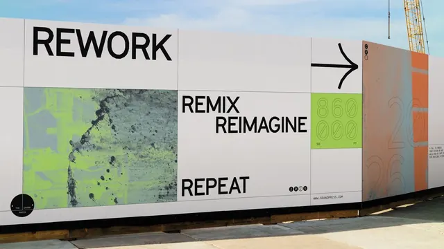
A construction-site hoarding gridded into typographic panels reading REWORK / REMIX REIMAGINE / REPEAT, with a lime-tinted concrete texture and an 860,000 SQ FT stat block.
Summary
A real-estate construction hoarding for The Grand Press, organized as a white modular grid of typographic panels reading REWORK, REMIX REIMAGINE, and REPEAT, punctuated by a lime-green concrete texture tile and an 860,000 SQ FT figure.
Visual description
Photographed in situ against a pale sky with a yellow crane at the right edge. The wall is divided into a strict rectangular grid of off-white panels. Top-left carries an oversized black grotesque REWORK; a center column stacks REMIX REIMAGINE and REPEAT in the same heavy sans; a right panel holds a thick black right-pointing arrow above a lime-green tile reading 860,000 SQ FT in outlined numerals. A circular "THE GRAND PRESS" stamp sits bottom-left, the URL www.grandpress.com runs along the lower edge, and a half-tone concrete texture printed in lime-and-grey duotone fills one lower-left cell. The far-right return panel shifts to muted terracotta with ghosted "20 26" numerals.
Key takeaway
Run a three-word brand cadence (REWORK / REMIX / REPEAT) across a literal grid so each word claims its own panel and the structure does the rhythm. Use a single saturated accent (lime) only inside the texture tile and the stat block, keeping the rest black-on-white so the color reads as a deliberate signal, not decoration.
Reuse notes
A strong template for development, property, or events hoardings and any large-format environmental graphics where a passerby reads it in seconds. Needs real scale and a hero stat to land; the grotesque-on-grid system scales down to decks and web headers but loses impact below billboard size.
More like this




Keep what you find
A free account saves references to boards and can send you a weekly email of picks based on what you save.
To see every result, go Pro.