Preview image. Unlock full-res
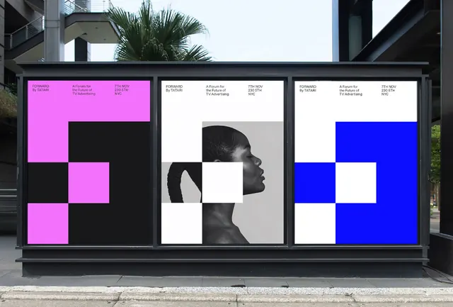
An outdoor billboard displaying three adjacent vertical poster panels built on one shared modular grid, where a chunky numeral form recolours across magenta, black-and-white, and electric blue with a photographic portrait interrupt in the center panel.
Summary
A modular poster system where a chunky numeral built from square grid cells recolours across three vertical panels: bright magenta on black (left), high-contrast black-and-white portrait (center), and electric blue on near-white (right), unified by one shared compositional grid.
Visual description
A street-level outdoor billboard photographed with palm and building context, holding three vertical poster panels side by side. Each poster is constructed from a large square grid (approximately 4x4 or 5x5 cells) so a blocky numeral form (resembling a "5" or similar mark) is spelled out by filled and empty squares. The left panel shows bright magenta filled blocks against black empty cells. The center panel dissolves the grid over a high-contrast greyscale portrait of a figure with a hand raised near the face, photographed in duotone so the portrait sits as one of the grid cells. The right panel mirrors the left panel's block pattern but inverts the colors, with electric blue blocks against a near-white or pale grey background. Small functional caption text runs horizontally along the top edge of each panel in a clean sans-serif. The three pieces read as a single identity system shown in three distinct colorways rather than three independent images, with the portrait serving as a human focal point and visual pause between the two geometric variants.
Key takeaway
Building a poster series off a rigid square-cell grid so a shape, numeral, or monogram is spelled purely by filled and empty squares, then expressing campaign variants by recolouring the same grid and introducing one or more photographic cells. The grid provides instant unity across any number of panels while recolouring and compositional swaps keep each panel visually distinct and interesting. The contrast ratio between the left and right panels (magenta-on-black versus blue-on-white) demonstrates how the same grid reads completely differently under inversion.
Reuse notes
Ideal for flexible identity or campaign systems that must work across many sizes, placements, and media (OOH, social, print, web) without custom design per version. Document the grid proportions, the core numeral or mark structure, and a tight palette so future executions stay on-system. This model works best where the primary mark is a geometric shape, numeral, monogram, or letter that can be constructed from rectangular cells; flowing or script type would fight the constraint. Photographic cells can interrupt the grid for emphasis or hero storytelling, but limit to one or two so the geometric language stays clear. The magenta and blue chosen here offer high legibility separation and work well together but remain distinct in both light and dark contexts.
More like this





Keep what you find
A free account saves references to boards and can send you a weekly email of picks based on what you save.
To see every result, go Pro.