Preview image. Unlock full-res
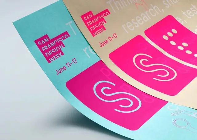
Promotional brochure and card set for San Francisco Design Week featuring hot pink and teal color blocking, bold all-caps typography, and a curved S mark.
Summary
A San Francisco Design Week event marketing collateral set showing multiple brochures and cards with event dates (June 11-17) rendered in isometric perspective.
Visual description
Isometric arrangement of printed collateral pieces stacked at angles: a teal card on the left and cream-colored cards on the right. Each features hot pink rectangular blocks containing "SAN FRANCISCO DESIGN WEEK" in white all-caps sans-serif type, with event dates "June 11-17" in smaller pink text. The right cards display a large curved outline S mark in cream against hot pink backgrounds. A subtle circular dot pattern appears on visible card edges. The color palette is teal, hot pink, cream, and white.
Key takeaway
The bold, legible all-caps typography combined with high-contrast color blocking (hot pink and teal) creates immediate visual impact for event promotion. The simple curved S logomark works as a strong, scalable symbol across printed materials.
Reuse notes
Effective for event or conference branding where dates and venue information must remain legible at small scales. The two-color block approach works well for printed collateral. Works best when the event name and dates are the primary content hierarchy.
More like this



Keep what you find
A free account saves references to boards and can send you a weekly email of picks based on what you save.
To see every result, go Pro.