Preview image. Unlock full-res
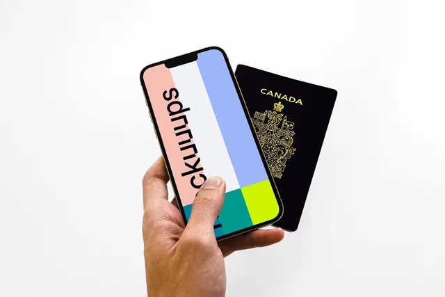
A hand holds a phone showing a vertical colour-block wordmark beside a navy Canadian passport, presenting a playful brand identity as a travel-app lock screen.
Summary
A brand identity shown as a phone lock screen: a vertical lowercase wordmark runs sideways over candy-colored blocks (pink, white, periwinkle, teal, lime), held in one hand next to a navy Canadian passport.
Visual description
A single hand grips a gold-edged smartphone against a clean white backdrop, a navy passport with gold "CANADA" embossing and crest tucked behind it. The phone screen is divided into wide vertical color bands, pink, white, periwinkle blue, then a teal-and-lime split across the bottom. A bold black lowercase wordmark is rotated ninety degrees and set down the screen, reading sideways. The whole frame is bright, evenly lit, and shot flat-on, so the type and color planes read as crisp geometric blocks rather than a real-world UI.
Key takeaway
The rotated wordmark over full-bleed vertical color bands turns a plain lock screen into a recognizable brand surface. Pairing the digital mockup with a tangible passport instantly signals the category (travel/identity) without a single line of copy.
Reuse notes
Good reference for a travel, fintech, or identity app that needs its branding to feel personal and pocket-sized. The color-band-plus-rotated-type system scales to stickers, cards, and app icons. Note the wordmark is hard to read sideways, so keep a horizontal lockup for primary use.