Preview image. Unlock full-res
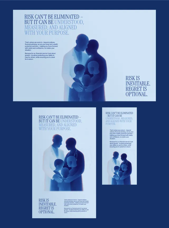
A financial-services campaign in deep navy with serif headlines over a soft blue duotone photo of a family embracing, shown as one wide layout plus square and vertical crops.
Summary
A wealth-management campaign rendered in monochrome navy: serif headlines with selectively highlighted phrases sit over a soft blue duotone photograph of a multi-generational family embracing, shown once as a wide banner and again as square and vertical responsive crops.
Visual description
Everything lives inside one deep-navy frame. The hero is a wide ad where a duotone family group, treated in pale blues and whites with soft focus, occupies the right half while a serif headline runs along the top left; the words "understood, measured, and aligned" are tinted a lighter blue to pop out of the darker line. A short body paragraph and a secondary serif line, "Risk is inevitable. Regret is optional.", complete the composition. Below sit two smaller adaptations of the same layout, a square and a tall vertical, proving the system reflows across formats while keeping the palette, photo treatment, and type hierarchy intact.
Key takeaway
Highlight only the operative words of a headline in a second tint of the same hue to steer reading without changing typeface. Locking the whole campaign to one duotone color family lets the same family photo, headline, and crops feel unmistakably like one brand across desktop, square, and story formats.
Reuse notes
Built for finance, insurance, or advisory brands that need to feel both warm and serious. The serif and the embracing-family photo carry the emotional register; swap in any subject but keep the single-hue duotone and the highlighted-phrase device. Caveat: the all-navy treatment can read heavy, so reserve the lightest tint for the one idea you most want remembered.
More like this





Keep what you find
A free account saves references to boards and can send you a weekly email of picks based on what you save.
To see every result, go Pro.