Preview image. Unlock full-res
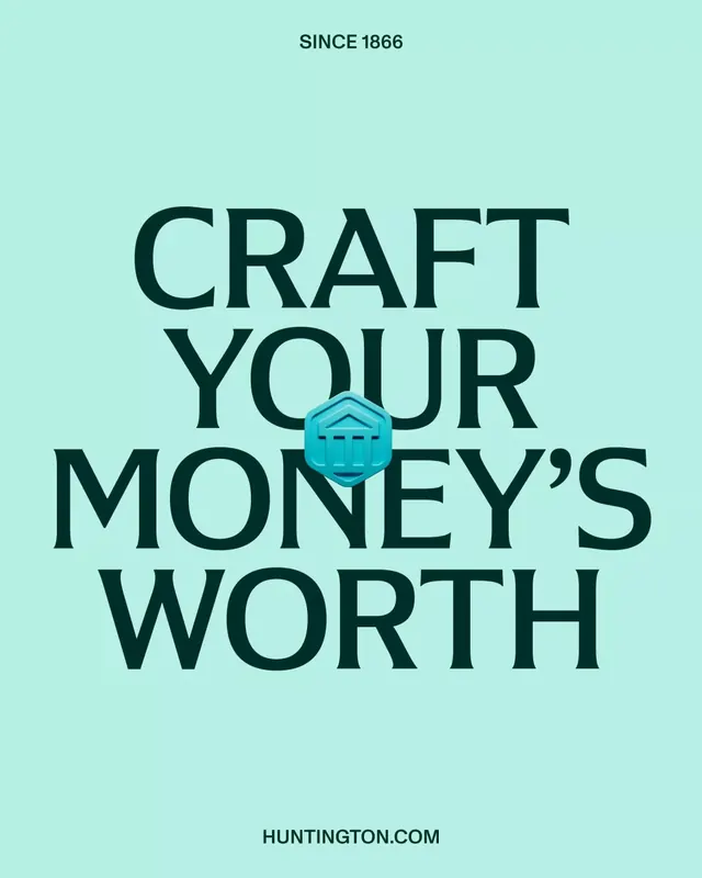
A mint-green banking social poster stacking 'CRAFT YOUR MONEY'S WORTH' in oversized dark-green serif caps around a small 3D coin-bank icon.
Summary
A vertical banking campaign poster that fills the frame with the tagline "CRAFT YOUR MONEY'S WORTH" set in a heavy dark-green serif, centered on a pale mint field with a small glossy 3D coin-and-pillars icon nested into the type. The defining move is the oversized serif headline doing almost all the work, broken only by one jewel-like product icon.
Visual description
The background is a flat soft mint green. A small "SINCE 1866" sits centered at the top in bold green caps, and "HUNTINGTON.COM" anchors the bottom in the same weight, bracketing the layout like a masthead and footer. Between them the headline runs four lines, "CRAFT / YOUR / MONEY'S / WORTH", in a high-contrast serif (thin hairlines, bracketed serifs) colored a very dark forest green, tightly leaded so the lines nearly touch. A small teal-blue 3D bank icon, a classical pillared facade inside a hexagon coin, is tucked over the "Y" and "O" of "YOUR/MONEY'S", reading as an embedded chip rather than a separate element.
Key takeaway
Letting a single oversized serif headline fill the whole canvas, with tiny matching caps as top and bottom rails, gives a complete poster from two type sizes. Nesting one small glossy 3D object directly into the letterforms adds a focal product cue without breaking the type block. The near-touching line leading on a multi-word headline reads as deliberate craft rather than crowding.
Reuse notes
Good for finance, heritage, or trust-led brands that want gravitas without photography. The monochrome-on-tint approach makes it cheap to recolor per campaign, and the embedded-icon trick suits any brand with a strong mark. Watch legibility where the icon overlaps letters; keep it small enough that the words still read.
More like this


Keep what you find
A free account saves references to boards and can send you a weekly email of picks based on what you save.
To see every result, go Pro.