Preview image. Unlock full-res
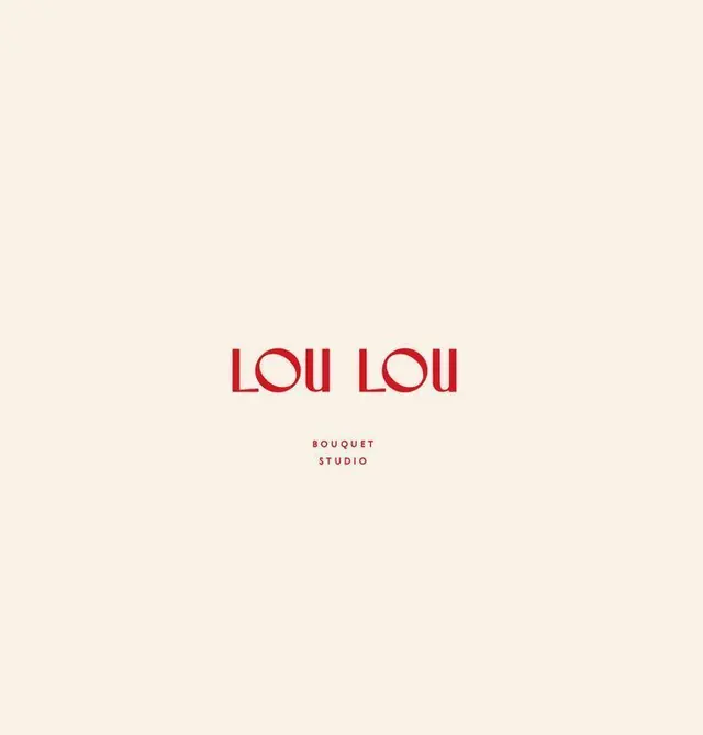
A red art-deco wordmark reading LOU LOU centered on a warm cream field, with a small tracked BOUQUET STUDIO descriptor stacked beneath it.
Summary
A florist wordmark set in deep red art-deco capitals reading "LOU LOU", centered low on a cream canvas with a tiny tracked "BOUQUET STUDIO" line beneath.
Visual description
The composition is almost all negative space: a tall cream rectangle with the logo sitting just below center. The wordmark uses geometric display capitals with a distinctly deco flavor, the O's are perfect circles, strokes are even-weight, and the L's and U's read as drawn from circles and straight lines. It is set in a single warm red. Below it, in much smaller letter-spaced capitals of the same red, a two-line descriptor "BOUQUET / STUDIO" centers under the mark. No imagery, no ornament, just type and breathing room.
Key takeaway
The single-color, all-caps geometric wordmark carried entirely by generous empty space, with a tightly tracked micro-descriptor as the only supporting element. The disciplined low placement (mark below center rather than dead-center) leaves room above for product photography or a header crop.
Reuse notes
A strong template for boutique, florist, beauty, or hospitality identities that want warmth without looking fussy. Works as a standalone logo lockup, a business-card face, or a packaging label. The cream/red warmth reads premium; cooling the palette would shift it corporate. Keep the descriptor small so it never competes with the wordmark.
More like this
Keep what you find
A free account saves references to boards and can send you a weekly email of picks based on what you save.
To see every result, go Pro.