Preview image. Unlock full-res
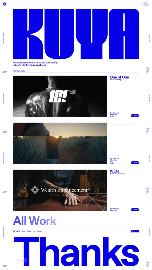
A creative studio homepage stacking three muted project rows between two giant electric-blue display wordmarks, KUYA at the top and Thanks running off the bottom edge.
Summary
A multidisciplinary studio homepage that bookends a quiet, photo-led project list with two oversized electric-blue wordmarks, "KUYA" filling the header and "Thanks" bleeding off the footer.
Visual description
A tall white-background scroll. The hero is a single heavy condensed "KUYA" in saturated electric blue, packed edge to edge, with one line of small studio sub-copy and a pill "Menu" button top right. Below, three full-width landscape project rows in muted, desaturated photography (a back, a figure at sunset, hands on a table) each carry a small dark title, a few lines of metadata, and a dark "Explore" pill at the right. Tiny rotated labels run vertically along both outer margins. The page closes with a lighter-blue "All Work" link row and then the word "Thanks" set in the same giant blue type, cropped by the bottom edge.
Key takeaway
Bracketing a restrained body with two enormous blue type moments turns the wordmark itself into the brand's whole color system. The muted project imagery deliberately recedes so the blue stays the only loud thing. Rotated vertical micro-labels in the side margins add an editorial, technical-sheet feel for almost no space.
Reuse notes
Reach for this when one accent color plus oversized type is the entire identity and you want the work to stay calm underneath. Works best with a genuinely restrained, color-graded image set, busy thumbnails would fight the blue. Pairs naturally with a grotesque-style display face and generous white margins.
More like this







Keep what you find
A free account saves references to boards and can send you a weekly email of picks based on what you save.
To see every result, go Pro.