Preview image. Unlock full-res
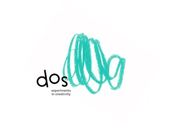
A single-weight green monoline logomark drawn as one continuous looping stroke that reads like a cursive m, finished with a separate dot accent on a white field.
Summary
A green monoline logomark formed from one continuous, even-weight stroke that loops into a cursive lowercase m shape, with a small detached dot to the upper right. Centered on plain white.
Visual description
The mark is a single uniform-thickness line with fully rounded caps, rendered in a saturated mint green on a white background. It rises and loops left to right, creating two interlocking teardrop loops in the middle that resemble a hand-drawn lowercase m or a pair of linked rings, then tapers off to the right ending in a short rounded terminal. A separate filled green dot sits above and to the right, acting as an i-dot or accent that balances the open right side. There is no type, no container, and no shading; the entire identity rests on the gesture of the line and its consistent weight.
Key takeaway
Building a whole logomark from one unbroken constant-weight stroke with rounded caps, so it reads as a single confident gesture and stays legible at small sizes. The detached dot is a cheap way to add asymmetry and personality to an otherwise closed loop, and doubles as a flexible standalone accent or favicon.
Reuse notes
Reach for this monoline approach when a brand wants to feel approachable, light and modern (apps, wellness, fintech, small SaaS) without heavy geometry. Single-stroke marks animate beautifully as a self-drawing line for splash screens and loaders. Keep the stroke weight identical everywhere; uneven weight kills the effect.