Preview image. Unlock full-res
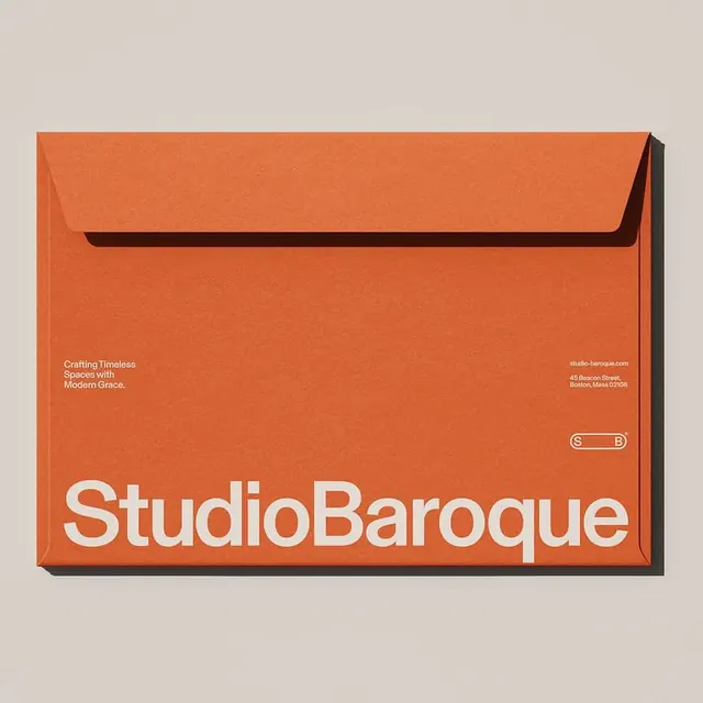
A cream lowercase 'timbr' wordmark in a soft geometric sans, anchored to the bottom of a solid terracotta square with a small circled-C glyph.
Summary
The lowercase wordmark "timbr" set in a soft, slightly rounded geometric sans, rendered cream and sitting flush along the bottom edge of a solid terracotta square. A small circled-C trails the final letter.
Visual description
The composition is a single saturated terracotta field with the wordmark baseline-anchored low, so the whole upper two-thirds is empty warm color. The type is heavy and friendly: even stroke weight, gently rounded corners, a single-storey 'm' and 'b' bowl, and a distinctive flat-topped 'i' and 't' that share a clipped, almost squared terminal. The cream of the letters is an off-white with a faint warm cast against the brick-red ground, a two-tone earthy pairing. A tiny circled copyright mark sits at the lower right, just past the 'r'.
Key takeaway
Anchor a heavy lowercase wordmark to the bottom edge rather than centering it, letting a single block of brand color fill the frame above. Lean on rounded geometric terminals to make a tech-leaning name feel approachable and warm instead of clinical.
Reuse notes
Reach for this as a brand cover, app splash, or social avatar where one warm color plus a confident wordmark is enough. The earthy terracotta-and-cream pairing reads media, craft, or lifestyle more than fintech. Bottom alignment leaves natural room above for a tagline or supporting mark if needed.