Preview image. Unlock full-res
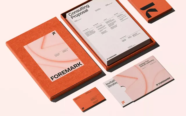
Consulting brand identity featuring a burnt-orange wordmark and stationery system with soft curved illustration, cream and terracotta color palette.
Summary
A complete stationery system for a consulting firm using burnt orange and cream, featuring a wordmark with subtle curved illustration elements.
Visual description
A flat-lay of brand materials against a pale peach background. Orange folder with a cream front cover bearing the "FOREMARK" wordmark and a soft flowing curved illustration in complementary pink. Interior shows proposal pages with a header repeating the curved motif and body text in a clean sans-serif. A matching orange and white business card and small orange branded notepad complete the set. The color palette relies on burnt orange (#DF5D35) as the primary accent, cream (#FFEFEB) as the background, with warm peachy and dark brown supporting tones. All typography is contemporary and minimal.
Key takeaway
The restraint of the curved illustration: a single organic shape serves as the visual identity element, never competing with the wordmark. The palette's warmth and earthiness feels premium without appearing cold or corporate. Consistent accent color placement across collateral creates immediate brand recognition without over-design.
Reuse notes
Ideal for consulting, financial advisory, or professional services firms seeking to balance authority with approachability. The earthy palette reads as grounded and trustworthy. Works particularly well for B2B positioning where visual sophistication matters but friendliness is also valued. The warm accent color commands attention on proposals and folders without exhausting the eye.